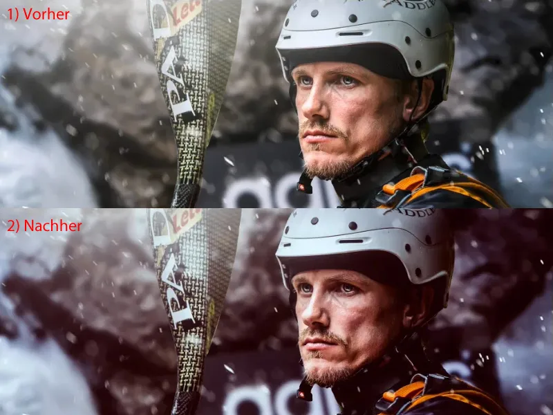
I'll show you how you can easily achieve a color look with adjustment layers. You have various options here: You can fall back on the spectrum of adjustment layers (1), you have the opacity at your disposal (2) and you have the layer mode(3) at your disposal.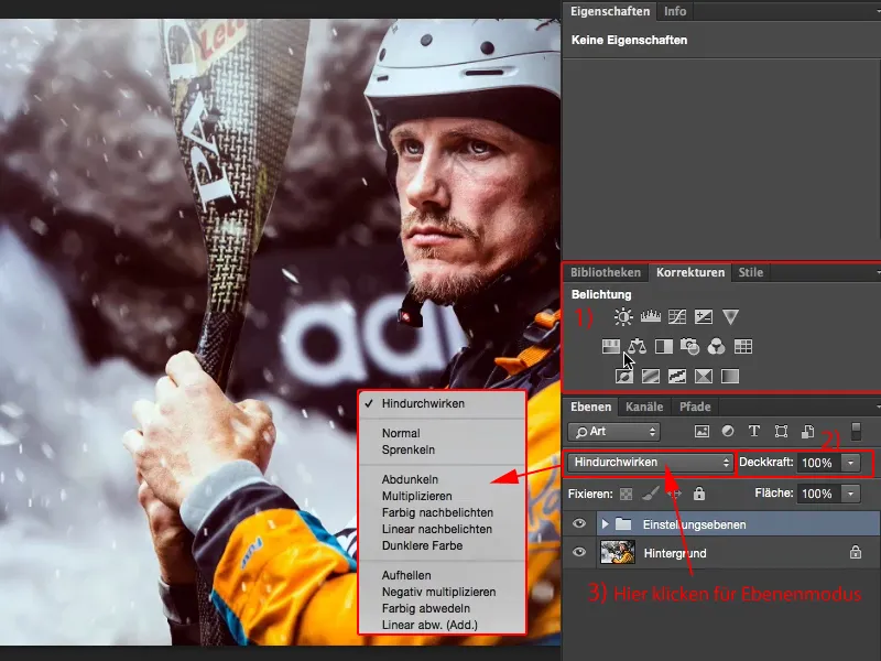
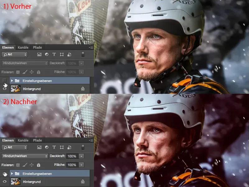
And with these combination options alone, you can tease a little something out of a good-looking image, here on the background layer (1) (2). You can give the whole thing your stamp, your look.
What do you do here? There is no rule of thumb as to what you should do first. You have to look at the picture and think: How could it look different? Where could the picture still have potential? Incidentally, the picture here is a photomontage, there used to be a different background, and the water splashes have also been added digitally. The eyes on the face were lightened with Dodge & Burn. The full program, but that's not the point here. It's about: How can I tease out the last five or ten percent and make the whole thing a bit more interesting? Of course, I also want to have a recognition value.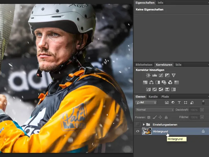
Tonal value correction
I usually start by looking at the contrast. I think to myself: I don't know exactly what it would look like if I had more or less contrast now. And I always create a Tone Correction adjustment layer for this purpose.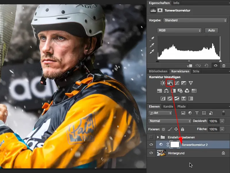
I can set this tone value correction (the layer must be selected) to soft light mode here (1) and I have already increased the contrast. The colors become stronger, the contrast is increased. To compare the two image versions, simply switch the Tone correction layer on and off by clicking on the icon with the eye (2). If I don't want this correction, for example here (3) on the cheek you can see the color shifts very strongly, then I set the layer under (1) back to Normal mode ...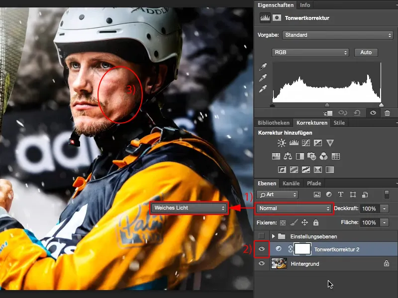
... and use the tone value correction as it should be: I drag the depths here (1) with the black handle to the place where there is a bit more information. I do the same with the highlights using the white handle (2).
With the middles (gray handle), I think to myself: Do I want it brighter (1) or do I want it darker (2)? I decide that I want it a touch darker here (3).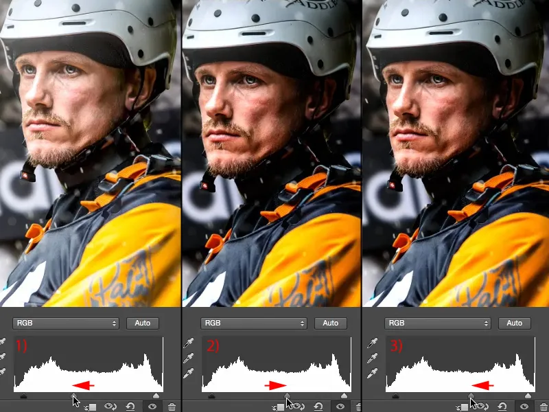
Now I don't have this blatant color shift in the face (1), but I still have more contrast in the picture. I think that suits the picture quite well, even if the hand (2) and the nose (3) are almost a bit off. That's this last line here (4) in the highlights and black (5) is also drowning out a bit, probably here (6) on the belts and back there on the rocks (7). But that doesn't matter, a histogram is never broken, a histogram is always image-dependent, I would say. If I had a tonal value break in the histogram, i.e. thin, black lines where there is no image information, then I would have a problem. However, my histogram has a front-to-back drawing, with two outliers (4 and 5). And that's a good thing, because that's what I see in the image. So that's the tone value correction.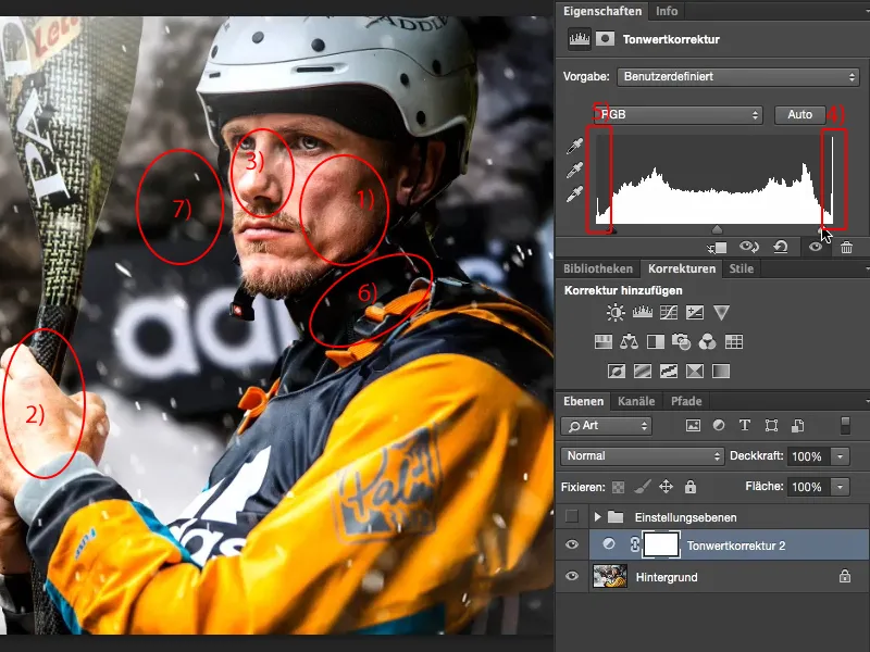
Color balance
Next, I want to know whether the image looks warm or cold. So I select the Color balance adjustment layer (1) under Corrections. For a warm impression, I move the sliders slightly into the red and slightly into the yellow (2). Looks good.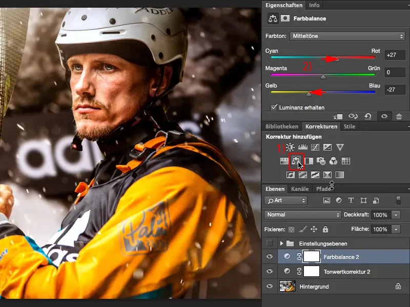
Let's test the cold impression and move the sliders more towards cyan and blue. That appeals to me more because the water and everything is a little bit wrapped up again. It suggests a bit of the outdoors and wildlife. Kayaking is just cold. It's not for nothing that the guys put on such thick clothing and that's why I just make the picture cold.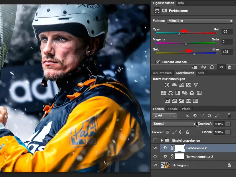
Gradation curves
Then I think to myself: could the picture do with cross-colors? I don't know and go to gradation curves here (1). To get an overview, I'll Blender the window (under 2) and arrange my view (3) so that I can work well in this window (4). And now I'll take a look at the blue tones (5).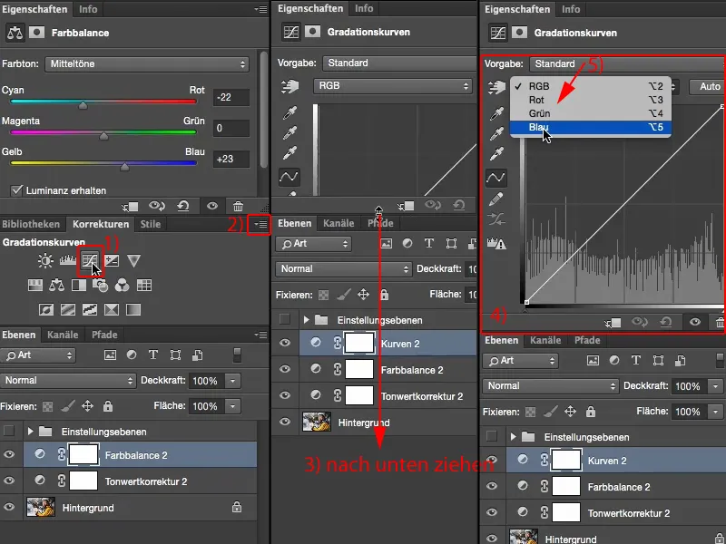
The blue tones because I already have a cold picture here (1), and blue is cold. Then I think to myself: do I perhaps do it like this and pull the handle upwards (2)? That would be too much for me. Do I go to the right (3) and drag it into the cold green area? I don't like that.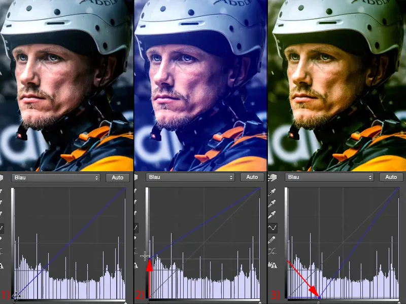
So I just add a touch of blue in the depths (1). To complement this, I can now "tighten" the highlights (2): If I take the highlights down here (3), they turn yellow. That would be way too much of a good thing, this is pure Instagram, ...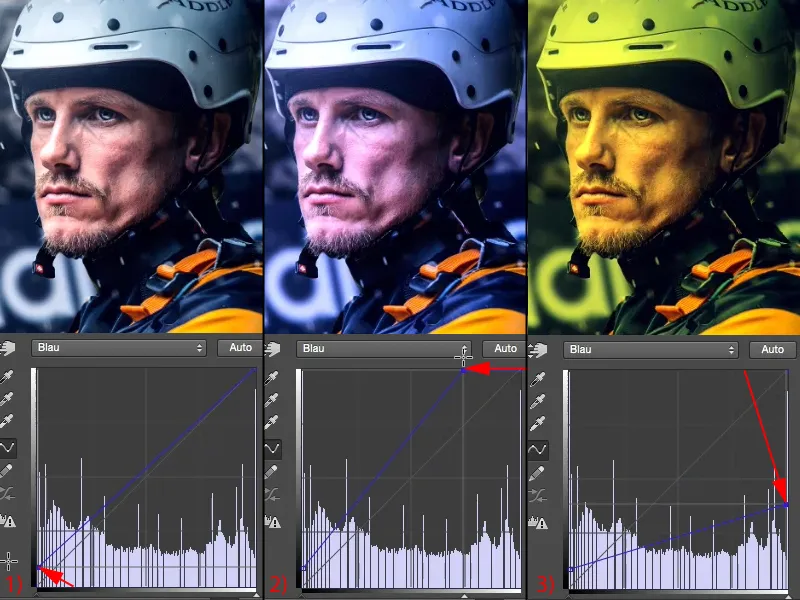
... but a touch like this (1) - I really, really like it like this. Let me take a look at the before (left) and after (right), click on the background layer with the Alt key here (2). I think this look has definitely improved the picture.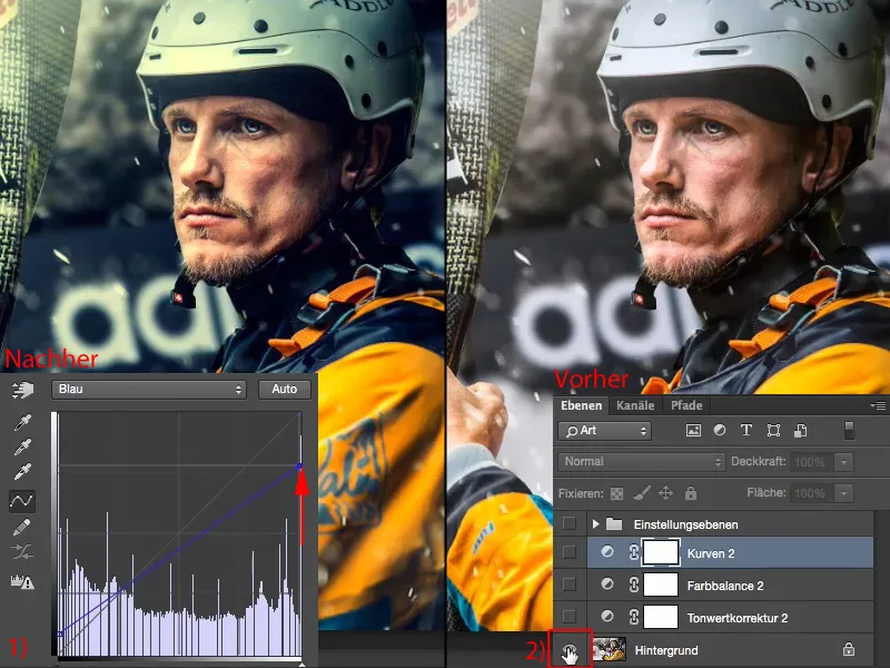
Further possibilities
If that's enough for you, then you've already reached your goal and have created a really cool look with three adjustment layers, which you can also apply to a complete series of images. If you want to go even further, you can of course go ahead here. You pop the corrections paletteback in and say: What other options are there?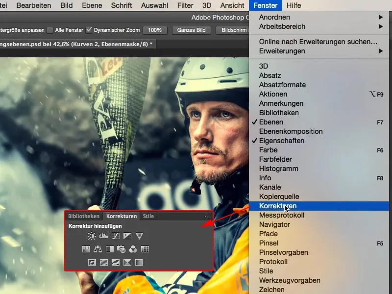
You can easily turn it into black and white (1). It doesn't look bad, but I've invested so much time in the colors now - no, get rid of the black and white layer(2).
What else do I have? Exposure, brightness/contrast, gradation curves, tone correction, everything to do with brightness up here (3). No, it doesn't bother me because I've already optimized the contrast.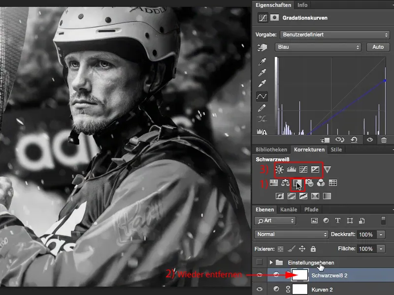
Dynamics
Dynamics: Enhance weak colors in the image (1). What are the weak colors? Apparently the blue tones in the background. I don't want to do anything about them, at least I don't want to enhance them (2). What would it look like if I took them out (3)? Well - it's almost like a color key, that's a bit trite.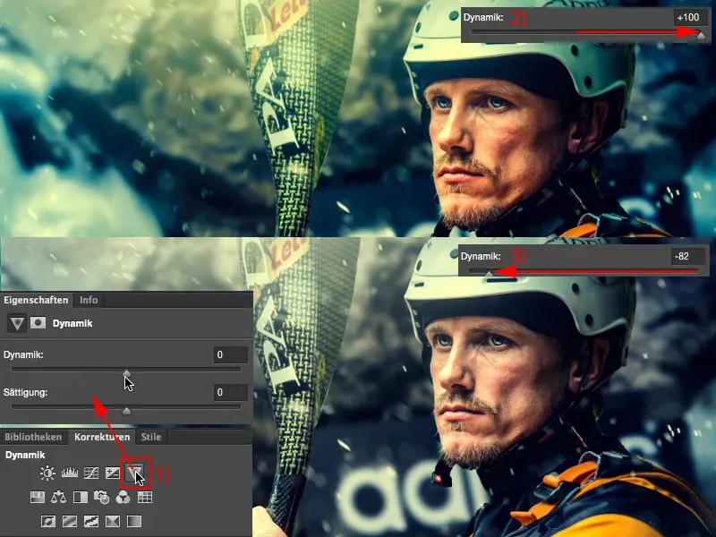
But if I take out just a hint like that, then the athlete should theoretically move more into the foreground. And it does. So I used another simple adjustment layer to get a little more out of the picture.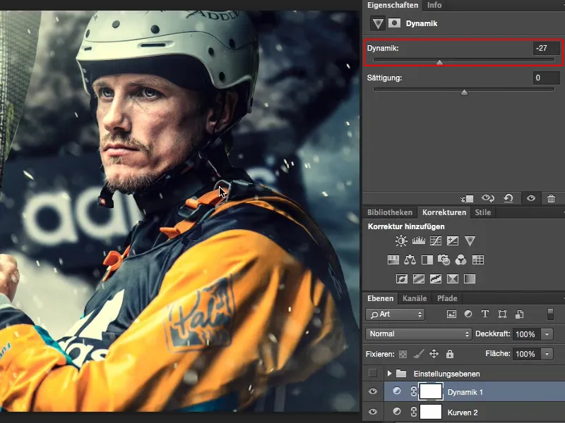
Summary
And what every photo editor always does, and what you should do too, is: reward yourself after your work, regardless of whether it was easy or difficult. Look at the before and after two or three times, because that's the only way you can really see: did you get something out of it or did you make something worse? I think this image has definitely gained a very, very good look through this simple editing with adjustment layers.