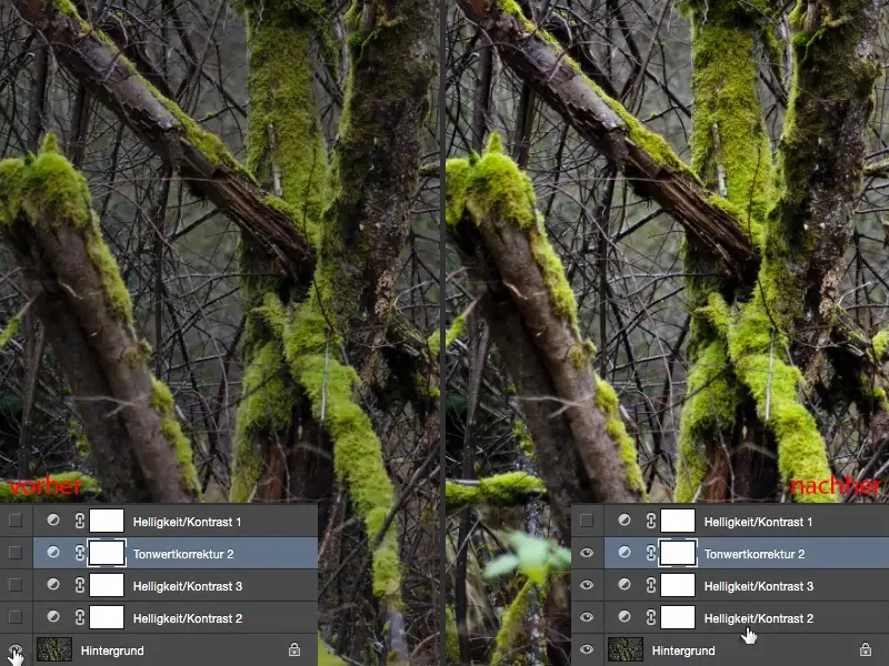
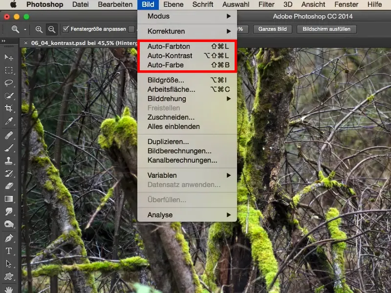
I have prepared something for you here on the subject of contrast. The default way is usually via auto contrast. This is what the image looks like before (before), it's a bit dull in the mid-tones. And the auto-contrast pulls it all together (after). What I usually don't like about Auto Contrast is that it always brightens the colors a bit.
If you look at the green, at the moss, there's more contrast, but the colors here are also a bit strange, they're different, it's almost neon green, and I'd like the whole thing to be a bit darker.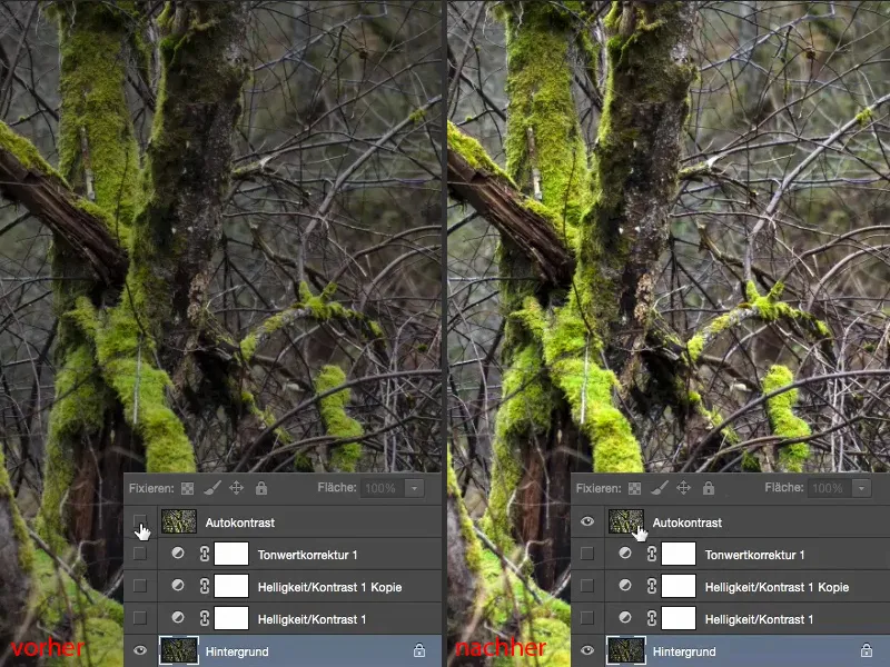
And that's the problem when you use corrections, auto-contrast, auto-color and so on. There can only be one universal algorithm behind this. Of course, it doesn't know what kind of image you want to edit. That's why you'll only get a mediocre result.
And all you can do here is to adjust the opacity.
If it's really only minor things, then maybe that's enough, but I'm never 100 percent satisfied. So I Blender that out right away.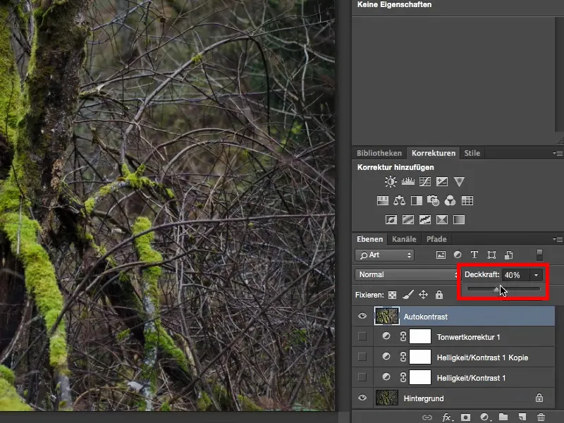
And then you can see: I've done brightness/contrast, a copy and a tone correction here. And with this method, which I'll show you briefly now, you're a bit more flexible.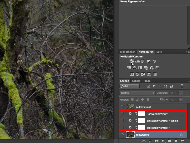
Brightness/Contrast adjustment layer
Let's create a Brightness/Contrast adjustment layer (1). Then you have two options: You can influence the brightness (2) separately from the contrast (3). That's already nice.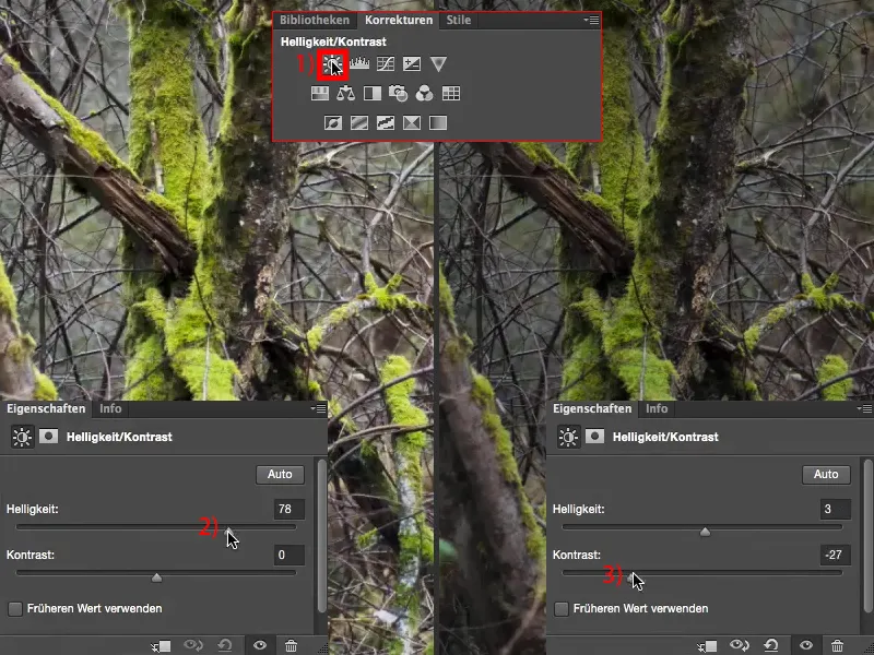
You also have the Use previous value (1) checkbox here. If you then experiment with contrast, you will notice that the dark areas of the image are made extremely contrasty (2). And if you remove the contrast here, the whole thing becomes very, very dull (3).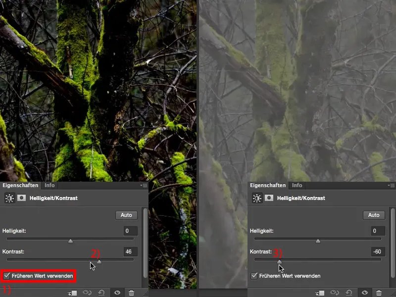
If you turn this checkbox off again (1) and go back (2), you will get a completely different result. So you should already know that. Feel free to try out this earlier value here.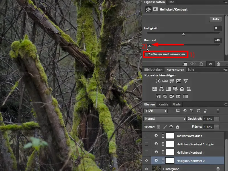
The brightness is actually similar, make it light (1) and dark (2). I can mask it, I can adjust the opacity. It's quite nice, but it's still not what I want to do now.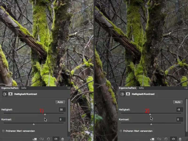
Multiply brightness/contrast and negative
I would like to have even more setting options. And you can achieve this by making two Brightness/Contrast adjustment layers and setting one of them to Multiply Neg ative, for example. Then the image is already extremely brightened.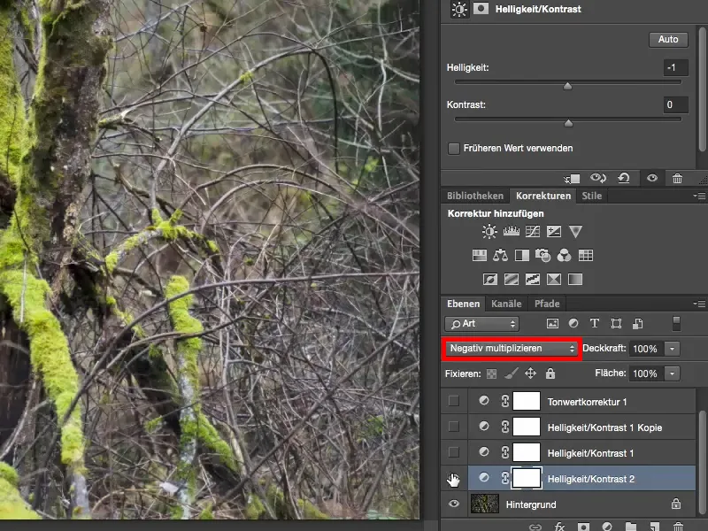
And now you have the option of using these two sliders to determine the extent to which you brighten (1) or darken (2).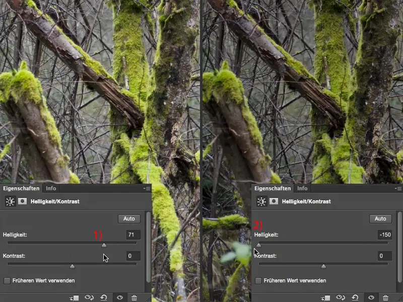
And the first thing I do with negative multiplication is: I pull the brightness slider all the way to minus 150 (1). If you then look at the before and after: my green hasn't changed at all in terms of color and brightness. And that's because this brightness is now applied to the image in negative multiply mode. So the colors are not affected in the same way as if you were using the auto correction here.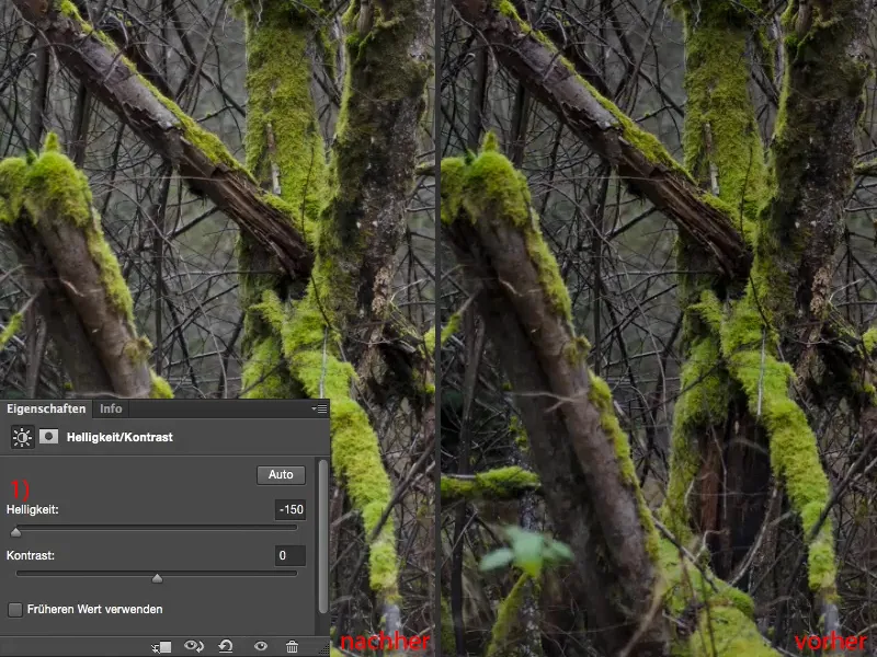
I can also play a little with the contrast. Look at how light it is now, even if I pull it all the way to the stop (1): The result is much, much softer than if I were to use it in Normal mode, even though I'm using a very strong brightening mode here.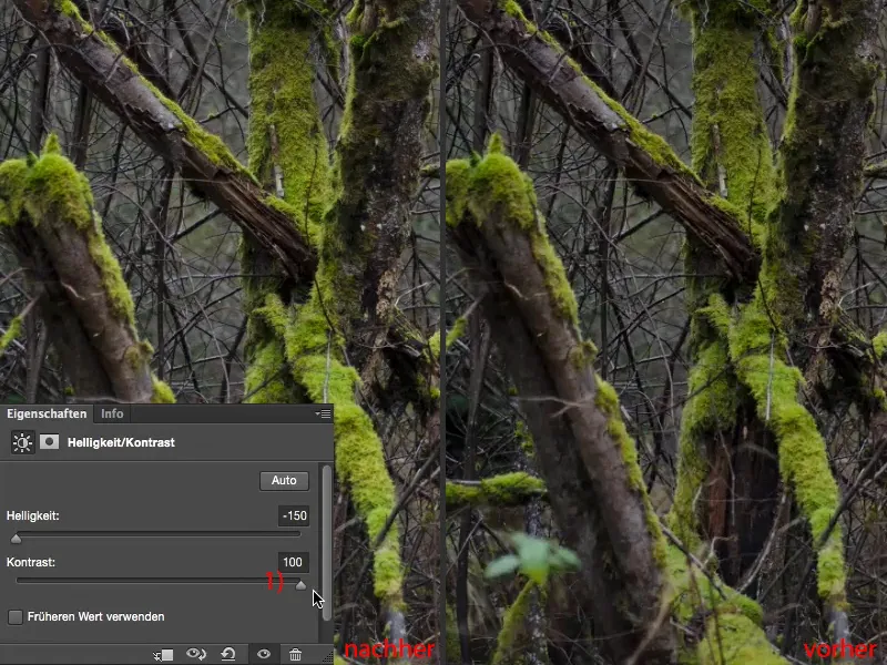
I've taken that out a bit by setting the brightness to minus 150, and now I can experiment with the contrast. And although both are now at the maximum minus value (1), it still looks okay. It always depends a bit on the image and what you actually want to do, of course.
And now I'm really pulling it up as far as it will go (2). Now I have a contrast that's a shade better than my original image, but I'm not finished yet.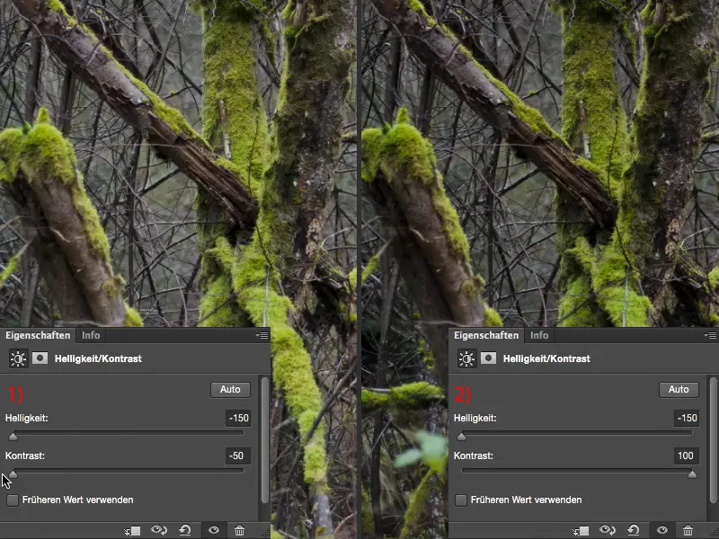
Brightness/contrast and multiply
I make a second adjustment layer (1) and set the layer mode to Multiply (2). Of course, this now darkens the image extremely (3).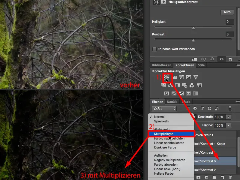
Here I set the brightness and contrast to high (1). Now I have a very, very high-contrast image (left), and it's now bringing out what the first brightness/contrast layerdidn't manage to do.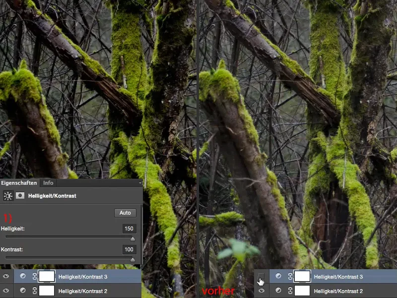
You can of course also experiment with other layer modes. I usually set it to 50% (1), and when I hold down the Alt key(2) and look at the before and after, I'm happy with the image, because I didn't want to change the exposure, I just wanted to optimize the contrast a little more. I've definitely achieved that now. The colors are slightly enhanced, but not so much that it immediately catches my eye as with the contrast auto correction. And so I have now adjusted this contrast in my image and can also adjust the opacity of these two layers.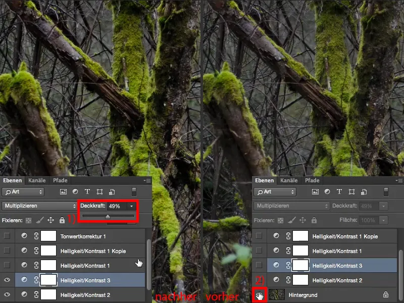
Tone value correction
Last but not least, I always create a tone value correction (1). Of course, the tonal values then look pretty messed up, I have quite a few gaps in between (2). That's because I used these extreme values for brightness and contrast. If you go about it a little more gently, you'll also get fewer tears here.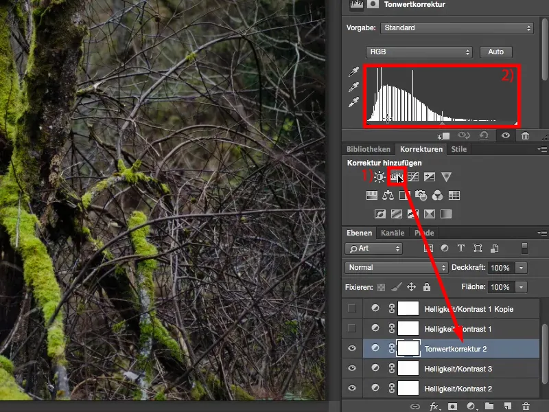
And now I'll just have a look: what's in the highlights here? I can see that this is where the whole thing actually starts, and I realize that right where the image information starts (1), I've reached the point where I say: Now it's getting fun, now I'm going to get out of the image what I actually imagined photographically.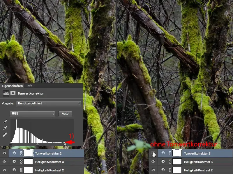
If you want the shadows to be a little darker, simply move them a little to the right (1 and the left image) and use the midtones to adjust the global brightness of your image (2 and the right image).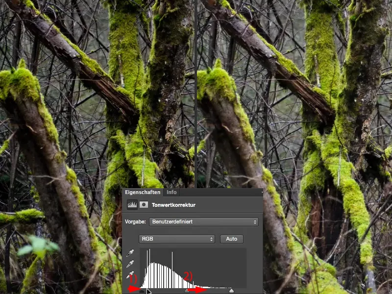
And that in combination with these two contrast levels, with these two setting levels Multiply and Multiply negative - you now have many, many possible combinations. And you can optimize the contrast as you need it.