
Modern presentation templates

Professional design templates for PowerPoint, Keynote & Google Slides
Put a dot behind the biggest to-do of your presentation - with our design templates for PowerPoint, Keynote and Google Slides . You know the situation: a presentation needs to be created - and you want to get it off your desk quickly. Here you go! Our presentation templates make your life easy. Instead of designing the layout, all you have to do is select it - and start placing your text and images straight away. That saves you a lot of time. Just take a few moments now and discover our templates:
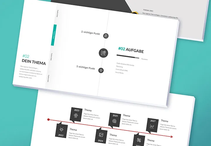
Prepared timelines in grandiose designs
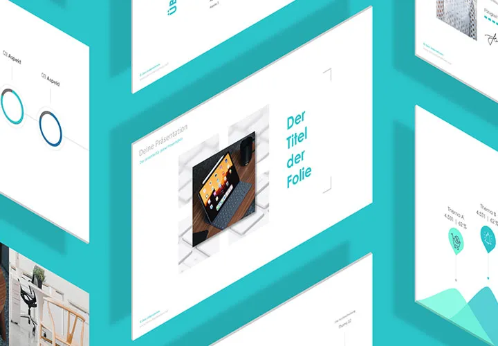
First-class presentation
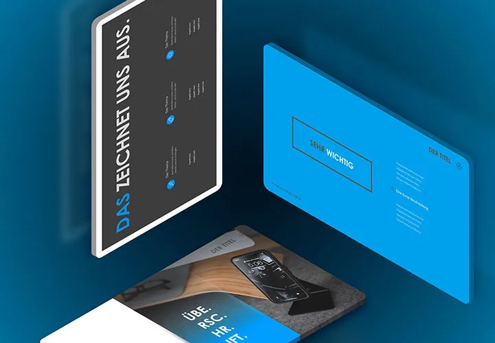
150 layouts to take off
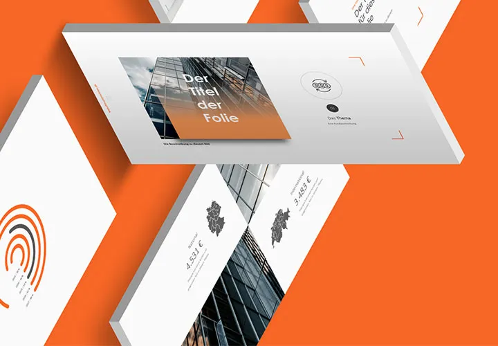
Your shortcut to the finished presentation
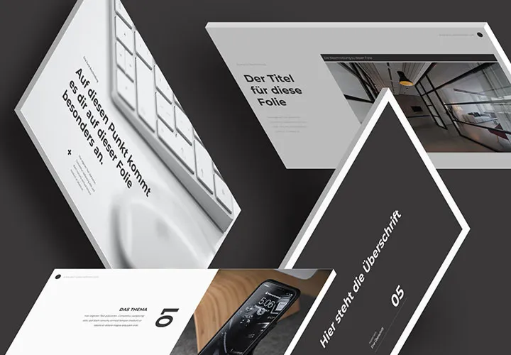
And off to the lecture!
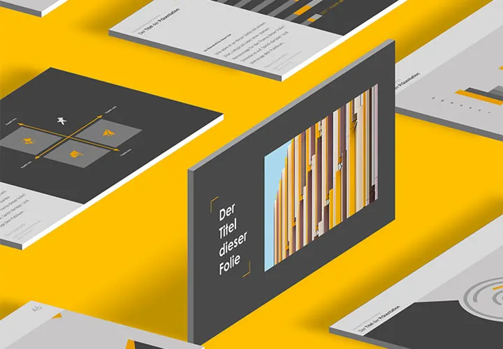
Create your presentation even faster now
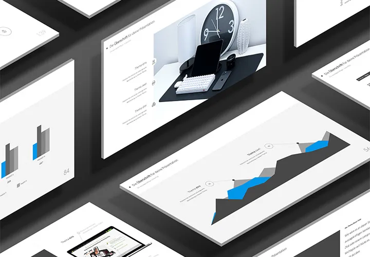
Create your presentations even faster!
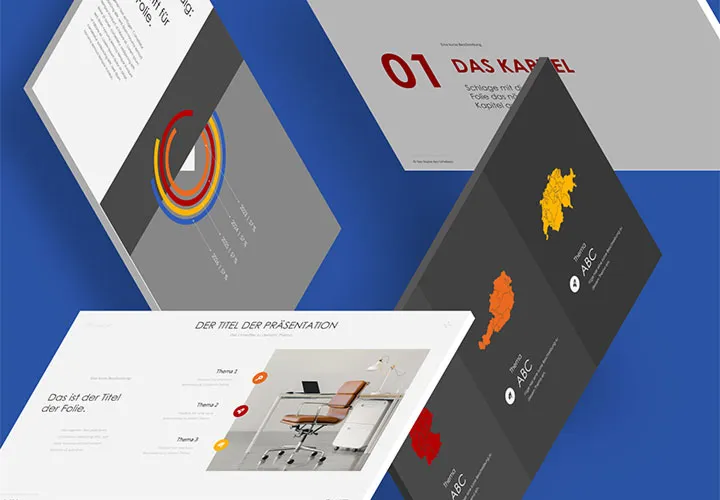
And your presentation is ready!
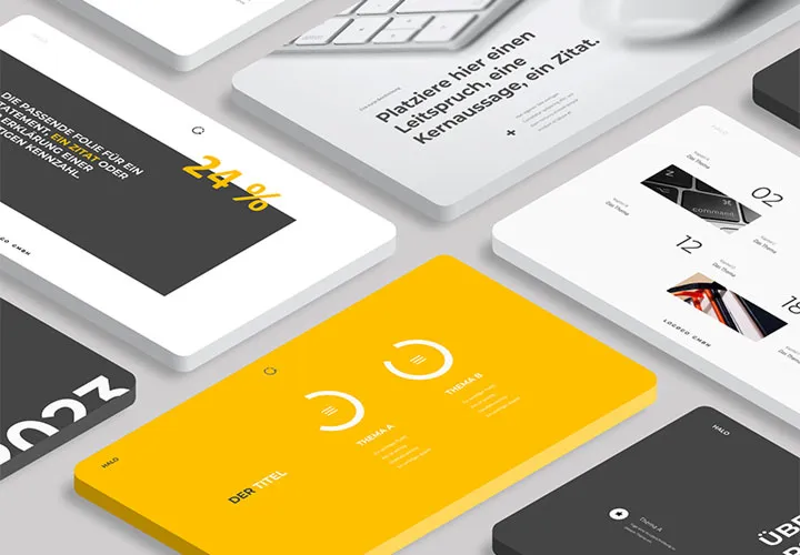
Create impressive presentations
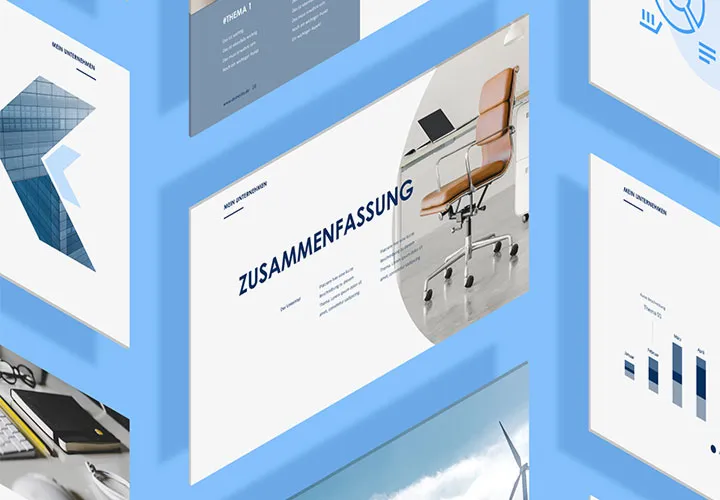
Download, customize, present
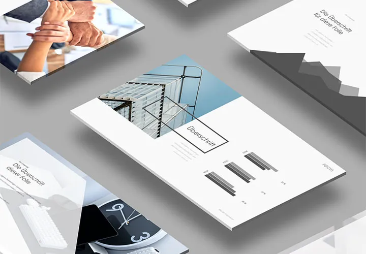
Maximum focus on your content!
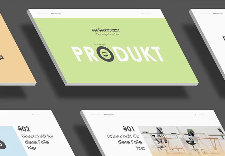
For charmingly engaging presentations
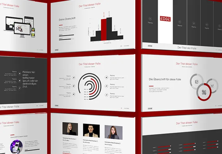
Select and easily customize slide set
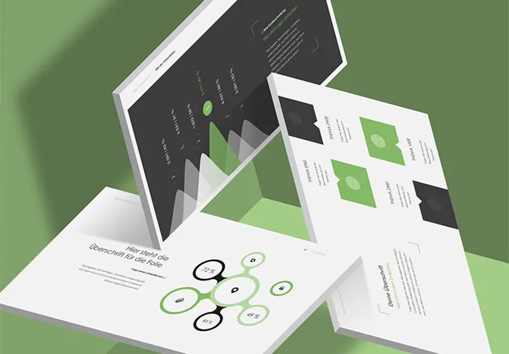
A design to take off!
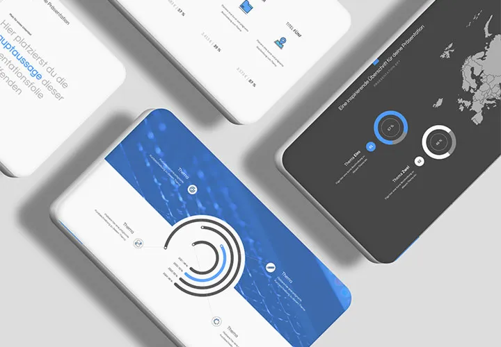
Create heavenly presentations
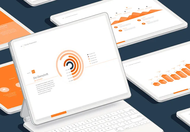
Well presented!
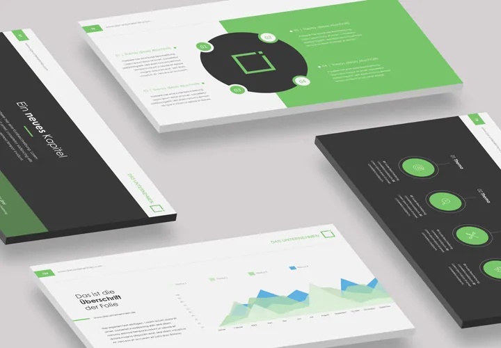
120 editable films
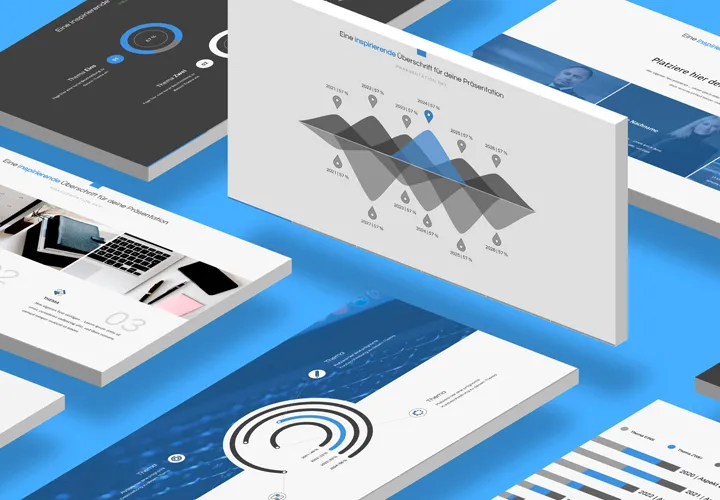
Faster to the lecture
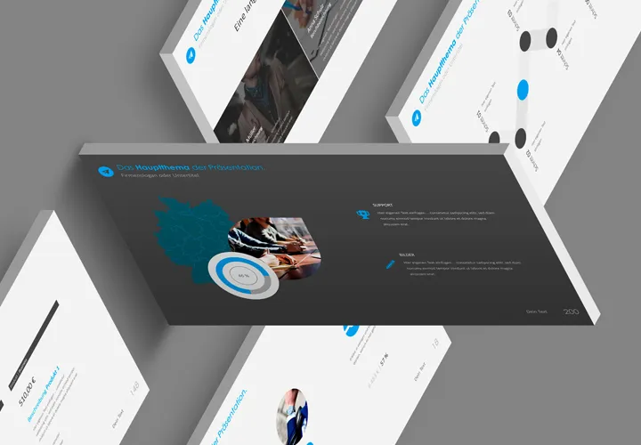
200 modern slide templates
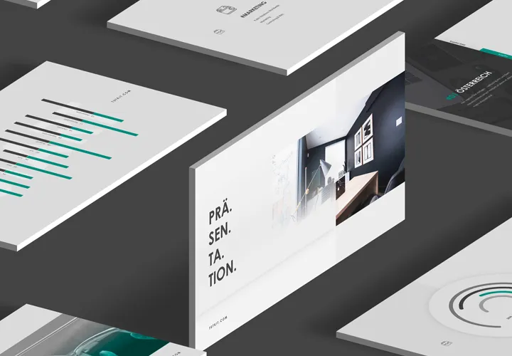
150 slide layouts!
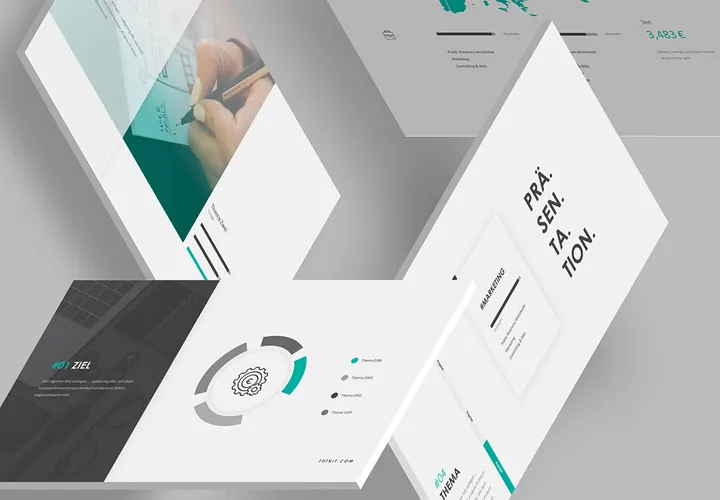
For refreshing presentations
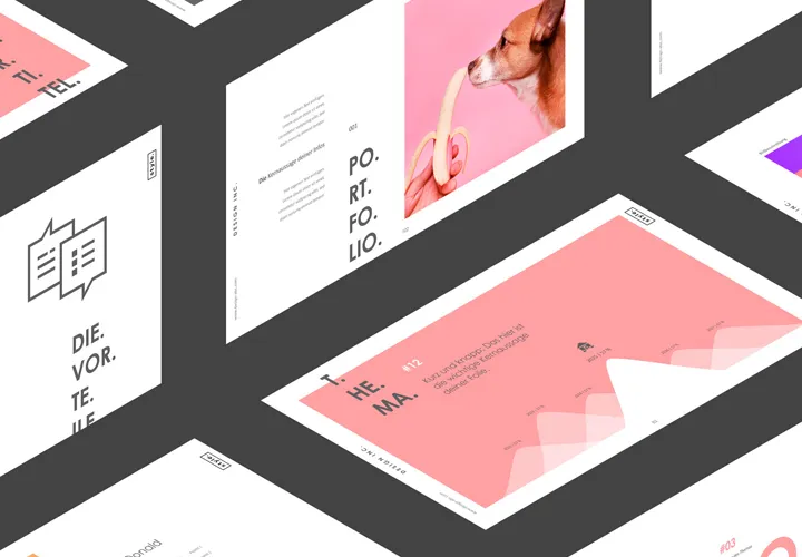
Modern layouts for your presentation
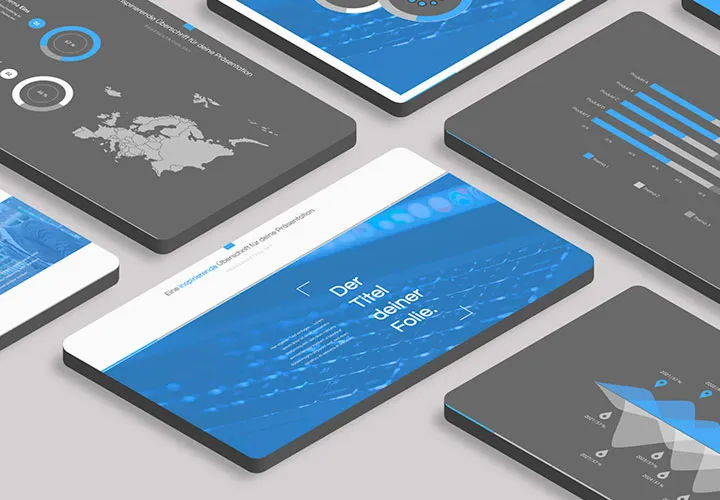
Heavenly easy to work with
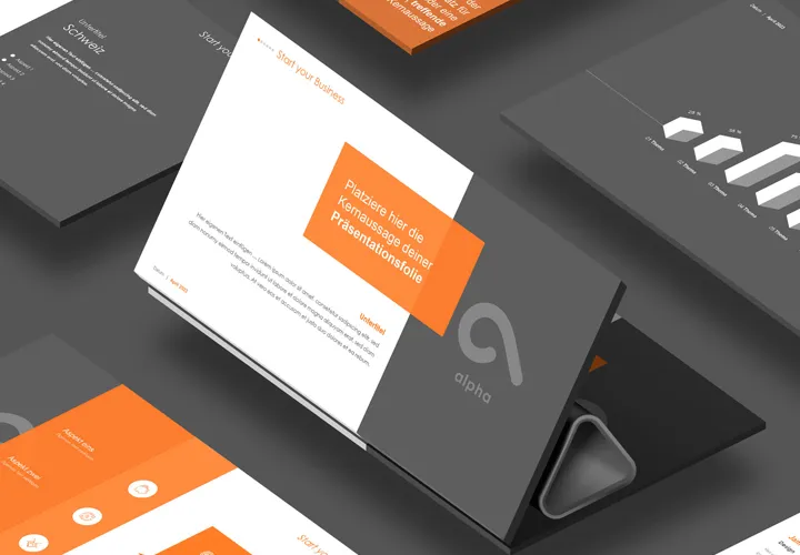
Modern design with 130 foils!
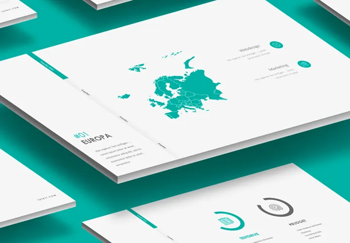
Floating light machining
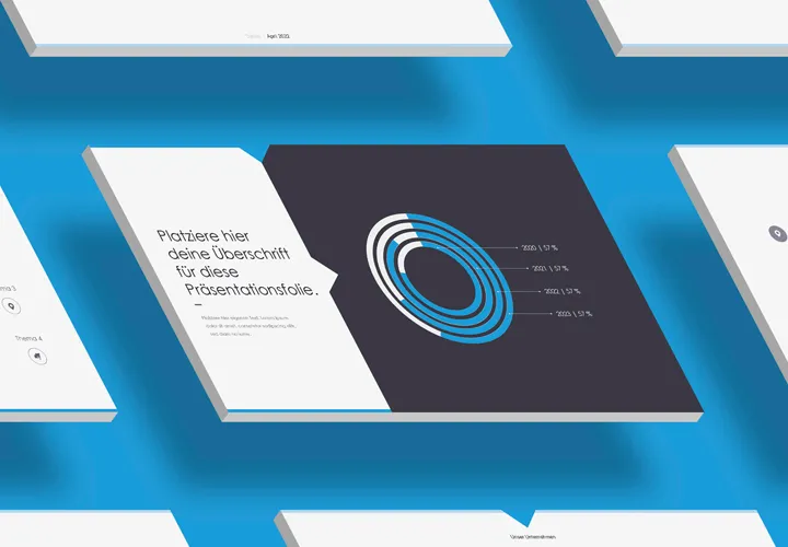
One design, 165 layouts
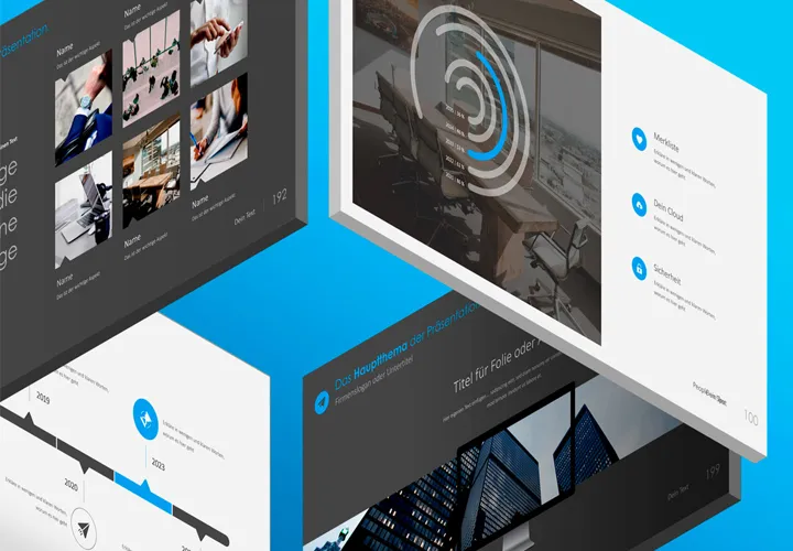
200 layouts in one design!
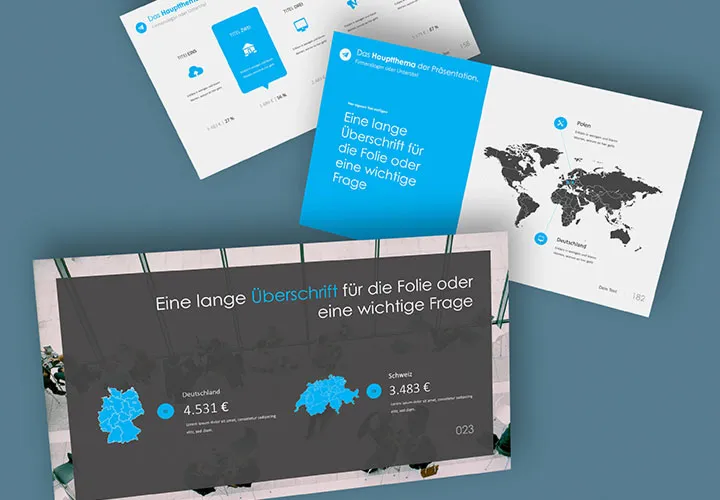
200 films in one design
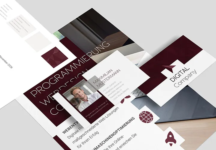
With flyer, business card & Co.

For complete business equipment
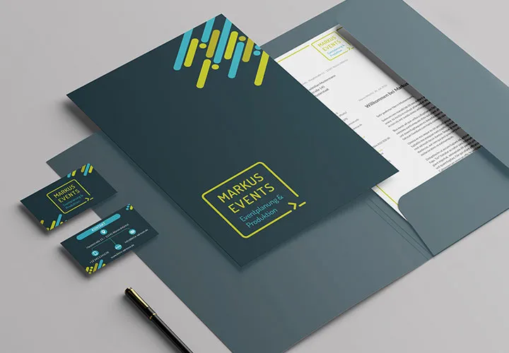
Fully equipped from flyer to roll-up
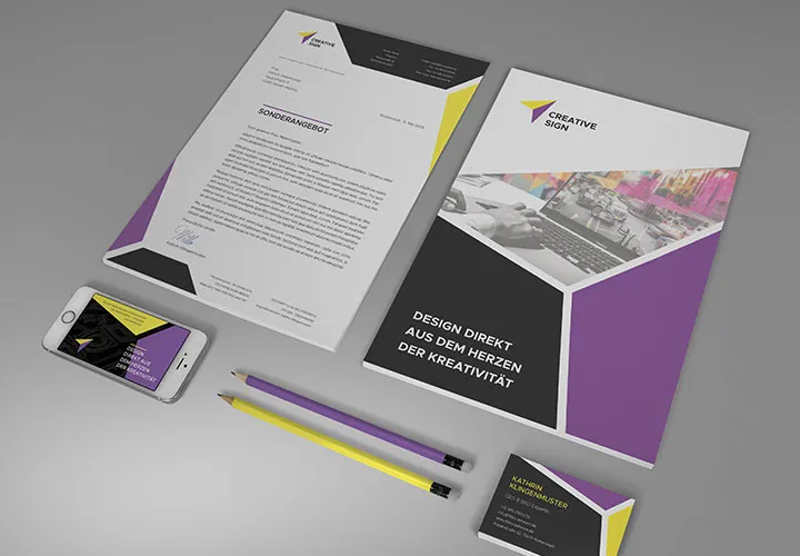
From the business card to the roll-up
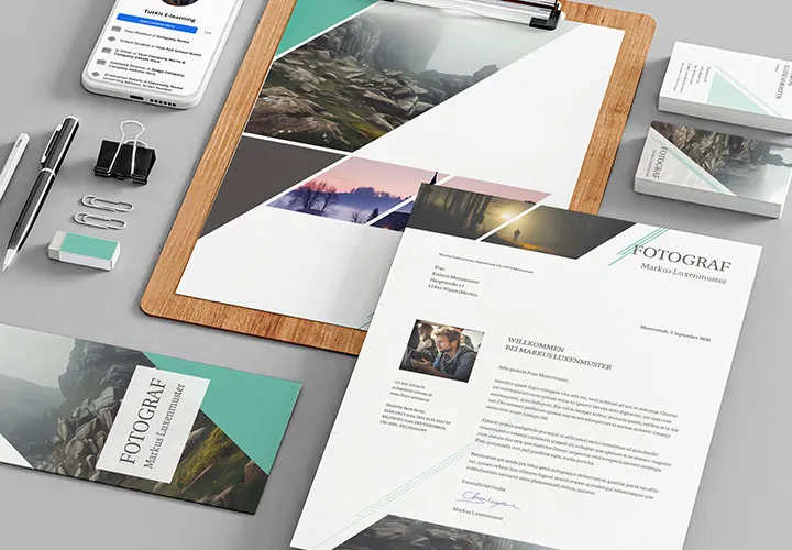
Quickly create high-quality business equipment
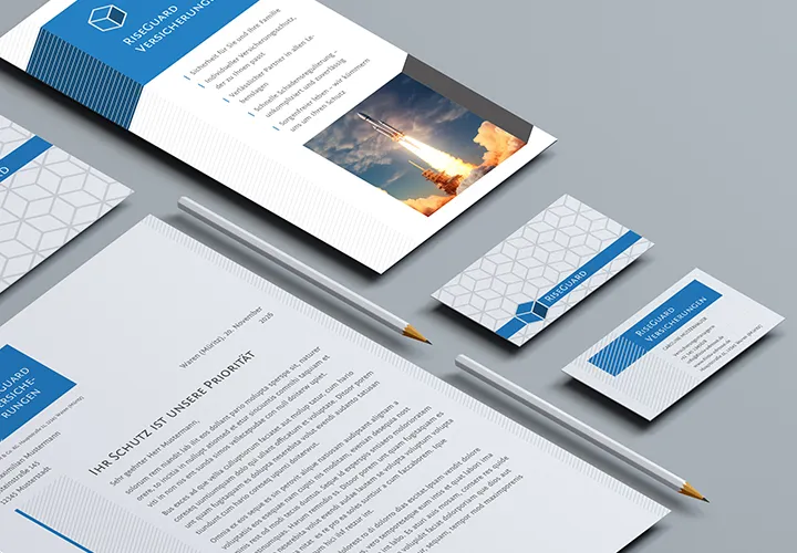
Elegant templates for your business stationery
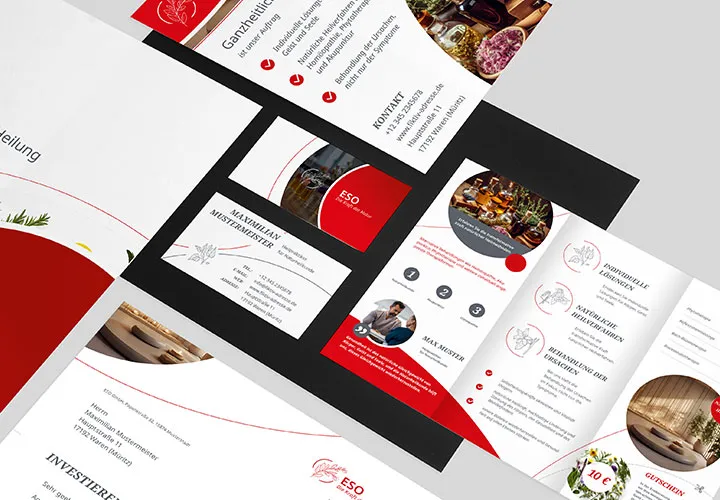
A relaxed approach to corporate design
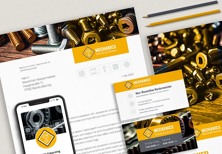
Complete business equipment
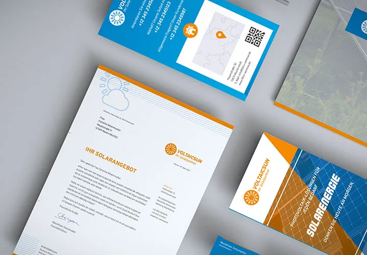
Complete business equipment
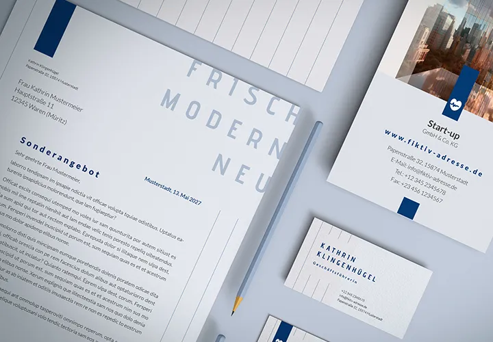
Save time with modern templates
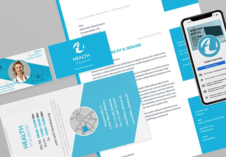
From the business card to the roll-up
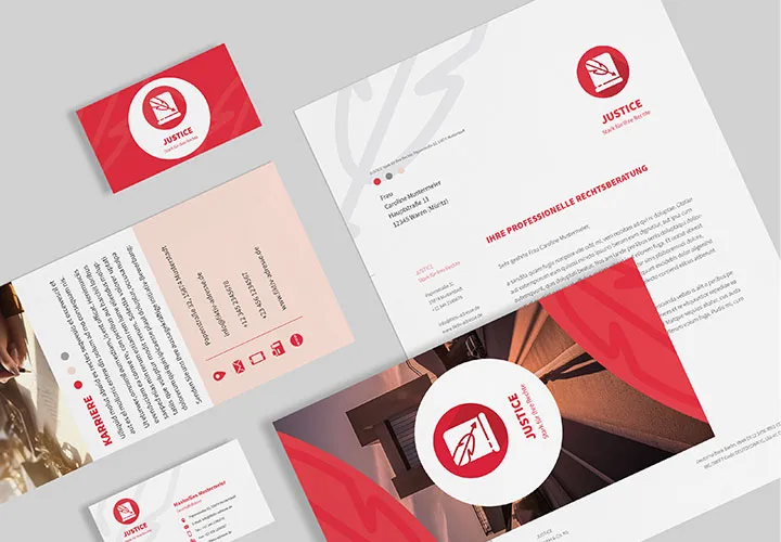
Quickly to the finished corporate design
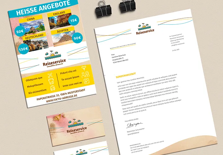
Get you to your design goal quickly
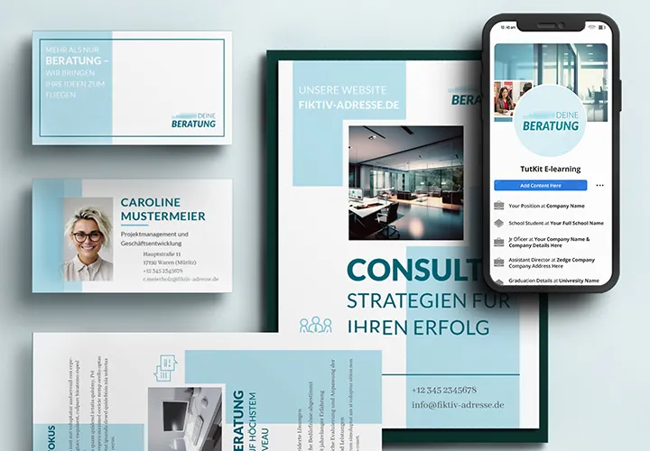
Download. Customize. Use.
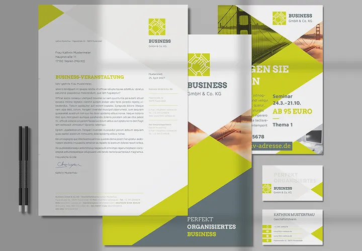
Everything prepared in a uniform design

Inserting and presenting content
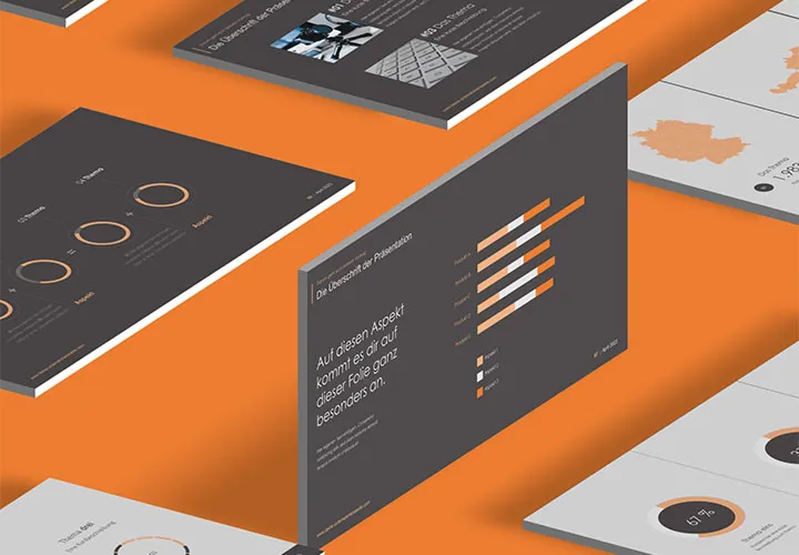
Simply place and present content
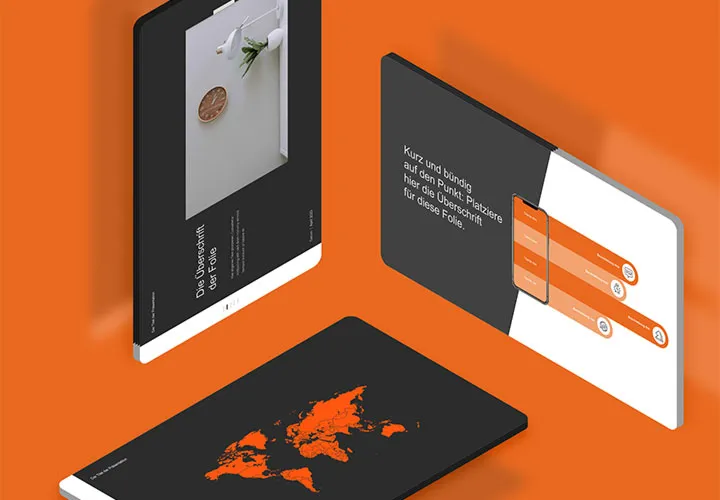
Select. Customize. Present.
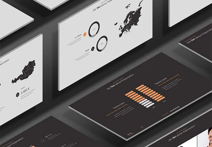
Simply edit and present!
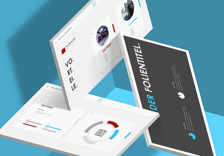
In three size formats
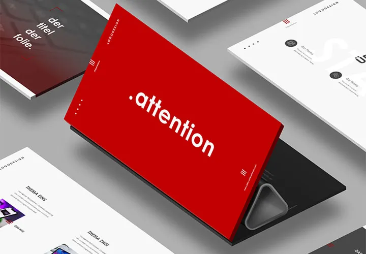
Time to save time!
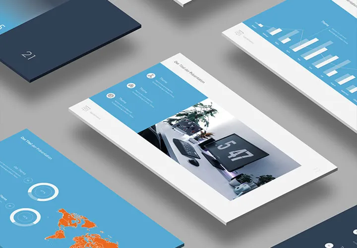
Quick presentations with templates
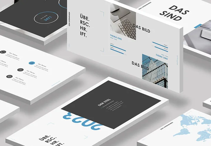
Start with ready-made layouts
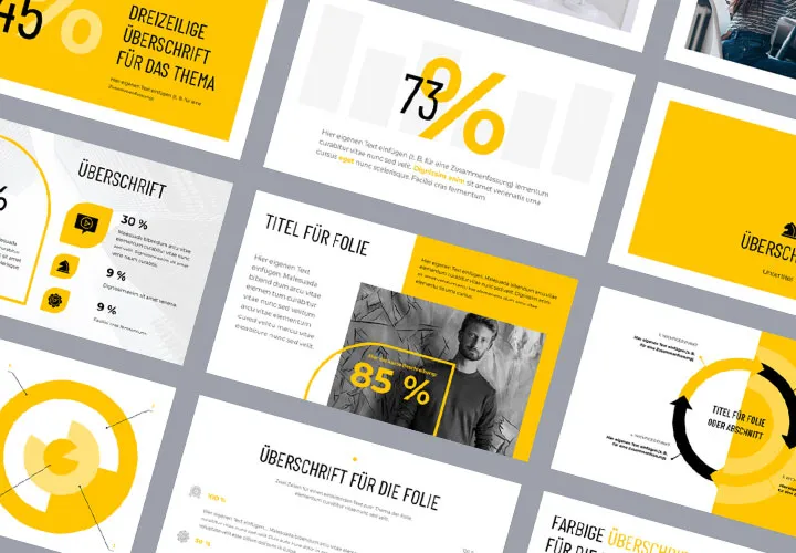
Templates for your slides
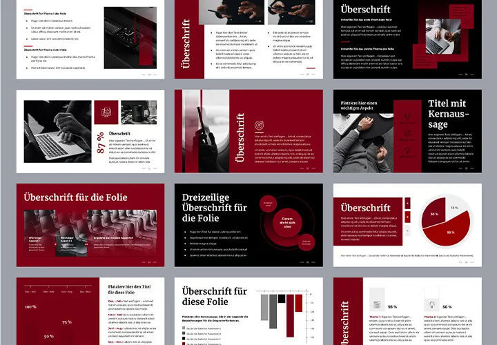
50 layouts in a uniform design
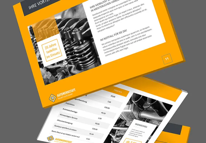
Over 90 sample films!
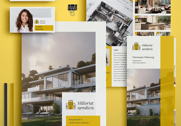
For real estate in its finest form and shape
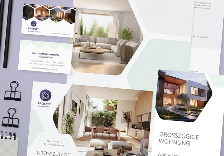
How to present your house and apartment properly!
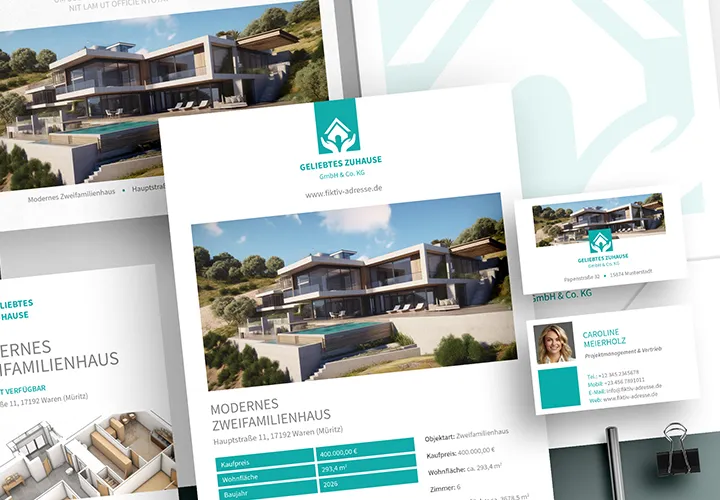
Quickly designed - fully equipped!
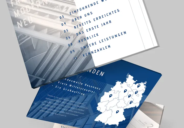
High-quality designs for your content
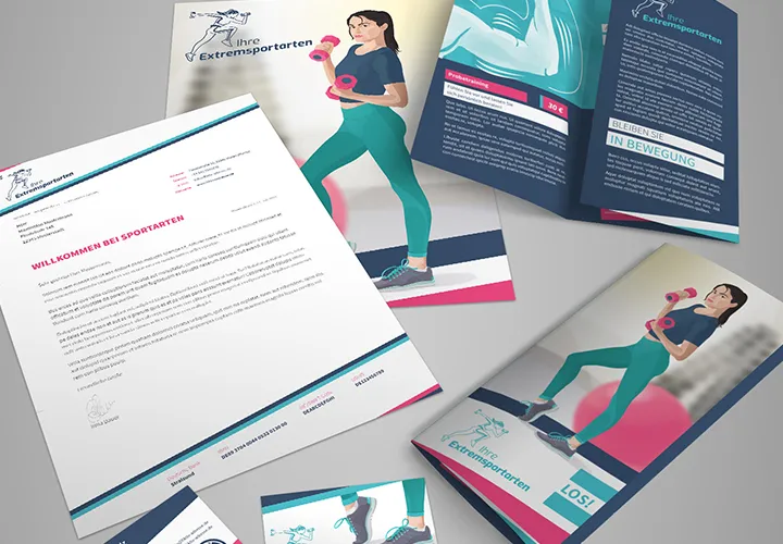
Identity-creating templates
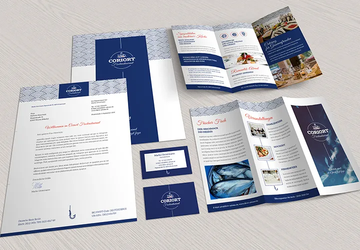
Tasteful templates
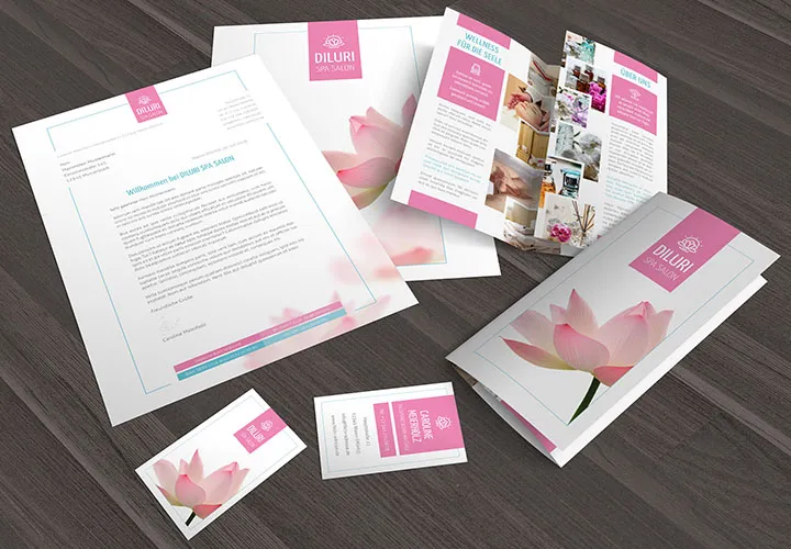
For an outwardly effective and professional appearance
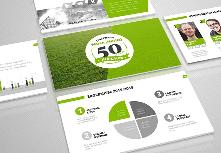
Convince yourself and then the others!
Fully prepared - fully machinable
Presentation templates for PowerPoint, Keynote and Google Slides
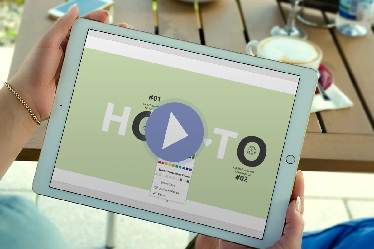
Made for your presentation program
What is a presentation template for PowerPoint, Keynote or Google Slides and why do you need it?
When planning your digital presentation, please consider the topic and purpose. Once you have determined your main objectives, you can choose a suitable design. Before you do, ask yourself the following questions:
- Do you want to create a presentation from scratch yourself?
- Is a modern presentation template as a download ideal for you?
- Is it worth getting professional help from agencies to create a customized presentation?
What is the best way to proceed? In the following lines, you will learn about various options so that you can find the best solution for your task!
Before you get started, it's worth paying attention to what exactly the term "presentation template" means and what important components it contains in its structure. A presentation template is a package of designed slides that are used to present different types of information. If that sounds complicated to you, let's understand it in more detail.
A template is a ready-made presentation design with a slide master that contains the following elements:
- Visual design (background, color palette).
- Predefined fonts with coordinated sizes for headings, main text, quotes, etc..
- Design of graphic elements (diagrams, tables, graphics, icons, illustrations).
- Arrangement of objects on the slide (frame sizes, indents, positioning of the footer).
- Prepared slides for common applications, i.e. cover, index, topic page, team, about us, competencies, timeline, etc.
If you need these components in your presentation, you will find our presentation templates to be the best help to get your customization done effectively and quickly. Presentations are generally used to visually display information, and their tasks can vary depending on the situation and the user's goals. Fortunately, we have covered most applications in our templates, which is why the templates often contain over 100 slides. Choose the slides that suit you and remove anything you don't need.
A presentation template is a ready-made slide structure that contains templates, color schemes, fonts and other design elements. It serves as the basis for creating a presentation and leaves room for adding specific content such as text, images and graphics. The use of templates saves a lot of time and simplifies the creation of a presentation, as the design does not have to be created from scratch.
It is important that the template matches the theme and style of the company or presentation. This creates a consistent and professional look that effectively conveys your message and strengthens your brand. Therefore, when choosing a template, you should pay attention to the design, composition and overall aesthetic to ensure that it meets your needs and the expectations of your audience. You can easily adapt colors and fonts to your corporate design!
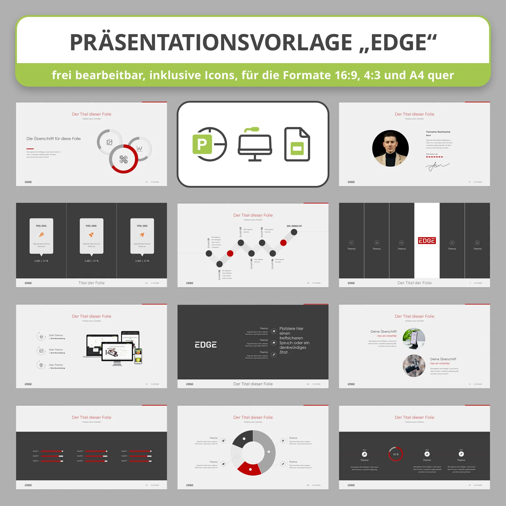
In which programs are presentation templates supported?
When working with presentation templates, you can use various software programs. The choice depends primarily on your design skills. Microsoft's PowerPoint is one of the most popular programs for working with presentations and templates. Our templates are all suitable for PowerPoint.
Keynote: This is a presentation creation software designed specifically for macOS and iOS users. Keynote has some stylish templates and tools for creating professional presentations. Use our templates to edit them in Keynote too.
Google Presentations: This is an online application from Google that allows you to create, edit and share presentations. Google Presentations also offers various templates and a user-friendly interface to work with. You can also easily import and use the PowerPoint templates from this site.
When you download our presentation templates, you will receive them in various formats. With this selection, we want to save you the stress of having to use software that you have never worked with before. Our aim is to offer you maximum convenience and efficiency when creating your presentations - without any major effort.
Where can you find ready-made presentation templates?
Use templates built into the presentation software.
Many presentation programs such as Microsoft PowerPoint, Google Slides and Keynote offer built-in free presentation templates. These templates usually have an outdated design and also do not have the common uses such as index, timeline, team view, portfolio and references as master slides. Therefore, don't limit your options, but use professional presentation templates that already do most of the work for you.
Advantages of these built-in templates: There is a variety of designs and layouts provided by the program. The templates are integrated directly into the program, which makes them easier to select and use. You can start customizing right away.
Disadvantages: The templates are less unique and standardized as they are available to all users of the program. Additional changes need to be made to make the presentation more individual and professional. It also lacks many master slides that cover the most important application purposes (see above). Free cheese is only available in a mousetrap.
You've probably often sat in lectures where the speaker has shown overloaded presentations. Then you know why they are like that: The speaker used the software's existing templates. A good presentation must present the information clearly and concisely. The layout simplifies the information so that it can be absorbed more easily. This is exactly why professional presentation designs are so effective. Don't underestimate the impression you can make when your presentation stands out in a positive way.
A good presentation can grab an audience's attention, make an impression, convey information effectively and achieve the desired result, whether it's attracting investment, selling a product or pitching ideas.
Use professional tools in your work, including high-quality presentations. It doesn't matter whether you buy an inexpensive quality template, commission a custom design from an agency or learn the basics of design and do the work yourself.
Professional, high-quality presentation templates
There are various platforms that offer ready-made professional presentation templates. Our portal TutKit.com is an example of such a platform. What sets us apart from our competitors is our working principle: we only offer high-quality presentation templates developed by the award-winning agency 4eck Media.
The most important features of our way of working:
Professionalism: all our presentation templates are created by experienced designers from the 4eck Media agency, guaranteeing high quality and stylish design.
Experience: The high standards have been developed through numerous client projects where presentations were developed for big money for well-known companies.
Trust and consistency: We strive for long-term relationships with our customers. Anyone who buys from us can rely on quality and reliability. We want our customers to be happy with our content. This is only possible through quality.
We are proud that our portal TutKit.com offers absolutely high-quality presentation templates so that you can impress your audience and achieve your goals.
Order a presentation template from the 4eck Media agency
The best, albeit more expensive, solution for creating an excellent presentation is to hire a competent agency individually. You can send us your existing presentation and we will improve it for you, or we can create a high-quality presentation in line with your corporate design. That costs a lot of money. The result speaks for itself.
The faster way to a finished presentation
Slides and layouts for Keynote, Google Slides and PowerPoint
Whatever you're planning or publishing - show your professional side. Our design templates give you a wide range of options. No matter which layout you choose - everything is already prepared down to the last detail. Simply choose from individual templates ranging from classic to ultra-modern - packed with plenty of slides. Simply download and you can add the content you want in no time at all. Are you more of a 4:3 type or do you prefer 16:9? Take a look around and find the right one for you!
5 rules for choosing a good presentation template
Here are five rules for choosing a good presentation template:
- Optimal number of slides: a good presentation should contain between 10 and 30 slides. This is enough to present the information without overloading the presentation or making it difficult to create. Our templates often have over 100 slides for all possible content modules. You only need to use the ones you really need.
- Adapt the design to the purpose of the presentation: The design of the slides should match the purpose and atmosphere of the presentation. Adapt the colors to your corporate design and change the fonts accordingly.
- No unnecessary elements: A good presentation should not contain any unnecessary embellishments that distract from the main content. Avoid ornate monograms, color gradients and ornaments that can make it difficult to perceive the information. And also avoid overly action-packed effects when changing slides. That's not professional!
- Icons and graphics: The template should include elements such as icons and graphics that can help visualize data and make the presentation more effective and memorable. These elements can also help to make the information easier to understand and clearer. Our templates already include icons and graphics for you.
- Adapt the content to the purpose of the presentation: The content of the slides should match the purpose of the presentation. Some presentations contain more text, others more graphics, images or illustrations. The text content is not intended to be read aloud, but rather as a bullet point. Keep this in mind when creating.
5 tips to make your presentation better
Presentations are an instrument of visual communication in companies. It is important that, on the one hand, the message is clear and, on the other, that it is conveyed in the company's corporate design. The same mistakes are often repeated.
Templates for company presentations with practical instructions and clear rules improve the quality of the documents and make the daily work of creating slides easier. And, of course, it is easier for the audience to understand clear slides.
Working on a presentation usually takes a lot of time and effort. Especially if you don't have the skills of a professional layout designer. We give you five simple tips to simplify the process and create high-quality slides.
1. use only high quality images
Images on a slide support the information and are much better perceived and remembered than ordinary text. Use visual images to reduce the amount of text and try to explain your idea without words. Only use high quality images. Don't download banal images from search engines and photo archives. Business people shaking hands, women giving thumbs up, climbers scaling a mountain and other clichés come across as dishonest, cheap and arbitrary. Use images of yourself, your products and your company. From real life and with real people. Such images are much more honest and credible.
2. decide on a color scheme
A good design should be unobtrusive and consistent. To ensure that your work is perceived as a cohesive, unified project, you should use the same colors for your slides. And these are the colors of your corporate design. You can adjust these for all slides with just a few clicks using the slide master! You can also add accent colors for the presentation. Avoid random colors and unexpected color transitions. Colors should attract attention, but not distract from the essentials - the content.
3. choose fonts for the project
Special attention should be paid to typography. If the presentation is in the company's corporate design, you should also use the fonts. You can also assign these quickly and easily via the slide masters. Combine these fonts with a maximum of one other font. You can set further accents using the font styles. Make sure the text is the right size. It should be large enough and have sufficient contrast to the background. Contrasts can be lost later via the projector. Think about this when you create it.
4. use icons to convey information
Icons are great for breaking up information and decorating a slide. Sometimes they can also replace text to save space on the slide and create a more interesting composition.
Icons also speed up the absorption of information as they are read faster than text and help to emphasize important points.
5. check the quality of layout and alignment
Your presentation should look neat and clean. It looks sloppy and unprofessional if elements are not aligned, indents are different on each slide and similar elements are different sizes.
Always use the alignment and distribution tools. It is important that the elements do not twitch or jump when you move quickly through the presentation from page to page.
Pay attention to the layout - think about the best way to arrange the elements on the slide so that the information is legible and there is enough space available.
To make it easier to create a high-quality presentation, a ready-made presentation template is available to download. All our templates are developed by the 4eck Media agency. Select the perfect template for PowerPoint, Keynote or Google Slides above and download it.
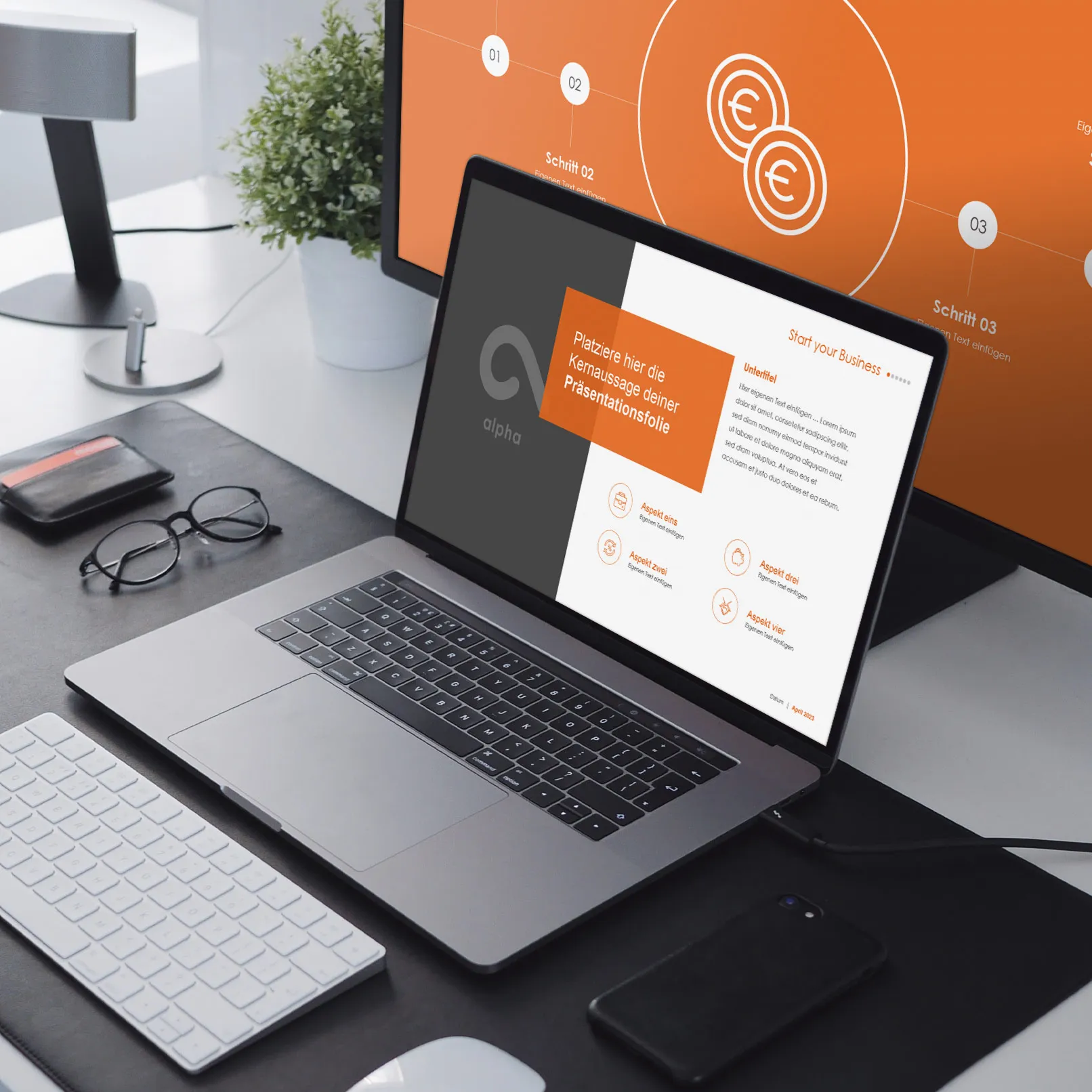
Why order a presentation template from an agency?
- 100% uniqueness with professional design: You are guaranteed to receive a unique template with an original and impressive design that will make your presentation stand out from the competition.
- Individual approach: Each project is treated individually, taking into account all your requirements and the specifics of your brand or the content you are presenting.
- WOW effect for the audience: A professional presentation design makes your presentation memorable and impressive for the audience and helps you achieve your goals.
Of course, these presentations are usually more expensive than the previous options, but their quality and effectiveness justify the investment.
Conclusion and conclusions
A good presentation template can make your job easier, even if you don't have any special design skills. It will help you create an appealing presentation, save you a lot of time when designing it and ensure a consistent style across multiple company presentations.
Although you can find and download free presentation templates on the internet, these are often not particularly original. That's why you'll find modern, high-quality templates of the highest caliber here - true agency quality.
If you choose a creative template from 4eck Media, which is now available for download, you can be sure of the quality. The result will not disappoint you and your presentation is sure to impress your future clients with its professionalism and stylish design.
The best tip at the end: On the last slide of your presentation, don't just include your contact details, but also a call to action. This way, you can ask the audience to network via LinkedIn or ask for a review on Google via QR code. This call to action makes a big difference and we have had great success with it. Give it a try too.