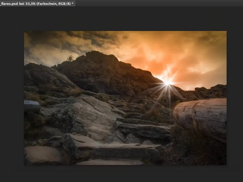
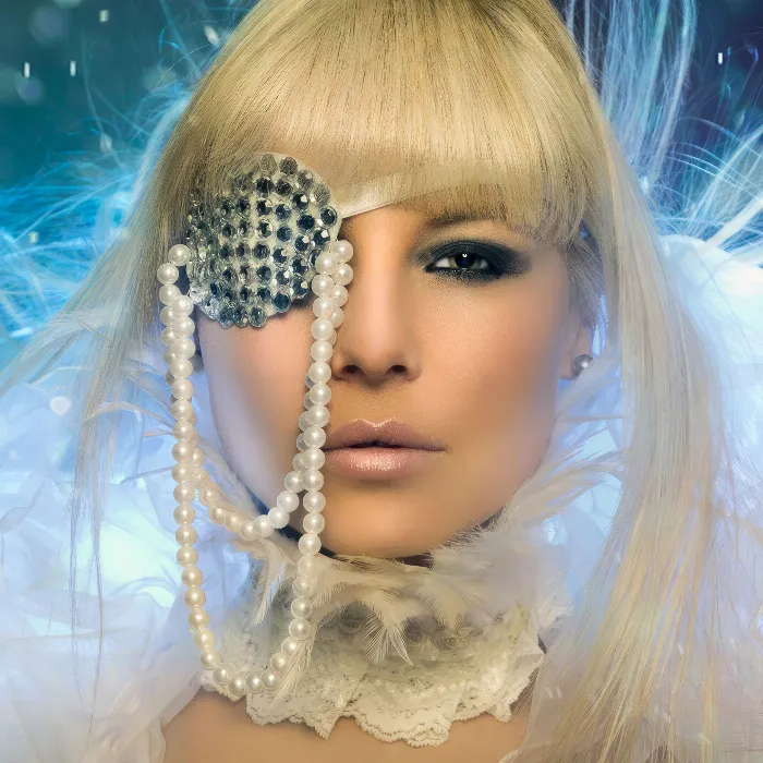
In this tutorial, I'll show you how you can spice up a relatively nice landscape shot with a flare and a gigantic lighting mood to create a really nice, warm look.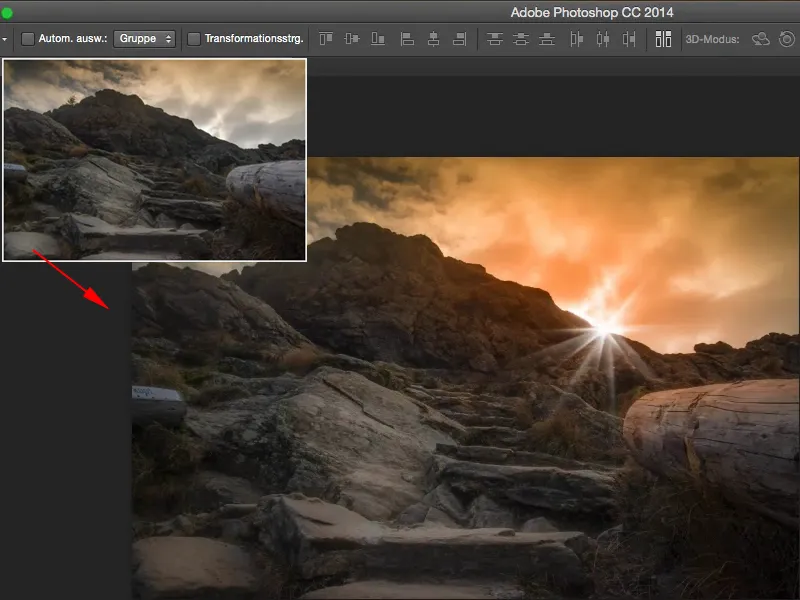
Yes, where do you get these flares? You can easily download them for free from deviantART or many other free stock sites. Of course, you are not allowed to use them commercially. If you want to use them commercially, there's almost no way around either photographing them yourself and adding them to the image using a layer mode, or you can simply build them yourself using Photoshop, and there's a really nice trick that I'd like to show you now.
Here we go: Steps 1-10
Step 1
But first I'll show you how you shouldn't do it and what Photoshop offers with its on-board tools.
I'll hide the retouching layer, create a new, empty layer over my background layer and fill it with black via Edit>Fill Area>Content: Black.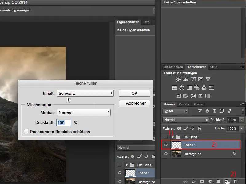
Step 2
Now it will be as black as night, as dark as night. I'm doing this because I want to use the fade filter here (1). (And on black, because the render filter simply needs pixels to render. If you do this on an empty layer, you will immediately get an error message).
The fade spot dialoglooks like this (2).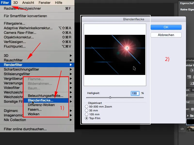
My request to Adobe: Please make this preview larger. Make it 50% transparent so that you can see roughly where you should place the whole thing in the image.
That would be my biggest Christmas, Easter and birthday wish to Adobe, which I have hereby expressed. Just as an aside.
Step 3
Now you have these four more or less nice flares in the picture. That actually looks pretty cool.
And if you confirm this with OK, then you have it in the picture. The problem is always: I have all sorts of other things here (arrow) that I don't want. And maybe the position isn't right here (1), but there ... (2) or there ... (3). You don't know.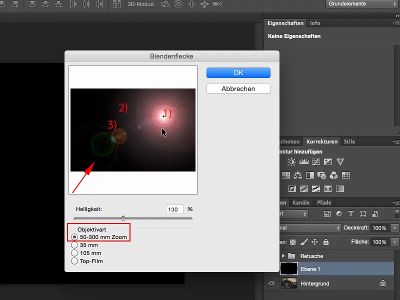
Step 4
So - how can you deal with this? Convert the layer into a smart object: via right mouse button>Convert to smart object (1), and now you can access the filter again at any time. That's already a plus.
I'll go back to the aperture spots and select the first one. I guess it would have been the sun around there (2) ... and say OK.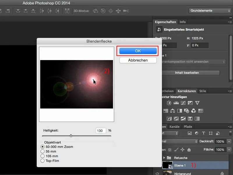
Step 5
Then I set this to Multiply Negative to fade out the black, and I see: I've actually almost hit it, and with V I can move the whole thing here in the image. It actually looks quite nice, but I don't want that red ring, I don't want all that stuff on the front left - so that doesn't suit me.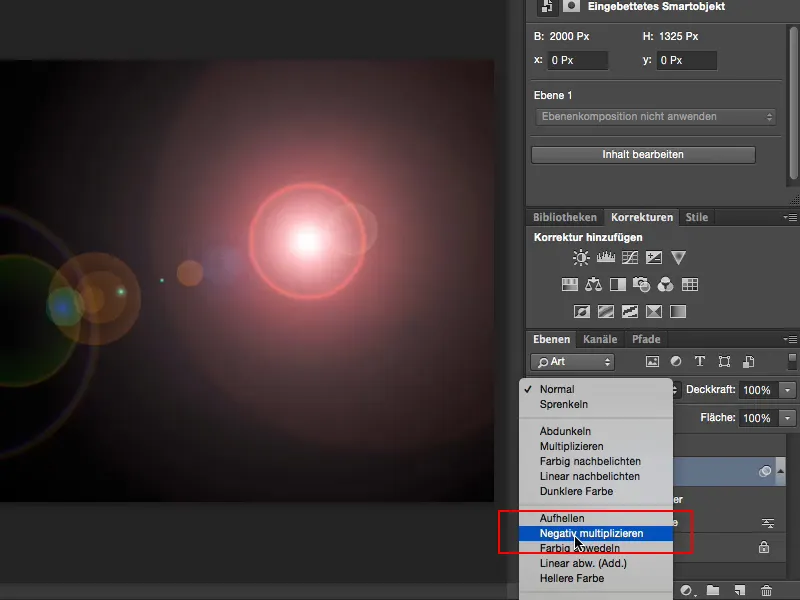
Step 6
So: double-click on the aperture spot, because it's a smart filter in the smart object, I can come back here at any time. This one (1) looks a bit too ... science fiction-like. This one (2) is blue ... I actually want a warm color mood, so I would have to change that, and I don't have any really great rays in it either.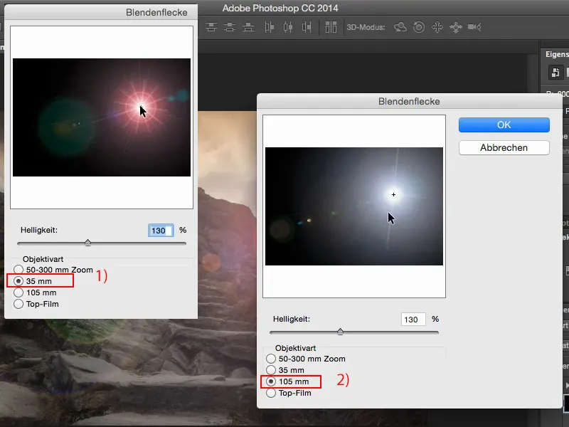
Step 7
Well, I use it and realize that it somehow ruins the picture, and even with a tone correction I can't get any individual rays to work.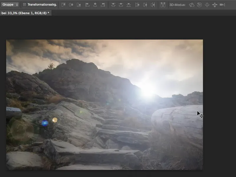
Step 8
What do I do then? First I throw away the layer here and create a new, empty layer. And then there's something really cool that I don't think many people have even discovered in Photoshop yet: It's hidden down here with all the shape tools. There's a custom shape tool and it's really magic.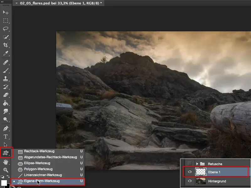
Step 9
Click on the shape at the top here (1). If you can't see all the ones I've opened here, there's this little cogwheel at the top. You can click on Small miniature, Large miniature and so on. (2) - I think the small ones here are enough for a preview.
You can load shapes here , you can also load your own shapes, which you may have previously designed in black and white in Photoshop (3), and you can click on All here (4).
Then you should actually see what I see here, and then have a look to see if you can find a sun, a star or something similar somewhere here. I have also used a Blum here for this tutorial before, I don't see it here right now.
I think that (5) would work quite well. I have a sun like this here, I have a sun like this (6) and there (7) I have a small one with very thin rays, and I'll just choose that one now.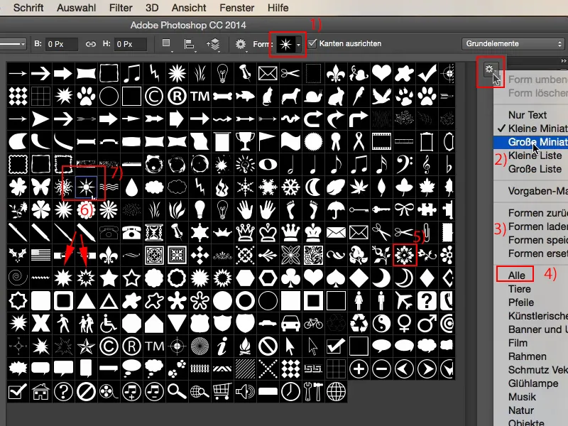
Step 10
Now I bring them into the picture: I click somewhere and drag it to where I think it fits. These are now vectors. That's a shape, ...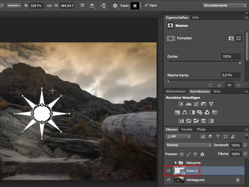
Let's continue: Steps 11-20
Step 11
... and if I want to blur it now, for example, I have to right-click on it (1) and select the Rasterize layer function.
Now I can easily move it here in the image using the Move button. But before I move it to its final position, I have to do something else first. I want the whole thing to be in the center of the image. Photoshop CC 2014 has these wonderful built-in guides that automatically dock as soon as you move an object to the center (2).
This also works if you just want it up here (3): Then you can see that you always get a vertical line displayed and now this object sits exactly in the center of the image.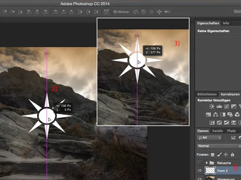
You can do this roughly by eye, but for the next filter it is very important that it is really in the center of the image.
Step 12
And the filter we need now is the Radial Bl ur filter (1). Set this to 100 immediately, because anything at 30, 20 or less is useless. We want really cool rays here.
You can leave the quality at Draft or Good (2). It will be transformed and integrated into the image later anyway, so that's enough for us.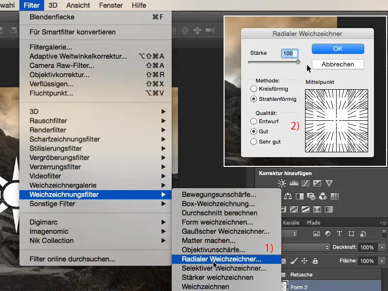
Step 13
You can repeat any filter using the shortcut Command+F5. You can always see this displayed here at the back (1). I'm just going to do this here a few times and click on it diligently until I really, really, really like the radial blur here in the picture.
Yes, and I'm going to keep playing this game over and over and over ...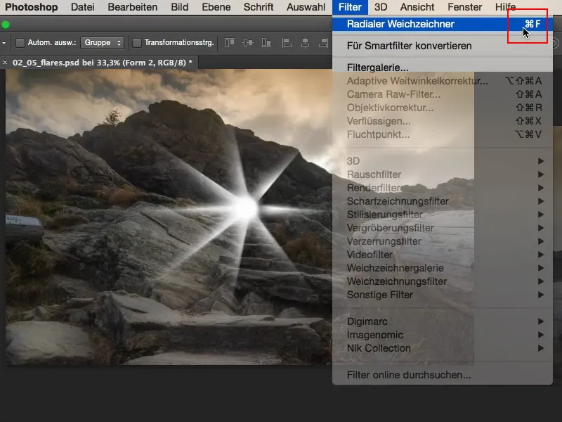
Step 14
... and finally I might soften it a bit more with the Gaussian blur (1) at a radius of approx. 2.6 (2).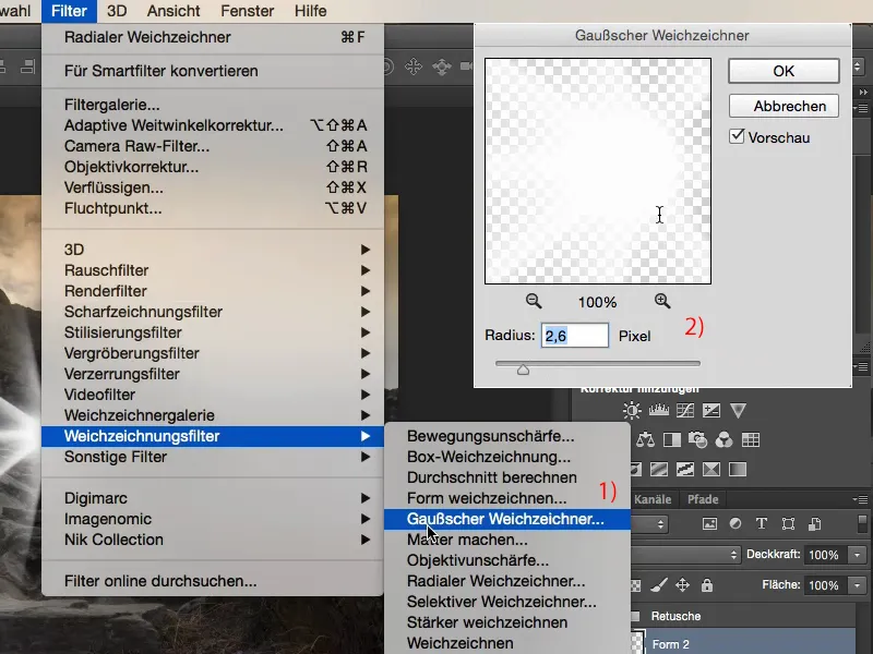
Step 15
... it looks really cool like this.
And then I transform the whole thing using Ctrl+T or Command+T and make it smaller, smaller, smaller, smaller, and position it here (2) exactly where I want it. You can really maneuver with pixel precision using the arrow keys. Maybe a little bit bigger (arrow on the right). I think it looks really cool like this.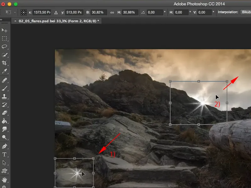
Step 16
And now we have this flare. We have nice rays, it goes to all sides, we have a bright spot here in the middle, it looks really cool.
What we still need now are larger rays that really run into the picture here, and to do this we simply duplicate the star, then go to Free Transform here , hold down the Shift key, make the whole thing a little bigger (1), put it back in the middle, rotate it a little so that the rays also run in a different direction here (2) ...
Maybe a little smaller ... something like that. And by moving it, I bring the whole thing down a little here (3).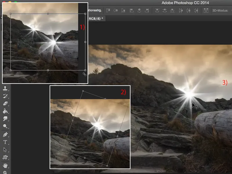
Step 17
Now we have a really cool flare in the picture, but what we don't have yet is this lighting mood. I need a bit of warm light here. The clouds up here are already in beige-brown tones, I've got the grass going a bit in that direction and I want to support that here. To do this, I'll create a layer down here; for the sake of clarity, I'll name the whole thing "Color" and "Spot" here and "Star 1" here and "Star 2" here (1).
Yes, and now I'll choose a color (2) - I'll go for these brown-orange tones here.
Maybe a little more red ... That looks good, this shade of orange (3). We'll go with that.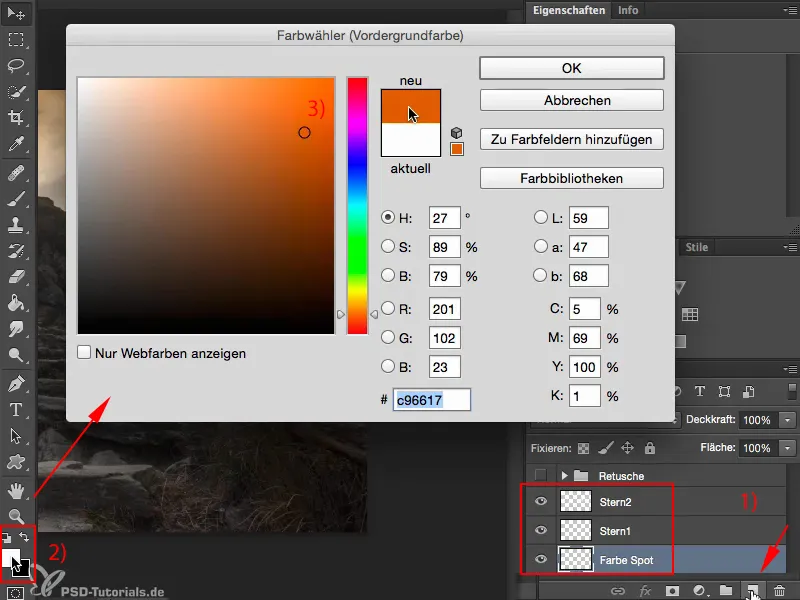
Step 18
Let's set this layer here to Color mode ... or: First, take a look at what happens if you just make a big blob here with 100% opacity.
Let's take a look at this: Now it's under the white star, of course it pops, and you say: You can forget about it, the mounting, it's badly mounted, I'd say: You're right, that's true.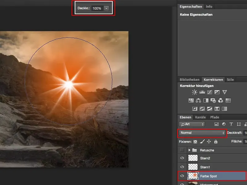
Step 19
But take a look at what happens when you set this to color mode.
On the one hand, I now have the whole thing here really super on the landscape, I also have it in the sky, so it's really nicely colored, ...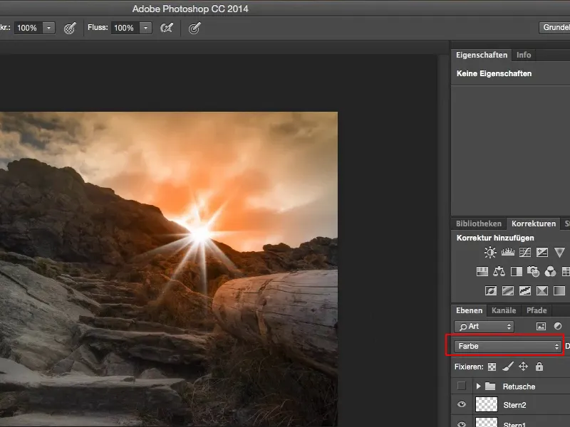
Step 20
... and using Ctrl+T or Command+T and this transformation option here at the top (1), I can now also adjust it here.
I want this to have more of an effect on this tree stump (2) and less down here (3), so I'll just drag it out of the image down here ...
And the whole thing is already here, if I want it a bit high there (4), then I can do that. Not too much maybe, it looks cool like this.
Now the sky is burning here, and you confirm the whole thing with Enter.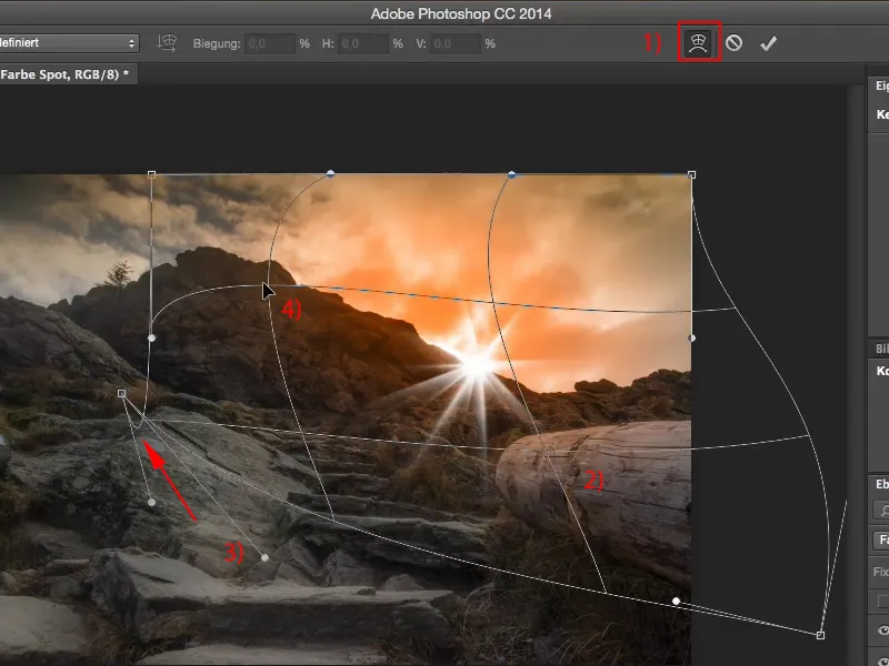
The last steps
Step 21
If the effect is too much, simply reduce the opacity a little here and you'll see that even 70% still creates this BAM effect. That's exactly what you need here.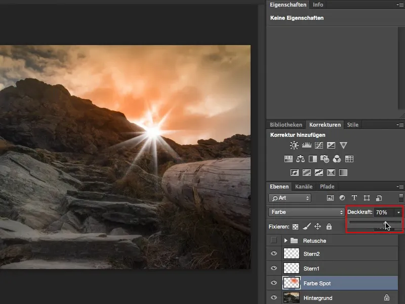
Step 22
We still have a white star. What do we do here? We simply go to the Color Balance adjustment layer (1) and create a clipping mask using the little icon here (2). Now the color balance only affects the star down here (3).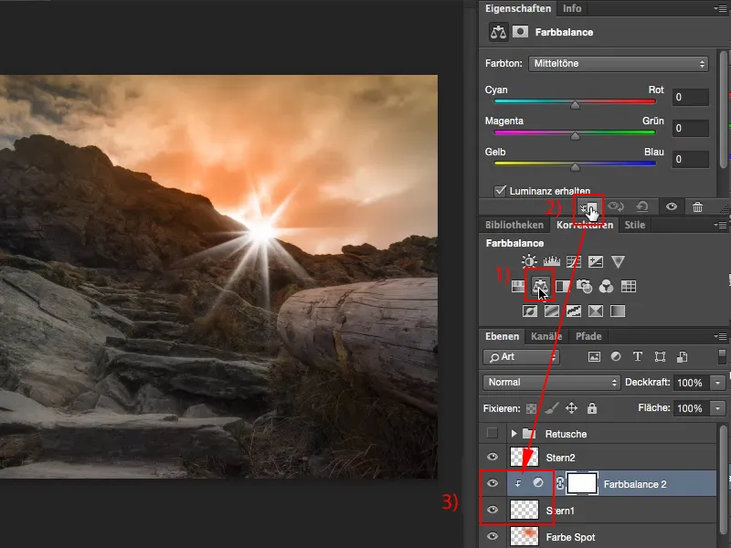
Step 23
And now we add a little bit of color (1). We'll duplicate the layer here (2) and place it over the second star (3).
Now we still need the clipping mask - bang (4).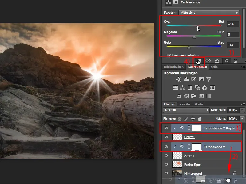
Step 24
Now we can add a little more gas here (1) and I would even reduce the opacity of the second star a little, like this (2):
And set the mode for both stars to Multiply negative (3), then everything will blend into the image a little better.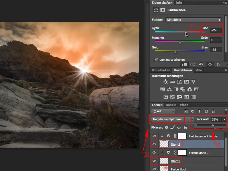
Step 25
Yes, and now I've created this flare. What I want to do now to make the whole effect a bit more dramatic is as follows: I'll go to the background here, right-click on it and convert this into a Smart Object (1).
And now I'm going to use the Camera Raw filter (2) - one of the most powerful new features I can think of here in a long time.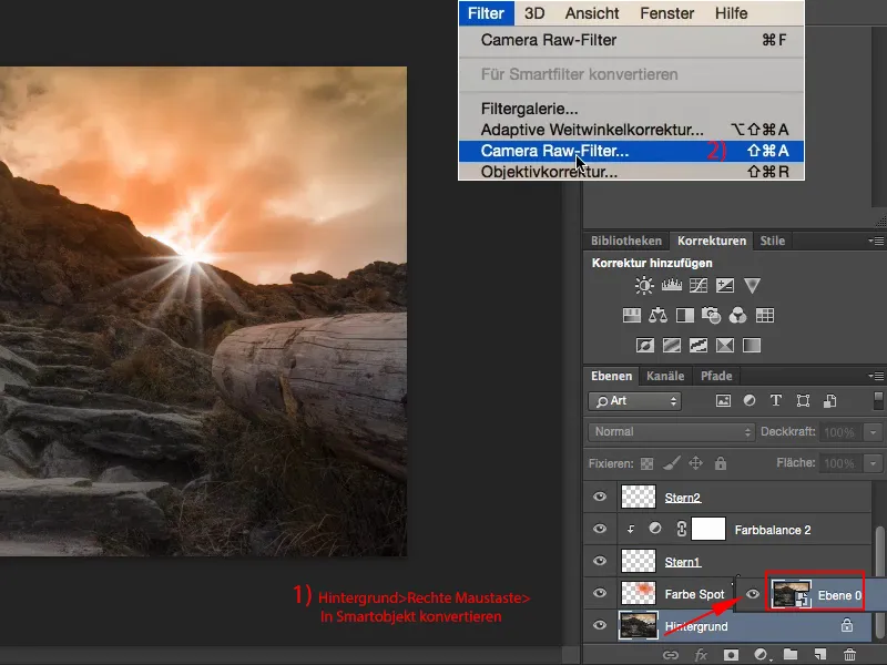
Step 26
You can see that the flare is gone - that's clear, we're on the background layer, which has been converted into a Smart Object, yes, and now let's simply select the gradient filter, the linear gradient filter, up here (1), ... reset the settings and draw a slight gradient from top to bottom here (2). Now I'll make sure that it takes up the top two thirds of the tree (3), and I'll simply adjust the color mood so that it matches this flare (4).
It looks really cool.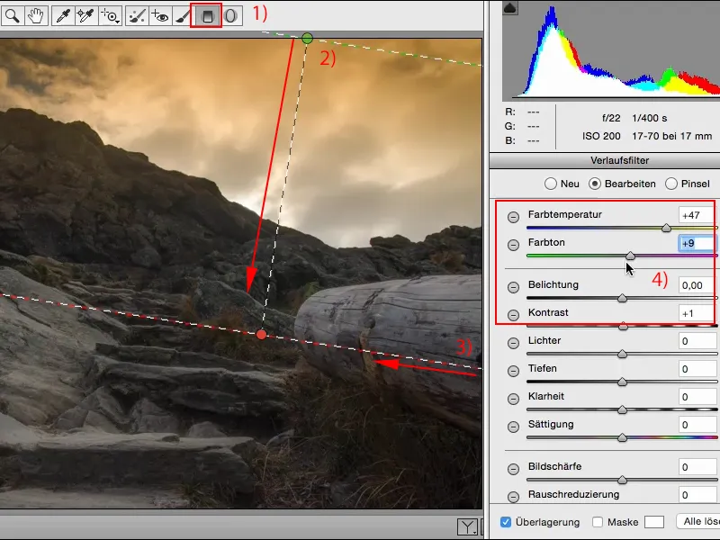
Step 27
Yes, and finally I'll go to the fx (1)(2) - special effects are always good in Photoshop, and now I'll drag the vignetting after clipping, the vignette in good German, into the negative (3) to make everything a bit darker here. This is converted here using OK...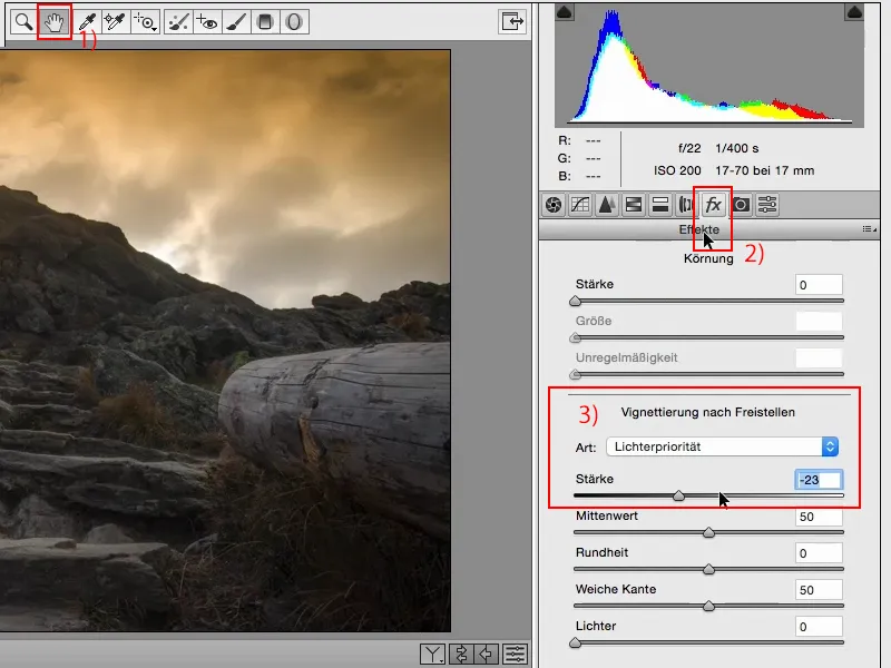
Step 28
... and I go to Edit... one step back (1), and this is really gigantic, I think, what all this makes up in the whole mood (2).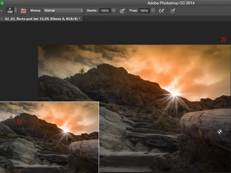
Step 29
Now. But what we're still missing now, or what spices up the image a little more, is: We're going to add a color glow to the image here; to do this, create a new layer using "Color Balance 2 Copy" (1), name it "Color Glow" (2), then take the eyedropper tool or the brush tool, simply go to the sky and select this color. As you can see, this appears here as the foreground color.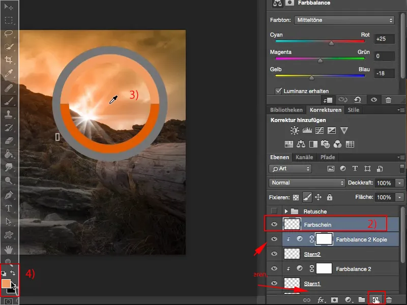
Step 30
Set the opacity down to 5-10 % (1). The more experienced you are, the more you can use.
I'm going to zoom in a bit more into the picture here. And what I want to do now is emphasize certain things. For example, I'd like to intensify the glow of light a little here at the top.
To do this, I'll set the layer here to Color mode (2 ) and start painting over the tree stump here (3).
And you can see that the whole thing really looks as if this reddish light is coming in from above, and that gives the picture the finishing touch.
You just have to think about it: Where does it make sense to draw this here? On these slanted panels on the floor (4) - there in any case, sometimes a little more, sometimes a little less.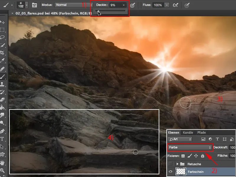
Step 31
I even go back a few percent with the opacity here (1). Here we can do the whole thing over a large area (2) ...
... and also on the individual stone slabs (3+4 etc.), where we can also add a little more.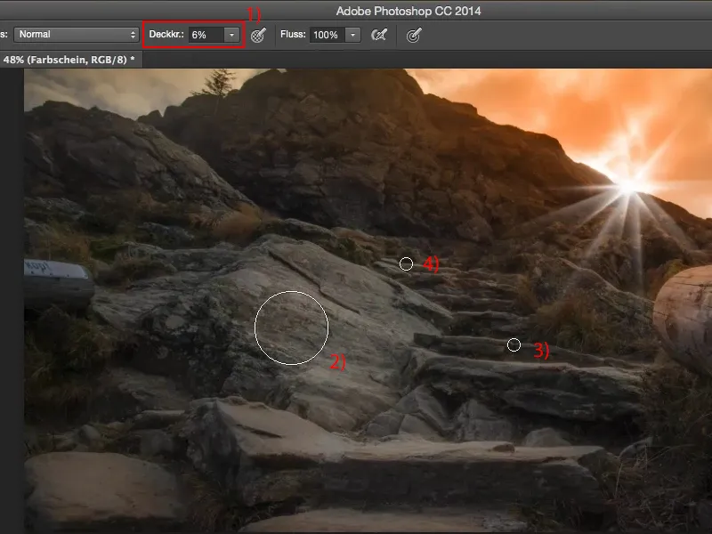
It's very, very quick, but if you just fade this one layer in and out with the color glow, especially on the tree and on the stairs, on the stone steps, ... that's kind of the final kick.
That makes the picture more realistic and so for me it's actually very successful, everything I need is there, I've built in this flare, I've got this lighting mood, the sky is on fire, everything is reflected a little on the smooth surfaces in the picture - that's what I wanted to achieve, and the self-made flare with a shape, that's the icing on the cake.