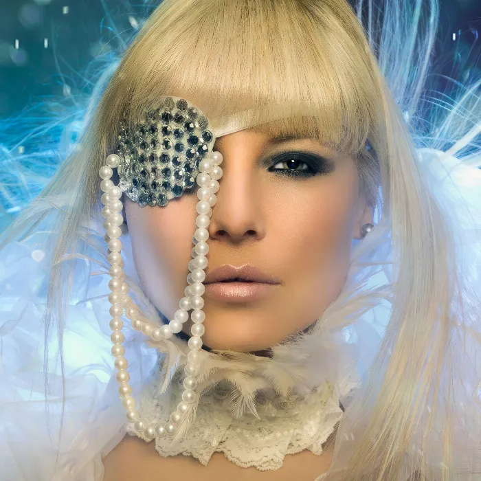
To conclude this wealth of tutorials on Looks & Styles, I'd like to summarize the whole thing for you in one chapter and simply talk about what happens here in the end.
Looks & Styles is about you hopefully learning how to extract the knowledge you need to create recognition value. That's really the main focus of Looks & Styles: create your own look. Create it for yourself, tinker with it until you say: "I can show my portraits in this style, I can also show a high-key, a low-key." Everything you want must be possible with Looks & Styles. Then you've made the most of this wealth of tutorials.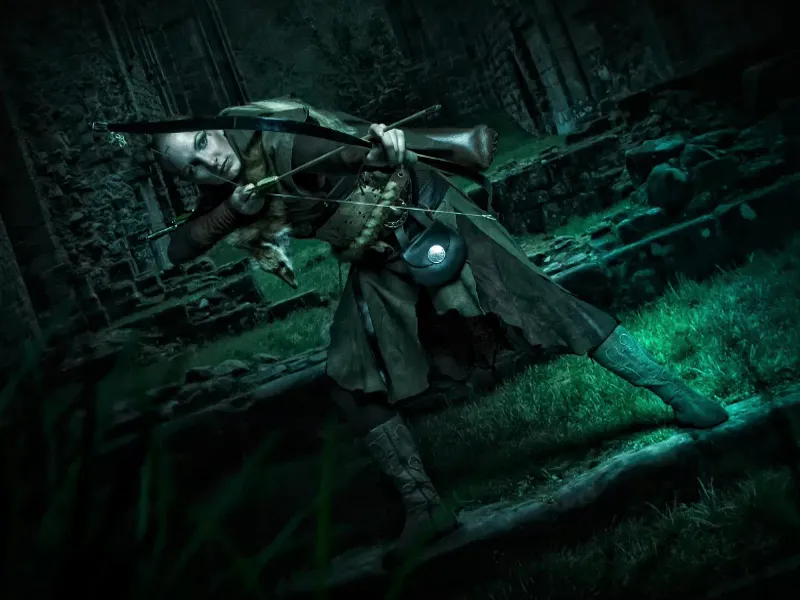
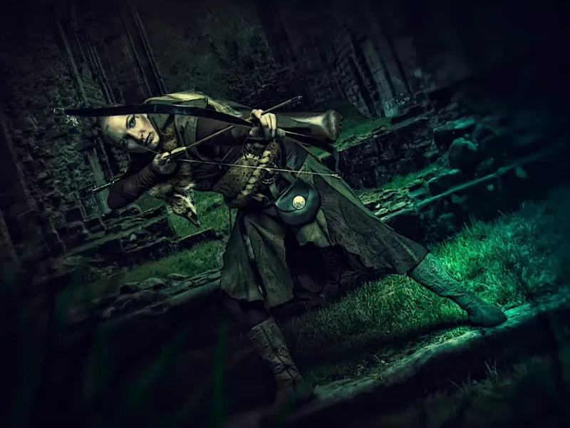
I have now prepared another example for you. This is the retouched image - with a color mood that has been fundamentally adjusted.
I followed certain image rules for this. I've mounted a background (1), I have a middle ground (2) where my model is positioned, and I have a foreground (3) with the blurred blades of grass that I've brushed in.

That's this brush - if you go to the settings at the top, you'll see this blade of grass brush. It can be that simple ... And if you follow these image rules for compositing, then you're already one step ahead with composings.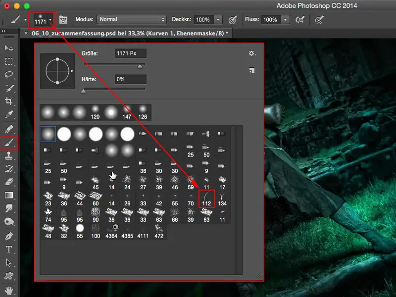
One thing to say about looks & styles: in principle, you're never really finished with a look. I'll click off all the layers here. And a look is always a personal taste. Don't be put off if people shout at you from all sides and say: "I would have done the colors completely differently, that's not my thing at all." That doesn't matter at all. A look is always your personal thing and that's what you want to convey to people: "People, this is the look, this is the style I use for my pictures and this is how it works for me here. And if you like it, you've come to the right place, but this look is only mine, it's my own look, I created it here for myself." Yes? That's where you have to go.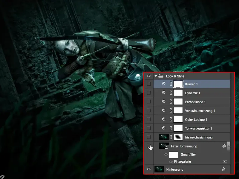
In this example, I thought to myself: "There's one thing I haven't tried yet in all these tutorials, and that's the filter gallery." I then made a copy (1) and converted it into a smart object (2) so that I could access it non-destructively at any time.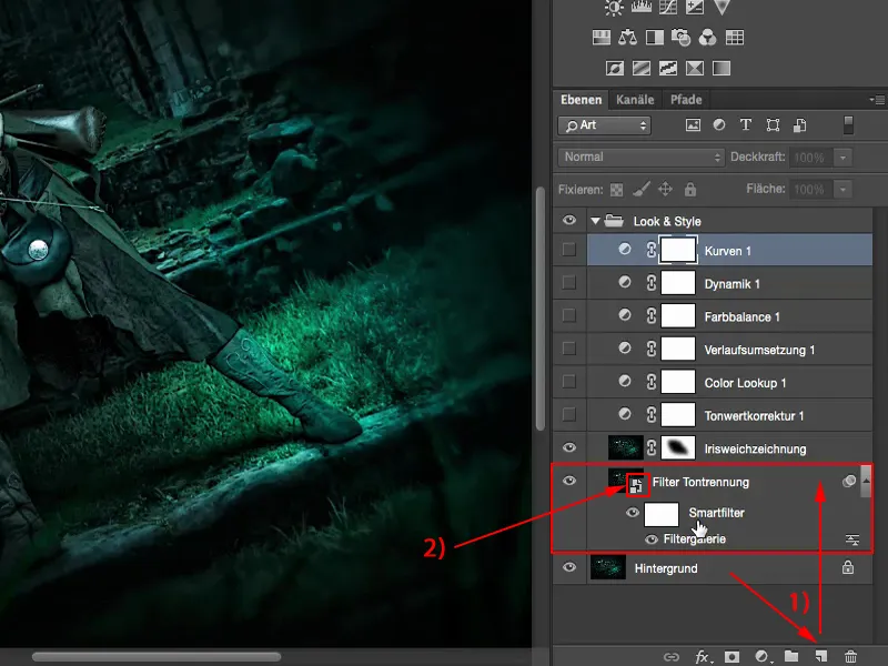
Filter gallery: Tone separation and edge accentuation
I just clicked through the filter gallery and looked at what actually fits quite well here. And I got stuck with the tone separation & edge accentuation (1).
I set extreme values (2) of 10 for edge thickness, 0 for edge opacity and 5 for tone separation and realized that it somehow has a comic book look. Of course, a lot of the real pixels have been destroyed, because this is an art filter - and they intervene very dramatically in the image. But I really, really liked it in this picture.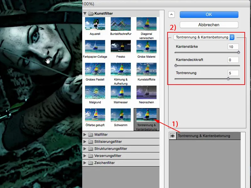
I'll go to the magnifying glass and you'll see that it's really one-to-one, just like in the filter preview on my picture.
And sure, it's a different look now, but hey: this could be a scene from Lord of the Rings. Here, Mrs. Elf is shooting the next orc dead. That's how I can imagine it. And then it can also go in the comic direction. For me, this image style fits in perfectly with this picture. So I've really moved away from this photorealism and created something completely different with an art filter.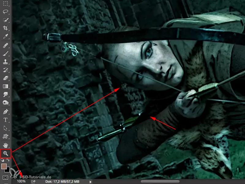
Iris blur
The next thing I stumbled across was the iris blur. I made myself a layer copy. Of course, I stupidly forgot the smart object here. Now I can't get back to the settings, but it doesn't matter in this case, because only adjustment layers happen above it. You can get over it, it happens to me from time to time. I used the iris blur because I thought to myself: "Nobody cares about the drawing (1) back here anyway, and the blades of grass (2) can blend in a bit more with the whole environment back here."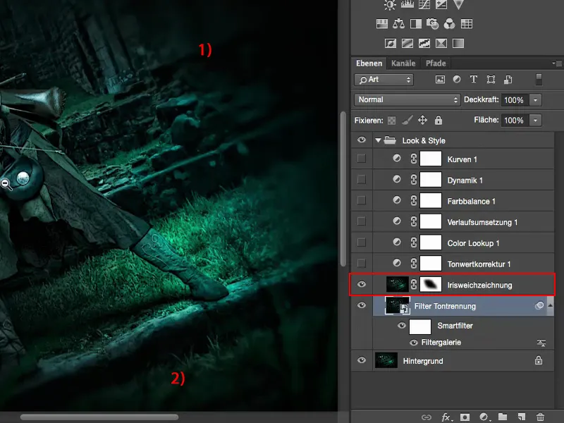
So I used Iris Blur (1) from the blur gallery (Filter>Blur Gallery>Iris Blur...) and brushed it all over the outside here using a mask (2), just the way I thought it would look nice. And now the whole thing is drawn back onto our archer in the center.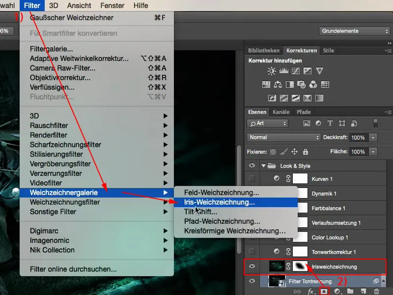
Tone values
Then I thought I'd have a look at the tonal values (1): Is there anything else I can optimize here? I realized that in Normal mode, the image is already suitable, it's already prepared. But in Negative Multiply mode (2) I can tweak it a bit.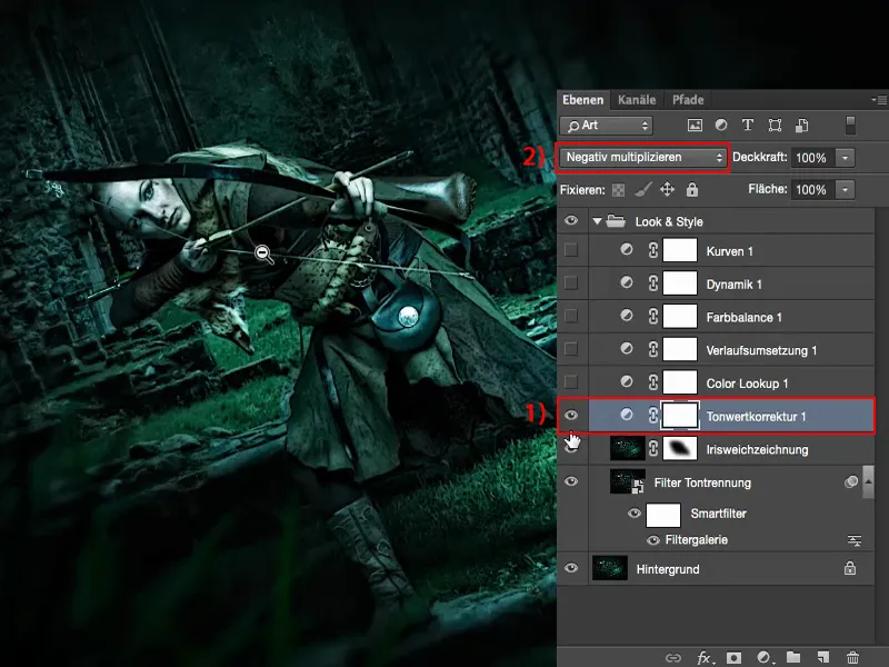
In comparison: 0 % and 100 % opacity. 100% would be too much for me, it would really glow, I don't like that at all, but 60 to 70%, maybe a bit more, I think I'm a bit closer to my model again.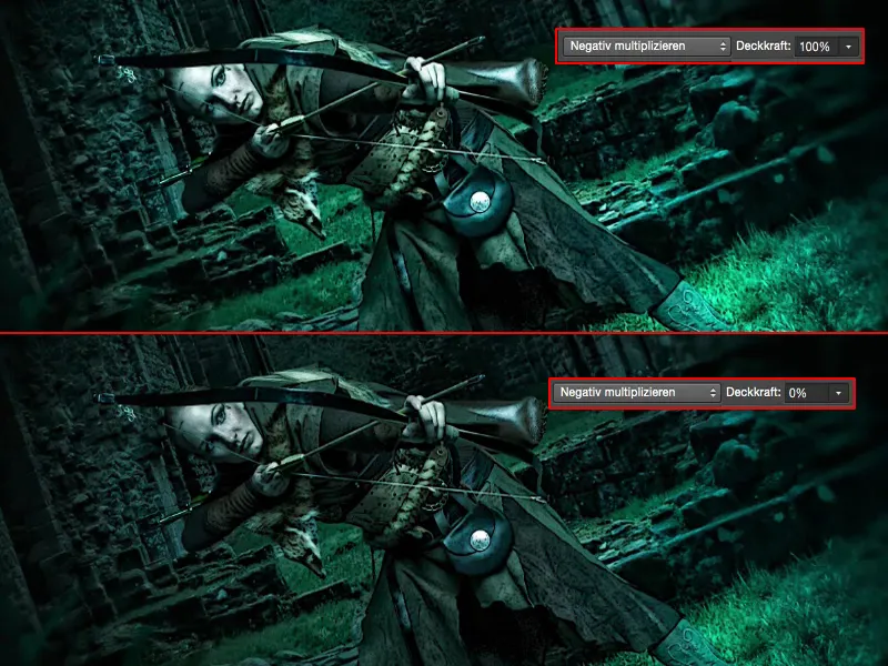
And that's why I left this 69% here, because I thought to myself: "It looks cool like this."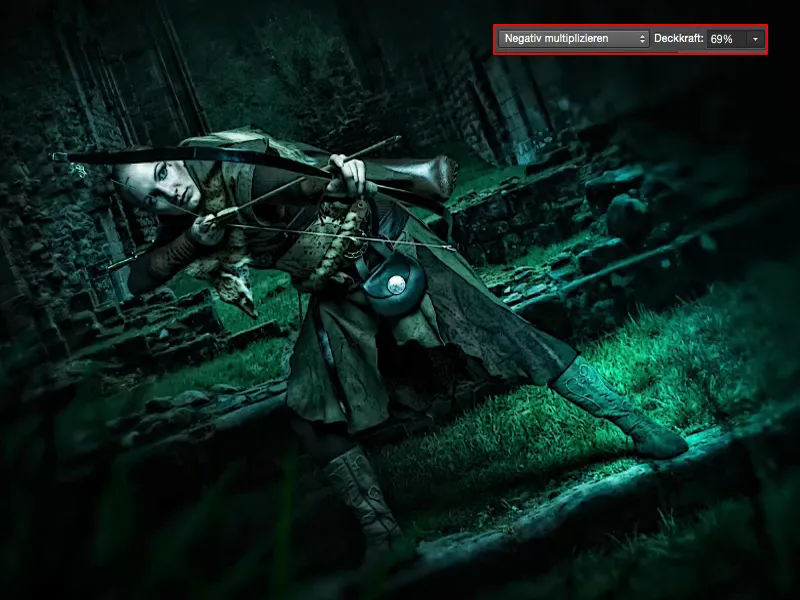
Color lookups
These color lookups (1) above are of course very, very suitable. I just check them out and go to 100% (2). So this is unmistakably EdgyAmber (3).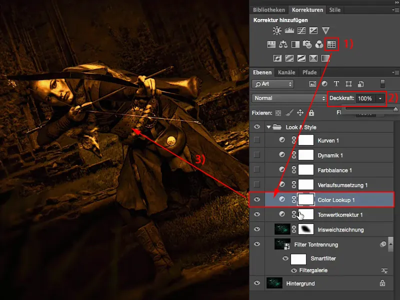
That's what I find so great about these color lookups. I overlay it a little on every layer because I think to myself: Sure, it's immediately obvious at 100%, but at 20 or 30% I get a warm touch of color in the cold image without completely removing the coldness from the image.
I can also do that with other adjustment layers if I tweak the sliders a bit - but why should I do that when there's already this nice adjustment layer, the Color Lookup with this EdgyAmber look? Then I just dragged 20, 30 % of this style into my picture.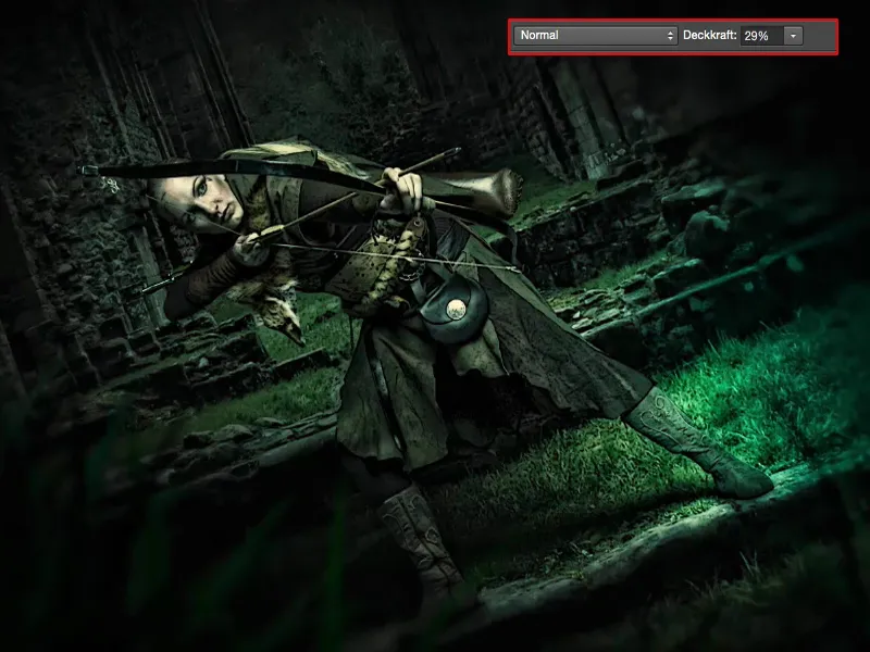
Gradient conversion
Gradient conversion (1) from light to dark: In this case, it went from this brown touch to black (2). This also appears a little here. I'll close this again so that you can keep an overview here.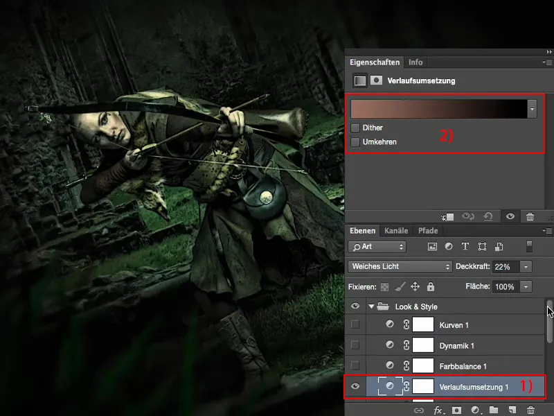
And the gradient conversion is set to soft light, at 100%. I get very, very strange colors here, but at 10, 20 % it thickens the whole thing again.
That's also one of the main focuses when I'm color grading an image at the end: I always try to make the atmosphere in the whole picture even more tangible, even more compact, even more fused and somehow even more intact. I don't know how else to describe it. It's a feeling: whenever I see this 20, 30 %, I almost feel naked when I look at the before, because this is what the picture was simply missing, and I get it back through the process implementation in this case.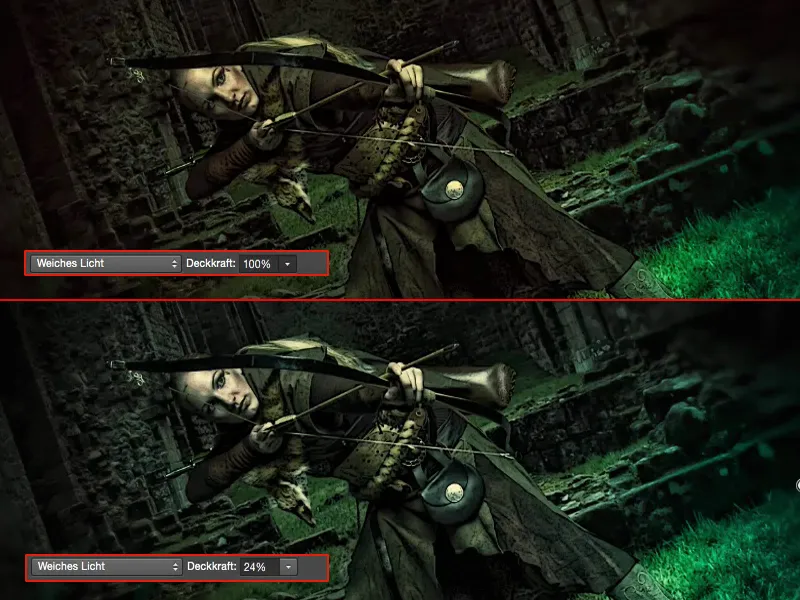
Color balance
With the color balance, I can pull the colors cool, pull them warm. I decided not to leave it at 100%, because otherwise I could have saved myself all the stuff beforehand with EdgeAmber and so on. No - I only pull in a few percent again and get a touch of coldness back, but not really much.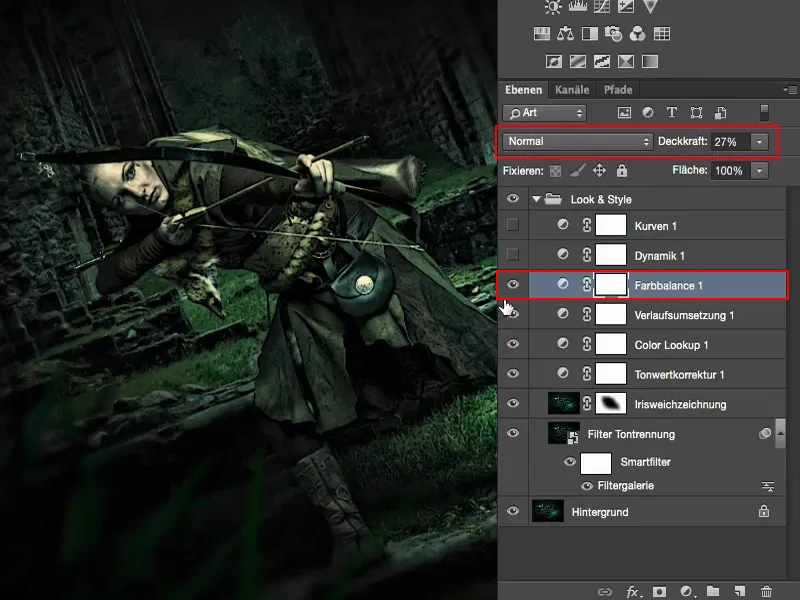
Dynamics
I just played around with the dynamics and realized: Not that much happens. I just tightened it up a bit, pro forma, because I thought to myself: boosting weak colors in the image - that just works well. It has almost no effect at all.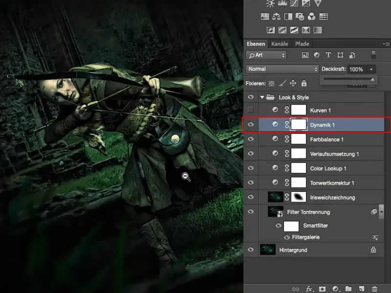
Gradation curves
Then I thought about it: Finally, I could tweak the curves (1) a bit. Gradation cur ves (2) are of course ideal for this if I want to create a bit of a cross look.
I'll go into the blue channel(3) here. You can see a very, very slight shift there. So I've just gone up a bit here. I'll show it a bit more clearly so you can see it in the picture. So here I can color the black values blue up to the ultimate (4). It doesn't look too bad, but I always like to have just a little touch (5) in my pictures.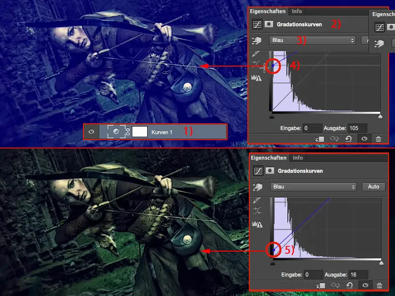
And if I pull down the highlights in the blue channelhere (1), I get yellow-green highlights. That's too much, so I only go down one shade here too.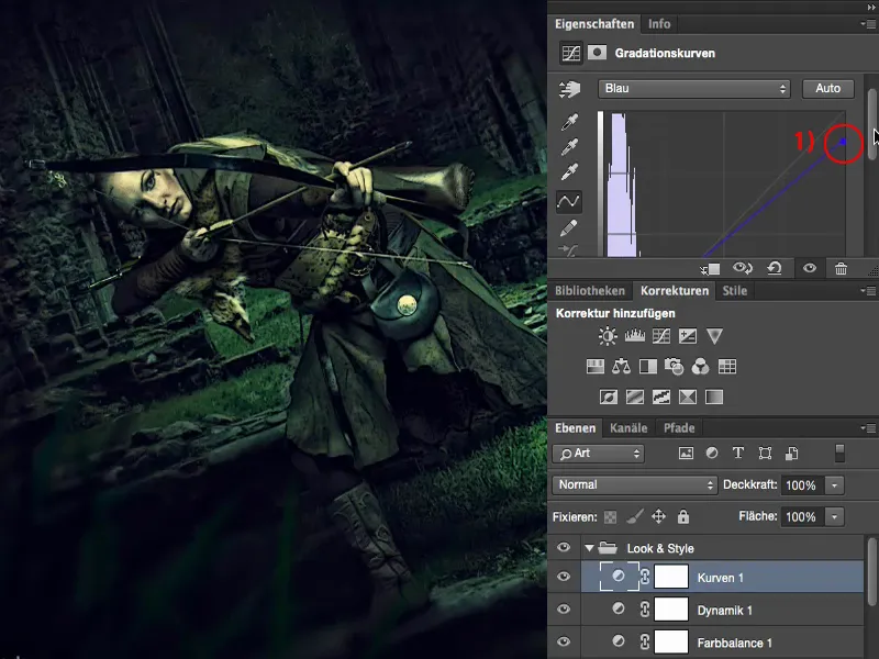
And then the picture is finished for me. You can try to tease out even more here. I can now convert the whole thing here into a Smart Object and can only mask certain parts of the image, that would also be an option. Or I can use Shift + Alt + Ctrl + E to summarize everything here again in a normal pixel layer (1) and say: "I have really cool options in the raw converter."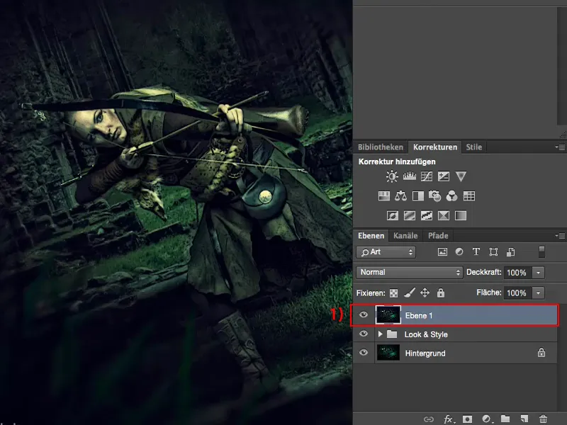
Camera Raw filters
Since the last, I think, two versions of Adobe Photoshop, I've added Camera Raw as a filter here. And that's of course super cool when I've already reached the end and want to do grading.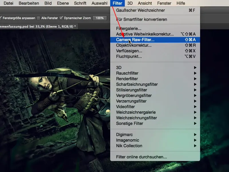
Above all, I can now take a look: What happens if I lighten the shadows and brighten the blacks? Then it's a completely different look again, much, much more graphic, a bit more comic-like. You can do it, but you don't have to. But I've at least had a look at it - without having to fiddle around with adjustment layers and so on - quite simply in the raw converter.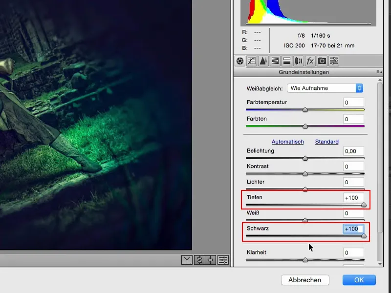
I can also completely change the color look. Warm colors, cold colors, I can just take a quick look at everything and then realize: "No, no, I'm already quite right here" by setting it back to 0.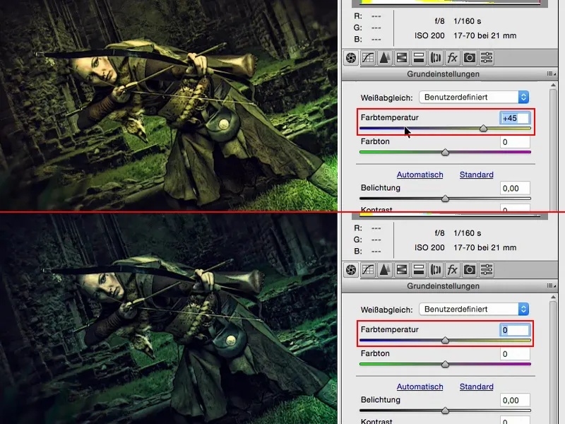
What happens if I pull the clarity (1) all the way to the stop?
Wow! High contrast look, not bad either. But it's too much for me. But maybe my picture could do with 10, 20 % clarity? Yes. Yes, about 20 %, we'll include that here (2). That works quite well.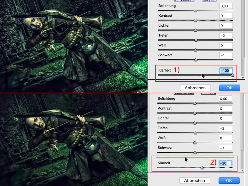
Or I also have nice things like these two gradient tools (1). What would it look like if I applied a warm cold gradient here? Let's try that out. I'm going to apply a gradient to the image from the right (2), which should run diagonally into the model, and these should be very warm colors (3) on the side. And the exposure (4) should also be adjusted a little - it draws the focus a little more to the foot. No, it's not my thing.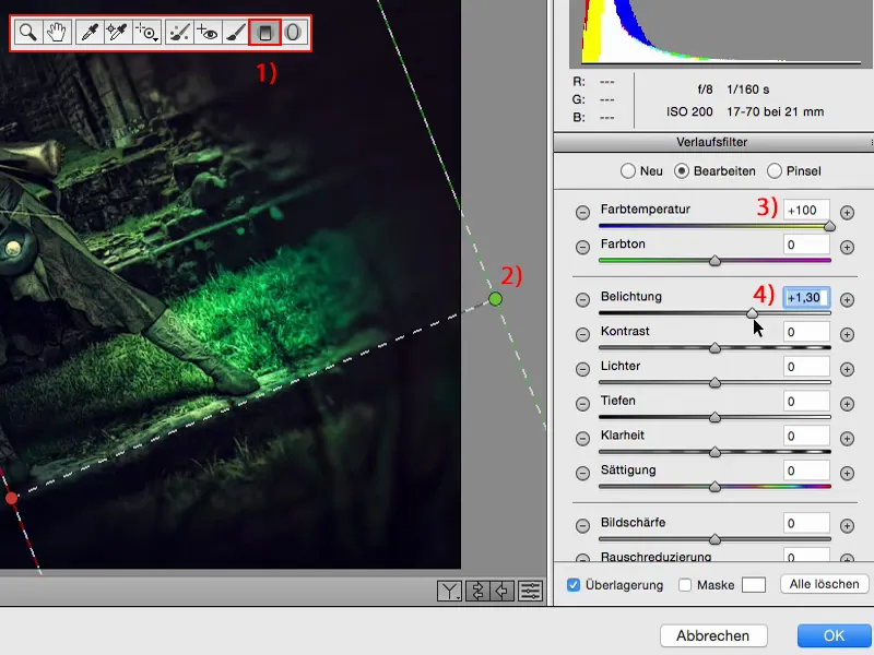
And what about cold colors (1)? - Cold is cool, though, because it looks as if a blue-green color is somehow being drawn in here on the right. And I realize: that's what we're doing here. It's almost like a colored vignette, and I've already changed the look again with this one. It's that simple here in the raw converter.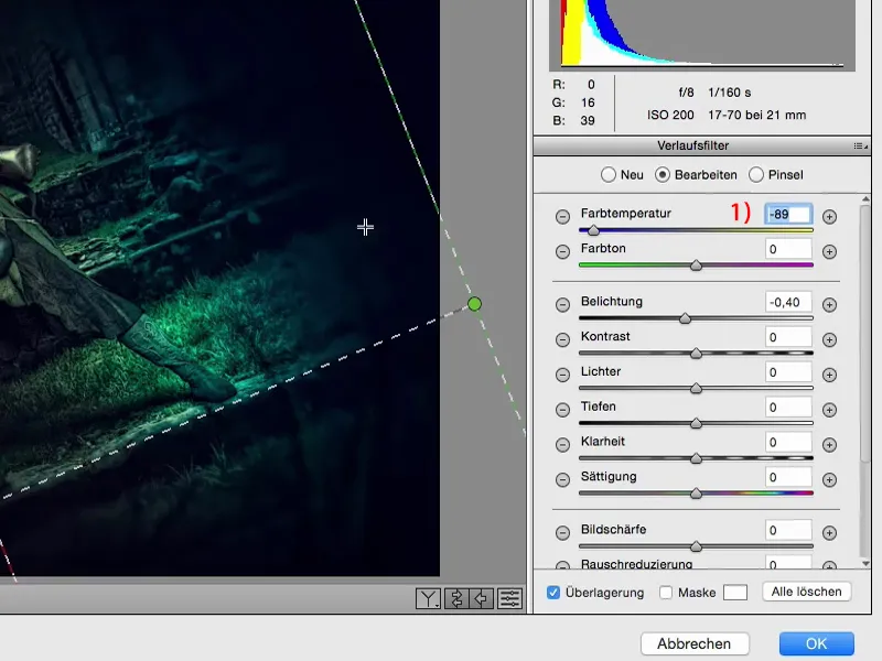
In any case, I take a look at the HSL/greyscale controls(1) in the raw converter. Hue, saturation, luminance (2) - cool! What colors does my image consist of? Yellow, green, blue - that's right, those are the colors. I won't be able to change much with red (3). If I drag red back and forth here, maybe it's still somewhere in the skin, but it's no longer visible.
With yellow (4) - I've definitely got that in here, mainly in the skin color and in the shiny areas. But I don't touch it, because if I pull it up - no, it doesn't look good.
I only have a little bit of orange (5) in my skin as well, actually almost only in my cheek, and not much happens there either.
Green (6) is a different story, of course. I still have quite a bit of air here with the grasses. And I decide to make the whole thing a little brighter. Aquamarine (7) also appears, and I'll add a little more to that too. And blue (8), that's quite a pull here on the side. I'll make it a little lighter here.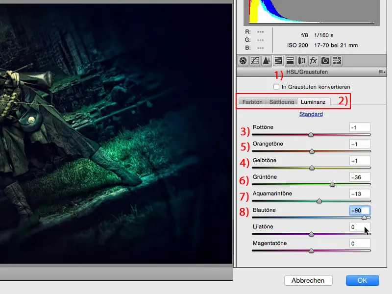
With the saturation: (1) green, of course - I can pull it all the way back or take it out. I even decide to let the green (2) recede a little. And with aquamarine (3), I decide to step on the gas a little. I don't think I can put on too much blue (4), otherwise it will all get too strange here. But look what happens if I suddenly take blue out. The whole thing becomes very, very surreal and almost looks like a color key. It's a bit frowned upon, but I think to myself: maybe I've even overdone it with blue.
That's the nice thing here: I can just have a look at things. And if I've messed up - I simply click on Cancel (5) or set the sliders back to 0 and start again from the beginning.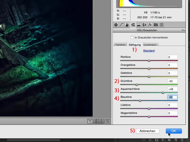
Then I give the whole thing back to myself. You've now been here live to see how we practically "looped" it, as they say. And we've now taken it out again in the raw converter. This is set to Normal, 100% opacity. As always, the rule is: reduce the opacity, go down to 70, 80 %, and it's still a great change. I would even go back a bit further, maybe only to 50% (1) approximately. And so the image becomes more and more compact and you get closer to the final whole.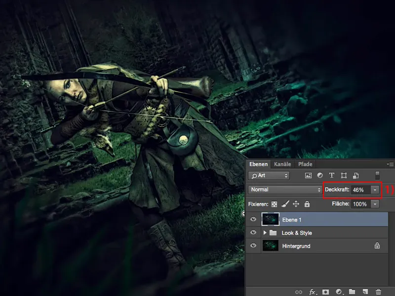
Final words
Ultimately, only you and you alone decide when the game is over. I always recommend: Before you actually save an image or don't throw away the PSD for God's sake - but maybe you will - then sleep on it for a night. Maybe sleep on it for two nights. If it's not a commercial story and you just want to publish it on Facebook or in your portfolio: No one is forcing you to upload it immediately, 10 minutes after you've finished it. Show it to friends, show it to acquaintances, don't upload it online yet! You'll see that they'll notice much, much different things than you, for example. Maybe they'll say to you: "What you've done here, with this strange soft focus, the transition (1) is much too hard." Or: "Take out the blue (2), make everything here green and it's much, much more coherent." You try it out, you have worked non-destructively, you redo the whole thing for yourself, not for your friends, but perhaps you listen to the advice they have given you. Then sleep on it for another night and you'll realize that there are still some areas that are lacking ... And that's how the whole thing will finally be perfect.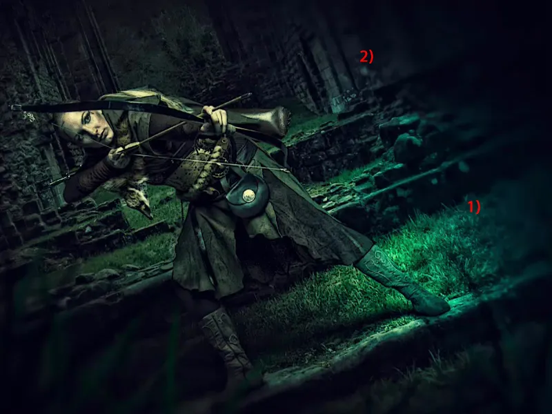
Of course, you should also remember to do all your retouching on empty layers with the tools (1) and to use the layer modes (2). All of this will make your working method compact, manageable and structured. And if you work with Smart Objects and work a lot on empty layers, then you will also realize that a non-destructive workflow is not that difficult. It will become second nature to you.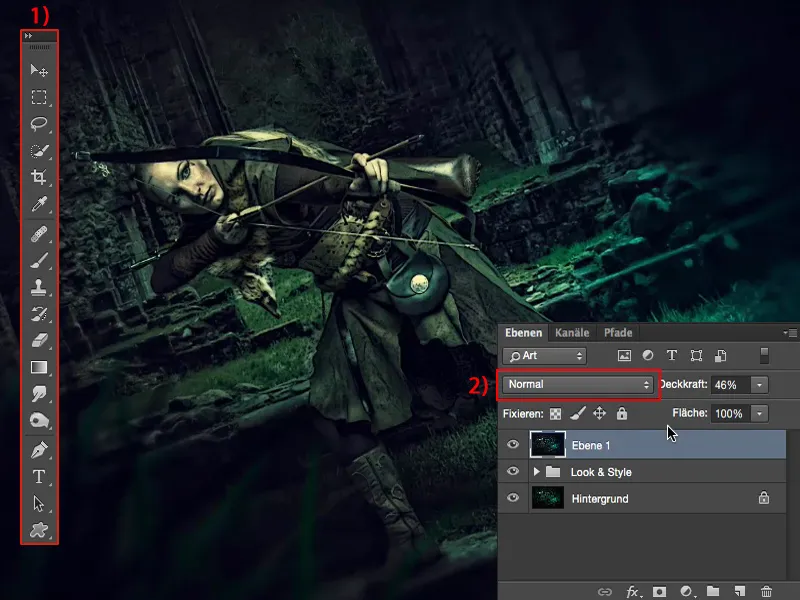
You need all of this together if you really want to find your look, your style. And I hope that these tutorials have helped you on your way.