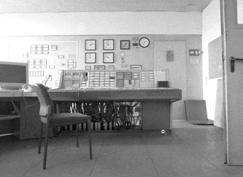
In this tutorial, I'm going to explain a very familiar look that you've known since childhood, the so-called newspaper look. It is characterized by the fact that it has very little contrast, because the newspaper is not printed on a glossy paper, it is printed on very thin, soft, cheap paper and also with little ink, it has to be cheap, a newspaper costs one euro or 1.20 euros, something like that, and the whole thing here is simply kept flat, the paper is not pure white either, it has a slight beige tone, there is grain on it, I'll zoom in a little closer here. You see, it's all very, very grainy, not everything is one hundred percent sharp, a newspaper is just a newspaper. How do you do the whole thing with Photoshop?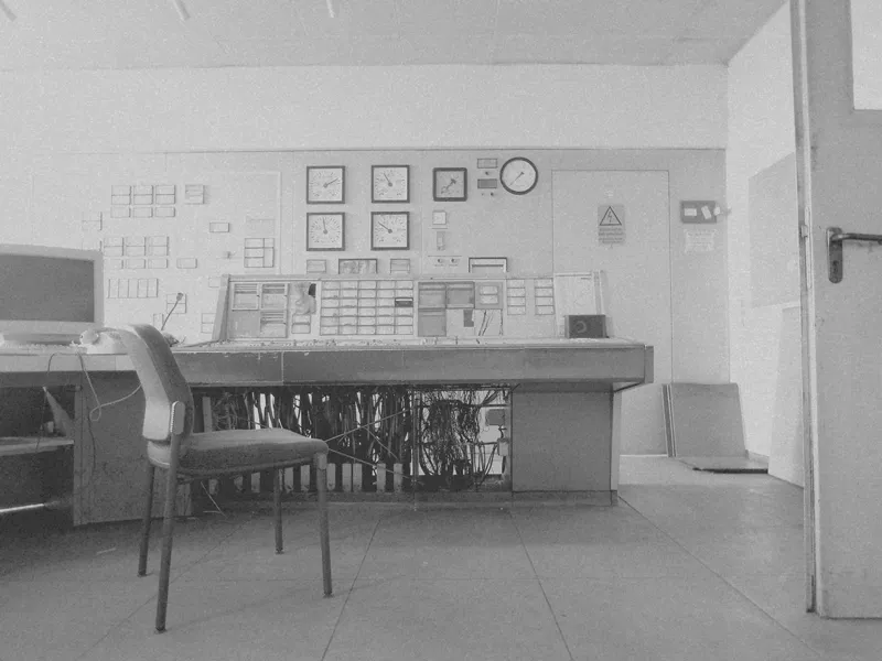
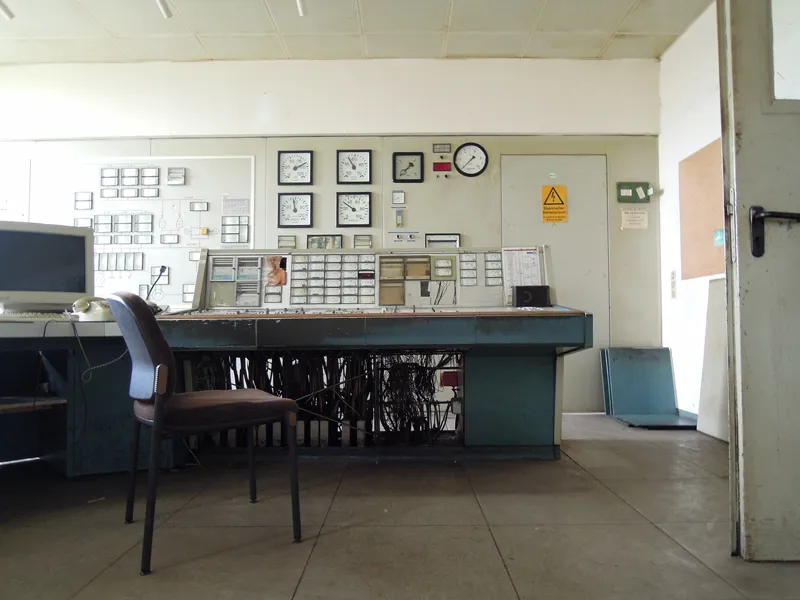
This is what my original picture looks like, it was taken in an old factory, the Maxhütte steelworks, this is the old control room here, the boiler control room. I thought it was really cool, everything looks exactly the same as it did when people worked here for the last time, and I think that's really cool, because reportage is always a big topic for a newspaper.
You won't find any glossy high-end retouched pictures in a newspaper, you'll usually find reportage and documentaries, and this is a reportage/documentary photo, which is why it's perfect for this newspaper look. You should always keep that in mind. A look always has a certain function and this look here immediately suggests to the viewer: Ah, that looks like an old newspaper. That's the point of this look. How does the whole thing work?
Step 1
First we need a black and white layer (1). You can now pull all the sliders up here (2), I always like to do it like this: I want to touch the image, i.e. make this black and white tone lighter, darker, etc., and there's this hand symbol here (3) and you can see arrows to the left and right of it.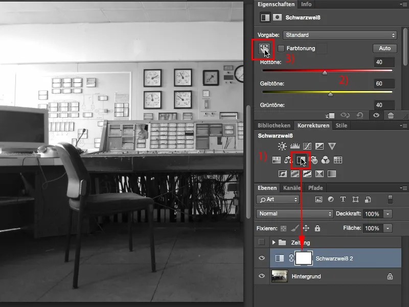
Step 2
If you have now activated this (1), you can now easily say in the picture: OK, the monitor, for example, I'll click on it now (2), then this hand symbol (3) appears and I drag to the right and left and can now lighten or darken exactly these gray values here.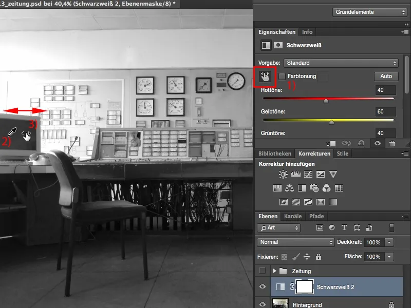
Step 3
Yes, and I now do this everywhere in the picture for as long as I think to myself, man, that looks cool (1). Anyone can do that, you don't have to drag around all these sliders, I do it until I really like the contrast. Like this. All the color sliders here, you can also learn a bit about your image composition, you can see how it all shifts live (2).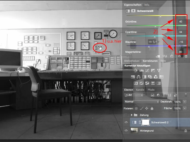
Step 4
Next, I need to make the image flat. And first I need to brighten it up a bit. I could also lighten it globally in the black and white layer, but I would have to find all the colors and make them a little brighter, which is usually always a bit difficult to blend.
This is much easier using the Tone correction adjustment layer (1). Of course, I could also optimize the contrast here by adjusting my black values and highlights, which would give me something rich in contrast, but that's not what I want with the newspaper look. With the newspaper look, I want to make the depths as shallow as possible. To do this, I only bring them up to the first point (1) and with the midtones, I brighten them up extremely and I also tighten the highlights a little (4).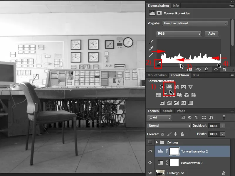
Step 5
Now I've almost done it.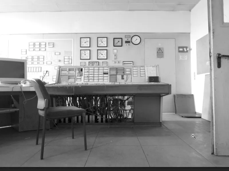
Step 6
Finally, I need a Brightness/Contrast adjustment layer (1), because I really want to get the contrast out of the image. And if I now pull the contrast sliderall the way to the stop (2), that's the little touch that was missing in the depths here (3). I don't want to remove it in the tone value correction (4) because then I'll probably get tonal breaks. But the Contrast slider, if I pull it out, makes the whole thing really cool.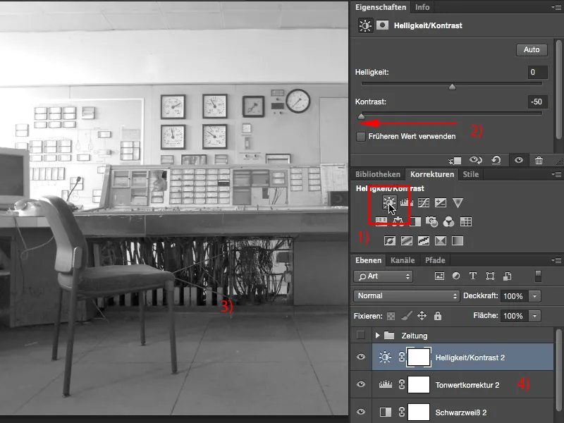
Step 7
Now I've reached the newspaper look in terms of brightness and contrast. I hardly have any pure black and the main part of the image is actually just midtones. There are perhaps a few highlights at the back here (1) and then on the left at the side (2). What I'm still missing is the grain. And the easiest way to simulate grain is to create a new, empty layer here (3)...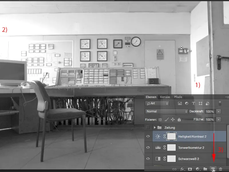
Step 8
... (1), then I go to Edit>Fill Area (2), this dialog box appears (3) and I select Foreground Color, Background Color, Color, Pattern, etc. under Content, then I select this 50% gray.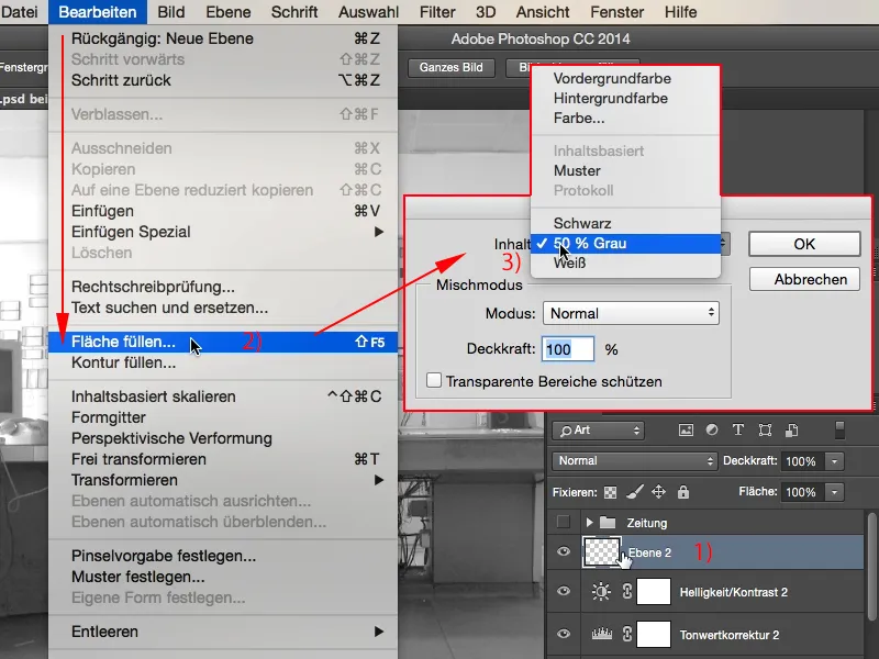
Step 9
This 50 % gray (1) corresponds to a value of RGB 128 and that is the golden mean in the brightness of the gray tones. And the trick is: I can make this 50 % gray invisible here in the calculation group. I'll just set this here to Radiant light (2) ...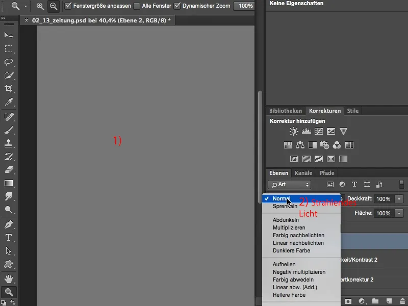
Step 10
... and it has disappeared. But if I now make a change to this layer, it will become visible, because everything that stands out from this 50% gray can be displayed again in Photoshop.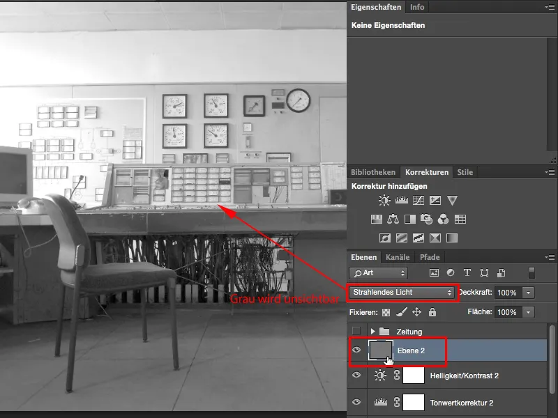
Step 11
I'm going to take advantage of this and go to Filter>Noise Filter>Add Noise.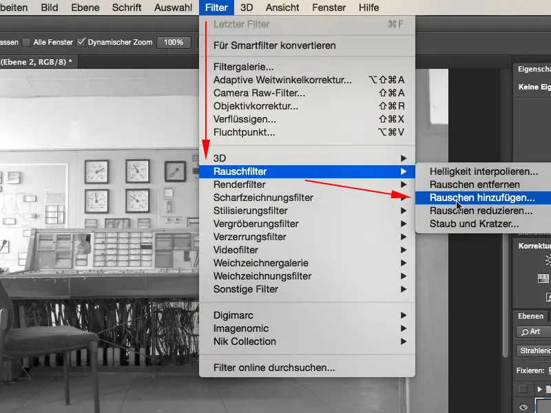
Step 12
It looks like this. By default, this is set to Uniform and Monochromatic is unchecked and you can see that you get color noise, and of course we don't want that here.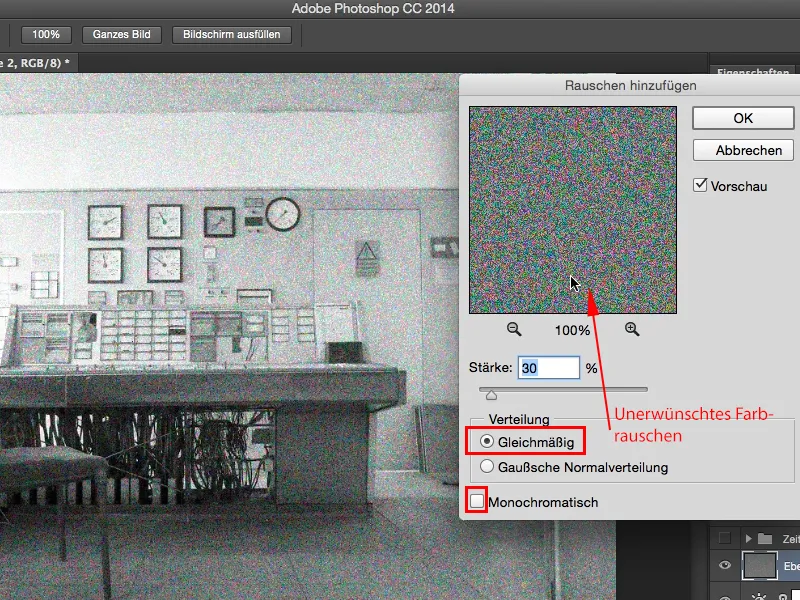
Step 13
So you click on the Gaussian normal distribution. This means that there is no repeating pattern here, ...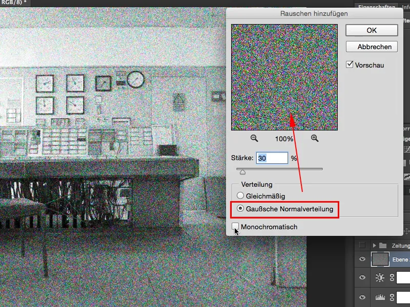
Step 14
... and of course Monochromatic (1). The noise is now (with a strength of 30) much too strong (2), I'll go for a value of 5, maybe 8, that's a bit too much, you have to adjust a bit. I'll now take 7 (3) and confirm the whole thing with OK.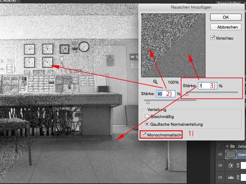
Step 15
Yes, and now I have created this newspaper look, in the end I have created a very dull image that is slightly noisy, but that has a recognition value and that is the task of this special newspaper look.