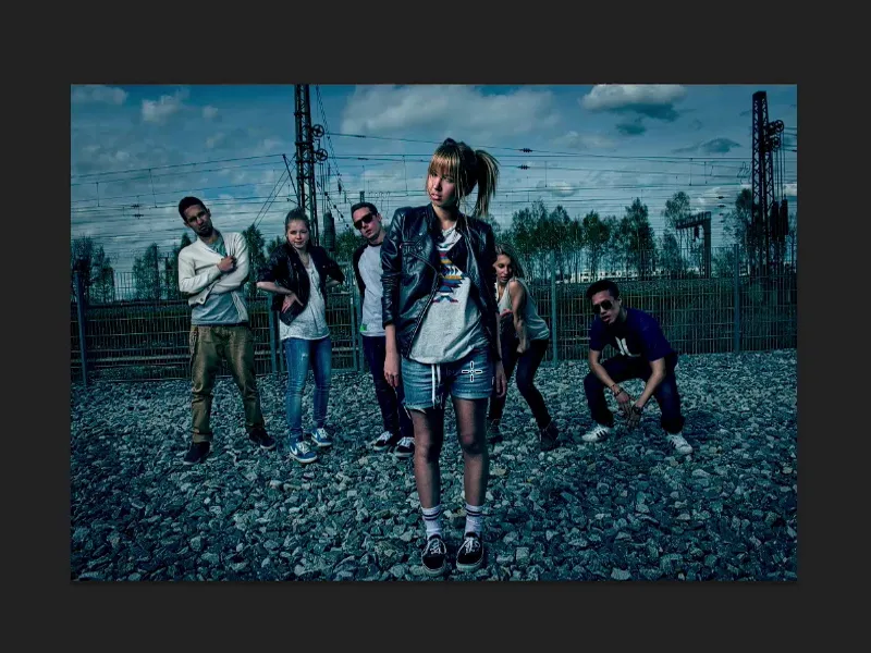
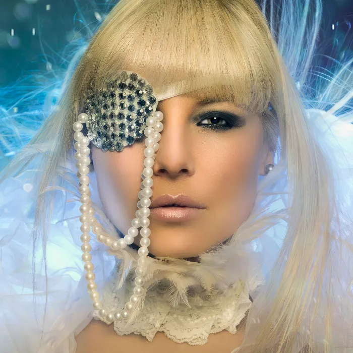
We've all been to the movies and watched some kind of blockbuster. I have now prepared three different looks, three different gradings. Namely: "Harry Potter", "300" and "Batman".
The whole thing is not one hundred percent the look of the movie, because I personally don't know how the look was done. It was also done with some kind of color grading software for video, but I can try to recreate it a little bit in Photoshop. And that's what I'm going to show you now.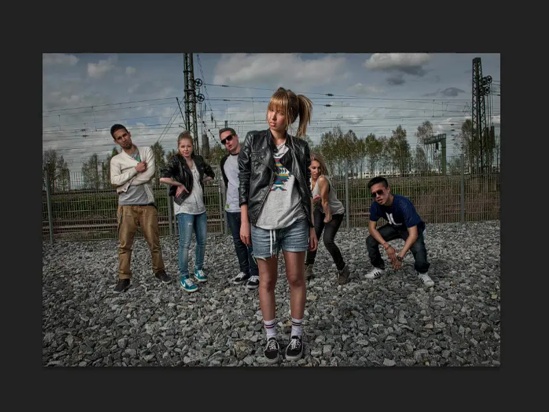
Movie look: Harry Potter
I'll just click on my Harry Potter look and say something about it: You might have to watch a trailer on YouTube or something just beforehand, press pause, and then you have to look at the still image and see what Harry Potter looks like. So not the person Harry Potter, but: What do the colors look like, what do the contrasts look like?
And with Harry Potter you'll notice that you have relatively saturated, yellow-orange skin, and the shadows and midtones are always greenish, bluish, almost cross-look sometimes, depending on what special effects are going on. But as a rule, I'd say the last two, three or four parts, which are getting darker and darker, they're somehow covered in this poisonous green. And I can try to imitate that in Photoshop.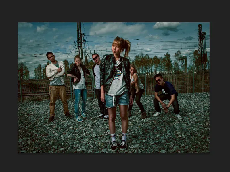
Movie look: 300
Next up is the 300 look. It's exactly the opposite. It's so warm, everything burns - the action scenes in the 300 film are done in this style. Totally overdrawn, it's almost a comic book and I can recreate that a bit in Photoshop as well.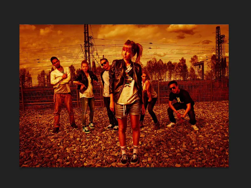
Movie look: Batman
Batman - when you think of Batman, I immediately think - without having seen the movie - of cool colors, of darkness, of black, I'm in the blue tones. And if I were to photograph someone in a Batman costume here, I'd do my damnedest to give them that 300 look or Harry Potter. No. I would definitely work with shades of blue. I would make the whole thing cold. This Batman leather costume literally screams: "Color me cold!" And then I'd also create something recognizable.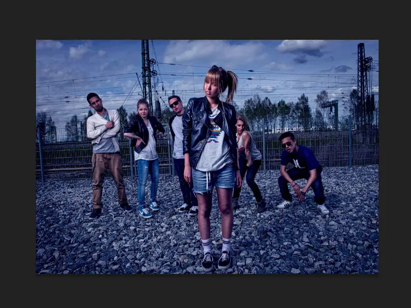
If you've ever watched all the Batman films or the various Harry Potter parts, maybe you're a fan, maybe you're not, then take a look at how the films are trimmed in terms of the colors. You'll notice that they have a consistent color look. And this look and style create recognition value.
You can also make use of this for photos. Imagine you have to create movie posters, even if it's just for the home cinema at home. For example, you've made a funny family film - if you color grade the whole film, you've created something where people say: "Okay, this isn't just a film that anyone can make, it looks cool in terms of the colors." And let's apply that to pictures.
Create a look: Selective color correction
I'm just going to do it again here. You can easily get the Harry Potter look or a similar look by using selective color correction (1).
Here I now have the option of coloring the grey tones (2) and the black tones separately and this works quite well. I first color my picture a little greener and add a touch of blue. You always have to think in complementary terms here. And then a little magenta and yellow. So now I have something here that is definitely no longer a normal photo, but has a bit of a film look, this impression.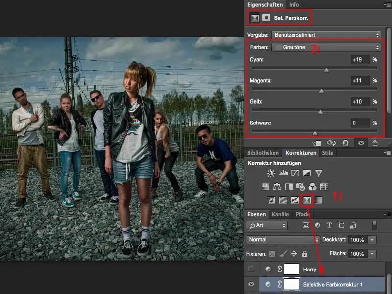
And I'm going a bit in the opposite direction with the black tones. So everything that is dark here should now have a slight orange or red tone. I can't color the depths blue, otherwise I'll end up with a cross look. But just a hint, a nuance, that works very, very well here. And I've already got a completely different color look that really looks like a film look. So this works very easily with the selective color correction.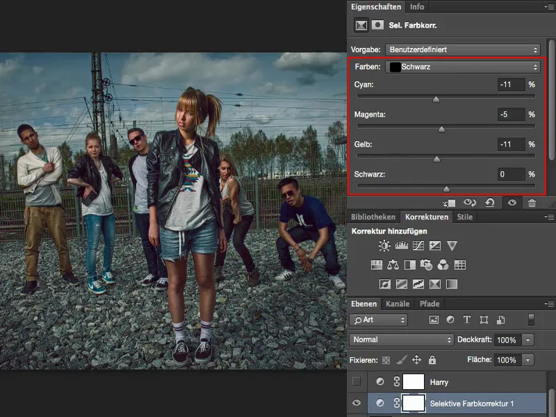
Create look: Color balance and tone correction 1
Next example: 300. If I look at what I have prepared, I definitely need a strong color shift into the warm tones. The easiest way to achieve this is with a Color Balance adjustment layer (1). I'll Blender out the 300 group here and pull the sliders all the way to the stop (2). The colors are already going in the right direction, but I'm not getting anywhere with the tonal values and the contrast.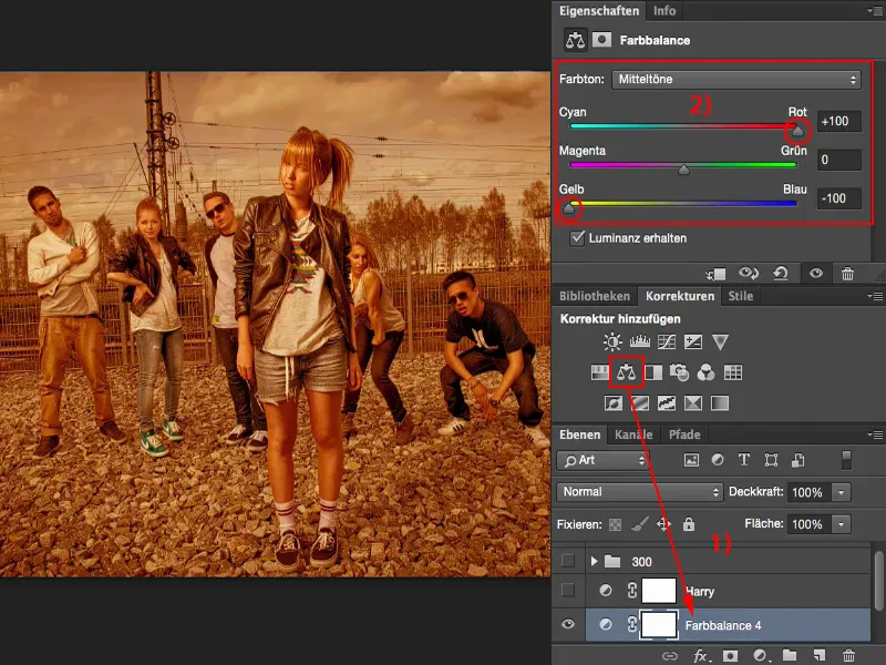
So I definitely need another adjustment layer, Tone Correction (1). I can now simply set it to Soft light mode (2). And then I realize: This actually looks quite cool.
If I now tinker a little with the tonal values (3) and darken the whole thing, then I've actually already achieved this film look with two simple adjustment layers: The color balance takes care of the colorfulness, the tone correction in soft light mode takes care of the contrast. I already have my 300 look on my picture.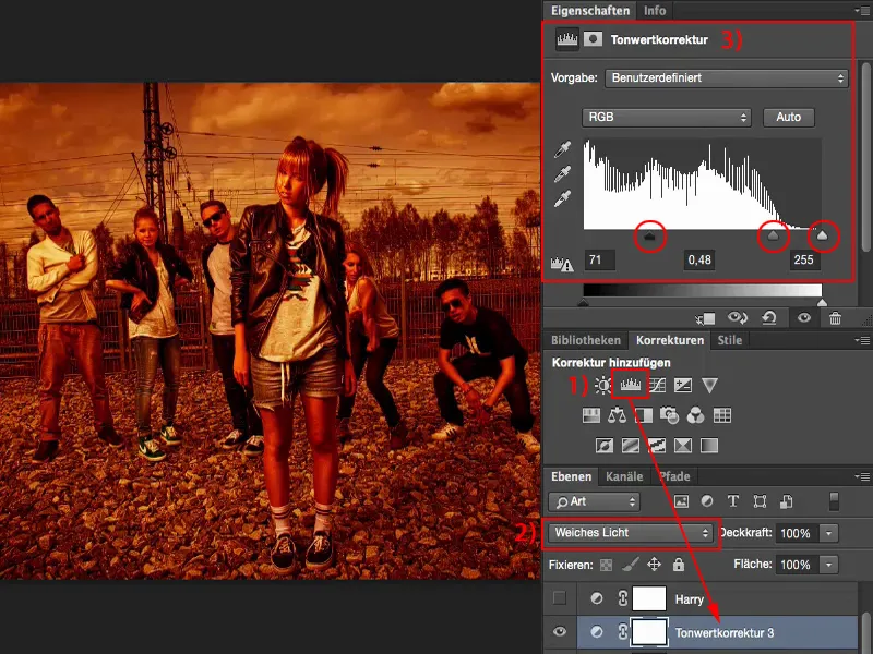
And if you take a look at the relatively normally photographed original image and what you can conjure up from it with two adjustment layers, I'm amazed every time.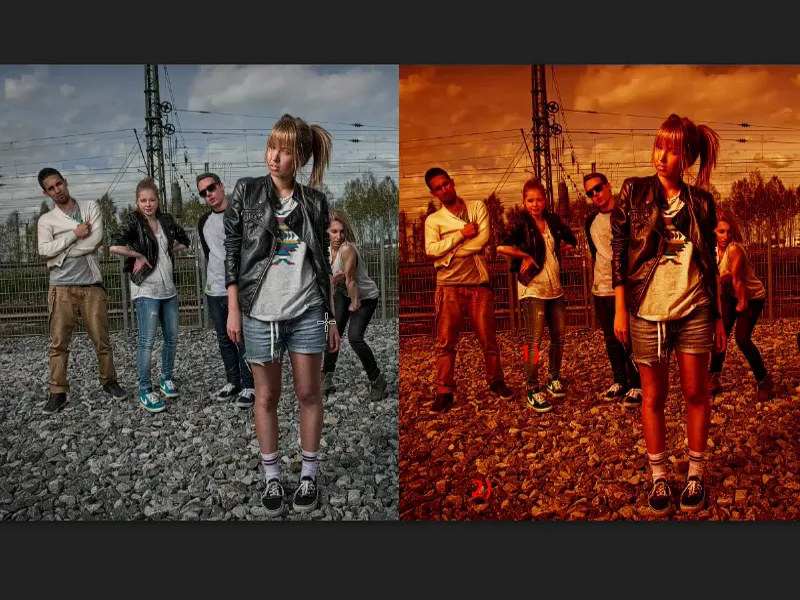
Creating a look: Color balance and tone correction 2
I'll take that back again. Next, I have Batman here. This is basically the 300 story in reverse. I need cold colors. So I go back to the color balance (1) and pull the sliders all the way to blue.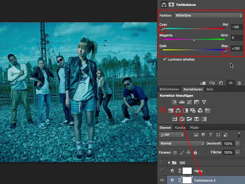
Again, I don't like the whole thing. So I make another tonal value correction (1) and try to optimize my contrasts. The highlights a little higher (2). Now I have the problem that this could almost be a night shot, but of course there is also warm skin color in this film look.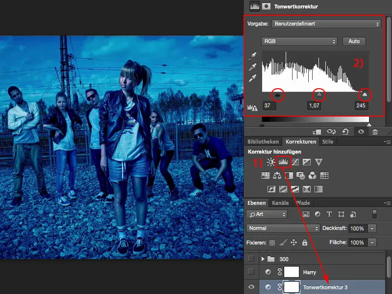
So I simply create another color balance layerand add a bit of warmth to the image. A little more red, and ...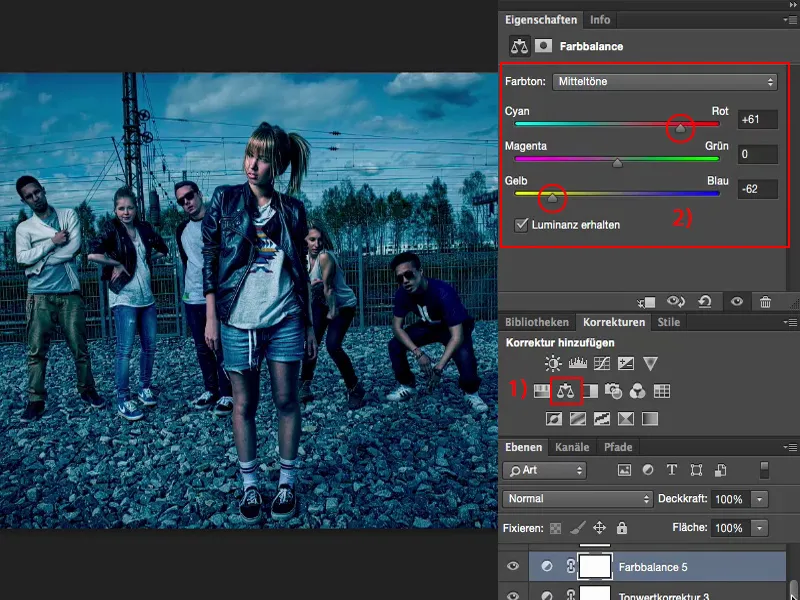
... because I have worked non-destructively with adjustment layers, I can go back to the color balance (1) at any time and reduce the opacity a little. Around 80 % (2). I've created this Batman look, this dark look, with high contrasts, which produces very cold colors here.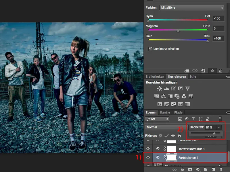
So take a close look at a movie like this: What actually happens with the colors and how do these colors work? Why did the director choose this particular color look? Because it embodies the mood of the whole movie a little bit, and this mood is the purpose of applying such a movie look to your photo.