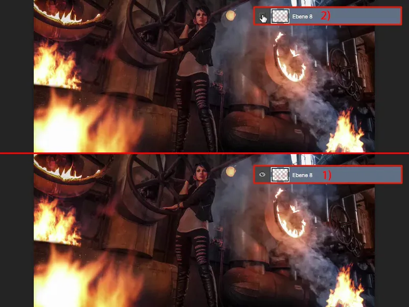
If you want to play with fire in Photoshop, there's nothing easier than that if you use the right source material. And there's a little rule for that, which I'll explain in a moment.
A quick look at the original image: We photographed this at the Maxhütte steelworks location and used burning paste. And if you take a look at the real fire in the photo - it definitely casts a glow on the surroundings and you have to keep that in mind when the real fire is mounted.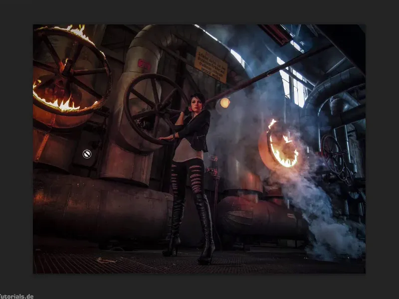
All you need is the right source material. It usually looks like this. Whenever I see a St. Martin's fire, for example, or we're outside having a barbecue and the Kohler throws a few more flames into the air, I photograph it. And I expose it so that everything around it goes black. That's how all my fire photos actually look. I have flames here that flicker in different ways, so I can take 50 photos within a minute and again I have endless fire textures.
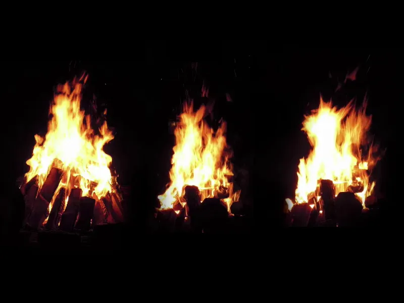
The whole thing works brilliantly in this mode if you use the layer mode. I simply cut out the flames, don't save the whole thing and go to my PSD here. Now I just have to insert the fire, transform it and make it the right size. And back here we had one of those, I don't know what it's called, a smoke torch, but it certainly smoked a lot here and I can put this campfire on top of this smoke, where you can still see the logs quite clearly at the bottom.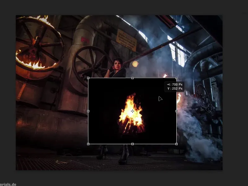
I actually only have to make use of one layer mode and that is negative multiply. Because everything that is black or dark in this image is completely masked out with Multiply Negative. I position the whole thing and confirm it with the Enter key.
And you see, no matter what else you want to do here to incorporate the fire better - that's actually it. You have the logs, which burn exactly where the smoke rises - black is completely faded out. You don't have any unsightly edges here either, because the black is still a bit below in the wood and at the edges of the fire and that's all taken out. So you've positioned the first fire at the back here.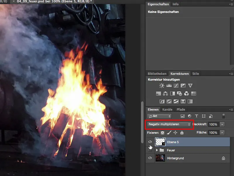
Then the second fire from the second picture - I'm thinking, do I take this or that? I'm going to go for this story here. Ctrl + A, Ctrl + X, Ctrl + W, close the document, don't save.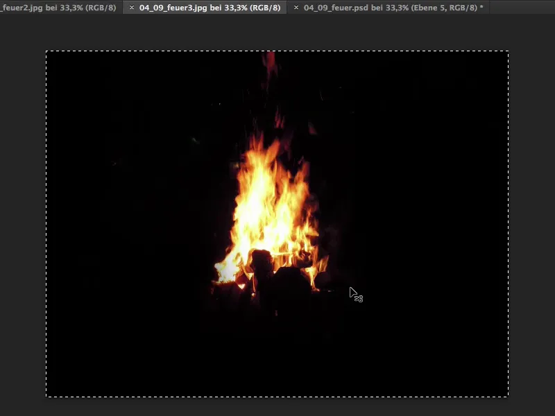
I go back again, say here: Please insert, transform freely, multiply negative and drag the fire to where I want it to be. Here I can imagine quite well that it looks as if the fire is sitting on top of the pipe.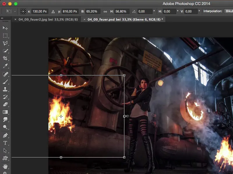
I zoom in a little closer. Then I have this line here and I can use it as a guide. I'll place it so that you can no longer see the logs down here, grab a mask (1), a brush (2), 100% opacity (3) and just try to continue this edge (4). Then I brush away the fire at the bottom here.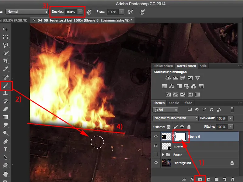
Now the edge is still a little soft, so I go up a little with the hardness and just brush over it again a little and the whole thing looks as if the fire is flaring out from behind this pipe. This is the second fire I've added here. Of course, it fits perfectly here too, because this glow of light can be found again.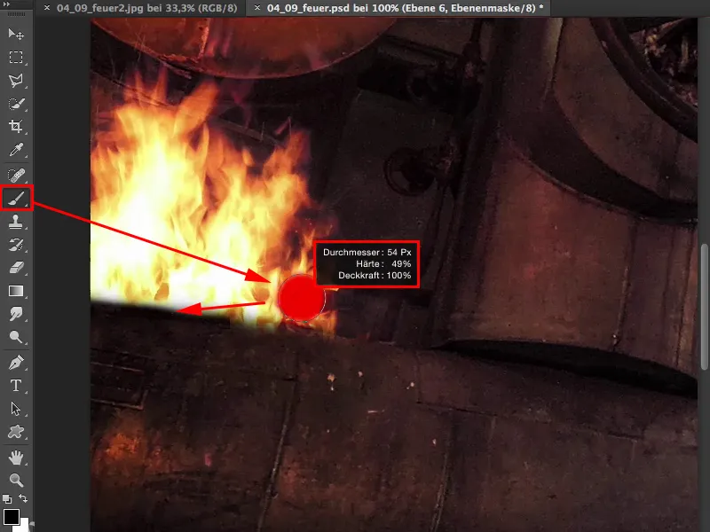
Now I've prepared another texture here, which I'll also cut out again and insert using Ctrl + T, positioning the whole thing using Multiply Negative. And now I'd like to have this in the foreground and make it really, really big, because I'm going to blur it a bit later. I want it to look like it's shooting out of the corner at the very, very front.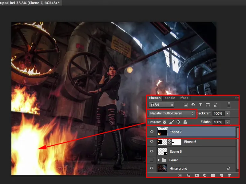
I could also turn it into a smart object now. For the sake of simplicity, I'll do it here with the Gaussian blur. That's probably too much, but something like 7 pixels, that looks quite cool.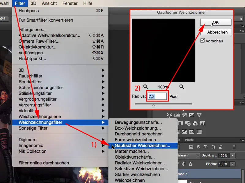
So now I've added three flames here in a matter of minutes. It looks really cool. I don't think it's even recognizable as a photomontage because the whole picture is absolutely coherent.
The only thing I'm still missing a bit is a bit of orange lightspill on the model and the surroundings. To do this, I create an empty layer (1), take my color filter and go to this fire layer. Holding down the Alt key in the brush, I use the pipette to get this orange tone (2). Of course, I don't want to paint over the whole thing now, so I'll go back to 20% to 30% (3) and show you what it looks like when I brush over it now (4).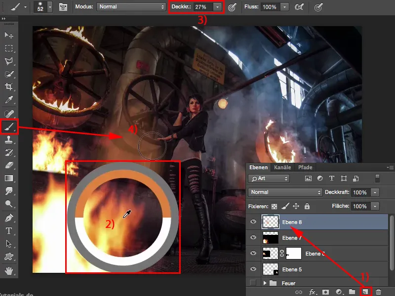
Everyone can see immediately that this was simply painted with color (4). Let me go back.
But I can use the layer mode and I'll set it to color here. And now I can paint this glow of fire in the picture.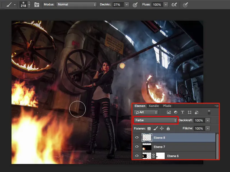
I might go down a bit with the brightness and also go more into the red. I think it will be even more harmonious that way.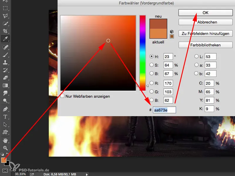
I'll also reduce the force of the brush a little (1). Less really is more here. And then I also go a little over the left half of the model, down on the floor, I can also intensify the smoke a little. So now I'm painting my way through the picture and you can see at the back right, for example, where it's all so blue, I can also go over there with this color tone. Who can tell me that the next fire isn't burning back here? And I can suggest all this to the viewer. This glow of light from the fire should also continue at the top of the pipe, and I want to intensify it there too.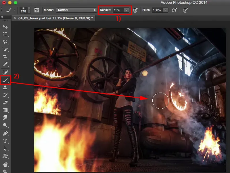
And if I fade this layer in (1) and out (2) alone, then I think you can see how much sense it suddenly makes to apply this hue, this glow of fire a little in the picture in color mode, because only this splash of color or this brightening of color in the picture makes the whole thing coherent when you play with fire.