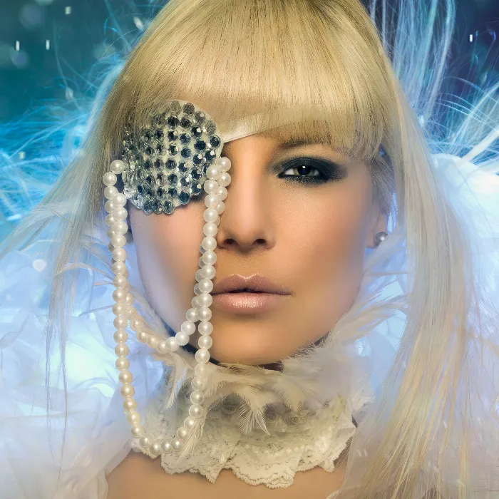
In this tutorial, I'll show you how this cross-look works. Here you have very diffuse colors in the shadows and also in the highlights. Somehow it all looks very strange, but also interesting..webp)
This is what the picture looks like before: Incidentally, this is a photomontage; I just grabbed a castle like this and added this live role-player here and worked a bit more with the grass brush at the front to make it a bit denser.
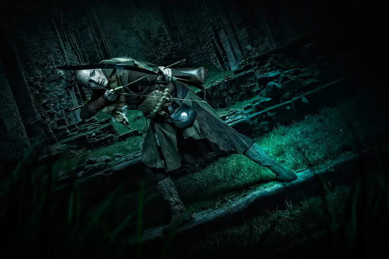
Yes, and then I thought about it: This looks really cool, top-lit here in the face, it's such a nice spot where she's standing on this stone step, I like that, and then I thought about it: What else can I try out here? And then I took a look at these cross-looks. And now I'll show you how it all works.
Step 1
Go to the background layer (1) and then grab the gradation curves (2). I'll close the window here so that we have a bit more space and pull this down a bit. This is what the whole thing looks like. By default, you make light and dark here by dragging the curve to certain values. You have deposited the histogram here and you can see that the image consists mainly of shadows (3), there are very few mids (4) and almost no highlights (5). We only have highlights on the shiny areas on the bag, on the quiver (6) at the back here and on the face. Otherwise, the image is quite dark. This is shown by the histogram, which is nicely highlighted in the gradation curves. This is quite practical.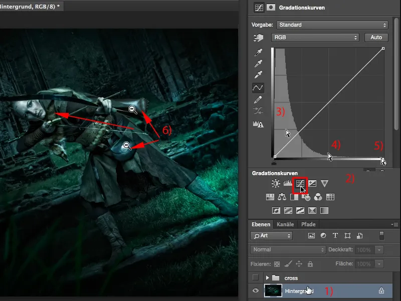
Step 2
Yes, and by default the whole thing is set to RGB (1) at the top. And if you click on it, you can see the individual color channels: Red, green, blue, RGB together. This is now checked.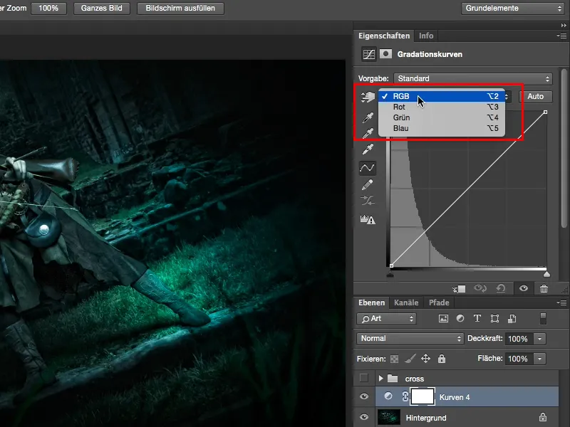
Step 3
Let's first go to the red channel(1). Now you can see the red color component of the image, which is relatively low, and if it is, then something happens here in the depths (2), everywhere else nothing happens. You now also have a red line (3), which symbolizes the red channel. That's logical, right?
Then you can use these two handles (4+5). Don't bend around in the middle, that gives the funniest colors you can imagine ...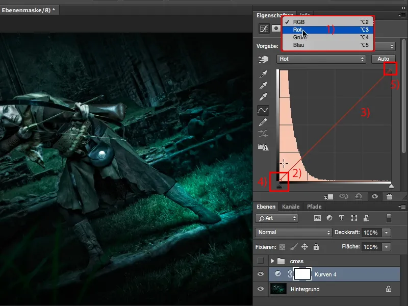
Step 4
... and see what happens when you pull this upwards (1). Your depths are colored red and become lighter (2).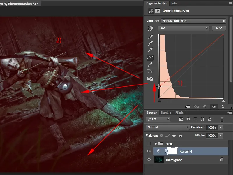
Step 5
Of course, the higher I go here, the more saturated, the brighter, the brighter I get the red (1). It doesn't look quite so great like this, so back off a little (2) and then you can give your shadows a touch of Instagram red.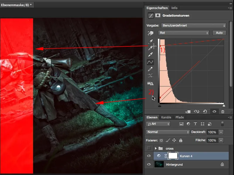
I think that alone looks super cool.
Step 6
In the depths, I can also see what happens when I pull down here. Aha, my lights turn greenish-bluish. It looks quite mystical, I think it looks very good on the picture.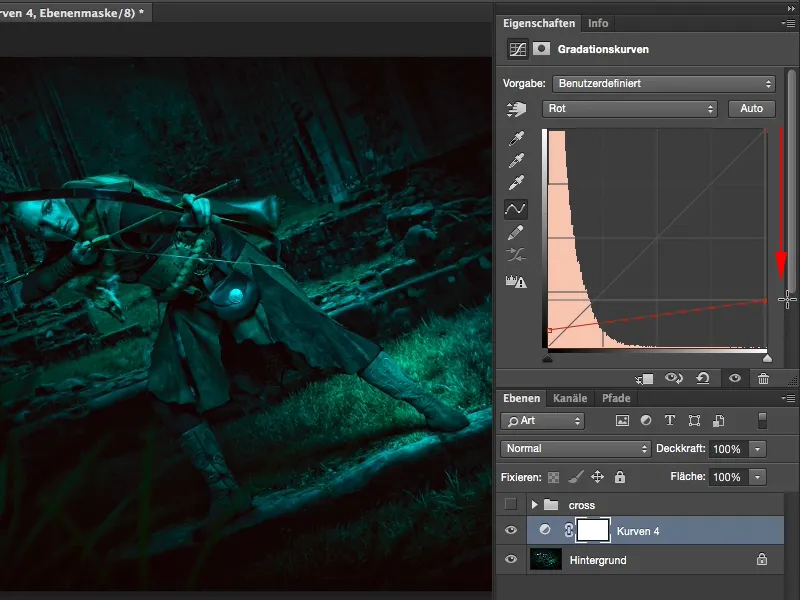
Step 7
And if I drag it over to the left, everything in the picture that has a pattern is colored bright red. That doesn't look so good any more...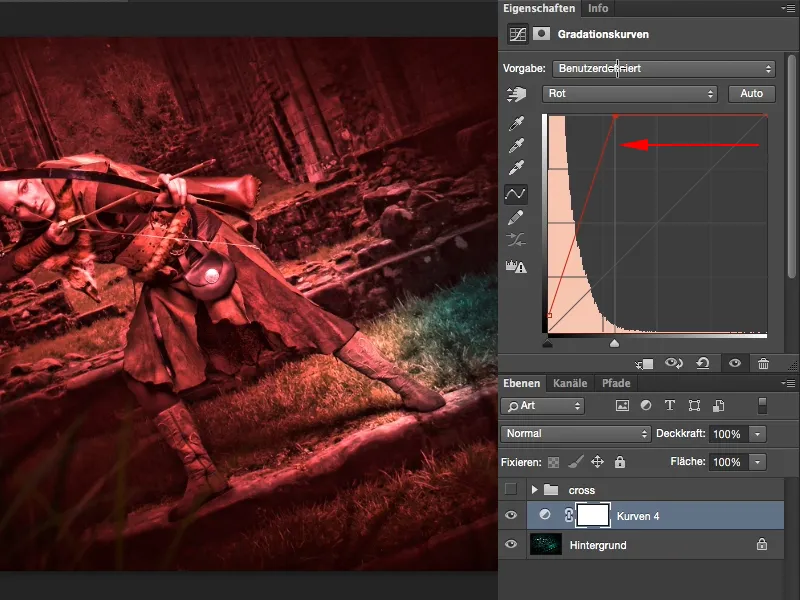
Step 8
... so I'm going to go back down here, but if I make it look a bit mystical (1), I quite like it. And the name "cross-look" comes from the fact that you practically cross the colors. If you think about this line, the starting line, and then look at this new line, you get a little cross with a very shallow angle (2). Hence the name cross look. I cross the colors here.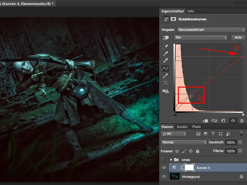
Step 9
Then I take a look at the next channel (1). What can I do there?
But I don't want to have the whole thing on a single adjustment layer (2), because I might make three, four, five gradation curves with different color looks, and I want to be flexible.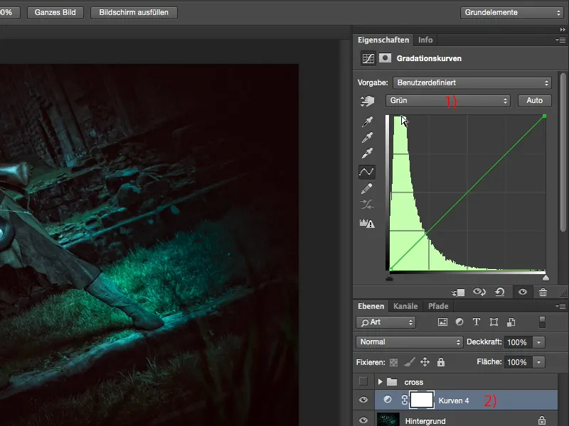
Step 10
So, what do you do? You simply go back to the corrections (I have to show this again here via Window>Corrections; the palette was hidden, otherwise it's always a bit too small up there in the video).
And then I create a new gradation curve (1). This is attached here at the bottom (2). I can now also label it "Red", "Green", "Blue", if you like. Then I'll hide the whole thing here again so that we have a better overview, ....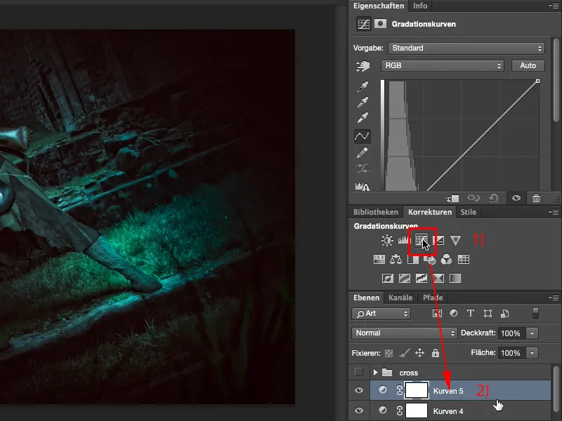
Step 11
... and go to the next channel, the green channel(1). It looks similar, with the depths shifted a bit more to the right (2), I also have green in the image here, so it's a bit more in the middle. And then I do the same thing again, I pull up here, add green to the depths. That looks cool, but in this case it's a bit too much for me, so I just add a little touch (3). This is generally a principle in which you change very little, but in such a way that it is visible in the picture. You create a look that is concise, memorable and fun.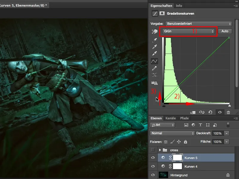
If it were so exaggerated, everyone would say to you, yes, you've done a lot of tweaking in Photoshop because it just doesn't look good.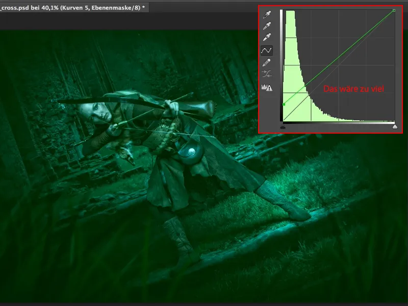
Step 12
So here's just a touch (1), and let's see again what happens to the lights over here. If I darken them, it turns purple (2), which also looks quite cool, but I still have a blue spot here (3), which doesn't really suit me...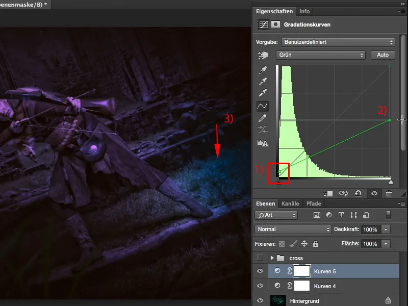
Step 13
... so I pull the lights a little in this direction.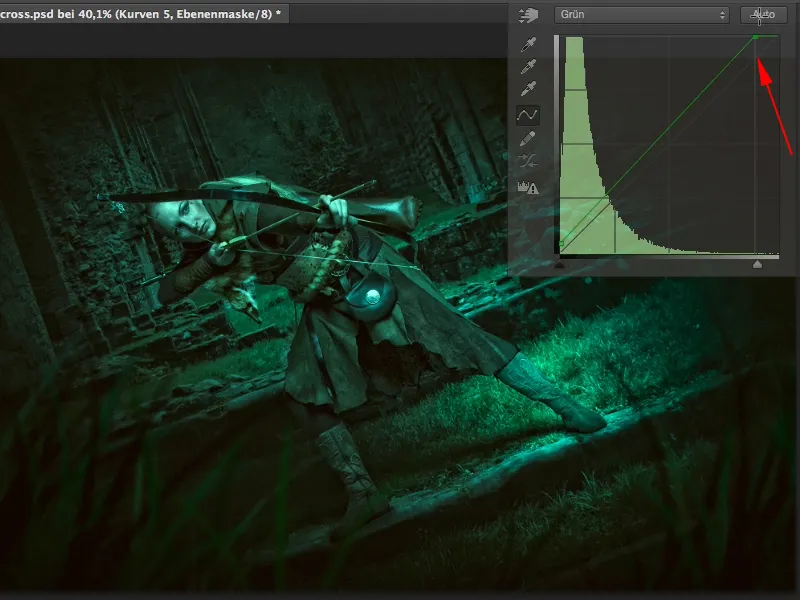
Step 14
Then I show my corrections fieldhere again, you probably have a bit more space on your monitor, for the video recording here it always has to be a bit smaller. Then I go back to my gradation curves (1), hide the tab again and then I can play around a bit in the blue channel. So RGB, blue (2), then let's see what's in the picture here (3). Aha, I get blue depths here (4), that looks mega cool, I think.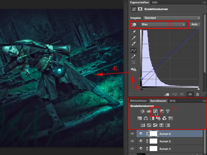
Step 15
If I drag to the right, I get green depths.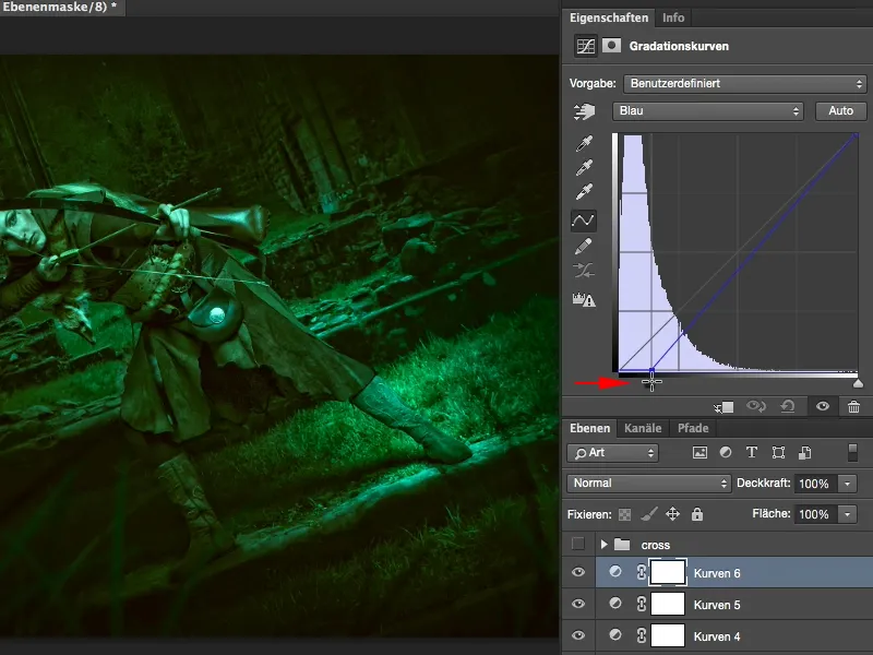
Well, that's not bad either ...
Step 16
... but I really like the blue (1). It all becomes so mystical, it's no longer clear where the color actually comes from. Yes, I'll have a look at the lights now too, so it's getting greener here (2).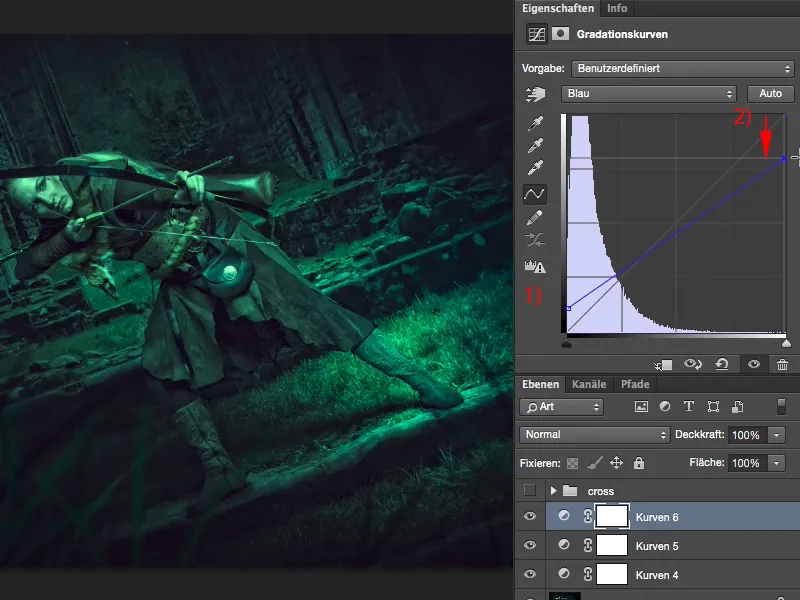
Step 17
And there it becomes a touch more bluish (1). That's the last touch the picture needs, because now she has a ghostly pale face (2), which fits this scene, it could be from Lord of the Rings, at least that's how I imagined it when I took the picture. Yes, and you see, it's very easy with this cross-look.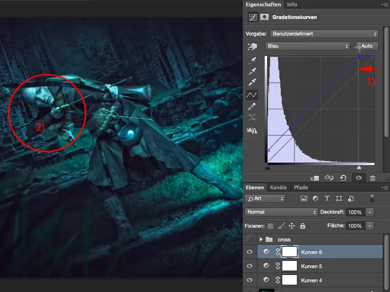
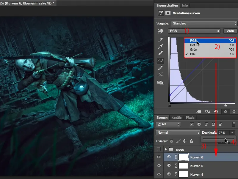
All you have to do is go to RGB here (1) and select the individual channels (2). You can do this on a single gradation curve, but I always recommend that you make different gradation curves (3), because now you are able to mix the individual curves freely. At the beginning you often tend to overdo it a bit, but you now have 100% opacity on each layer and I always recommend that you reduce it to 70-80% (4). I still do that today, because then the effect is built into the picture so subtly that everyone says, yes, OK, you've done something to the colors, but I can't really figure it out. That's always my aim, to confuse the viewer a little: yes, that's fun, and so this very simple cross-look is also fun.