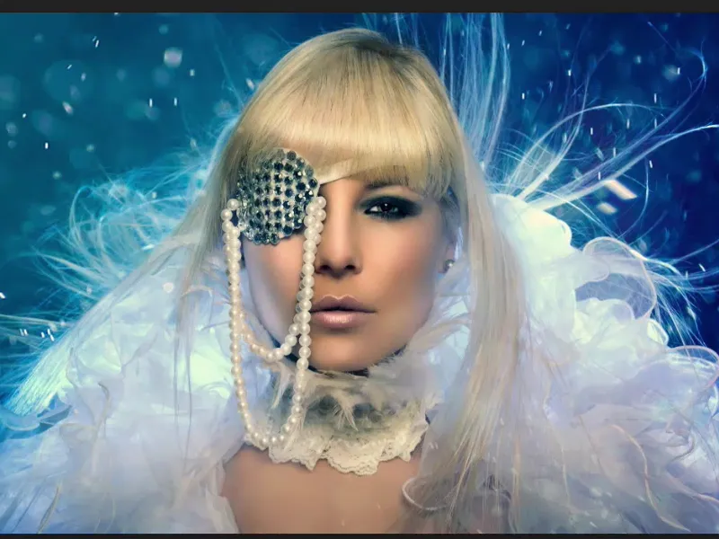
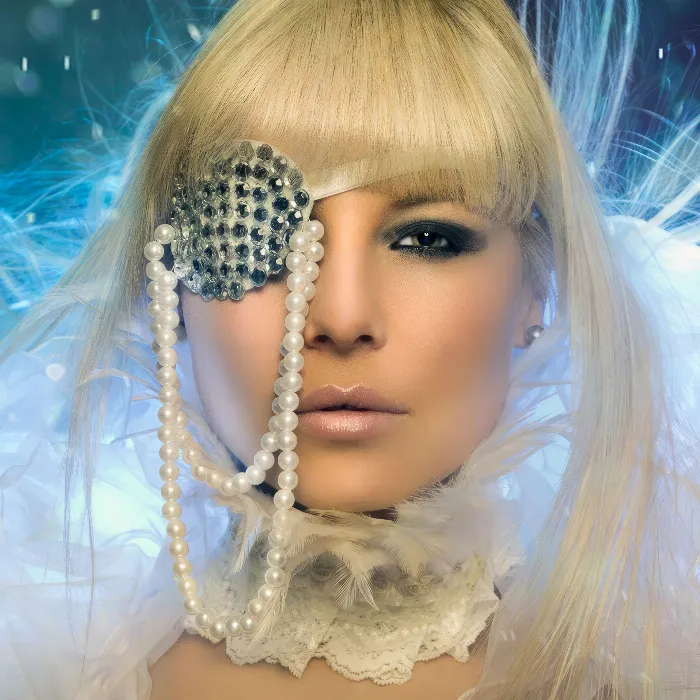
This tutorial is all about the final polish of a picture. What can I do at the end to tease the last five or ten percent out of an image? What do I do? I'll show you what my final polish looks like on this picture: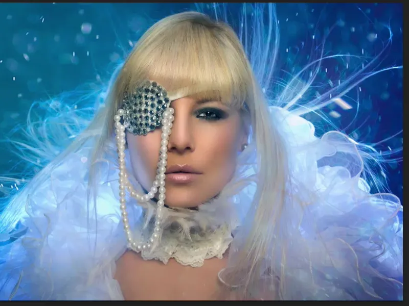
The picture is retouched, it has a perfect skin structure.
If you look at it at 100, 200 percent - it's not blurred, it's processed with frequency separation. All the wrinkles around the eyes are there. It's just as perfect as possible and really done with a long working time.
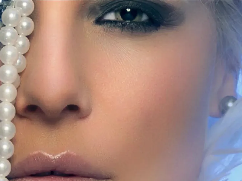
This is what it looks like at the end: I've added little particles like this, I've adjusted the colors, I've done dodge & burn, I've lightened, darkened, I've added lip gloss, I've maybe also made the nose smaller, put the eye a little higher, added hair and, and, and ... so I've tried to work as perfectly as possible.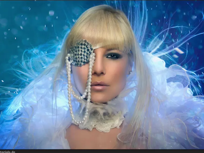
And the finishing touches aren't just about getting the best out of it - for me, it's also about checking for mistakes. I look at the picture again a day or two later after I've finished it, and if it's a free work, like this picture here, then I just leave it lying around if the client doesn't want it the next day or the same day, and then I look at it again at my leisure. If I have worked non-destructively, then I have the option of changing corrections in the layer stack very quickly.
If I only have a background copy or a JPG, as in this case (1), then I simply have to take a look: What can I still get out of it and what can I finalize now?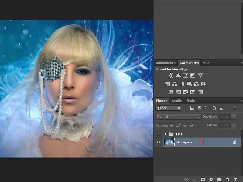
In color or in black and white?
The very first thing I always do when I look at a picture like this is to make a copy (1). I desaturate it via Shift + Command + U or via Reduce image saturation and look at it in black and white, because I'm still thinking about posting the image in black and white somewhere, because I think it just has such a beautiful luminosity. And when I look at it a day or two later in black and white, I'm perhaps more sure than I was before whether I'll take it in black and white or in color.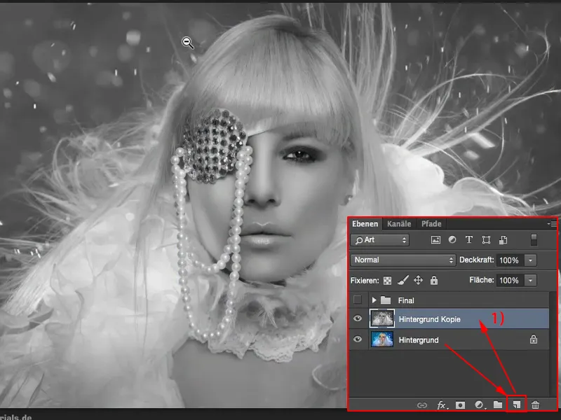
Editing contrast
I'll leave it at the color version for now. However, the next step I then take is to set the layer mode to Soft Light (1). And then I usually have an aha effect - that's how I should have done it with the contrasts, but I never thought of it here because I still like the picture, but somehow it pops a lot more this way.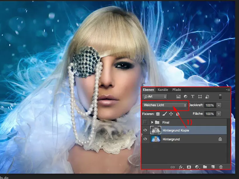
I might not add 100% opacity to the image, but perhaps only 40, 50, 60, 70% ... I always like that better - so 47%, layer copy black and white, contrast colors increased - I like it better than my original image. That's already two percent of the finishing touches.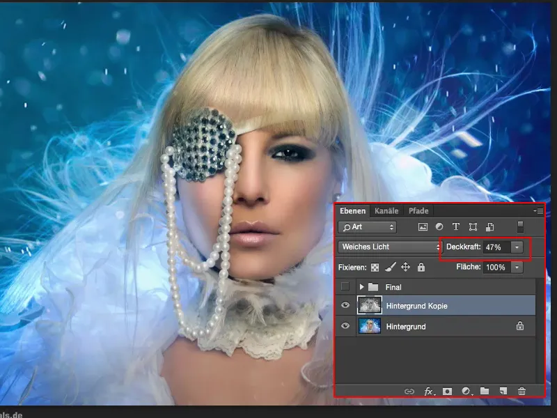
Adjusting the color tone
Then I take another look at the colors (1). Blue dominates here, the skin color, the blond hair and the white a little. So I look at the colors again and do some grading. See what happens if I add a slight blue touch here. I realize: Yes, the picture can take that.
Can it take more? So I step on the gas a little more (2). That also works well.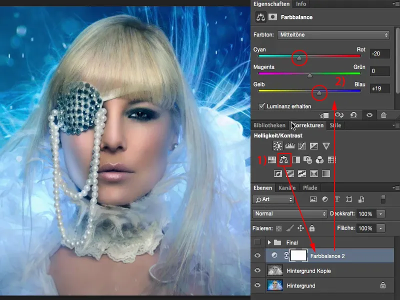
And what about warm colors? Yes, it doesn't look bad, but it's a completely different picture character now, because the skin color is so extremely intensified, and I have very different shades of blue here too. No.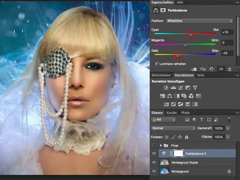
But cold colors, like 20%, before and after comparison - the picture can definitely handle that. It also makes the skin a little more matte and the blue glow really draws into the face on the left and right cheeks. It looks really good, that's what I want here.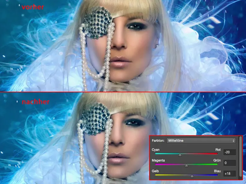
Correcting the tonal values
The next step is to take a look: What are my tonal values (1) actually doing here? And I realize: Aha, the histogram is already pretty torn up (2) from all my retouching work, it's not so ideal anymore, all these outliers here, these are tonal value tear-offs somewhere - I assume in the background or with all the blue stories. I have a mountain in the middle here (3). If I move the slider (4) to the right, it makes the whole picture much too dark. I definitely don't want that. I leave it like this (4).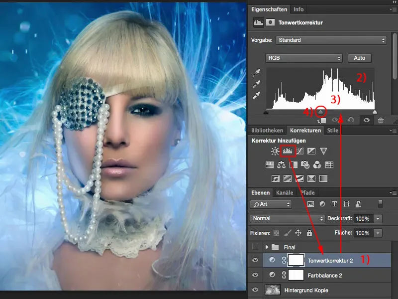
And the depths actually start here (1). If I move the slider (2) there, it doesn't look good either. The blue is already so bright that I don't like it. But I could do a little bit like this (2), couldn't I? Here too (3) - yes, I think it could be a little bit darker.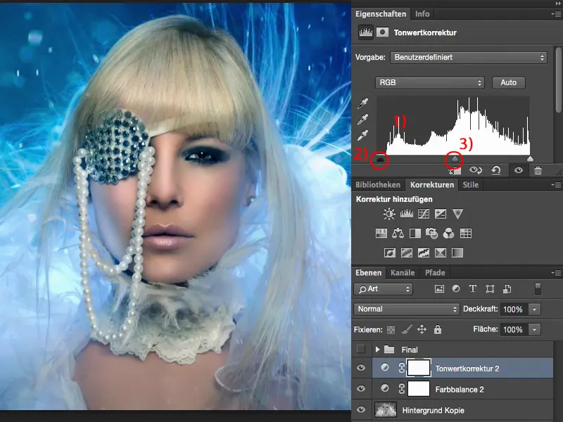
And the highlights, if I make them a bit brighter (1) ... I'm a bit worried about these areas (2) here if I ever want to print the picture, because it will probably all break off here, but on the monitor view, I'm sure of it: I've optimized the contrast a little bit more.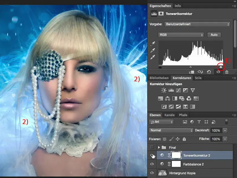
Troubleshooting
Then I go troubleshooting. To do this, I simply zoom in to 100% and look at the face: Have I missed any skin imperfections here? Do I have any hairs that I don't want? And I realize: Oh yes, I have one or two things here that I would like to have corrected.
For example, I have an eye wrinkle up here. I have a smudge here somehow. I don't know where it comes from, I've only saved the JPG - so I have to correct it.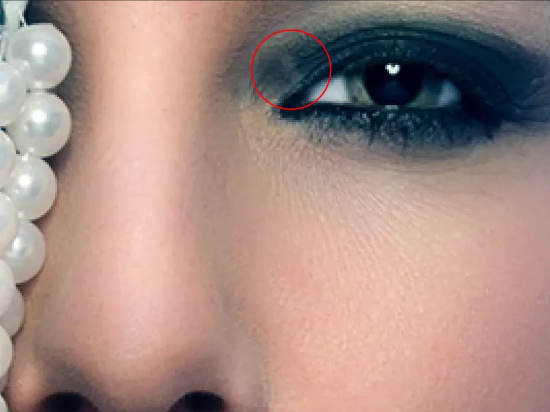
Empty layer (1). Then I'd better try it with the repair brush (2). This is selected. Current layer won't be of much use, so I'll check All layers (3) here. I'll make this very, very small and fizzy (4) and then try to get rid of this spot somehow. And I realize: No, that doesn't work. It's already much too small.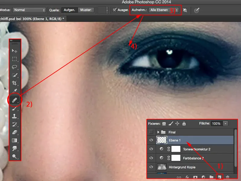
So I need the stamp (1). Normal mode (2), 30% opacity (3) sounds good. I make a soft edge (4) and try to even out the whole thing like this. I also stamp over it once or twice (5) and realize: Yes, this smudge has disappeared. Maybe here again from the side.
I know it looks super, super fussy, but this is my hammer picture - yes, this is my final check: before I throw it at the feet of the whole world, before I show it to the whole world, I want to have at least tickled out the maximum for myself personally. I don't care that no one will see this little spot later in the 100 percent view anyway.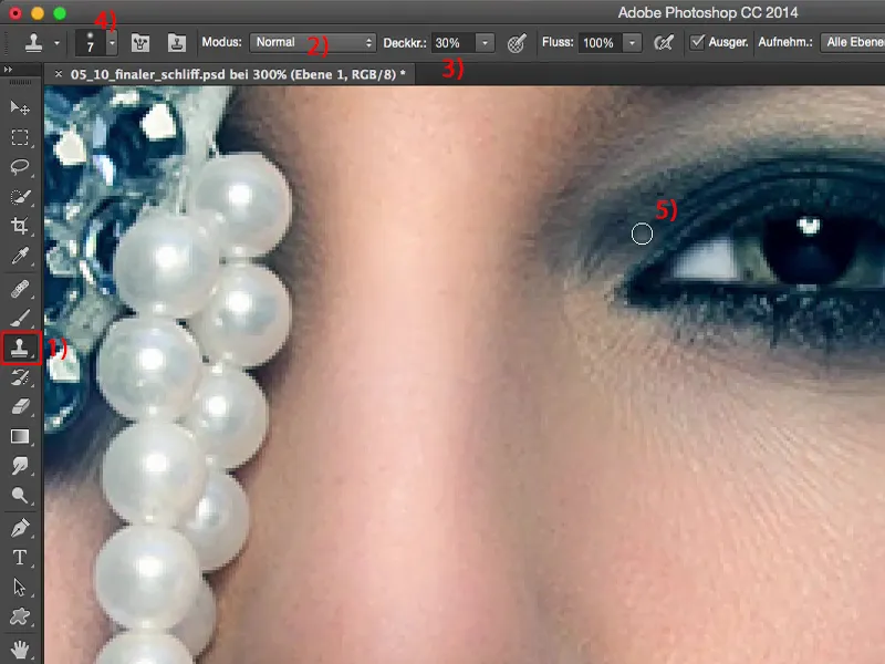
Then I realize: I would like this spot to be a little darker.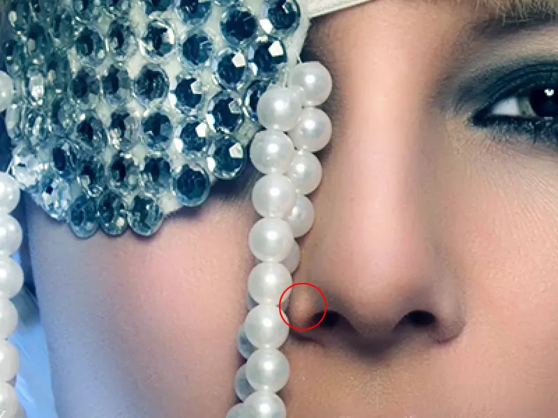
So empty layer (1). I grab a black brush, foreground color black (2), and set the layer mode to soft light (3), because then I can darken this spot very, very quickly. That was a bit too much of a good thing, with 100% opacity (4).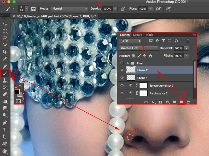
So of course I have to go way, way back with the brush strength here. And then I paint this hint away like this. And here too, the wing of the nose is a little too dominant for me, it can disappear.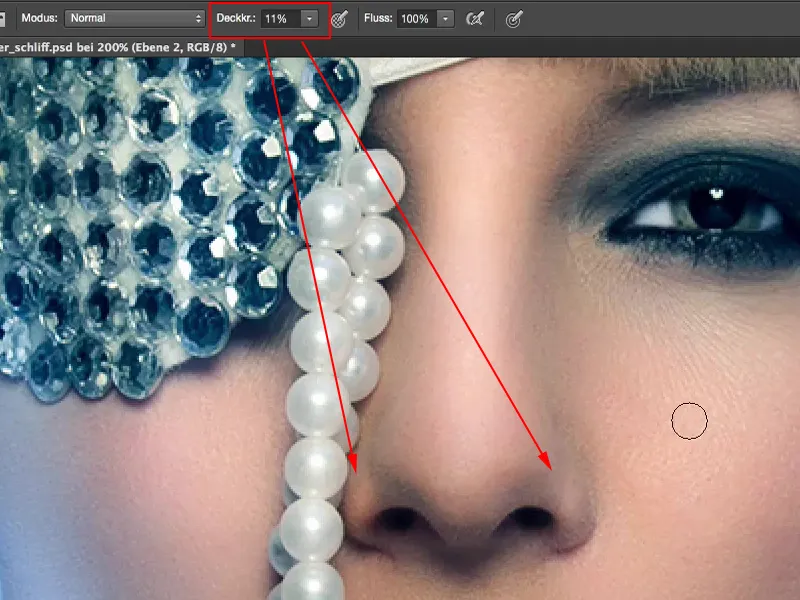
Then I look underneath here: I seem to have emphasized this heart with this shiny spot up there. I did that, maybe I forgot to finish it, but in any case I think to myself now in retrospect: if this were to run down a little further, it would probably look more harmonious.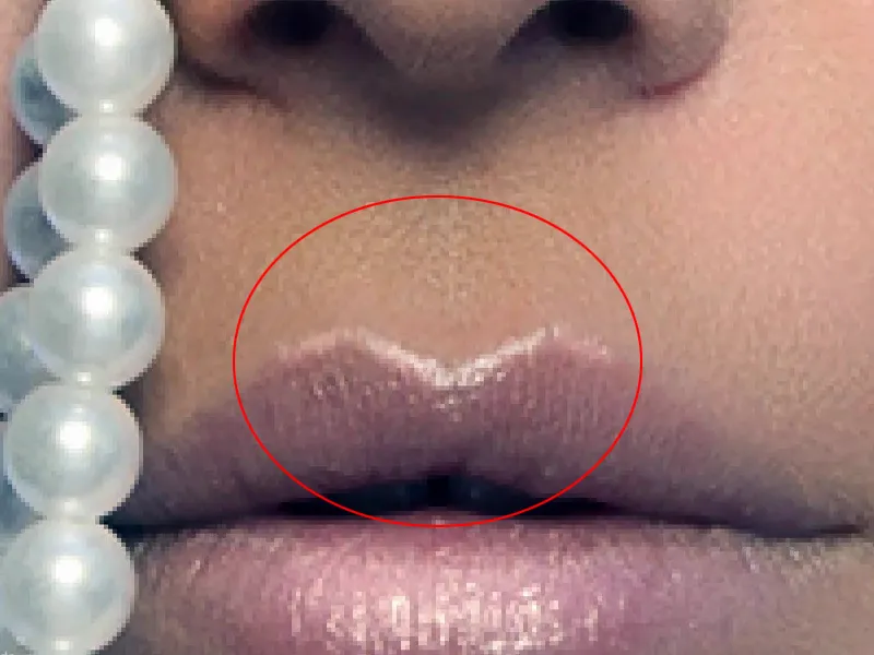
I'm already on the layer, Soft Light (1), so I'll make my brush (2) smaller and smaller here and I'll just give this glow a bit of a downward gradient. I also emphasize the whole thing on this side and let it run out very subtly. Here at the top I'm using a little more shine. Like this.
I'm already on the lips, so I can continue down here by simply drawing a kind of semi-circle and bringing out the lip gloss.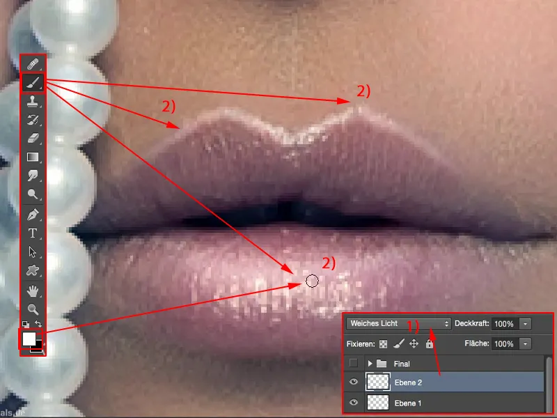
Then I have the pearl necklace: will anything happen if I go over it here? Let's see if we can conjure up a little more shine. Before and after ... Oh yes, there's a lot going on, that's cool, and I'm no longer actually at my last ten percent, but I think I'm almost afraid that this will become a big part of the picture, that I'll just brush something on here again.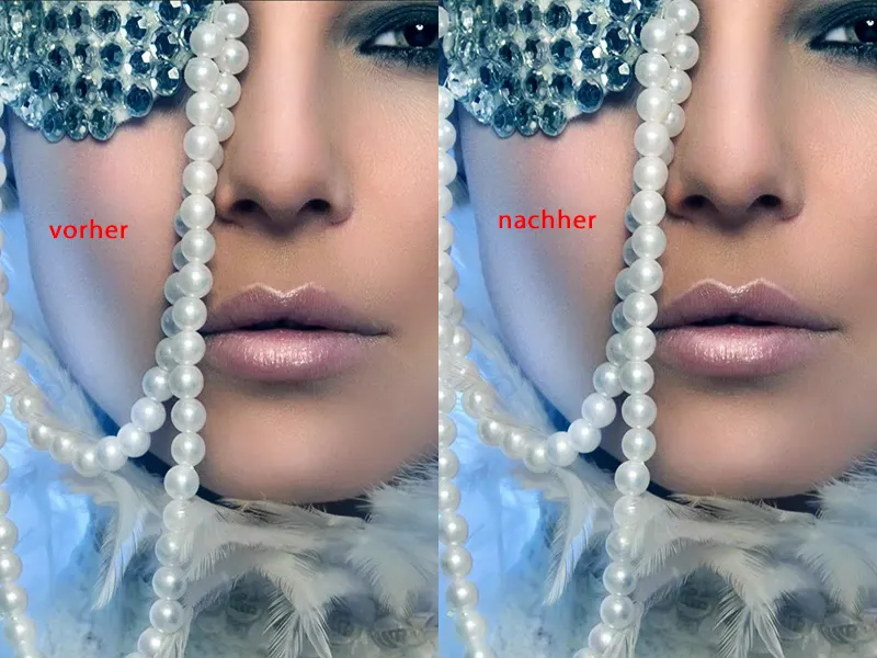
I also notice that this could be a little brighter here compared to the neighboring ruffles (1). And it's a bit flat here, I'll have to have a look: Do I have a breast line here? No, I don't, it's too far out of the picture, but if I lighten it up a bit here (2), I suggest that it gets darker towards the bottom. That looks cool. This area at the back here (3) can also be adjusted a little in terms of brightness so that it runs so smoothly.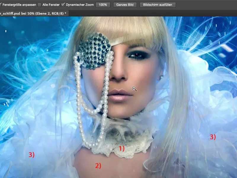
As you can see, a lot can still happen on this last round, on these last layers, but you can't see that at the beginning. You will finish your picture, you will want to publish it on the Internet as quickly as possible so that you can show it to people. And this level alone has already changed a lot. Especially the thing on my lips, that fits in really well here now. If I hide that, it looks completely unfinished. And I also like the fact that the sides of the nose have been darkened a bit.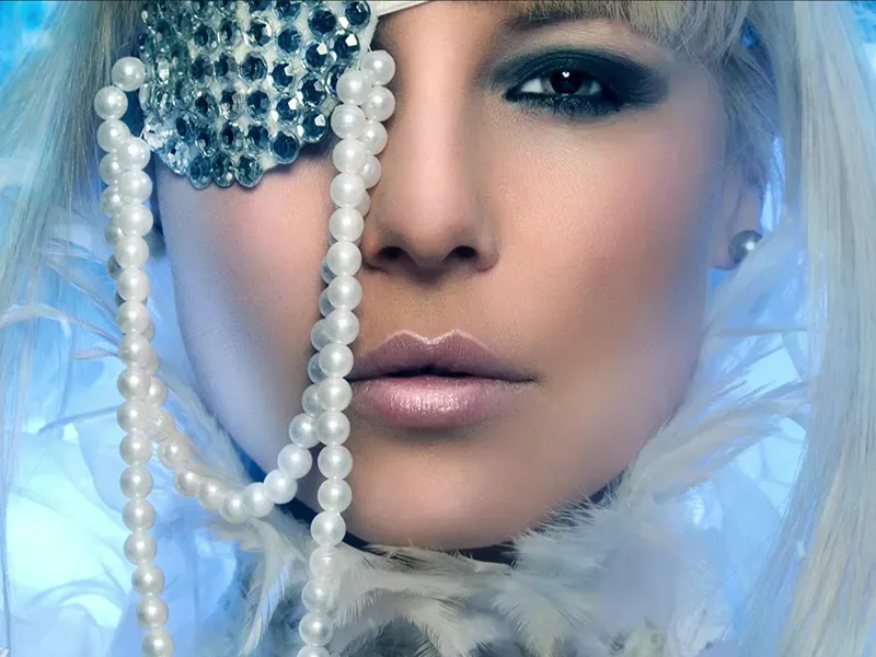
Maybe I'll go a bit further out here with the shiny part, redo it a bit and pull it back, because I think this fringe is kind of cool. I'm leaving the hairline like this at the back. It's okay that there's no more light, it fits like this.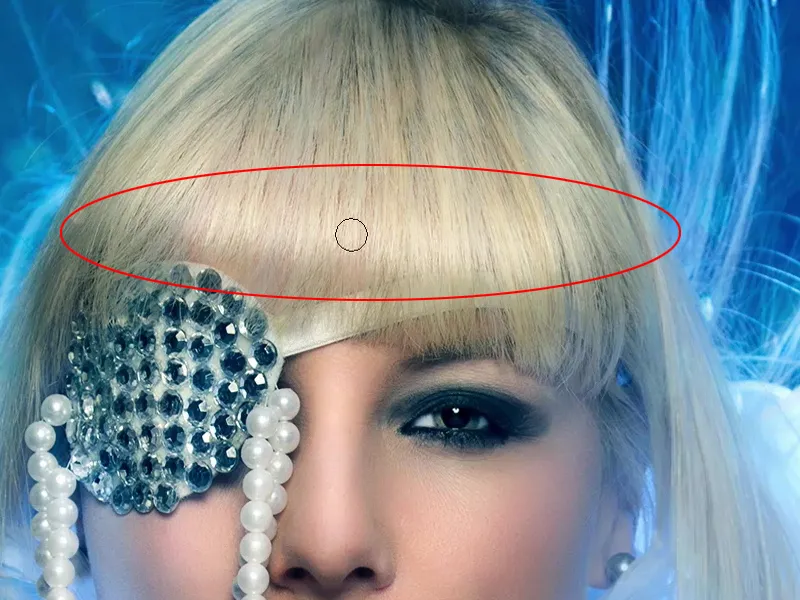
Yes, and now I've been working here for two or three minutes - let's see what the before and after looks like. A lot has happened in the picture. The highlight in the hair looks really nice, the little heart on the lips - yes, yes - I like that a lot better. The contrast is of course extremely enhanced. Now I could try working with different looks.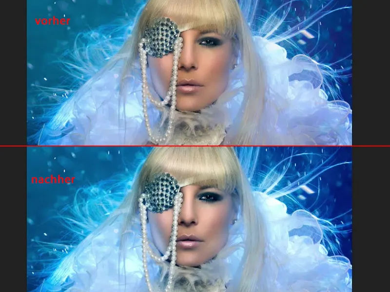
Selective color correction
Then I'll just go to Selective Color Correction (1) and take a look: What is actually happening in the black tones(2)? Do I still have some room here, do I want to color the shadows separately? I pull up something like this (3) and realize: Well, it's not such a hit. Or maybe I should put it the other way around? - It doesn't really do much either. Well, the black here on the eye (4) is turning really blue, but it doesn't look good. And in the opposite direction, it turns green, it turns red. I don't have much black in here at all, except in these two or three places here. So nothing will happen there, I'll leave it alone.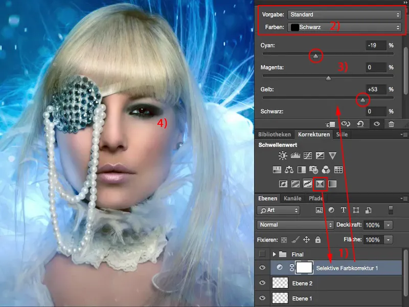
And what about the gray values (1)? That's similar to the color balance, except that it was designed for CMYK, for cyan, magenta, yellow and black (2). And I'll have a look at that too ... well, I could boost the blue again, but I've already boosted it with the color balance below. I'll leave it alone for now. Or do I want it a little warmer after all? It's not quite as much as I had before with the color balance, and I'm thinking about giving the skin color back a little more naturalness. No. I'm the cool type in this case, I'll leave it, I'll throw this selective color correction out here again.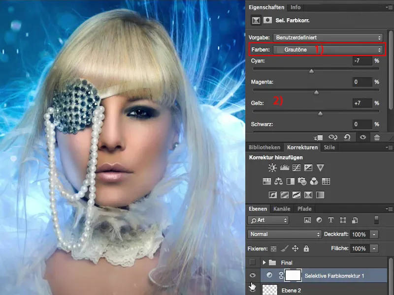
Gradient conversion
Then I usually like to look at the gradient conversion (1) and set it to soft light mode (2). This naturally takes out the contrasts.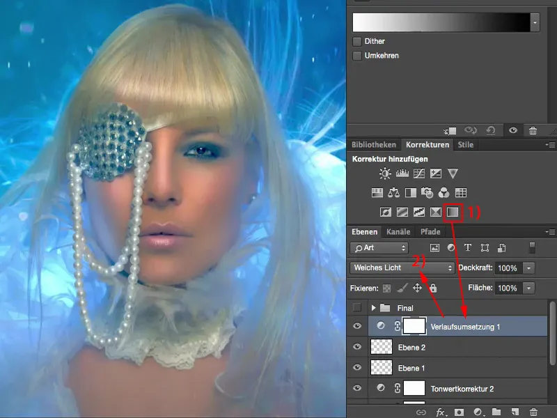
Conversely (1), it blows the contrasts out of proportion.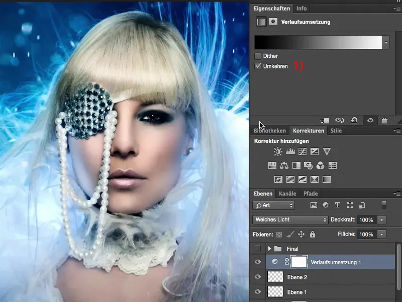
That's too much for me, but I'll go to this area (1) and have a look at the pastel tones. I'll try to find something like yellow/cyan, that could be quite cool somehow.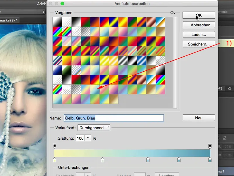
What if I turn it around? No, not that either.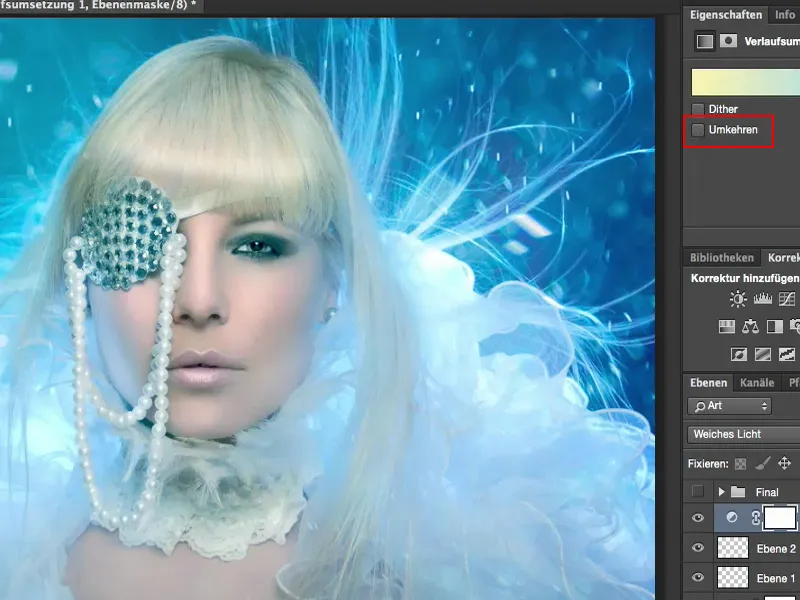
Let's see what happens if I use a dark blue here.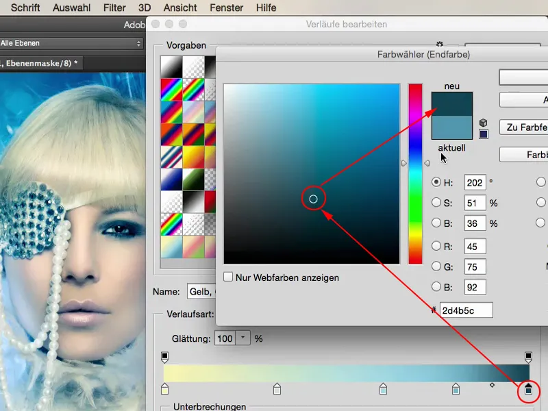
And a little down with the brightness here too ...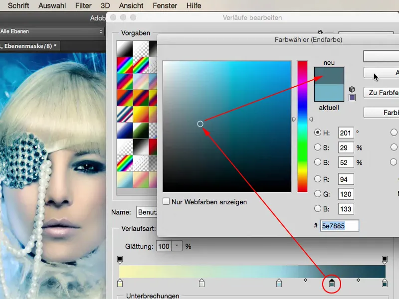
In principle, I'm leaving the gradient as it is, I'm actually just taking it down a shade for all the stops here, because I've just realized that it doesn't work for me, for my purposes.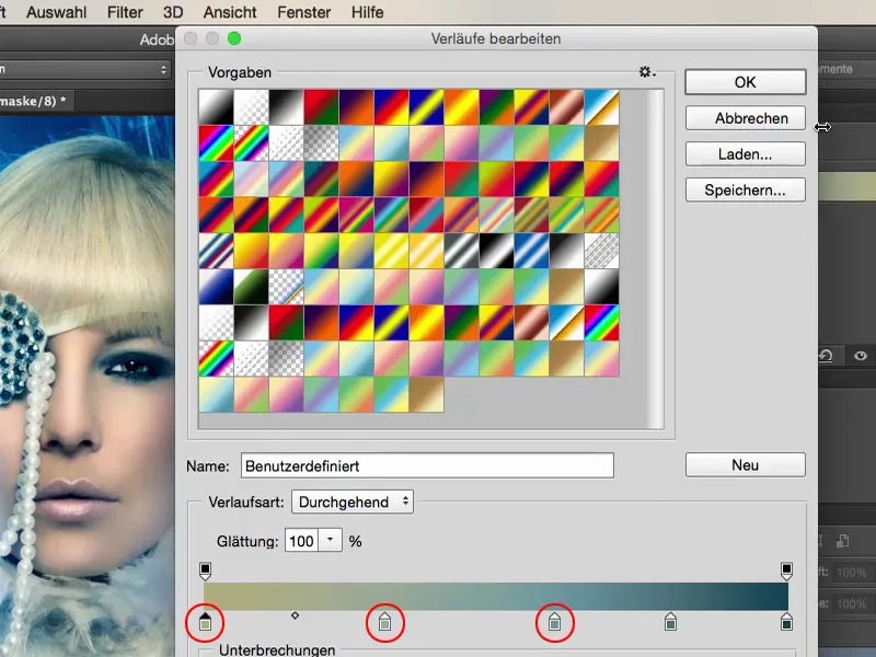
But this way, I'm sure it adds a light, warm touch to the picture, and I decide to add another 20, 30, 37% here ... Yes, it's a touch of color that nobody knows where it comes from, and that's what I love about this final touch, that I just tinker around until something comes out where everyone says: "You've probably been at it forever. It looks really cool, but I have no idea how you generated this one look."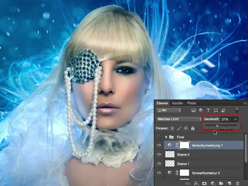
That's because there are already so many different looks here, 10% here, 20% here, 37% here - yes, and it's no longer clear what's actually happening here. That's also a bit of my goal: I want to generate something that is my image - that has recognition value. And the more I find about my look here, the more you'll see that you really do develop a completely unique workflow. Forget the skin texture, forget that you've painted any little hairs here and so on. These are the mechanical techniques that you need to change parts of the image, but to really finalize the look, the color grading, the style of an image, that's the great art.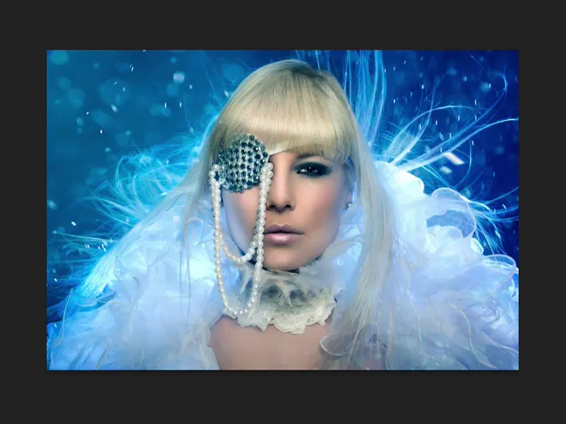
And believe it or not: I often sit on this look much, much longer than I needed for the whole picture when retouching, because the frequency separation, incorporating these flares and the first color, that's all done very quickly - or adding a strand and so on, but the final look, the final polish, that's where I sometimes sit at least as long, if not a little longer, because somehow I'm never really satisfied and I always want to develop myself further, I'm always looking for new ideas, what else could be combined here. And the possibilities in Photoshop are, unfortunately or thankfully, almost unlimited.
Color look-ups
I can take the game even further, even further. I can activate these color look-ups. I always like to check out this EdgyAmber.3DL. 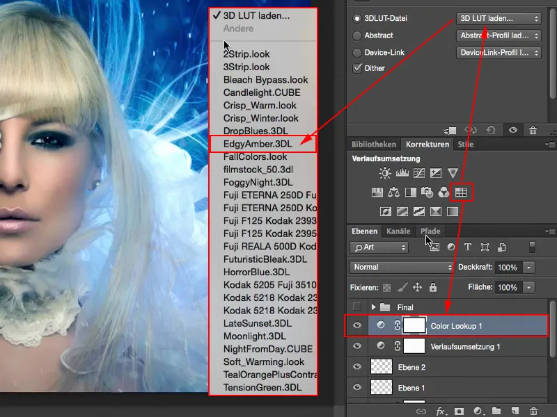
It's like "300" in one click, it always looks cool, but of course it's way too much.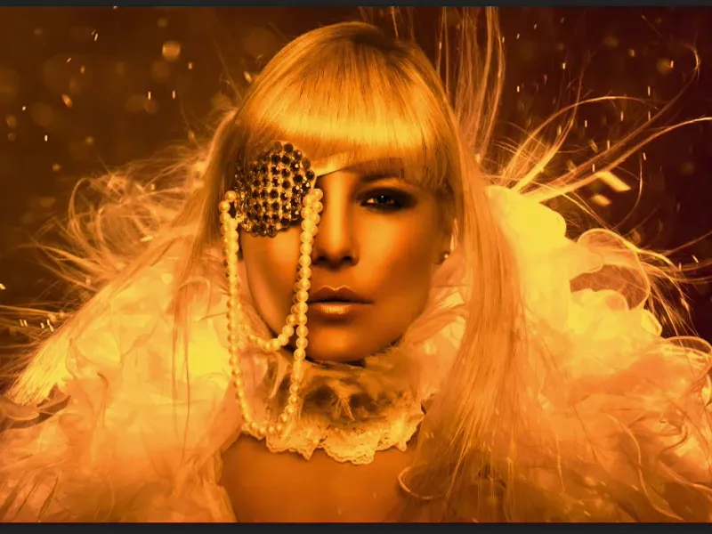
If I want to change the color here, I set the mode to Color, but I realize that no, there's so much tearing off in the highlights that it's no longer good.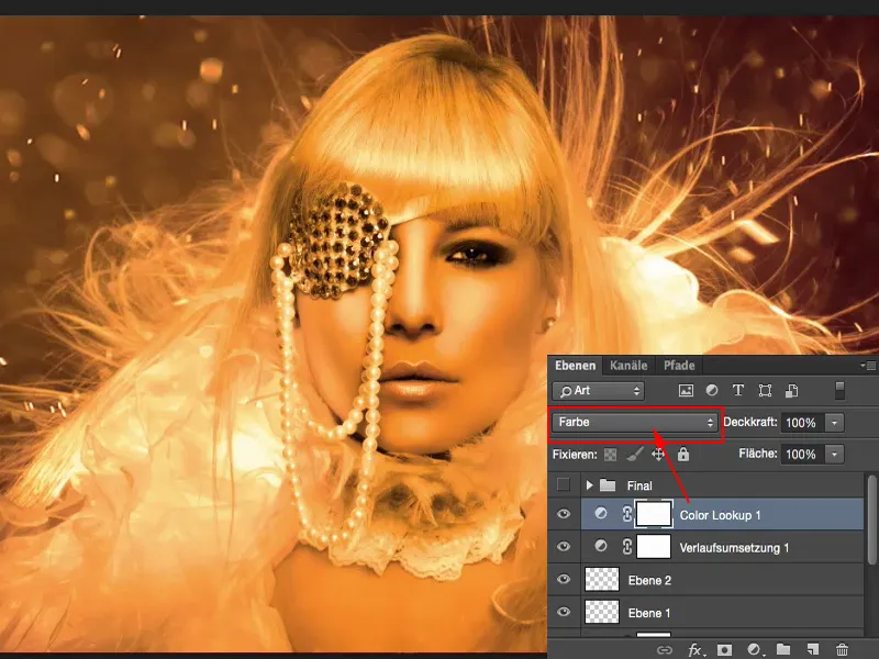
Soft light increases the contrast. No.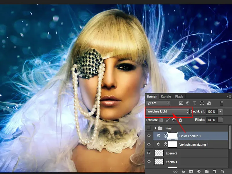
The more often you work with these layer modes, the more you actually know before you click what it's going to look like, namely not good in this case, but you click on it anyway because you're hoping: "Well, maybe there's something in there that makes me say: Yes, the picture still needs that." But somehow I'm not satisfied here. Then I reduce the opacity and think to myself: "Somehow ... but now?" It gets a golden shimmer. And then I'm in trouble again - I'm actually the cold color type, I told you. Well, maybe I'll throw the concept overboard and add another 22% of this color look-up story ...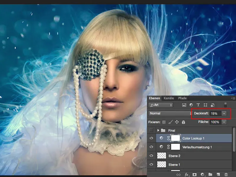
Final words
You alone decide when this whole game is finished. This is your personal look, your final touch. I'm giving up here, I'm done, for me the picture is finished. And I'm happy with it. With this final touch, with this last ten percent - we've been talking about it for another fifteen minutes. I still like my finished picture, but this one with the finishing touches has that final touch where I say: this is exactly what the picture needed.