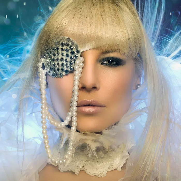
What is the very first thing you look at when you look at a portrait? For me, it's the eyes. The first thing I look at is always the eyes, the nose, the lips and then the overall picture. And for me, the eyes are the seat of the soul of the whole picture.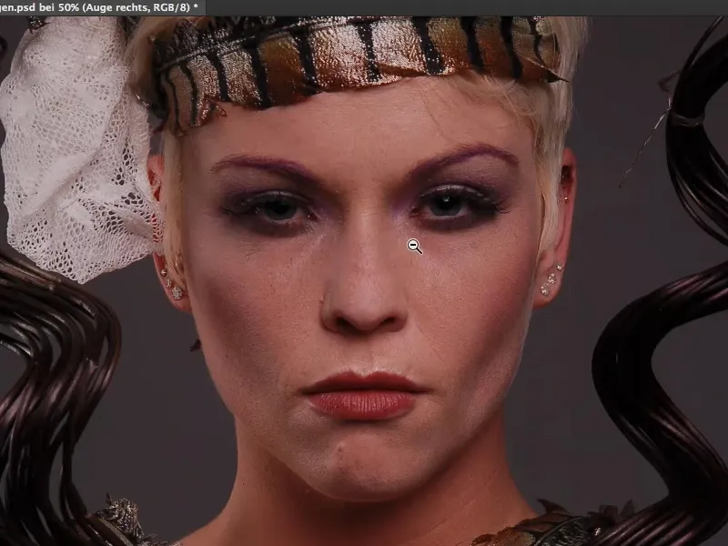
Shine and reflections in the eyes
Take a look at this eye, it shines when I have a reflex. You can see it very clearly here: here I have a reflex in my eye (in the picture on the right), here I have none (in the picture on the left).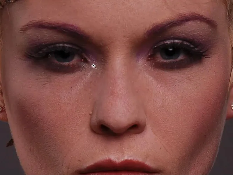
The very first thing I would do with this picture is: I grab the lasso (1), cut out this reflex (2), copy it with Cmd + J (or Ctrl + J) to a new layer (3) and move it over to the other eye (4).
I position this roughly - just take a look at how the image comes to life when both eyes have a reflex (5). Now the eye is almost visually lifted a little by itself, because there's this shiny spot at the top of the eye. If I don't have that, then it's just dull, it's dead, it's lifeless, it doesn't appeal to me. And I would also intensify this shiny spot afterwards. So those are the first things I would look at in an eye.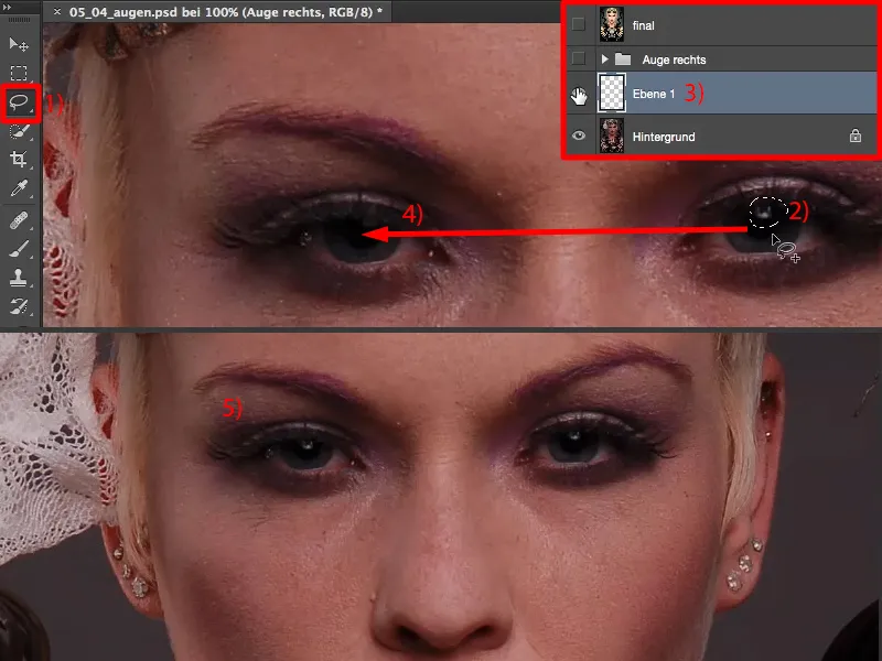
With this one (1), I could very well imagine cat eyes. I'll move this reflex over again (2) if I already have it on an empty layer. Free transform, Cmd + T or Ctrl + T. And I simply stretch the reflex a little (3). I've already got a long reflex like this (4).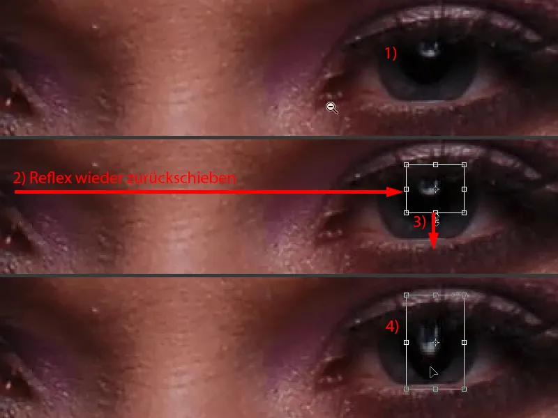
I have to clean up the black (1) with a layer mask (2) using the brush (3). But then it fits again (4).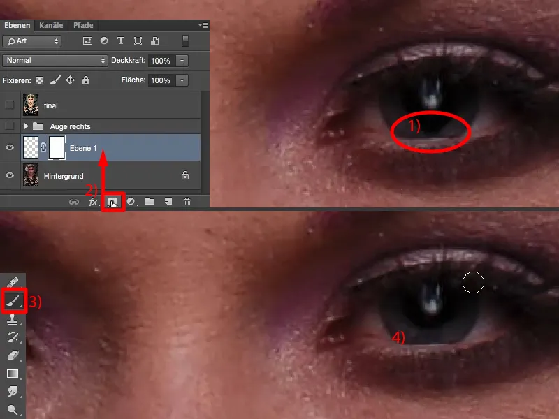
And now I have a completely different reflection here. I have simply stretched it out. When I look at the picture like this: nobody will notice this later, only I know because I did the whole thing. And the eye looks a bit more appealing because the reflex is simply bigger and stands out a bit more. So you could also do that here at the beginning.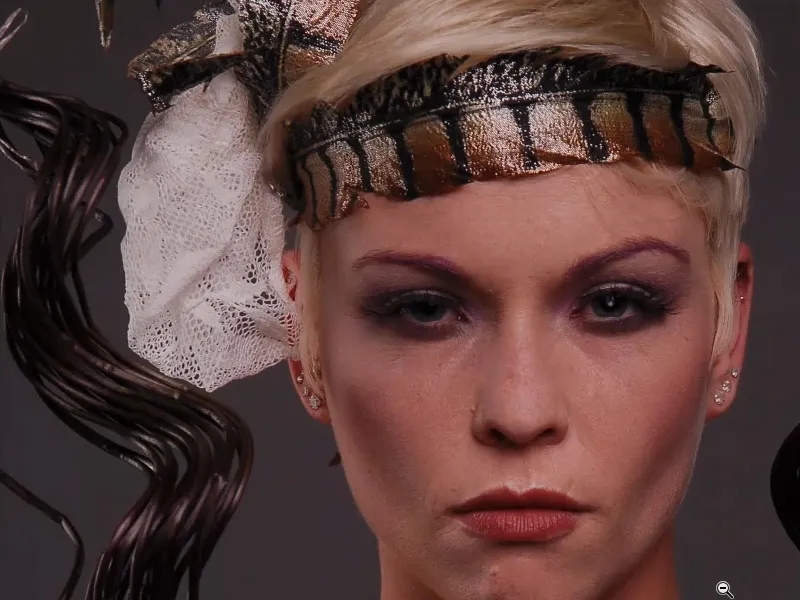
I deliberately didn't take a close-up of the eye, which might have been photographed with a special macro lens, because you could of course really work out the individual structures in the eye, stamp out the veins and so on. I wanted an upper body portrait like this, where the eye is really only a small part of the picture and the resolution of the eye is no longer as good, because the deficits in the eye are the same, but I just want to see it in relation to the whole picture. What can I do here now?
Overview of further processing on the eye
I have prepared this in this group (1) and switch it on and off. And then you see: The white of the eye is suddenly pure white again.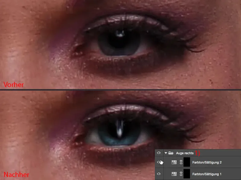
I'm doing this here on this hue/saturation layer(in the image above). So I've taken out the red. With the second hue/saturation layer(below) I colored the eye blue, the gray was a bit too boring for me.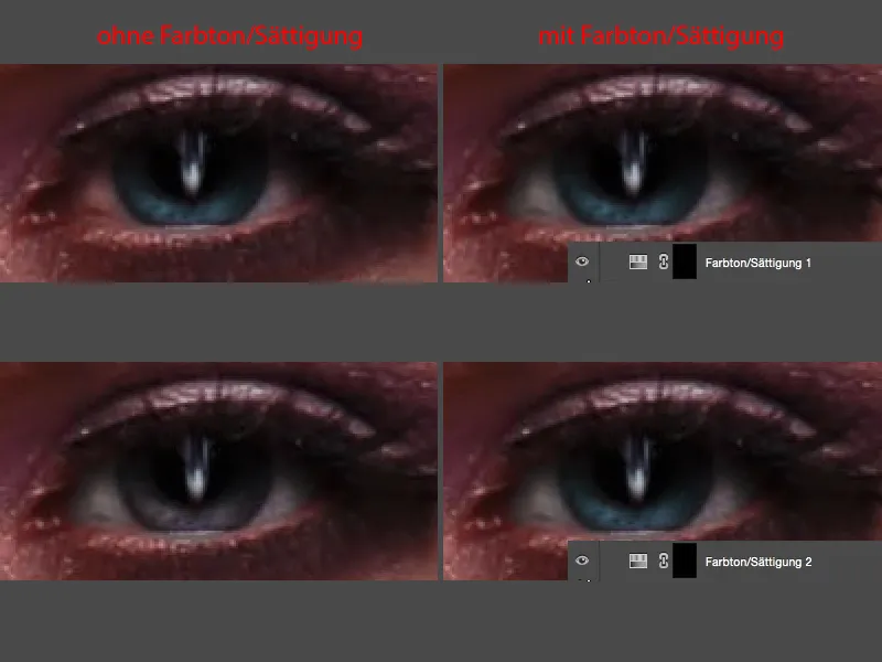
I did Dodge & Burn on the eye and around it. That's a bit part of it. And I also changed the reflex (stretched it a bit as described above), as you can see.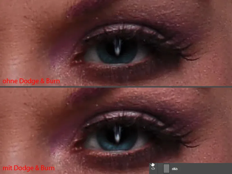
Dodge & and Burn
We've already built in the reflex. Then I can close my retouching group (1) - and then we'll just do it together. I'll rename it "Reflex" (2), because an overview is half the battle with a layer stack like this.
Next, I would now do Dodge & Burn. I do this on a standard layer (3). I fill this one with 50% gray.
Edit>Fill Area..., set the content to 50% gray, OK (4). I say copy one into the other (5). Soft light would be a bit more humane, I say, but it also works this way.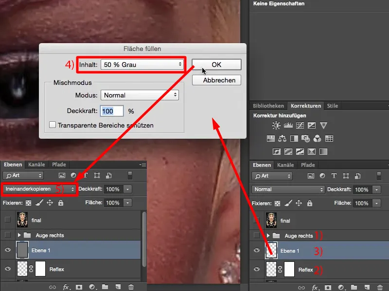
You can use the dodge tool, the post-exposure tool, these tools here (1), or paint with a white and a black brush (2 and 3). The result is identical, because all that is visible here is the difference in brightness compared to this neutral gray.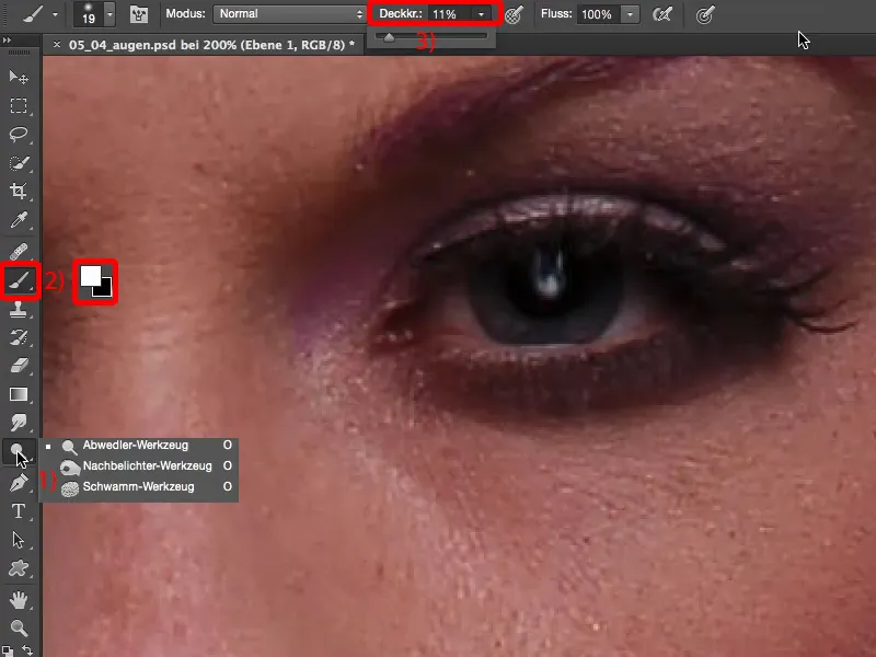
Let's get started: I want to emphasize this shiny area above the eye (1), for example. That also opens up the eye. Then I can very well imagine that we brighten up here (2), I also want to make the reflex really shine (3). I have a small white line here on the lower lid (4), I'm going to work this out a little too. Then I have a little crease here at the front (5), which I'm going to give a little shine. I definitely want to add a highlight or a light spot here at the top (6) too, because it opens up the eye a lot when I brighten under the brow. And then I've got another light spot here at the front (7), so I'll go over that a bit too. Something like that. Give the violet a little touch and then I actually quite like it. That's more or less how I imagine it (8).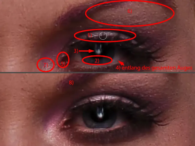
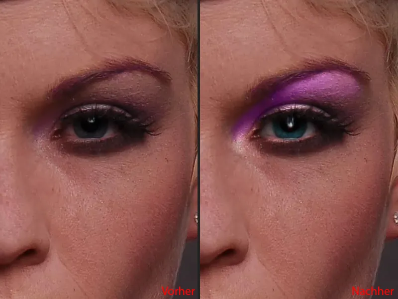
I'll zoom out a bit so that you can judge it better. So this eye, that's exciting now. Now the purple make-up suddenly appears in the corner of the eye. When I take it off (left picture), it's boring and gray. If I turn it on (right picture), the lights really come on. These highlights in particular now make the eye lively and open.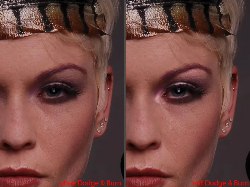
White of the eye: hue/saturation
In the next step, I want to correct the whites of the eyes. No matter how beautiful the eye is and how well it's photographed, it's always not the white or saturation I'd like. And with this one, I have red in it, brown, violet, blue, all sorts of things.
I create a Hue/Saturation adjustment layer (1) for editing.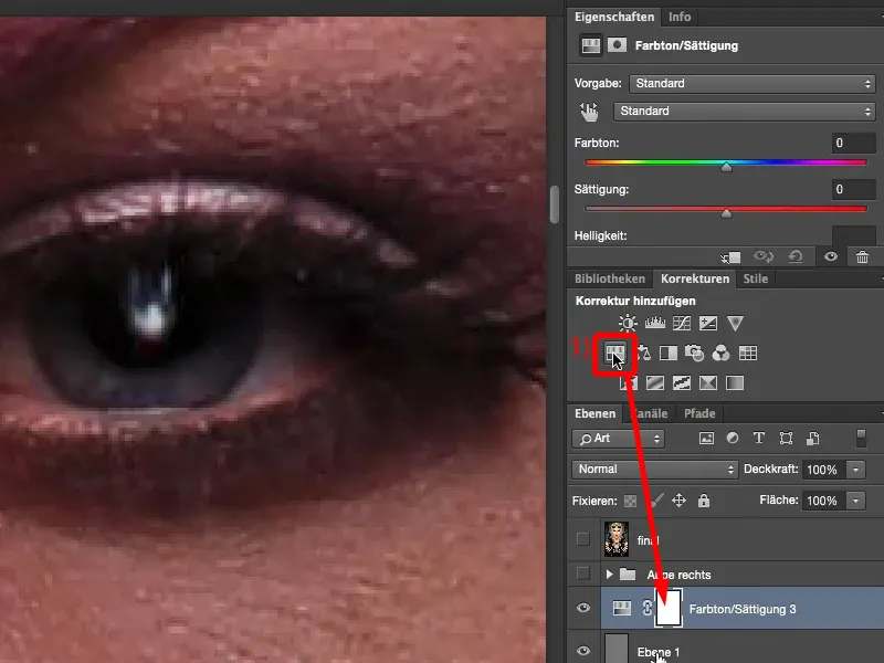
And what I'm doing here now is: I don't adjust the saturation downwards globally (1), because then the red will still remain relatively dominant.
I go up here to the red tones (2) and pull the saturation out of red (3). And then I can already see: What's left here? It's probably the magenta tones (4). And I'm going to take them out too (5) ... And then I'm actually ready to say: Yes, okay, that's fine.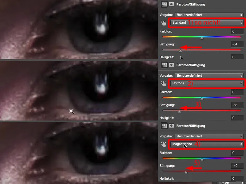
I go back to standard (1), adjust the global saturation a little (2). And what I can also do very nicely here is if I have set it to Standard at the top: I can darken and lighten. Not too much, of course (3), because otherwise the shadows and midtones will all be gray (4), but a shade like this, I usually go to 10 (5), a little more air than I actually need for the mask, and invert the mask using Cmd + I or Ctrl+ I (6).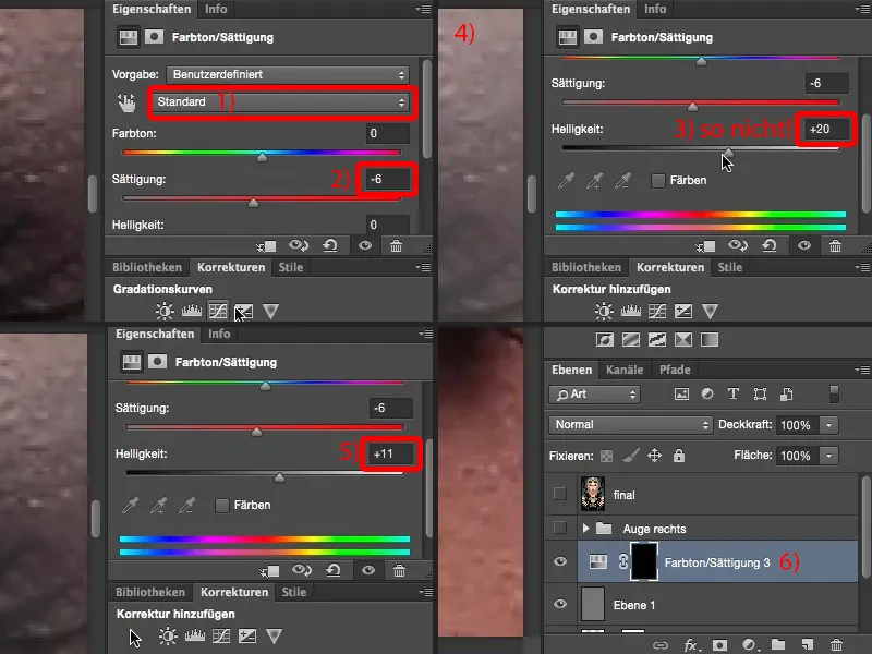
Then I take a brush at 100 % opacity, because I can still change the effect on the layer opacity, go to 0 %, soft edge (1). Then I paint this new eye white here with white (2).
If the whole thing looks a bit too painted on, as in my case here, so you can really see the brush, then you can do something very simple: You can blur the mask (Gaussian blur). Many people always think: "These filters, they only work on pixel levels." As you can see, the filters also work on masks. And then I simply look for a radius here that blends the whole thing so smoothly that it no longer looks painted. Then you can see my brush marks here, but even with a radius of 2 pixels (3) the marks are blurred (4). And I have already restored this white here.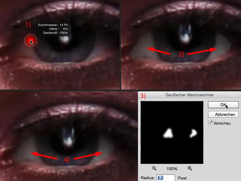
And now, of course, the eye glows one step more.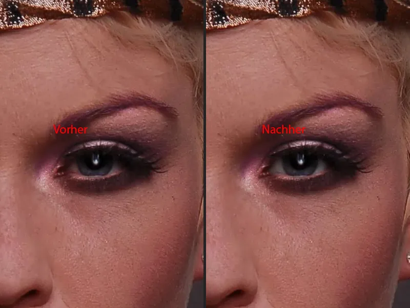
Adjusting the eye color
I need this adjustment layer (1) again, because I want to achieve a color shift. To do this, I simply go to the hue slider(2) at the top and drag it to a region that I find exciting. I take a light blue tone and then invert the whole thing (3).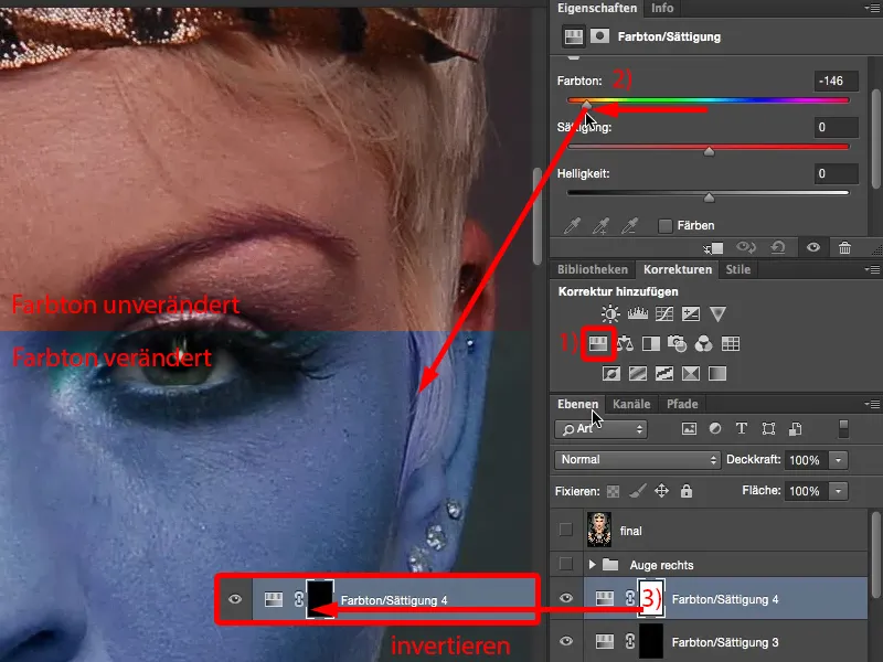
Another option (invert again, 1): You can also click on the Colorize option here (2), then the whole thing is a bit more dominant. Let's go here and find a shade of blue, then it will be a little stronger in the eye. A cyan like this looks really cool (3). Let's invert the mask (4).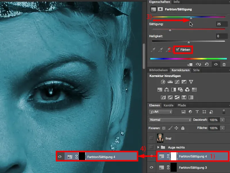
Now zoom in very close, grab another soft brush and brush on the new eye color. And that's it already. It can be that quick.
If you want to blur the brush marks again, simply repeat the Gaussian blur that you have already applied to the white of the eye. So you can easily work on the eye with these simple techniques.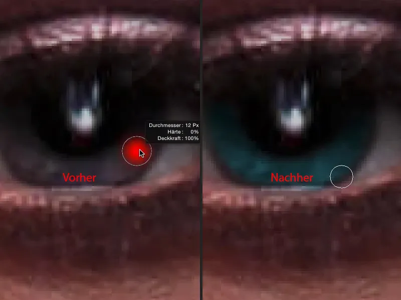
Applying make-up
If you still want to apply make-up here, I always recommend that you do this on an empty layer. I call this "make-up" (1). The problem is that you should always know what you're doing, because it's not for nothing that you have to do a two-year course or so in make-up artistry, depending on how professionally you want to do it. And I personally have no idea about make-up.
I just think to myself: "Okay, they've used purple make-up here, so I'll use purple", but do I need a purple with less saturation or do I need something dark that's really a solid color? I'll just go for the golden mean (2) and hope that it looks good later.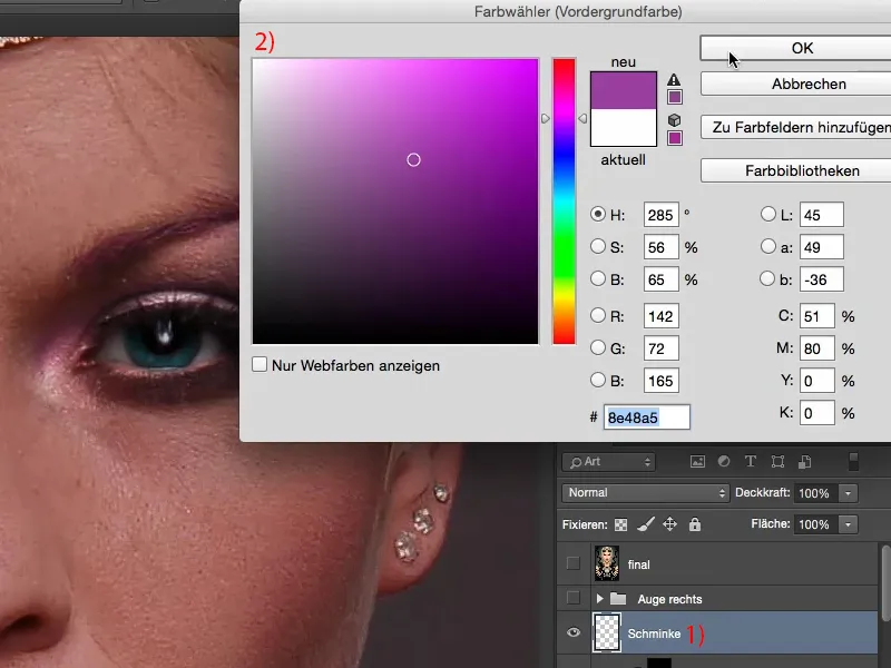
If I brush this on in Normal mode, at 100% opacity, it will of course look like I've painted over it (1). Let me take a step back.
But if you set this to Color mode, then you can apply this color very nicely here, and the brightness and also the structure are offset by the layer below (2).
I'm going to go back a bit with the opacity because, as I said, I don't know anything about make-up. But I think there's a hint of that purple shining through - you could definitely intensify it a little (3).
You can, of course, use an adjustment layer with a clipping mask to push and change the colors at any time. And then you actually have all the possibilities in the world to make something out of this eye.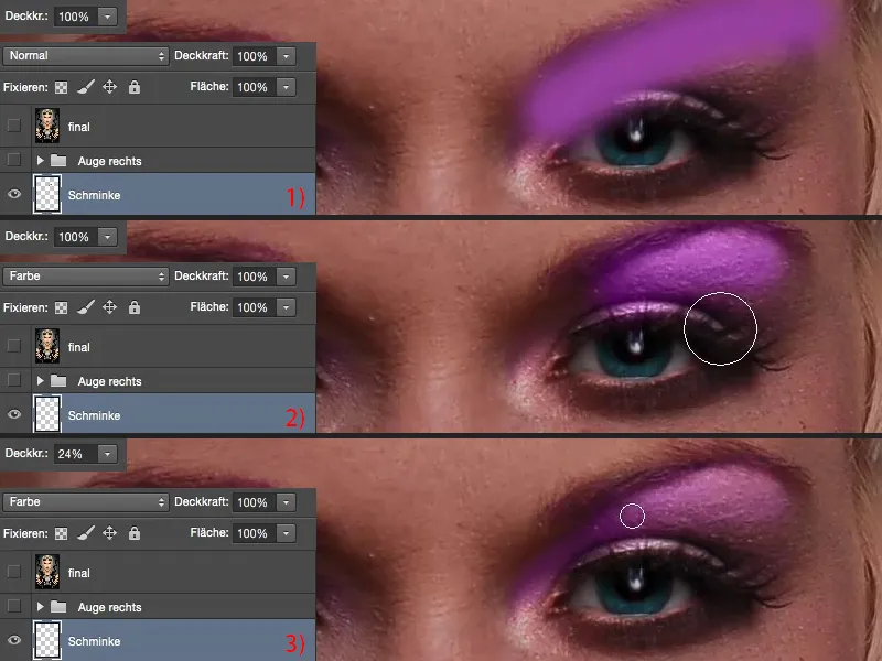
If you look at the before and after comparison, you'll realize what you've actually created here. You draw attention to the eyes - and that's where the soul of the picture is. And if the eyes are right and if the eyes are appealing, then people will forgive you for other image flaws - that's what I've learned in my experience. That's why the first thing I actually do after the skin is the eyes and the lips. These are the two areas where I always look first: what has the image editor, the retoucher done wrong or conjured up miracles here? That's the first thing that interests me.