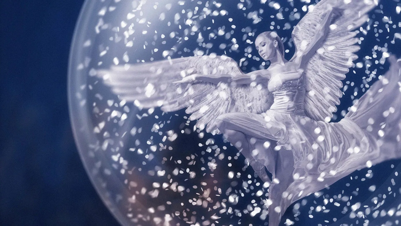
Do you want snow in your pictures? Then create the right brush in Affinity Photo just once - and use it again and again. You can find the right snow brush settings in this tutorial. The grand finale of our Christmas composing is also coming up!
Part 13: Painting snowflakes with your own brushes in Affinity Photo
The rocky background, the metal snow angel, the glass ball ... Everything is in place. All that's missing is the right winter Christmas atmosphere. Now paint it into the composition with a brush - by swirling up snowflakes .
The best thing is that you can save the settings for the brush right away so that you can shake Mrs. Holles' pillow yourself at any time in the future. We also recommend using various filters to add a further touch of realism to your flakes at the end. Trainer Marco Kolditz lets you know how to proceed ...
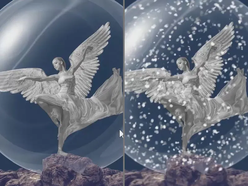
Here's what you'll learn in part 13 of the Affinity Photo tutorial
- Create brushes for painting snowflakes
- Paint snow into images using different layers and filters for a more realistic look
Preparing layers for snow
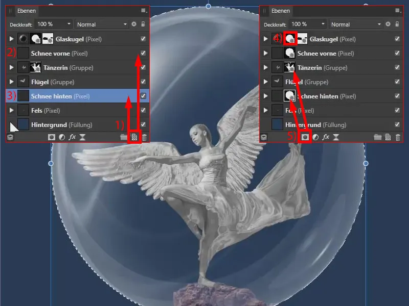
Now we will create snow using two pixel layers: On the one hand, there should be snow directly in front of the Christmas angel, and on the other, a little snow behind it. All the snow should be inside the snow globe.
I create a new pixel layer (1), which I rename "Snow in front". I drag it in front of the "Dancer" layer (2). I place the second pixel layer that I create below the "Wings" layer and above the "Rock" layer. I name it "Snow behind" (3).
I create a mask so that all the snow is inside the snow globe : I hold down the Ctrl keyand click on the mask of the snow globe (4). I create a mask for each of the two snow layers (5). In this way, I can paint snow on both pixel layers without the snow being visible beyond the sphere.
Create a brush for painting snowflakes
First, we create a brush with which we can paint these snowflakes . These are not real snowflakes, of course. They look more like something misshapen, almost like confetti.
We can already see various brushes in the brush palette(1). If I double-click on one of the brushes (2), we can see the properties of the brush (3) . We can set the size, the flow, the spacing and ...
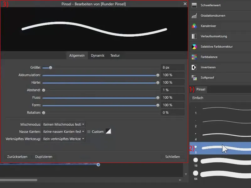
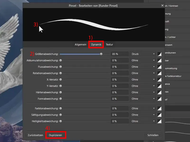
... even a dynamic (1). This means that the size of the brush, for example, can vary depending on how much pressure we apply to the graphics tablet with the pen. So if I set the size deviation (2), it can be a very thin or a very thick brush (3), depending on the pressure.
This can be adjusted individually. However, we are not changing the existing brush, but creating our own brush . To do this, click on Duplicate (4).
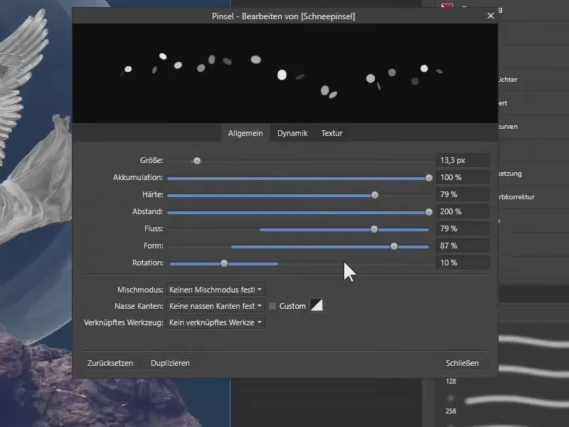
I have already prepared the corresponding settings for the snow brush - you can simply apply them. I have adjusted pretty much all the parameters, size, accumulation, hardness, spacing, flow, shape and rotation:
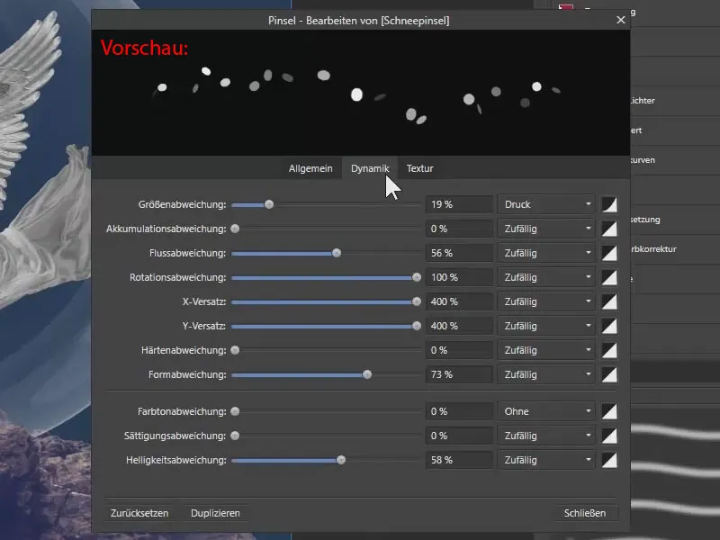
The Dynamics item is very important. I adjust the size by pressing the pencil. All other values are adjusted randomly in a very specific area.
You can see the result in the preview : there are relatively round dots, some are elliptical. The brushes are rotated, the spacing is quite high, and the opacity is also adjusted. This already looks typically like the snow inside snow globes . I'll close that.
Paint snow with the brush in the foreground and background
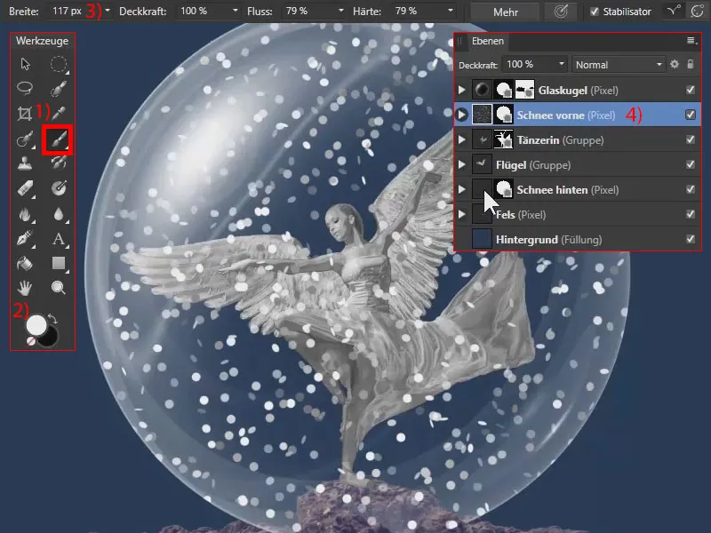
With the paintbrush active (1) and the snow brush selected, I paint with a white foreground color (2) and a width of about 117 px (3) on the "Snow front" layer (4). When painting, make sure that you leave the area of the angel's face free. This is now the snow in front of the angel.
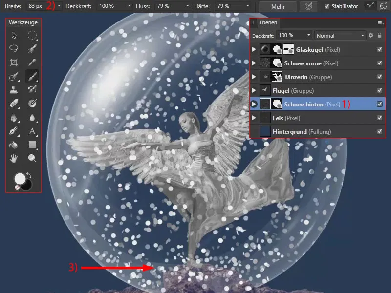
I switch to the "Snow behind" layer (1), reducing the width slightly to 83 px (2). Now I'll paint the snow behind the angel. You can place a little more of it in the lower area (3).
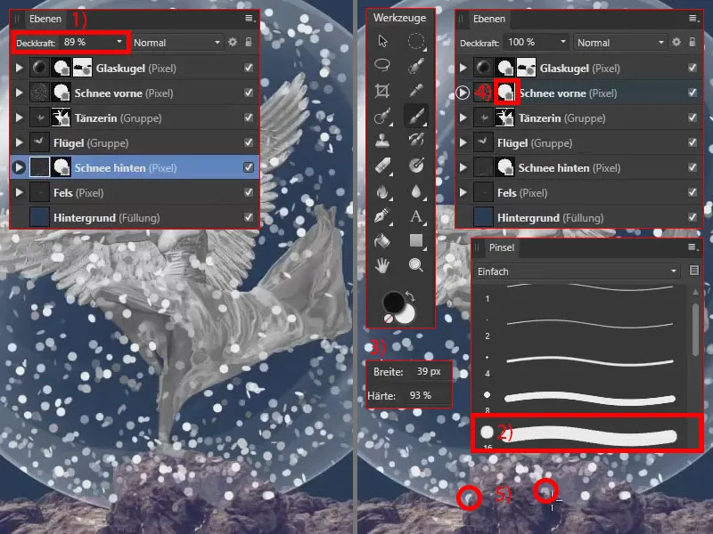
I reduce the opacity of the "Snow behind" layer a little because the snow appears a little further back (1).
I also make sure that there is no snow in front of the rock. To do this, I select a different brush (2), reduce the hardness a little (3) and go to the mask of the "Snow in front" layer (4). Using black and a width of 39 px (3), I paint out the snowflakes where they don't belong (5) .
Optimize snowflakes with the Waves, Motion Blur and Depth of Field filters
The snowflakes should not be perfect circles or ellipses, but should appear a little uneven. With the "Snow front" layer activated (1), I select a New live filter layer under Layer and then the Waves live filter (2). A corresponding filter layer is created automatically. I set the intensity to around 10 (3).
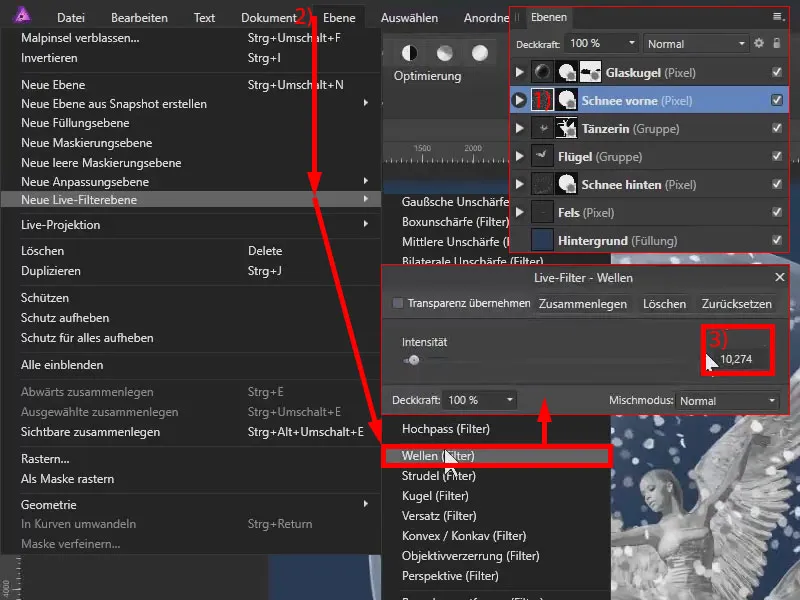
This live filter is therefore in the "Snow front" layer (1).
With the wave layeractive, I press Ctrl+C. Another tip for copying: Don't click on the name of the layer. This will select several elements at the same time. If you only want to select waves, click on the preview image. Now press Ctrl+C, go to "Snow behind", Ctrl+V, and you have the filter here for the snowflakes behind as well.
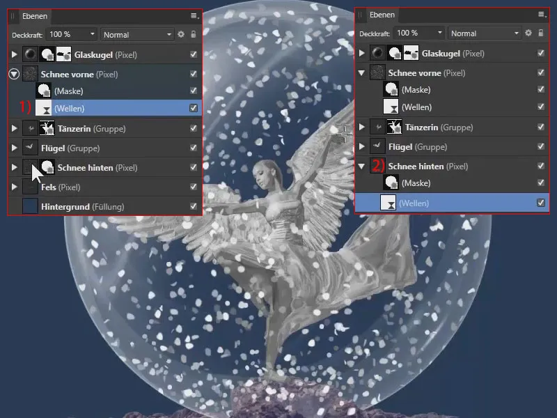
Now a little motion blur: I select "Snow in front", go back to Layer and New Live Filter Layer and click on Motion Blur (1). I set the rotation to 45° and the radius to 15.4 px (2).
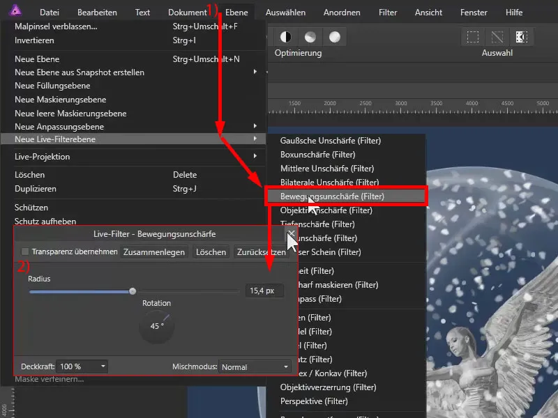
I do the same with "Snow behind", so again Layer>New Live Filter Layer and Motion Blur. Here I choose a different angle of 135°. I reduce the radius slightly to 0.5 px.
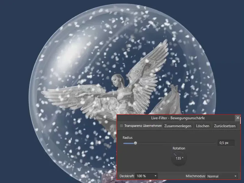
Now the outer areas of the image should appear blurred , while the middle area appears sharp. A nice gradient should be created between the sharp and blurred areas. I achieve this with the depth of field live filter layer.
I select the background (1), go to Layer>New live filter layer and to Depth of field (2).
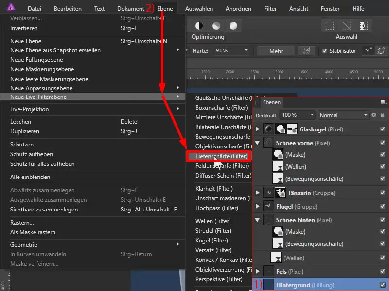
The filter is now in the background layer (1). I drag it all the way to the top so that it affects all the layers below it (2). We now see a dialog box with various sliders (3) and also a visual control option for the filter (4).
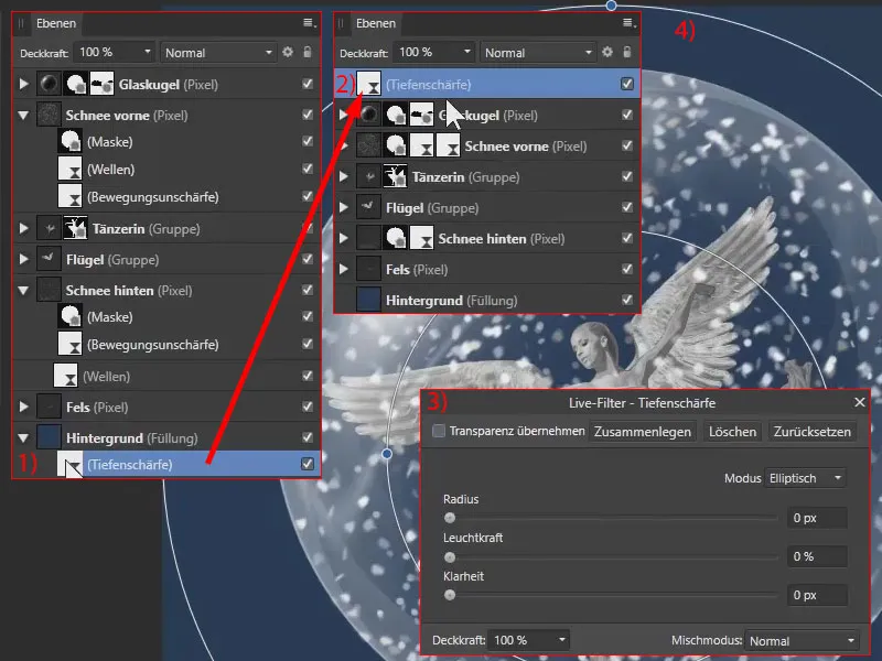
I use the middle point to set the center point. And I use the other anchor points to set the depth of field as desired.
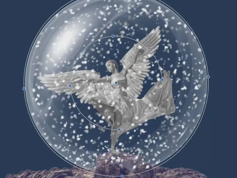
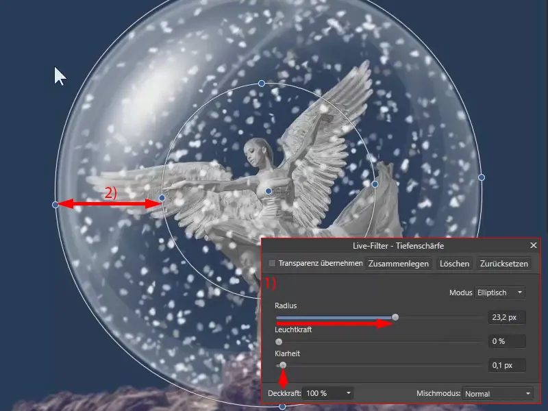
Now I set the radius and the clarity (1). This makes everything appear blurred on the outside, everything is clear in the middle and a sharpness gradient is created between these two rings (2).
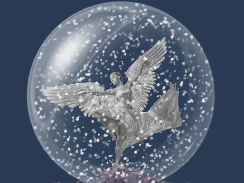
We have now transformed the glass sphere into a snow globe:
Creating a glass globe in Affinity Photo - Summary Part 13
- Use the settings mentioned in the tutorial to create a brush for painting snowflakes.
- When painting snow, work on several layers to make larger flakes fall in the foreground and smaller ones further back.
- Also give the snowflakes at the back a reduced opacity.
- At the bottom of the picture, it is advisable to place slightly more flakes if necessary.
- Make sure that the snowflakes do not necessarily cover essential elements of your image (such as faces) and do not appear in places where they do not belong.
- Use the Waves filter to make the snowflakes appear more irregular.
- Use the motion blur to give the flakes a certain dynamic movement.
- If necessary, create a depth effect by using the Depth of field filter to create a sharpness gradient.
Part 14: Swapping the background & fine-tuning
The most important image elements for the "Christmas angel" composition are now in place. Finally, the image is refined to create a harmonious overall impression. You also add a background and adjust it. You also work on the look with color balance, depth of field, vignette and noise. On to the grand finale:
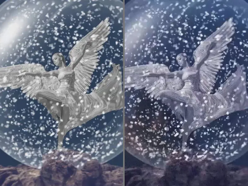
Here's what you'll learn in part 14 of the Affinity Photo tutorial
- How to replace a background and what you should pay attention to when doing so
- How to use the object blur, depth of field, vignette and noise filters
- How to use the color balance adjustment
- How to finalize a composing to create a coherent look
More order in the layers
Let's move on to the final steps. I'll now add a background and adjust the general color mood of the image. In the layer palette, I first create more order. All placed objects are placed in a group.
To do this, I select the top layer of the depth of field, hold down Shift and click on the "rock" layer. All the layers and groups in between are selected (1). I use Ctrl+G for grouping to create a new group, which I rename "The Christmas Angel" (2).
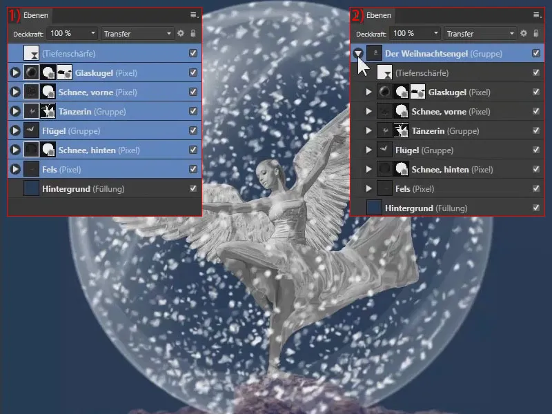
Place a background over the foreground!
The background should now be placed on top of the image, not in the background for once. To do this, drag the landscape image into Affinity Photo.
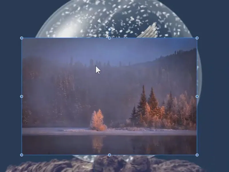
I'm particularly interested in the left-hand area, which I really like. The right-hand area would be a little too restless for me. So I scale the image and place it.
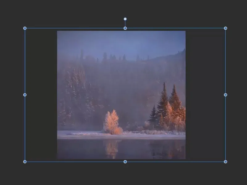
I set the layer mode from Normal to Soft Light. This places the background in the background, but it also affects the color of the entire image.
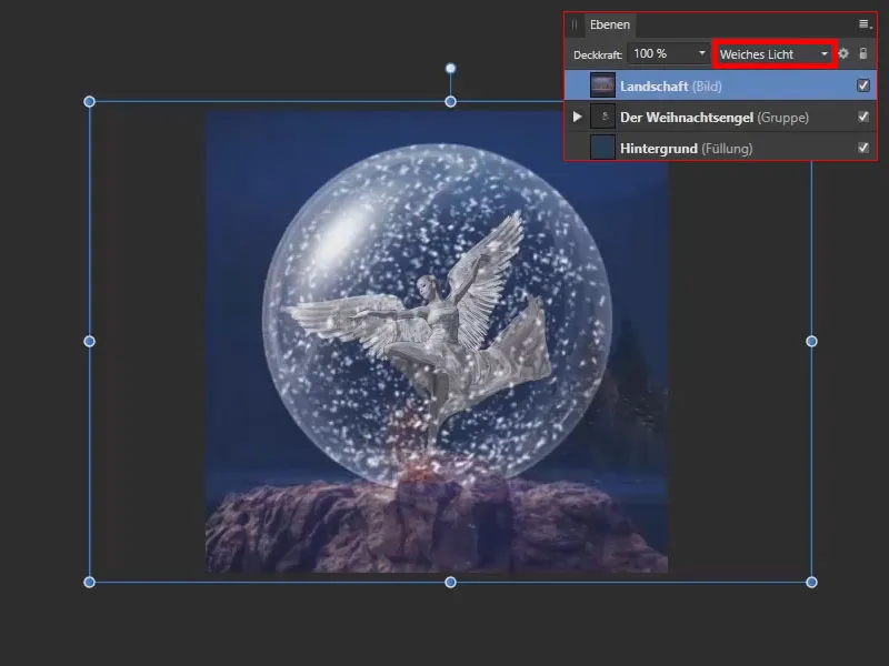
I rotate the image itself a little, even distorting it out of proportion. The tree should be on the right-hand side. That's more or less how I want it:
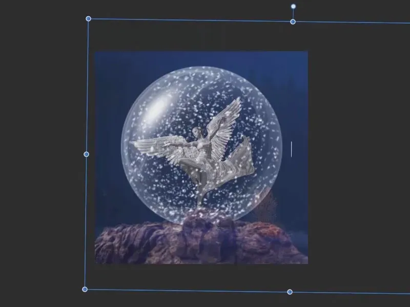
Adjust the new background with the Lens blur filter
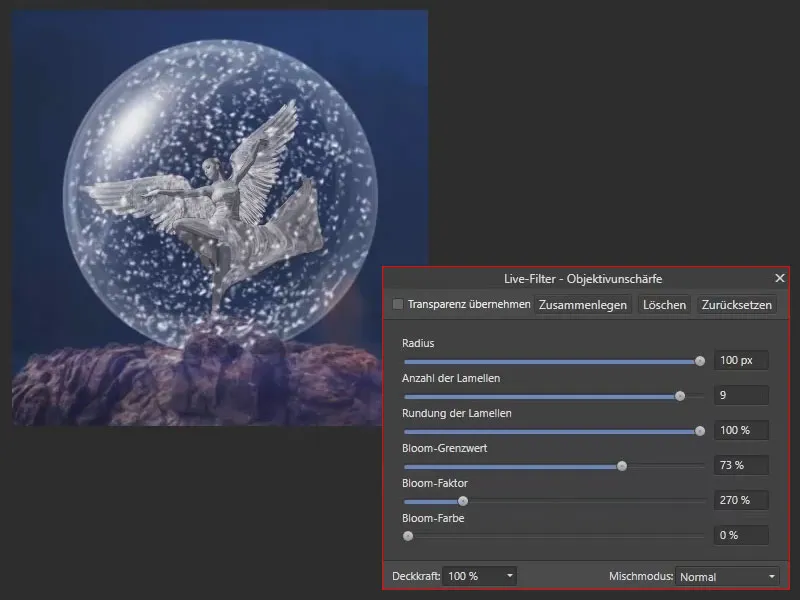
The background still appears far too sharp. To change this, I work with a live filter layer called Lens Blur.
I activate the "Landscape" layer (1) so that the live filter is only applied to the layer. Under Layer>New live filter layer, I select the lens blur ( 2).
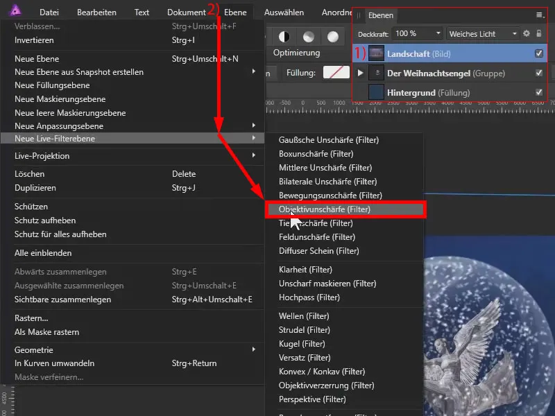
I drag the radius completely to the right for maximum blurring.
The number of blades has to do with the fact that, for example, if we achieve a nice bokeh in the background with a very open aperture in digital SLR photography, it can lead to the shape of the aperture being visible in the background, for example a pentagonal or octagonal one. I set the value to 9 and also increase the roundness of the slats considerably.
And here you can also set a bloom limit value. If I reduce the limit value and increase the bloom factor, we can see that the highlights in the background are brightened. This is where these typical bokeh effects appear.
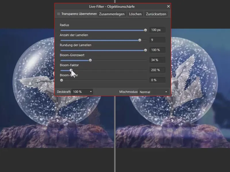
But that's not what I want in this example. I played around with it and thought that it actually looks quite nice, but in the end it doesn't suit this picture at all. So I use the following settings and close the filter.
Correcting inconsistencies with a mask
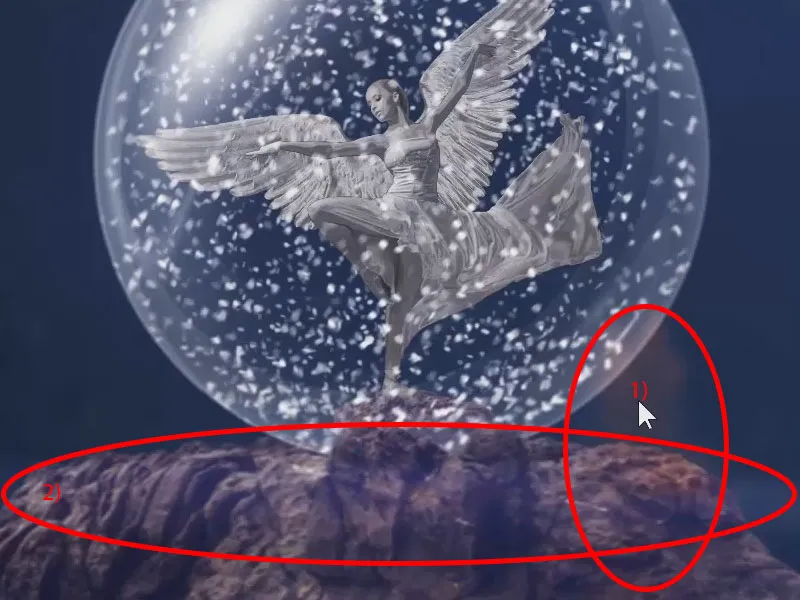
What I don't like: The landscape has an unattractive effect on the rock in some places. Here (1) we have the tree, which you can even see in the foreground near the rock at the marked point. And here (2) the bottom of the background is also very subtly visible. We carefully retouch this out.
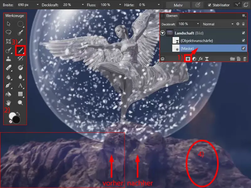
I therefore create a mask (1) for the "landscape" layer. Unfortunately, when a mask is edited, it is not automatically switched to black and white. For example, blue is currently selected, which does nothing for a mask. Therefore, when working with a mask, always switch to black and white first (2). Use X to switch between foreground and background color.
Using a black paintbrush (3), I paint on the mask with a width of 690 px, a low opacity and a hardness of 0%. In this way, I take back the color of the tree and also the bluish color impression from the bottom of the background (4).
Color balance for the Christmas angel
Now I adjust the color of the d ancer so that she blends in more with the rest of our picture. To do this, I have combined the dancer and the wings into a group called "Dancer and wings" (1). I apply a color balance to this (2). I drag this directly into the group (3).
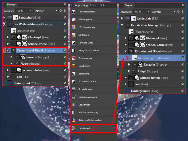
Now I adjust the shadows. I drag the cyan/red sliderto the left. Magenta/green remains as it is. I shift yellow/blue strongly towards blue. I leave the highlights as they are. I move the intermediate tones to red and blue.
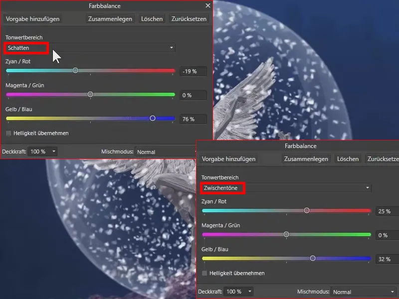
The angel now fits better into the overall picture.
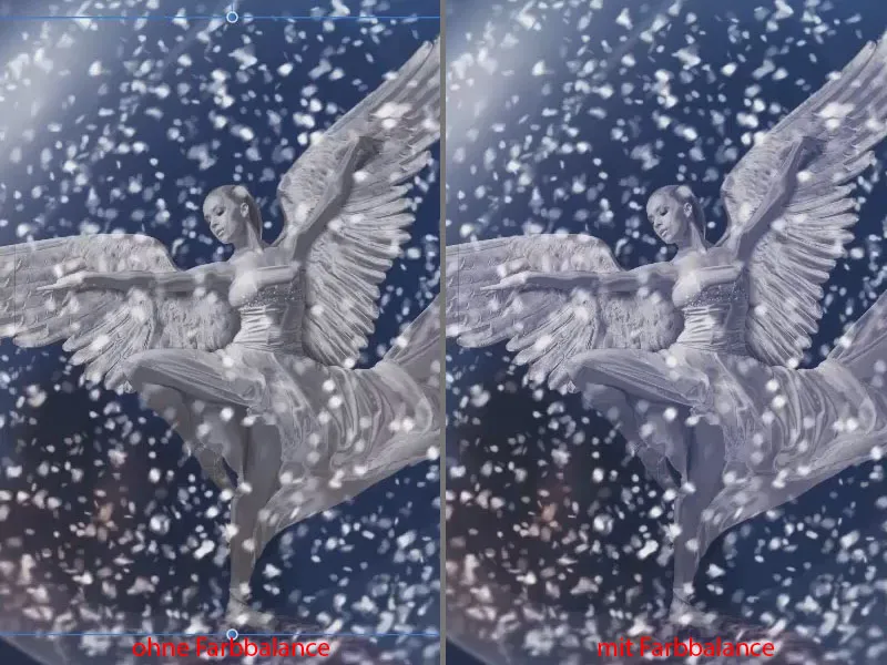
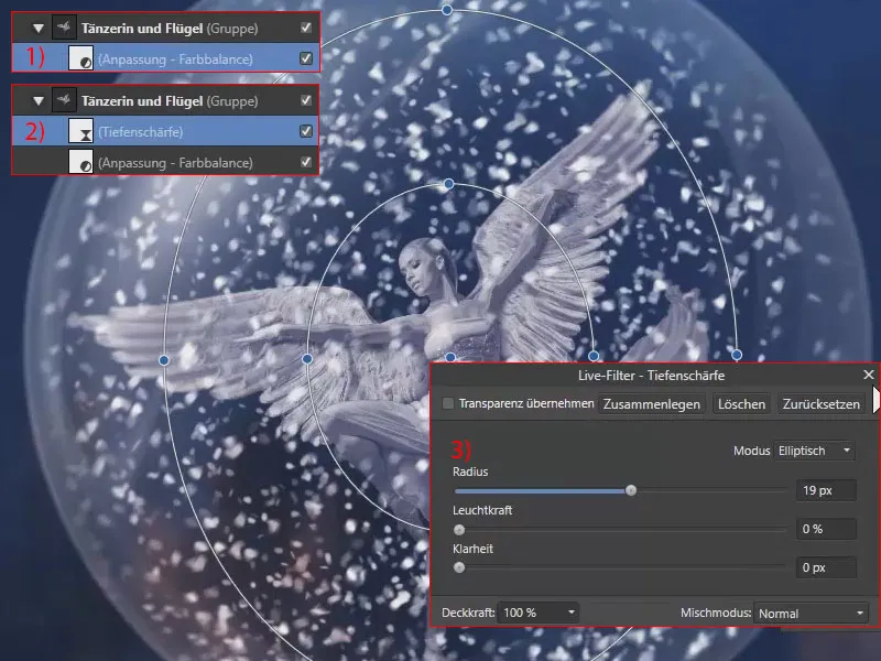
Off to the depth of field
The edges of the wings should also appear a little blurred , as if they were actually bent backwards a little: Under "Dancer and wings" I still have the color balance active (1). I select Layer>New live filter layer and then Depth of field. I place the layer directly below "Dancer and wings" (2). Just as we did with the background and the rock, I make the whole thing appear blurred. I set the radius to 19 px (3). When setting the filter, I pay attention to the edges. The dancer should remain sharp in the middle. The dress also disappears into the blur.
One more vignette is allowed
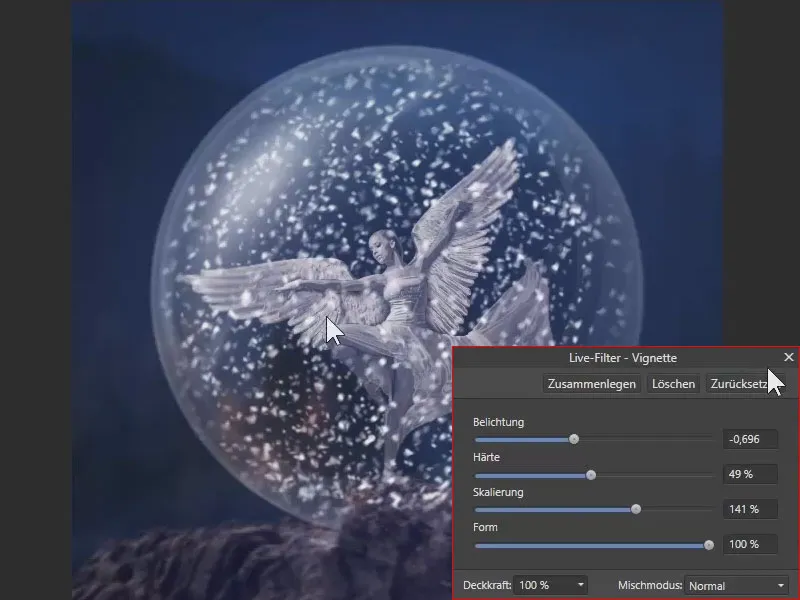
Now close the groups (1) and place a vignette over the image. You can find this under Layer>New live filter layer (2). The vignette is at the top of the layer palette(3).

I set the exposure, hardness, scaling and shape of the vignette accordingly.
Noise for a harmonious overall appearance
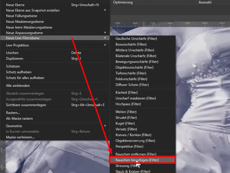
To make the individual components of the image fit together better, I add noise to the image. I also do this via Layer and New Live Filter Layer, where I select Add Noise.
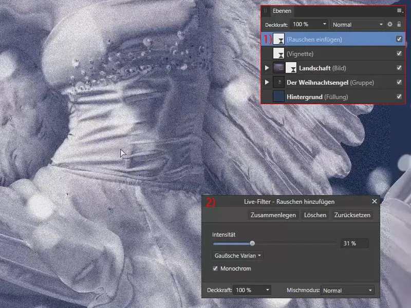
The noise is also moved to the top of the layer palette (1). I set the intensity to Monochrome and as a Gaussian variant to 31% (2). In this way, the individual components of the image blend together really nicely.
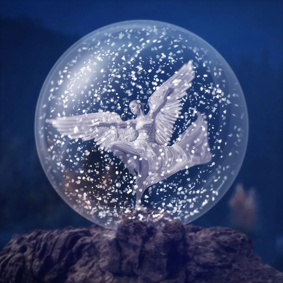
This brings us to the end of this Affinity Photo tutorial . Have fun recreating it!
Adding the background and refining the overall image - summary part 14
- Get your layer palette in order again before finalizing your compositing.
- Try this variant: Place the background in the foreground of your image and change the layer mode to Soft light. This way, the background will have an even stronger color effect on the foreground.
- If you place the background over your subjects: Use a mask to draw out unwanted overlays.
- If necessary, use an object blur to make the background appear softer.
- You can use the color balance filter to adjust the color effect of individual image elements to the overall appearance.
- You can use a vignette to draw more attention to the subject.
- A globally applied effect such as soft noise can give your composition a final, coherent look.
> To the previous parts 11 and 12 of the tutorial
> To the overview of all parts of the Affinity Photo tutorial
Important links for you
You can also watch the entire tutorial in the video training by Marco Kolditz. You can find more training courses and assets for Affinity Photo in the corresponding software category. If you work with Adobe Photoshop and want to paint snow with it, take a look at our prepared brushes for snowflakes and rain.

The contents of parts 13-14/14 are based on a video tutorial by our trainer Marco Kolditz:
