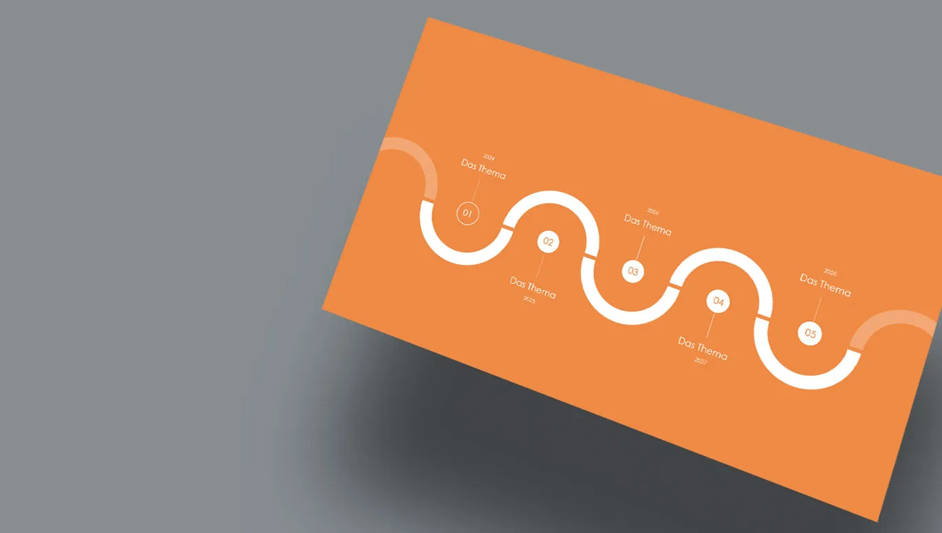
Need a timeline? We'll show you how to create it yourself in PowerPoint or with the help of SmartArt graphics. You can also add movement to your timeline with animations. Various layout examples will provide you with inspiration. And if you want to shorten the time to the finished timeline: download our free design templates.
Whether company history, milestone plan, roadmap, current project progress or process progress ... With a timeline, you can clearly present what was, what is and what will be. The graphical representation of events along a line or an arrow can be quickly grasped and can be both an information provider and a visual eye-catcher in your presentation.
Unfortunately, there is no tool in Microsoft PowerPoint that allows you to call up a timeline directly and customize it completely flexibly. However, there are ways and means that we will introduce to you in the following instructions ...
- 1 | Create timeline with shapes manually
- 2 | Tips on the layout, structure and appearance of your timeline
- 3 | Animating a timeline in PowerPoint
- 4 | Creating a timeline from SmartArt graphics
- 5 | 11 design examples for timelines from our PowerPoint templates
- 6 | Free PowerPoint templates with timeline
1 | Step by step: Create a timeline with shapes manually
If you want to retain maximum creative freedom when creating your timeline , you should use the shapes available in PowerPoint. This may be more time-consuming than using the SmartArt graphics described below. However, you remain flexible in every respect when it comes to the design and organization of your timeline. And this is how it works:
Step 1: Open the selection for the shapes under the Insert tab. Select the basic element for your timeline - i.e. the actual timeline itself. We recommend the line arrow under Lines. Under Block arrows, the variants of the normal, striped and notched block arrows are suitable. Nice alternatives are the pentagon and chevron arrows.
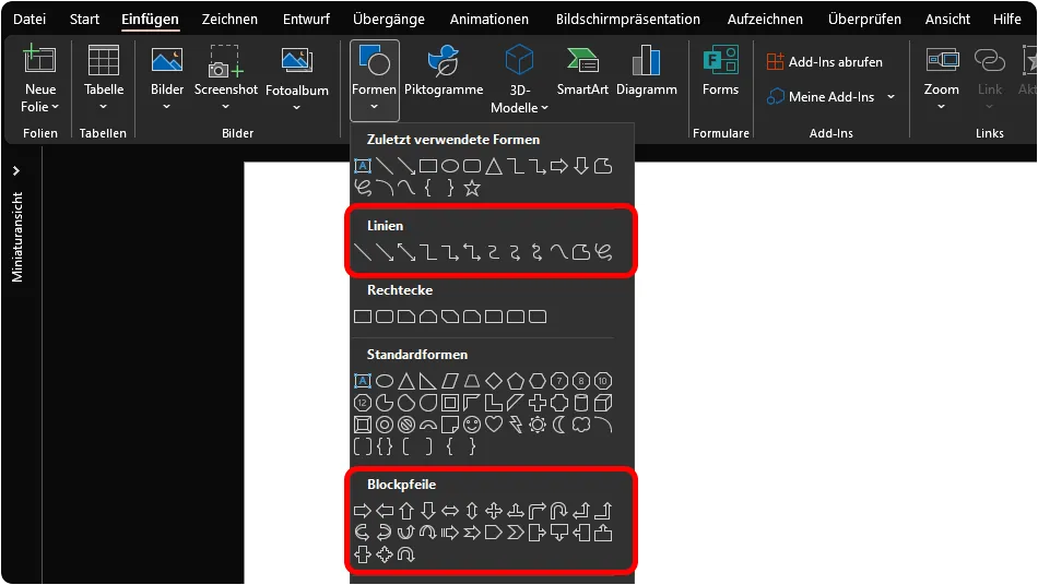
Step 2: Click on the workspace and drag the arrow to create your timeline - the axis on which you will now place your time markers.

Step 3: Grab another shape and draw it so that it extends from your timeline as a time mark er. The classic way to do this is to use a line. However, other shapes such as triangles or circles are also conceivable here. Copy the shape, paste it and position it on your timeline. Repeat this until you have created the required number of timestamps for your events.

Step 4: Now add a text field via the Insert tab by dragging it onto the workspace of your presentation. Write your text (for example, a year) and place the text box at the first time marker. As with the shapes for the timestamps, copy the text field, paste it again and place it at the other timestamps.

Tip: Use the guides automatically displayed by PowerPoint to accurately align individual shapes with other shapes when positioning them. For better orientation, activate the ruler and grid lines under View if necessary.
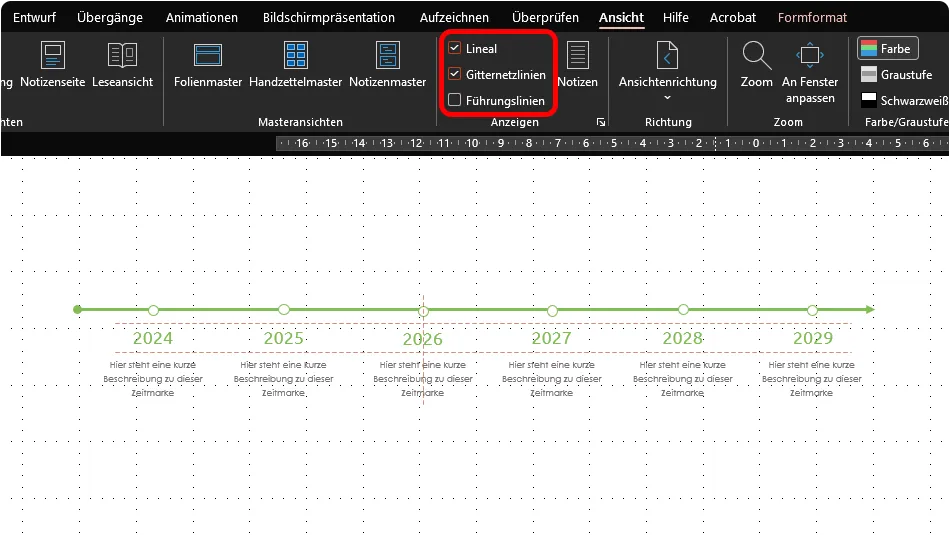
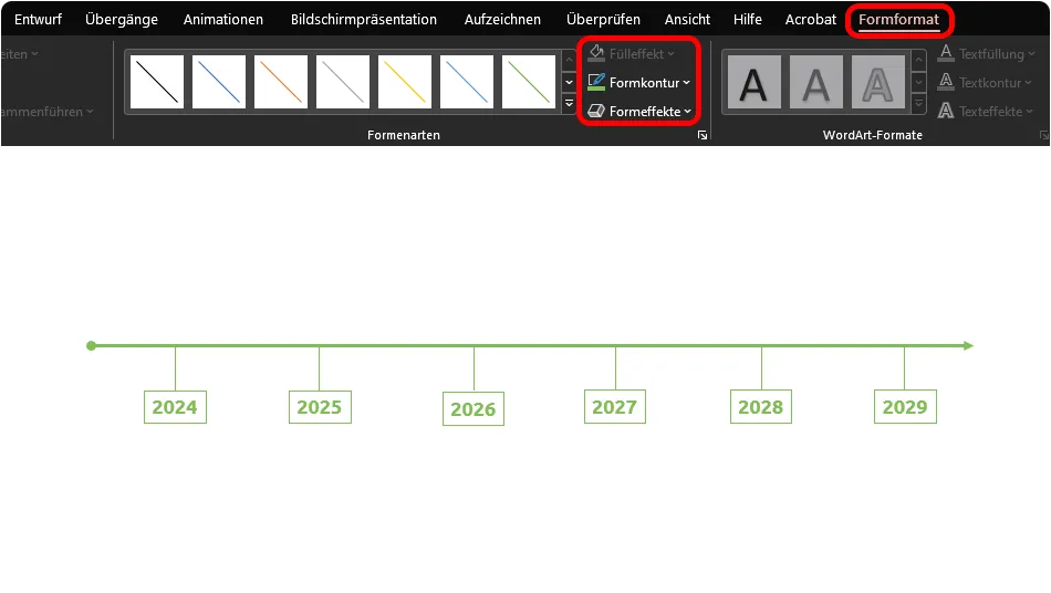
And another tip: After inserting and placing the shapes , you can further customize the formatting of the shapes as desired under the Shape format tab. For example, change the thickness and strokes of lines via Shape outline. Add a shadow to your timeline via Shape effect. Use a different type of arrow instead of a simple arrow (as in the following image, where the arrow shows a point at the beginning). Or simply adjust the colors of your shapes. However, always remember that even with timelines , less is more - and uniformity makes for an easy-to-grasp overview. So instead of applying one color after another to different shapes, concentrate on a selected design set.
2 | Tips on the design, structure and appearance of your timeline
Selecting, placing, formatting and labeling shapes - that's the basic principle for creating your timeline in PowerPoint. But to really take your audience on your journey through time, you should consider a few aspects regarding the structure and design of your tim eline. There are many options. The question is: which option do you choose? You should clarify the following in advance, for example:
- How many timestamps/stations do you want to display on your timeline?
- What information should be displayed at a time marker and in what form (image, headline, descriptive text)?
- Do the timestamps with the information to be conveyed fit on one slide or do you need several slides?
- Are there only one type of event on your timeline or different types of events? Do you need to differentiate between tasks and milestones, for example?
- And finally: What does the design of your presentation look like? Do other elements have a clear edge, for example? Or is it more rounded? Your timeline should fit seamlessly into its surroundings and the overall appearance of your PowerPoint slides.
Your answers to these questions will have a direct impact on the presentation of your timeline. Here are a few tips on structure, layout and design:
Get your timeline into shape
From a purely mathematical point of view, your timeline is an axis on which you slide forward from left to right through the dimension of time. From a purely mathematical point of view, a wafer-thin arrow would have to be drawn, and you wouldn't have much more room for maneuver.
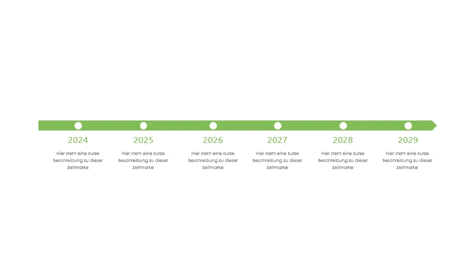
But fortunately, in PowerPoint and in most presentations, we don't strictly adhere to the restrictive grid of mathematical millimetres. Instead, you can play a little with the shape of your timeline . So open the menu for the shapes again, take a look at the considerable selection of different geometries available to you and play around a bit.
Does the design of your PowerPoint presentation already rely on circles, ellipses, squares, diamonds or triangles? Then use these elements in the timestamps of your timeline, for example ...
How to highlight milestones
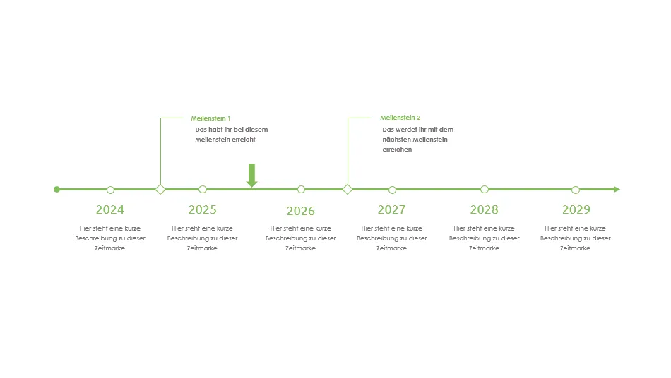
Some points are simply more important than others - milestones , for example. To highlight these, you can use different shapes or colors for the time markers on your timeline than for the other stations. If that's not enough, place the description of the milestones on the opposite side of the other descriptions.
Of course, this principle can also be applied to other types of events, for example if certain points are processed by different departments. For example, you could display the tasks for Team A as a circle, those for Team B as a diamond and those for Team C as a square. But be careful: you shouldn't overdo it with the variety of shapes on your timeline in order to make it as easy to read as possible.
A little tip on the side: If you want to explicitly point out where you are on the timeline at the time of your presentation, place a prominent arrow at the appropriate point, for example.
Placing images on your timeline
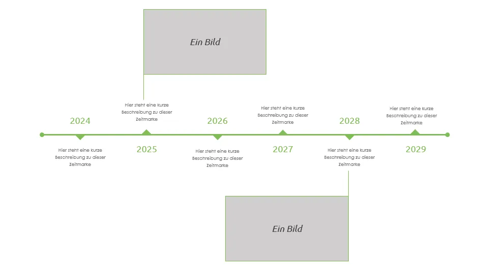
If you display a relatively space-saving timeline on your slide, a lot of space remains free - which is good, as you want your audience to concentrate fully on the timeline. If you want to show images , there is of course little reason not to use the free space for this. It is best to link the images to the corresponding timestamp using thin lines.
However, caution is again required here: The timeline in the following image already looks rather overloaded due to the change of label positions and the use of descriptive texts and images. If your timeline develops in this direction due to the large number of stations and information , two recommendations:
- Try reducing the number of stations on one slide by stretching the timeline over several slides. Examples of this are shown below.
- If you stick to one slide: Consider showing the stations one by one rather than all at once. You can do this with the help of animations(see below in this article).
Vertical timelines across several slides
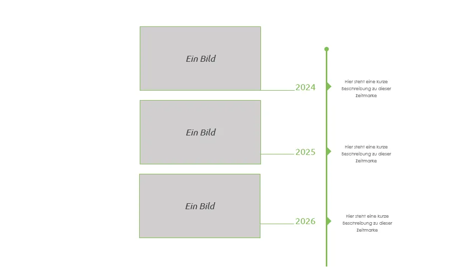
A timeline always runs horizontally from left to right? Why is that? You can also try out the vertical version . However, as presentations are usually displayed in 16:9 format, you'll soon realize that this is not the best way to display time: You can't fit too many stations in this way. After three to about five timestamps, the bottom edge of your slide is reached (at least if you create your presentation in 16:9 format). Accordingly, a vertical timeline will most likely extend over two or more slides . However, this change in layout opens up new possibilities, for example to accommodate images or diagrams.

3 | Animate timeline in PowerPoint
At the latest when your timeline becomes a little more complex and the stations with all their information cannot be grasped at a glance, you can think about an animation . Instead of displaying the complete timeline directly when the slide fades in, you can make the individual timestamps appear one by one.
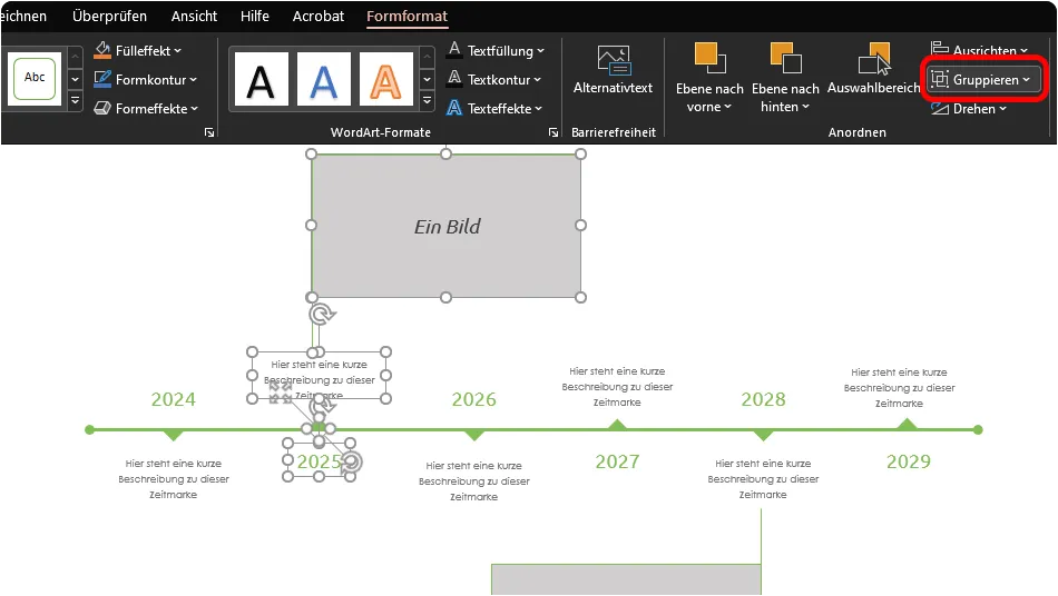
To do this, you should first group all the elements that belong to a timestamp. This will make it easier for you to animate them later. To do this, select all elements of a timestamp, open the Group menuin the Shape format tab and click on Group. Alternatively, you can also find the Group functionin the right-click menu.
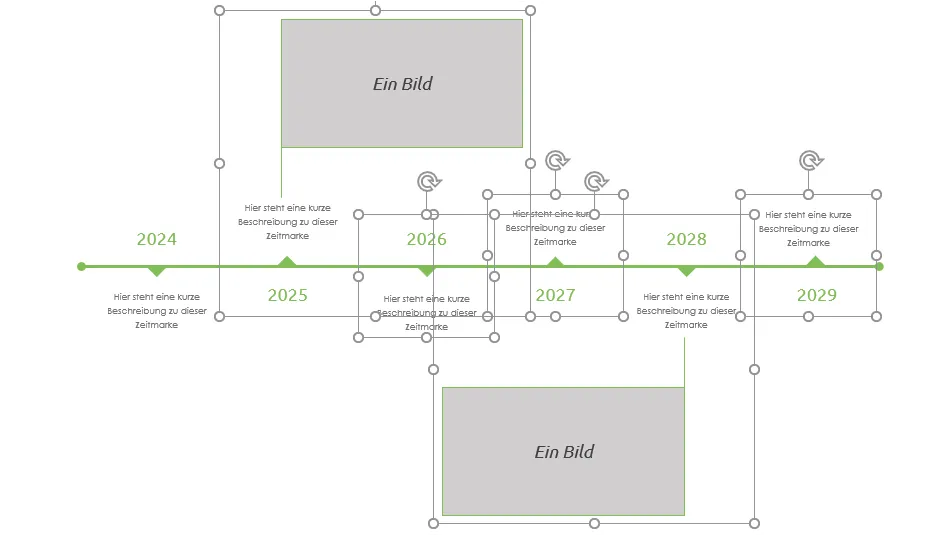
Now you can easily animate the individual stations on your timeline : Go to the Animations tab and open the animation area for a better overview. Select all your previously created groups and then assign them an animation.
Although there are many different and sometimes very playful animations available in PowerPoint, it is advisable to opt for simple variants such as appearing or fading. After all, the animation itself should not be the eye-catcher of your presentation - instead, it should help to direct the focus of your listeners and viewers to the essentials, point by point.
To be able to control the animation yourself during your PowerPoint presentation , you need to change its properties. To do this, select all animations in your groupings in the animation area, right-click and open the display duration window.
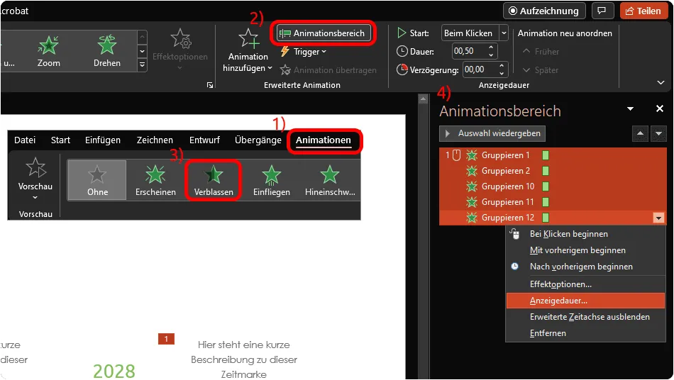
As the name suggests, you can set the duration of the animation in the display duration window. However, it is particularly important to set the start of your animations to On click. This means that the animations of your individual groupings no longer run automatically, but you can activate them yourself by clicking.

Already done! Open the slide with your timeline in the slide show and you will see that initially only the timeline itself or the first, non-animated station is displayed. Only when you click or press a key on your keyboard will the next station appear. With an animation like this , you can guide your audience from one time marker to the next during your presentation.
4 | Create a timeline from SmartArt graphics
In addition to shapes, you can also access some SmartArt graphics in PowerPoint that are suitable for creating a timeline. Click on SmartArt in the Insert tab and go to Process graphicsin the menu. There you will find templates that you can easily adapt for a timeline, such as the Simple process, Continuous block process, Continuous arrow process, Process arrows and Timeline with circle accent variants.
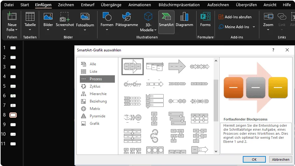
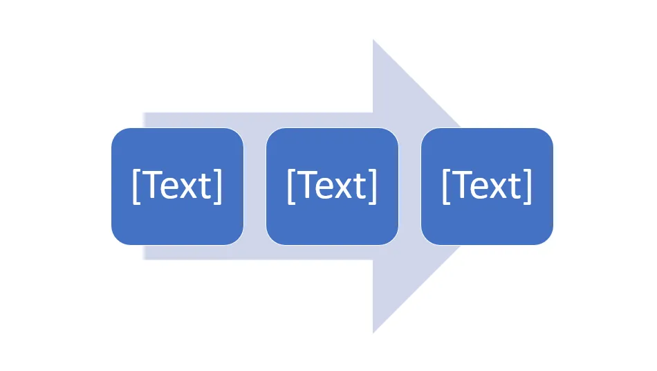
As an example, we will select the SmartArt template Continuous block process for a timeline. After inserting, the graphic looks overwhelmingly clunky, ...
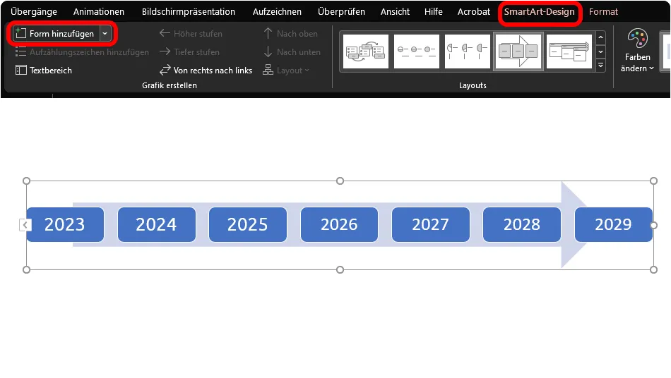
... but after adjusting the size and font and adding further stations via the SmartArt design tab and the options there under Add shape, we are already getting closer to the timeline.
The whole thing can now be expanded into a more comprehensive timeline with additional manually inserted shapes . For example, lines and text boxes were simply added below:

5 | 11 design examples from our PowerPoint templates
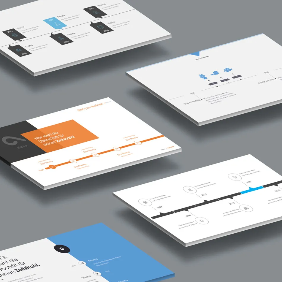
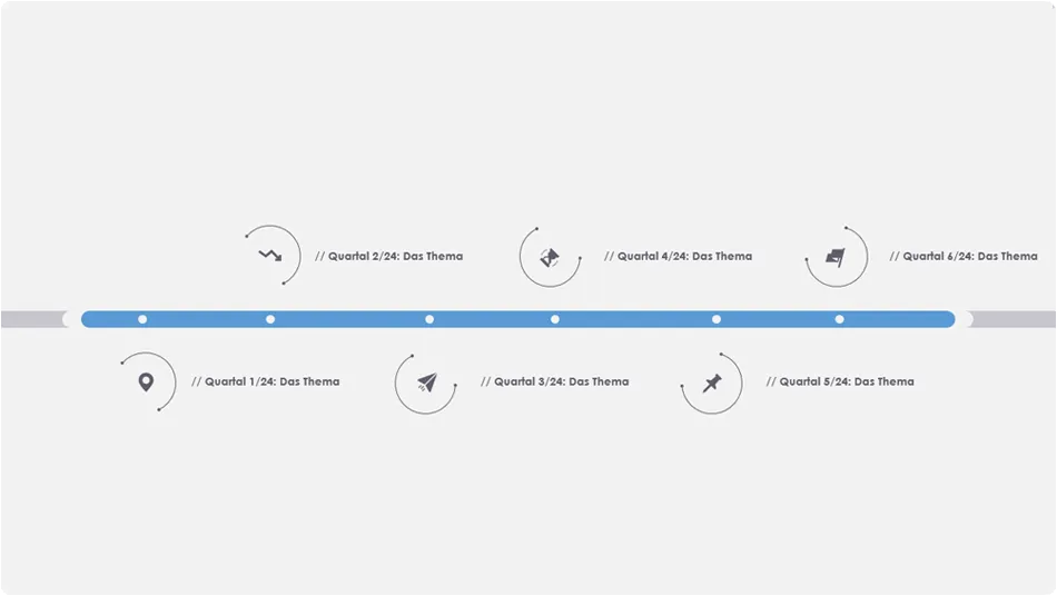
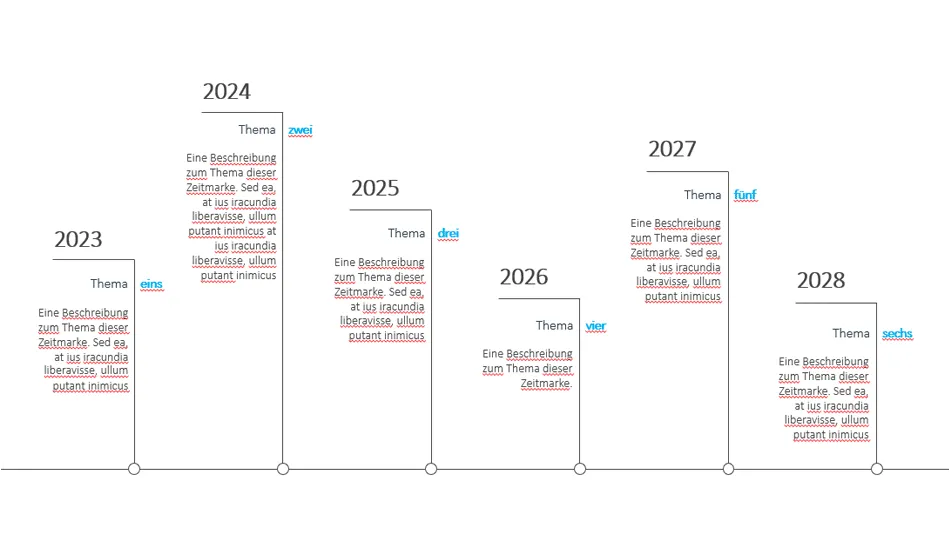
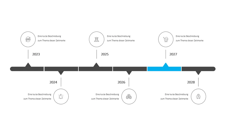
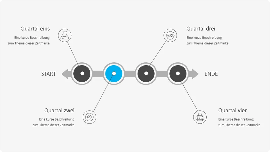
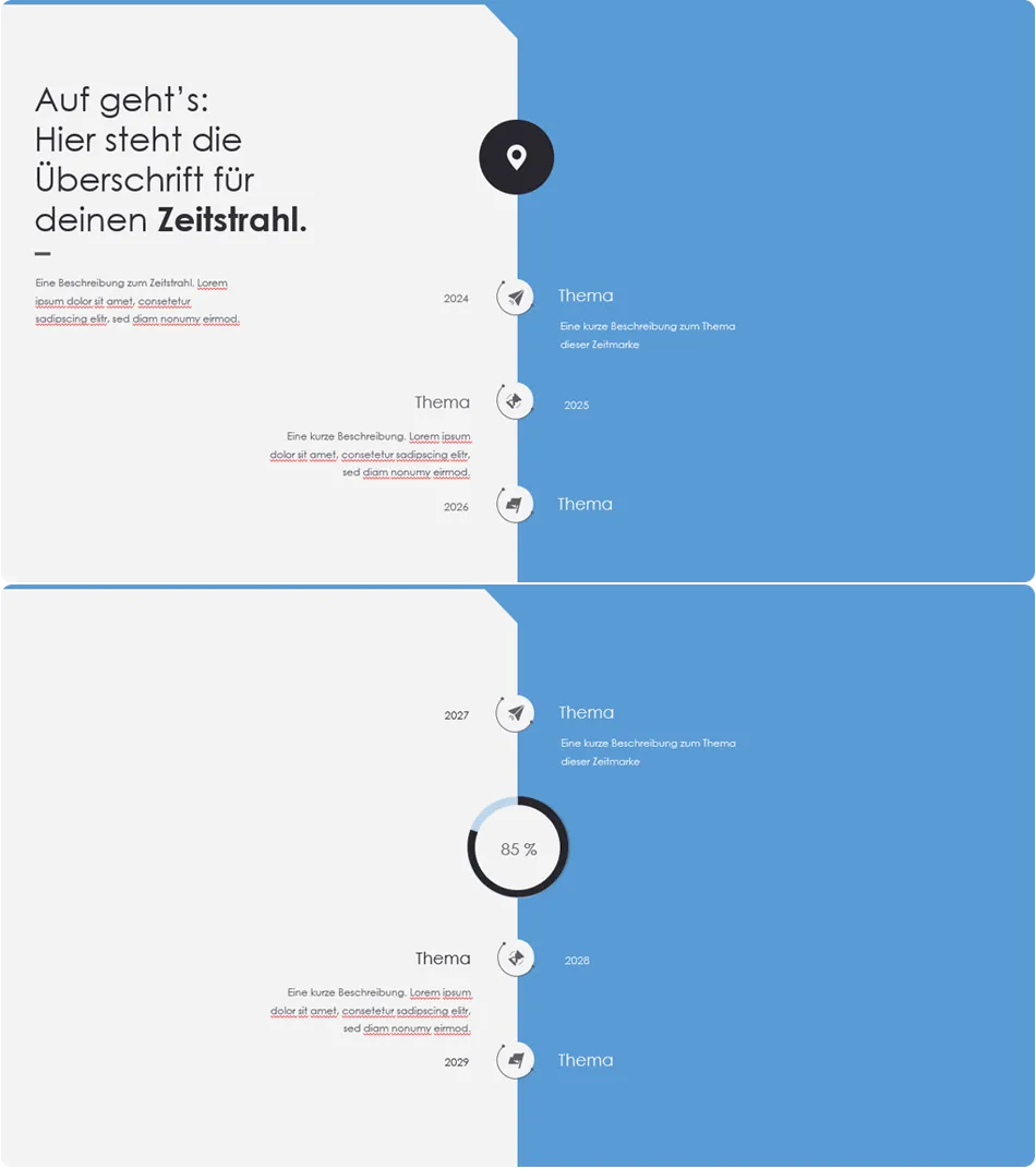
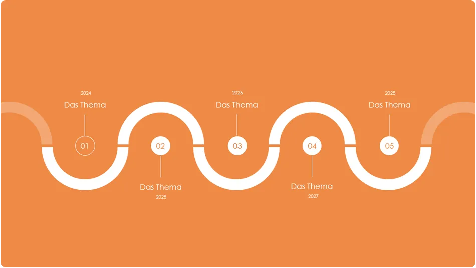
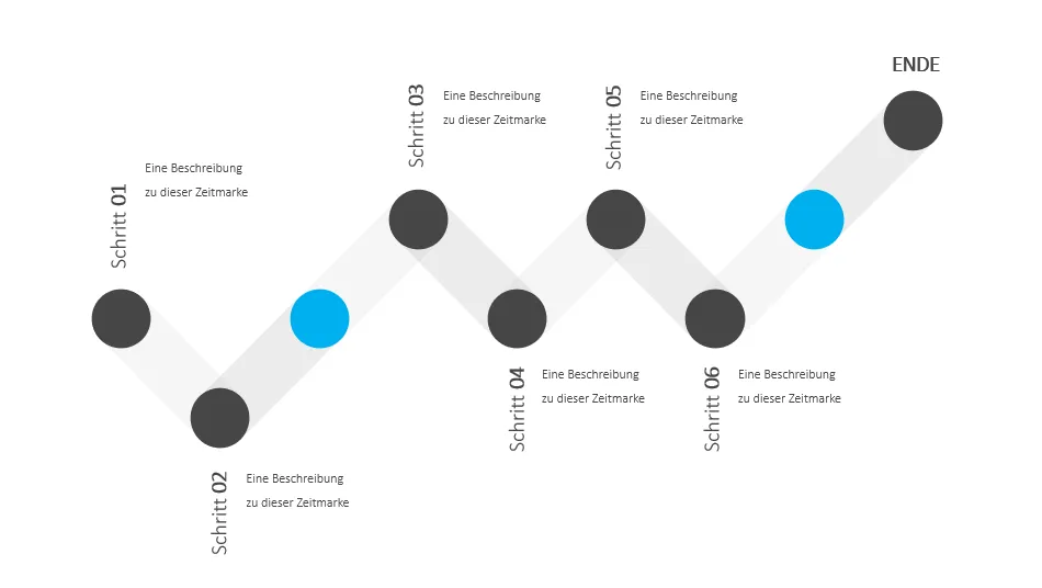
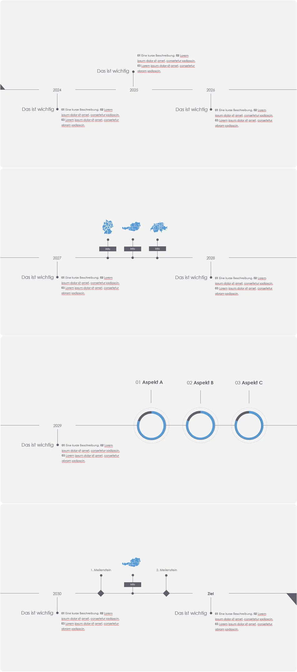
On TutKit.com you will find numerous PowerPoint templates with dozens of slide layouts. These also include timeline designs , some of which we would like to present to you. Let them inspire you to create your own timelines.
Horizontal timelines on a slide
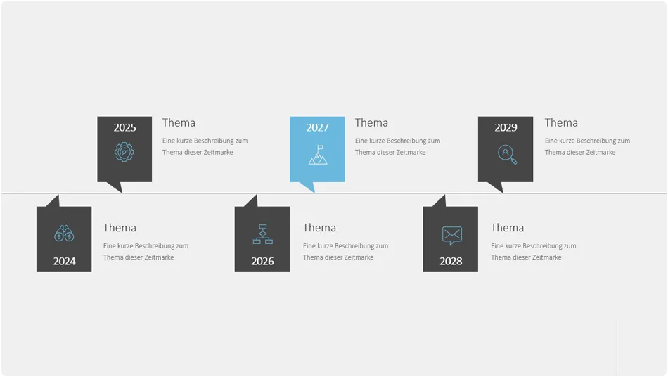
Horizontal and vertical timelines on several slides

Further design examples for timelines

Quite nice ... and complex
6 | Download free PowerPoint template with timeline templates
Download our free PowerPoint template with two examples of timelines right now. The first timeline is animated, so you also have a template for working with animations. The download is available in PPTX format and can be used in PowerPoint from version 2007.
If you need more than just a timeline for your presentation and a whole set of varied slides in high-quality designs, take a look at our category for presentation templates - many of these can be used not only in PowerPoint, but also in Keynote and Google Slides.
