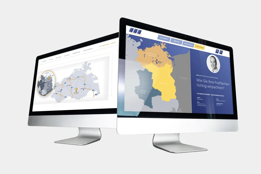
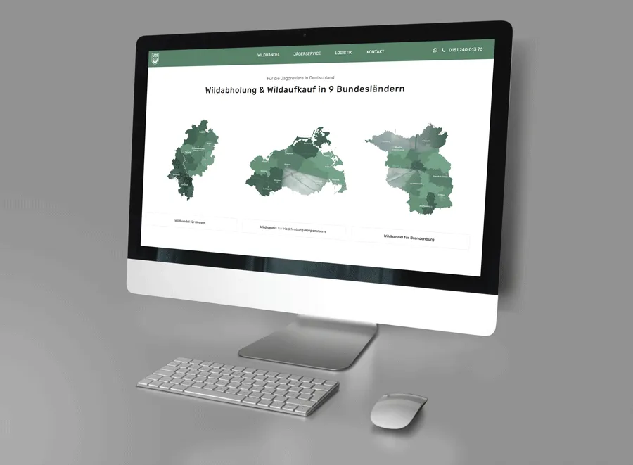
Where is your company based and where does it operate? If you want to answer these and similar questions visually, then simply put the answers on the map! We'll show you how to use our vector-based templates to create and customize your own maps in the colors and fonts of your choice. Step-by-step instructions, including video and free template to recreate.
Quick navigation
- Video for inspiration and with instructions: Companies that put their design on our maps
- Step by step: Create and design your own maps in Photoshop (using the map template for Hesse as an example)
- Excursus: Depicting areas of operation of companies in maps
- Excursus: Showing company locations on maps
- Free map template for Photoshop to download
TutKit in action: Companies that put their design fully on our maps!
It's a real pleasure to see TutKit.com's assets and templates in real-life use - such as our maps. In the video, Matthias Petri shows you a few examples of companies that fully base their design on our maps. You'll also get instructions on how to design the maps yourself in Photoshop ...
Step 1: Select your map template
For the imprint or the about us section of your website - for information flyers, image brochures or the final slide of your next presentation: If you want to show the location or area of operation of your company, we recommend our map templates for Germany, Austria and Switzerland as well as the 16 German federal states.
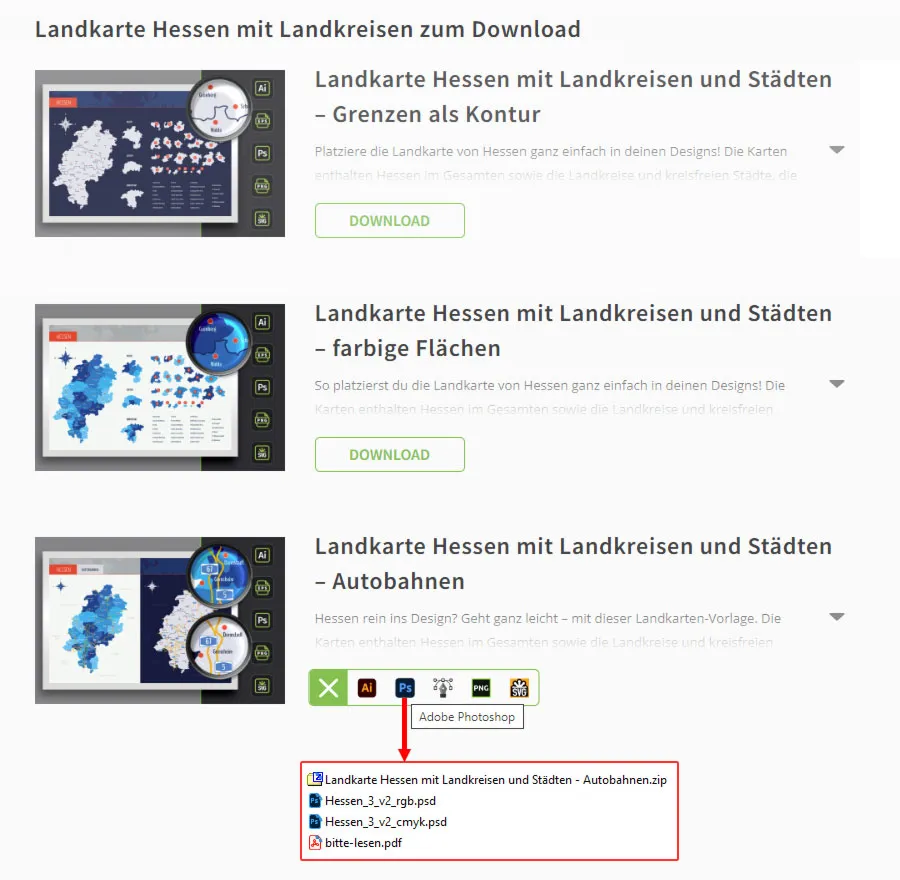
The maps of the federal states can be edited in Adobe Illustrator and Adobe Photoshop. They are also available as PNG, SVG and EPS files.
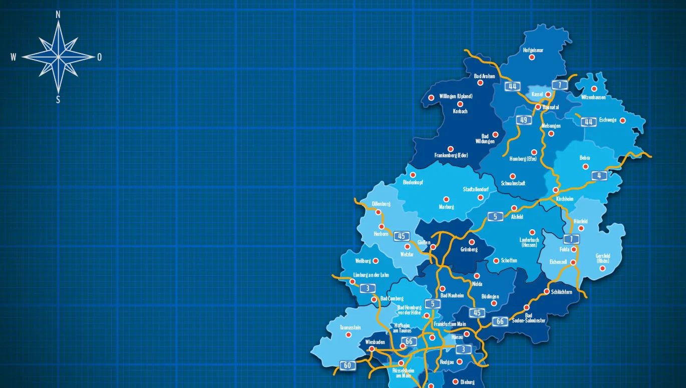
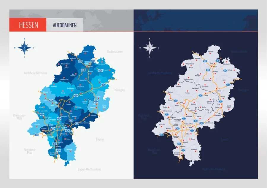
For the following instructions, we will use the map of Hesse. We will choose the Photoshop template that contains the Hessian highways. After downloading and unpacking the ZIP file, we open the RGB version because the map will ultimately be used on the web. If you want to print your map later, you should use the CMYK version.
Step 2: Which design should it be?
If you have also decided on a map with freeways, the map will be available in two designs after opening it in Photoshop: On the left-hand side, the areas of the counties come in different colors, from light to dark blue. On the right-hand side, there is a monochrome version in which the areas of the counties are separated from each other by contours.
In principle, it doesn't matter which variant you continue with, because ultimately you can also design the colored variant in one color and turn it upside down. However, it is quicker if you already know how you want to display your map and decide on the appropriate variant.
Step 3: Move the map to a separate file
Next, we create a new file in Photoshop with the values we need to display the map for our purposes. In our case, this would be a working area of 900 x 900 pixels at a resolution of 72 dpi. You are free to choose your own settings. The maps are based on vector shapes and retain their sharp-edged quality at both small and huge sizes.
In the layer mask of the template file, we then select the folder with the desired card design. Holding down the Ctrl key, click on the card and drag it from the template file into the new file. There we adjust the size of the card by transforming it(Ctrl + T). We can close the template file. This leaves it untouched and we can always revert to the original design later.
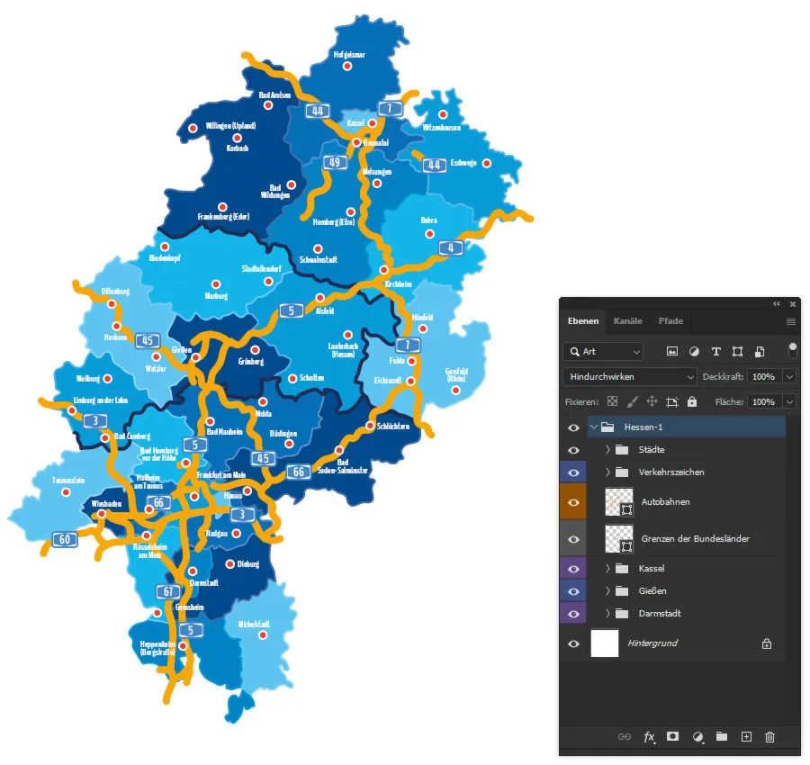
Before we start editing, let's take a quick look at the layers: In the map templates for the German federal states, you can show and hide all displayed cities, counties and highways and their numbering. So if you only want to show Kassel, Fulda and Frankfurt am Main in this example, simply hide the other cities . But we'll get to that in a moment. First, click through the available folders and levels to get an overview.
Step 4: Blend out what you don't need.
Let's get started with the actual design of the maps : First of all, let's Blender out everything that concerns the highways, because we'll deal with that later. So click on the eye icon in front of the "Traffic signs" folder and the "Motorways" layer. You can also hide the "Borders of the federal states" layer.
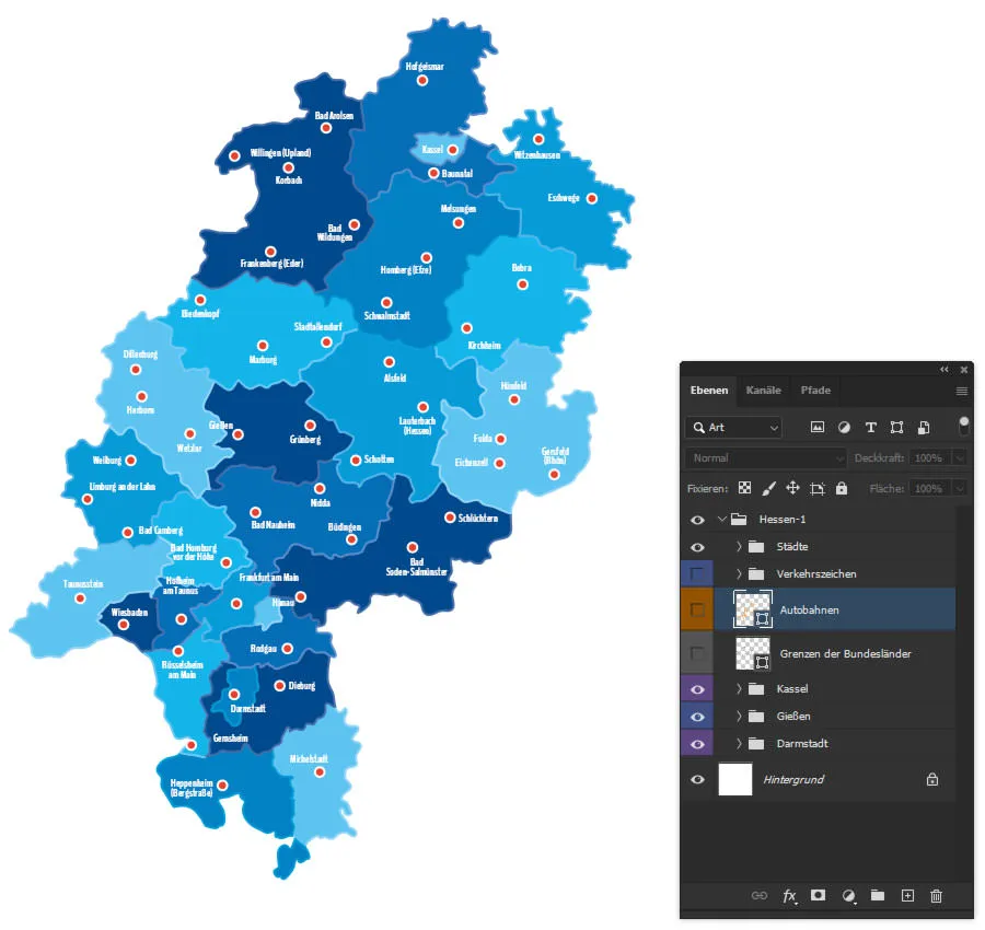
In the maps of the federal states, we have marked the positions of as many cities as possible for you. This way, you can easily decide for yourself which you want to display and which not.
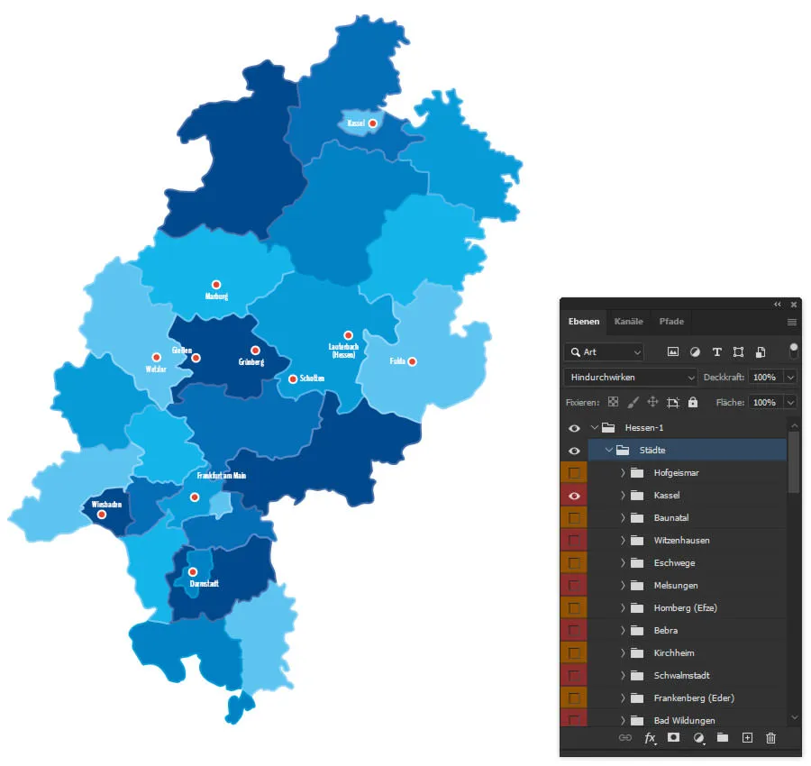
For our example, we are imagining a fictitious company that is based in Grünberg in Hesse and is mainly active in the central districts. In this respect, we display more cities there than in the other regions. Larger cities such as Kassel, Wiesbaden, Darmstadt and Frankfurt am Main are included for orientation purposes.
To show or hide cities, open the "Cities" folder and click on the eye icons in front of the folders.
Step 5: Maps in your corporate font
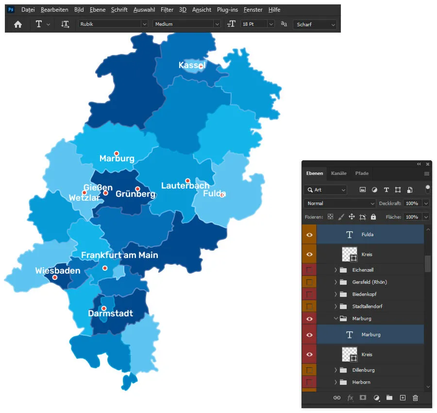
If your corporate design is important to you, you will certainly want to use your personal corporate font on your own map . The easiest way to customize all city names at once is to proceed as follows: Activate the Move tool (shortcut V), hold down the Shift keyand click on each city name. This will select all text layers with city names.
Then switch to the text tool (shortcut T) and specify your font, font style and font size in the menu bar. In our example, we will use Rubik's in Medium with a size of 18 points.
When changing the font, the city names on the map will shift a little. Here's a little tip: You can use the Move tool to roughly realign the names. However, their final positioning should be done at the very end when it comes to fine-tuning your map.
Step 6: Maps in your house colors
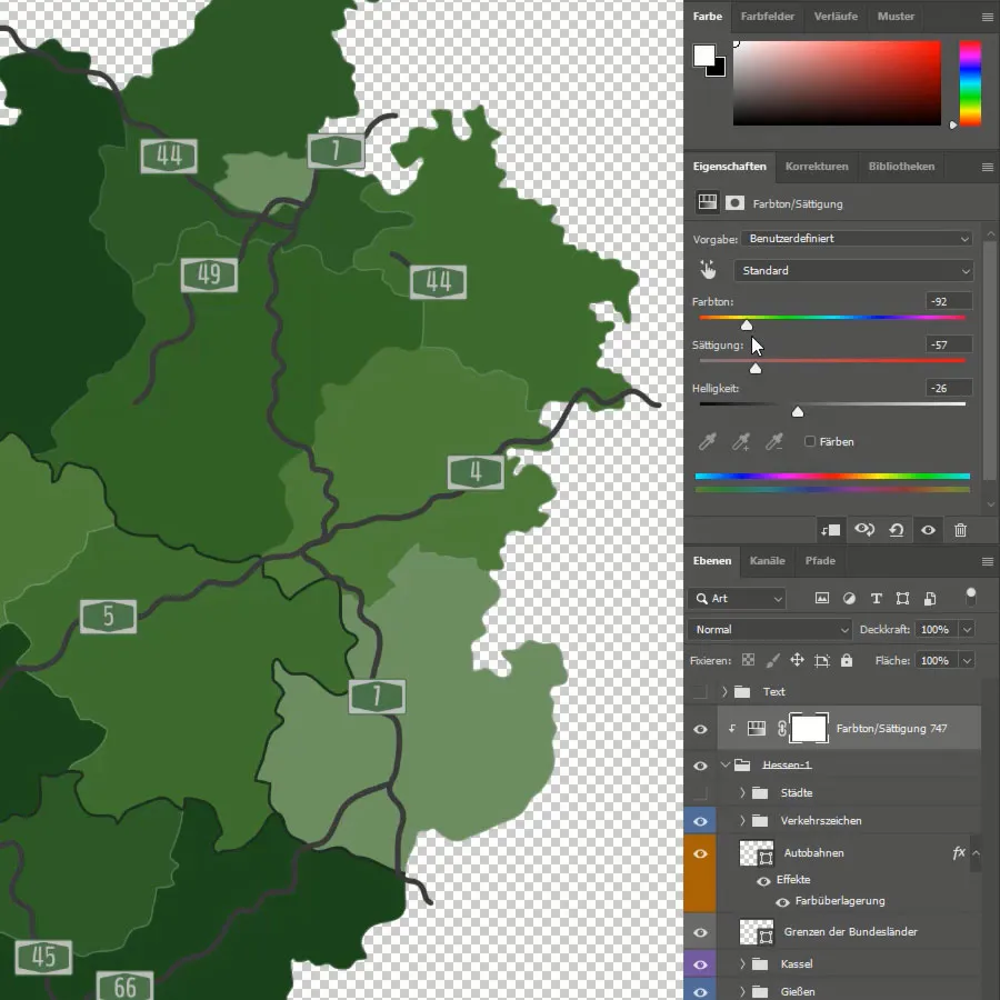
As with the font, it's probably the same with your colors: They should match your corporate design! But maybe you don't like the blue we've prepared and you simply want a completely different map color. So if you want to change the colors, you can use color overlays and clipping masks, for example. Matthias Petri shows you how this works in the video at the beginning of the blog post.
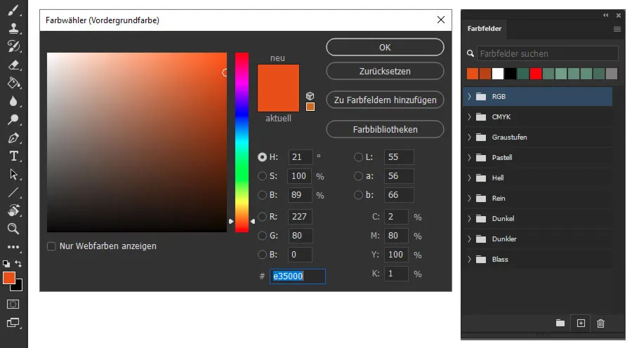
Another possible variant for adjusting the colors is described below: Create four or five variants of your desired color with different levels of brightness. Ideally, you should create your own color fields for this. To do this, click on the square for the foreground color in the tool menu at the bottom left and open the window for the color picker (foreground color). Set the colors here and click on Add to color fields. After assigning the name for the color field, you can sort the new color fields in the corresponding menu (Window > Color fields) if required.
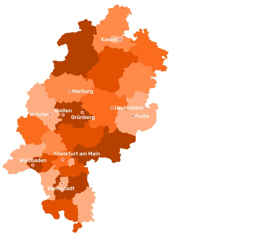
Have you found the right colors? Then back to the map: As before with the font adjustments for the city names, you now select all the counties that you want to see in a color variant. So hold down Shift again and click on the corresponding counties on the map.
Now activate one of the shape drawing tools with the shortcut U. In the context menu at the top, you can now change the color for the areas and contours of the selected counties. Click on the icons behind the area or contour and select the desired color from your prepared color fields from the menu that opens. If you do not want to display contours, use the same color as for the area.
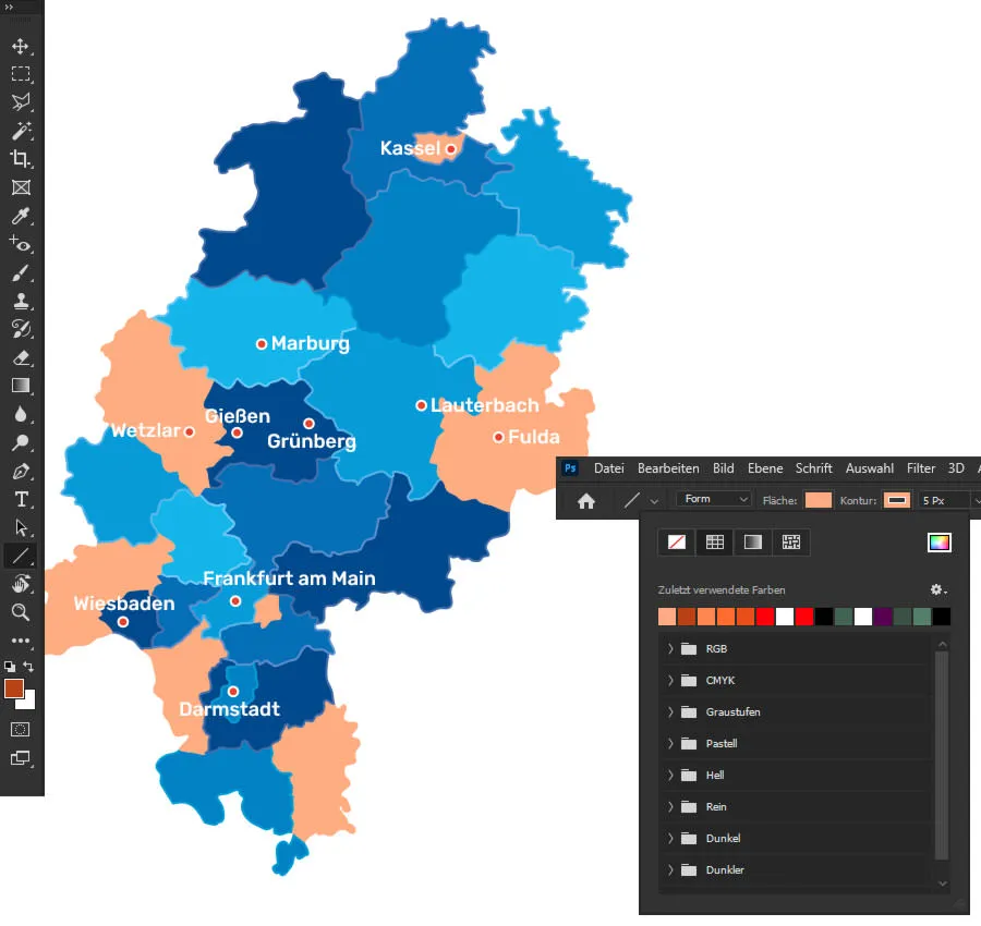
Then repeat the whole process with the other counties until you have given your map a completely new look ...
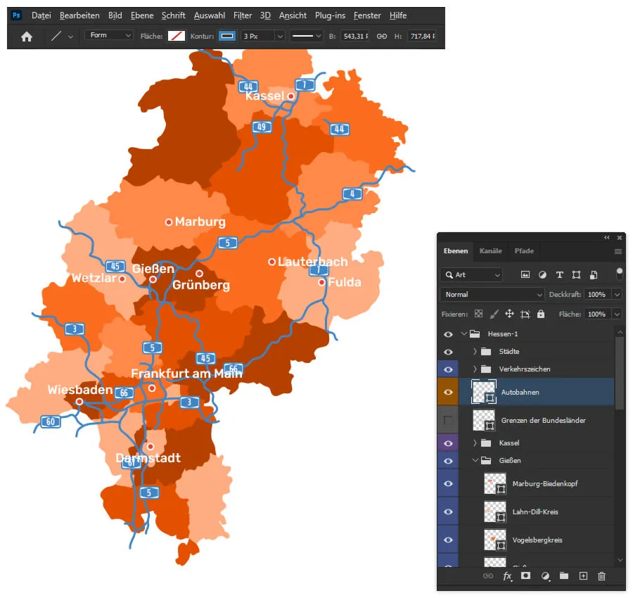
Step 7: Customize highways in a flash
Do you remember the layer with the highways and the folder with the traffic signs that we hid at the very beginning? Now we'll show them again. Select the freeways layer and activate a shape drawing tool again by pressing the U key . You can use the context menu to adjust the color, line thickness and line structure via the settings behind Contour.
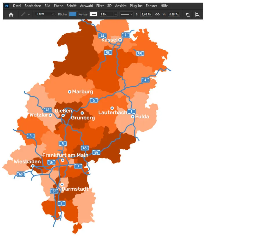
Step 8: Final adjustments
Finally, it is advisable to take another close look at the positions of the city names . For example, we have moved the name for Frankfurt am Main slightly here. Once you have finished, you can export and save the customized map.
Excursus: Show areas of application
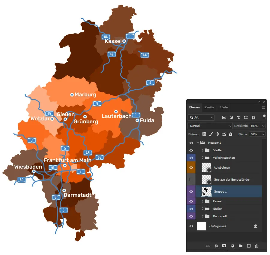
If you want to use a map to show where your company is active and where it is less so, here's an idea: Darken the regions where you are not active.
To achieve this, you can proceed as follows, for example: Using Shift and several clicks again, select all the counties you want to darken. Make copies of them by pressing Ctrl + J and put these copies into their own group by pressing Ctrl + G. Now make sure that the group with the copies is above the layers with the other circles in the layer control panel.
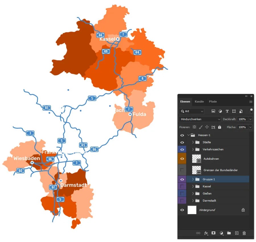
Now it's quick and easy: Press Ctrl + E to combine the copied counties into one layer. Hold down Ctrl and click on the layer thumbnail of the layer you have just created so that you select the areas of the counties. Now fill these areas with black (you can do this, for example, by setting the foreground color to black and then pressing the Alt and Delete keys). Finally, reduce the opacity or area value until you like the intensity of the darkening.
Tip for this: Of course, you can also work with color overlays for this process (see the video at the beginning of the blog post).
Excursus: Show locations on maps
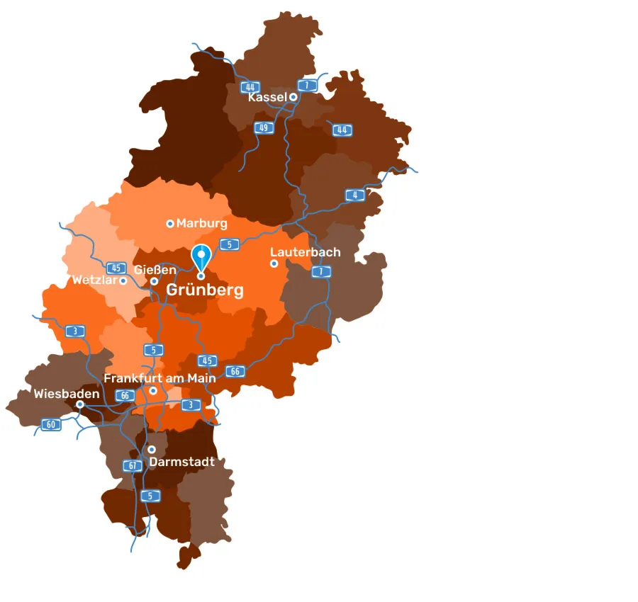
You probably also want to show exactly where your company is based or where there may be branches. To do this, you can, for example, slightly enlarge the font of the city name and place your logo there. Or you can take a location icon and insert it. The good thing is that our map templates for the German federal states always provide you with a suitable icon set.
In our example, we simply locate our imaginary company in Grünberg in Hesse and use a blue location icon:
Download free map and try it out for yourself
As the saying goes? Many roads lead to a customized map. The one described above is just one of them. If you want to follow it or create your own: Download the free map template of Hesse for Photoshop now and try it out. The download includes the map of Hesse with counties in different color gradations, without highways and prepared in RGB.
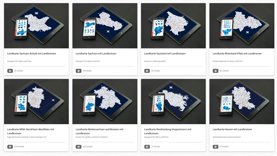
And as a reminder: All our map templates are not only available for Photoshop, but also for Illustrator, Affinity Designer and more. Click through to our map category and select the map you need:
We wish you a great editing journey with your personalized maps!
