If you consider individual elements of a website that also have a positive impact on the user experience, the logo is brand-forming and deserves its own consideration. In this article, I would like to give you a few tips from our agency practice on how you can ensure a high user experience for your website users when using your website logo.
The website logo replaces the home page menu item
The logo is often placed in the navigation bar and should ALWAYS be linked to the homepage. Users today also expect that clicking on the logo will take them back to the homepage. The logo thus also replaces the "Home" menu link, which is sometimes still visible on websites today to link to the homepage. A home link as a separate menu item in the navigation is unnecessary. And this also saves valuable space.
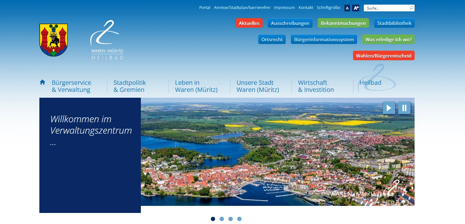
The town of Waren (Müritz) in northern Germany, where our company is based, has decided to use the house icon to help users interact with the home page. It was probably used here for two reasons: On the one hand, another logo was placed next to the logo, which could reduce the number of clicks on the logo. On the other hand, it is perhaps assumed that the users of this website are less familiar with the Internet. To be honest, this house icon only enhances the user experience to a limited extent, as this website has many noticeable shortcomings in terms of information architecture, user interface and also accessibility (especially the contrasts for reading links and text). The website of the town of Waren (Müritz) thus remains a negative example.
Responsive logo: Adaptation of the logo according to the resolution of the device
While a lot of space is available in desktop views and therefore the company name or claim can be included in the logo, the logo should be placed in a reduced form in the mobile view for reasons of space and attention.
As with websites, the trend towards adapting logos to size, medium and environment has been established for years. This is also referred to as a responsive logo, which means that the logo takes account of the environment and also presents itself perfectly on smaller media, which means that it may have to be displayed differently in some respects. In contrast to rigid logos, which look the same on all devices and screen sizes, responsive logos adapt to the respective requirements and thus offer a consistent and optimized user experience across different end devices. The logo is only reduced in its form, but not in its brand message.
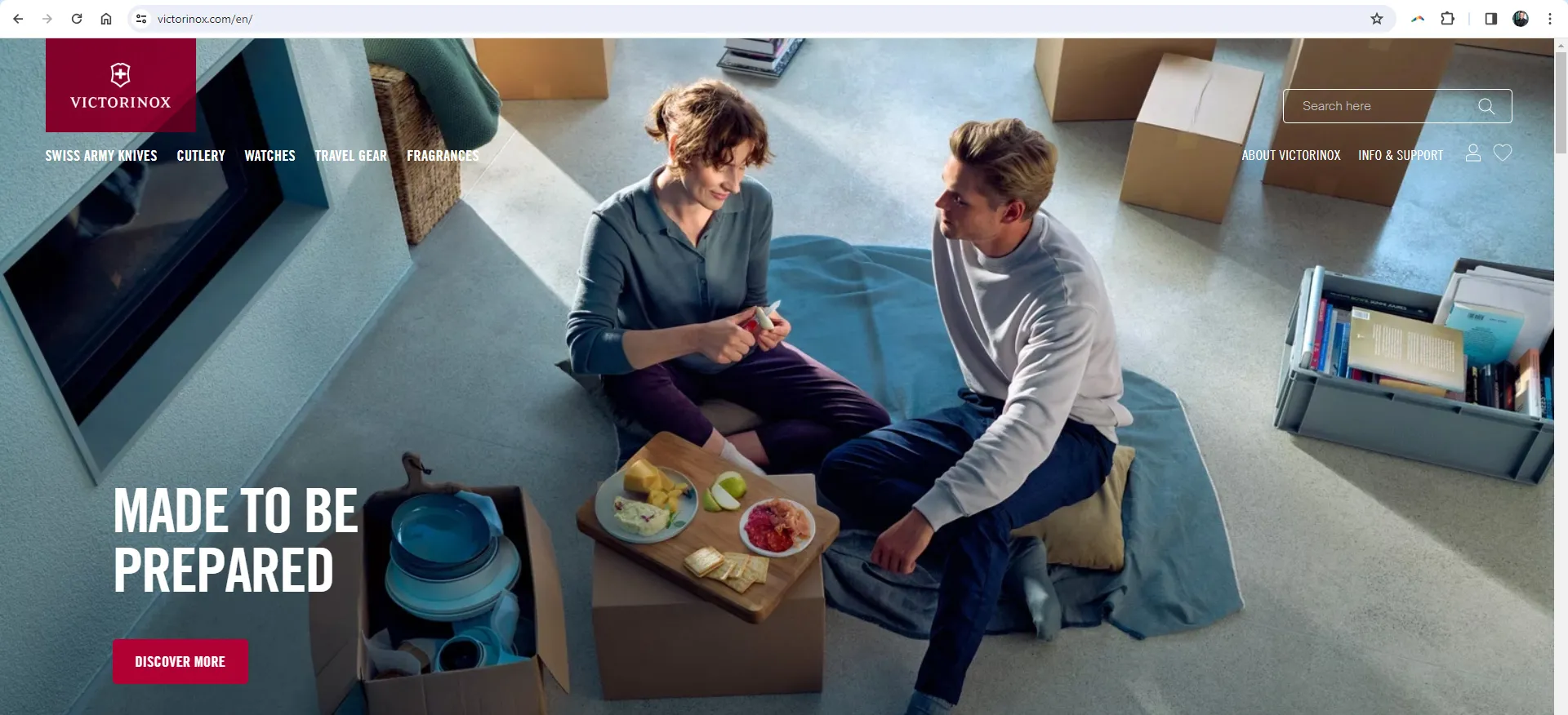
The Swiss company Victorinox offers a positive example. The large icon is displayed to the user as the first view. The only drawback is that the logo is integrated as a PNG file instead of an SVG.
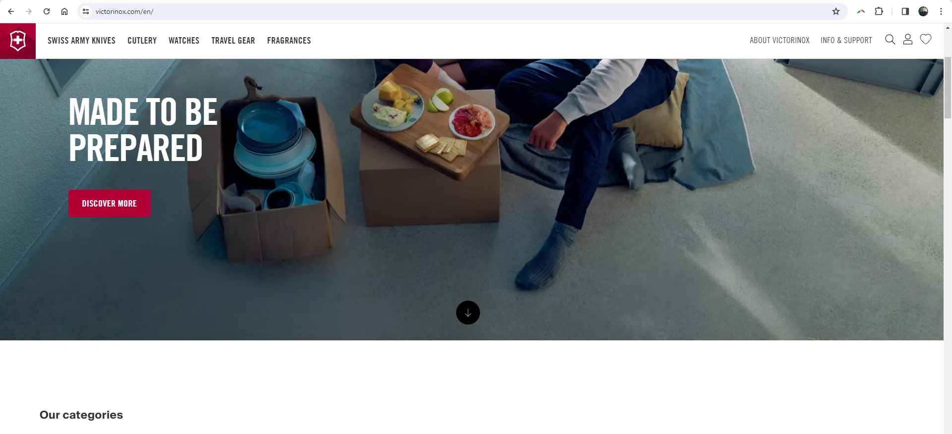
Only the image element is displayed in scrolling. A mountain can be seen in the background, emphasizing the Swiss origin. Branding is therefore important in the first viewport. The user should understand. Victorinox is the right place for you. If the user scrolls down, the content becomes important. The logo is reduced in size and gives the main content more space. The navigation remains at the top, which also makes a lot of sense from a usability perspective.
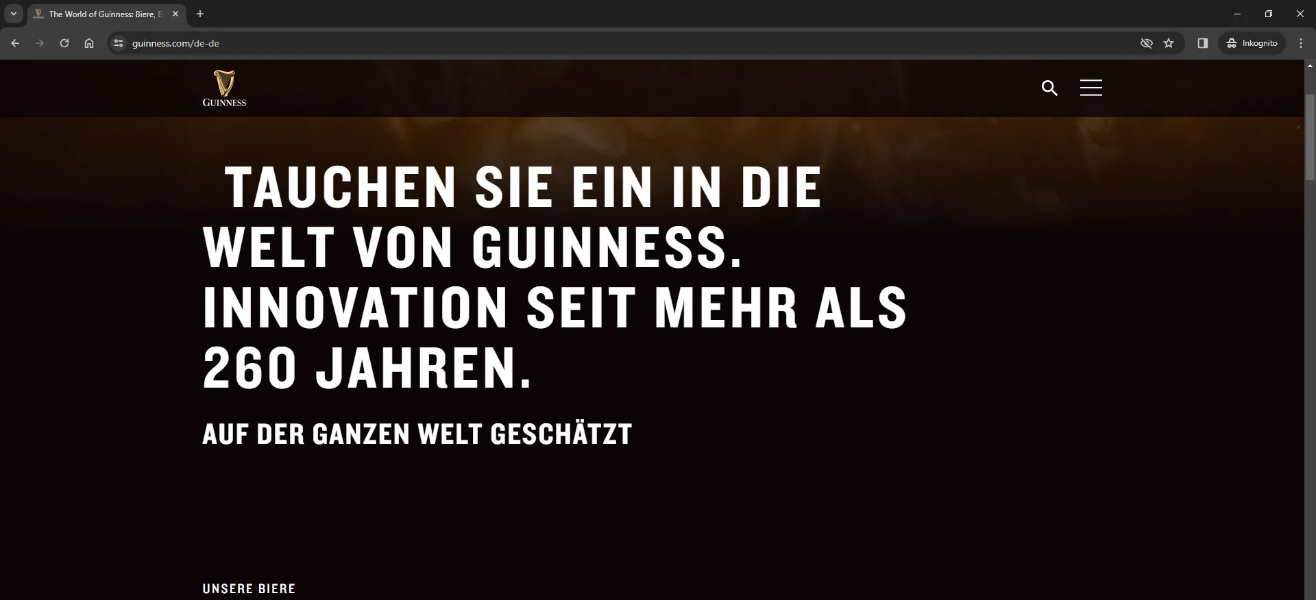
Another approach is taken by the Guinness website: The logo is placed with the company name. When scrolling, the logo becomes slightly smaller while the navigation remains visible. As soon as a user starts to scroll up, the logo and navigation become larger again because it is expected that the user will want to visit further pages.
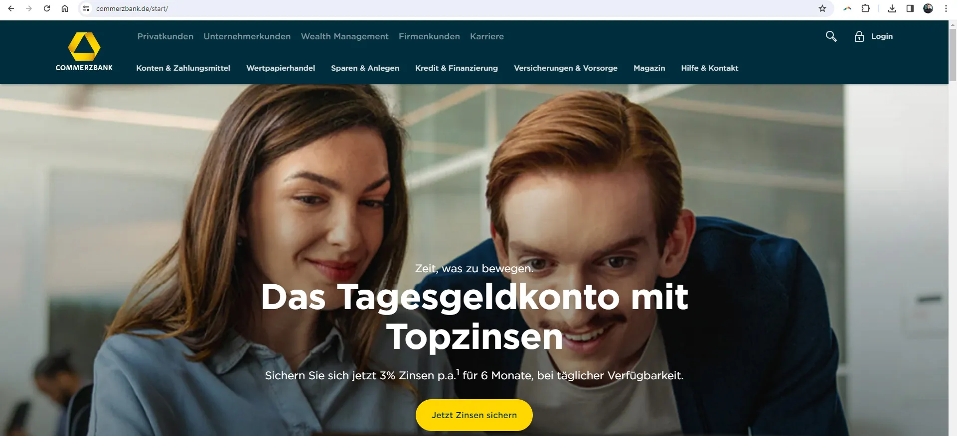
Commerzbank has not solved this problem optimally with its website. The logo is visible with the company name and placed as an SVG, which is a good solution. However, it competes very strongly with the adjacent navigation points. When scrolling, the navigation disappears completely and the user has to scroll all the way up again to see the navigation. A better solution would be for the navigation to appear as soon as the user starts scrolling up, as zeit.de has done.
From a conversion optimization perspective, Commerzbank's large image with the two people's gaze is a very good solution. They are looking in the direction of the button, which automatically directs the visitor's gaze to the button. Guiding the visitor's gaze to the call-to-action in this way is very effective. Well done, Commerzbank!
It gets interesting when we look at the examples in the mobile version.
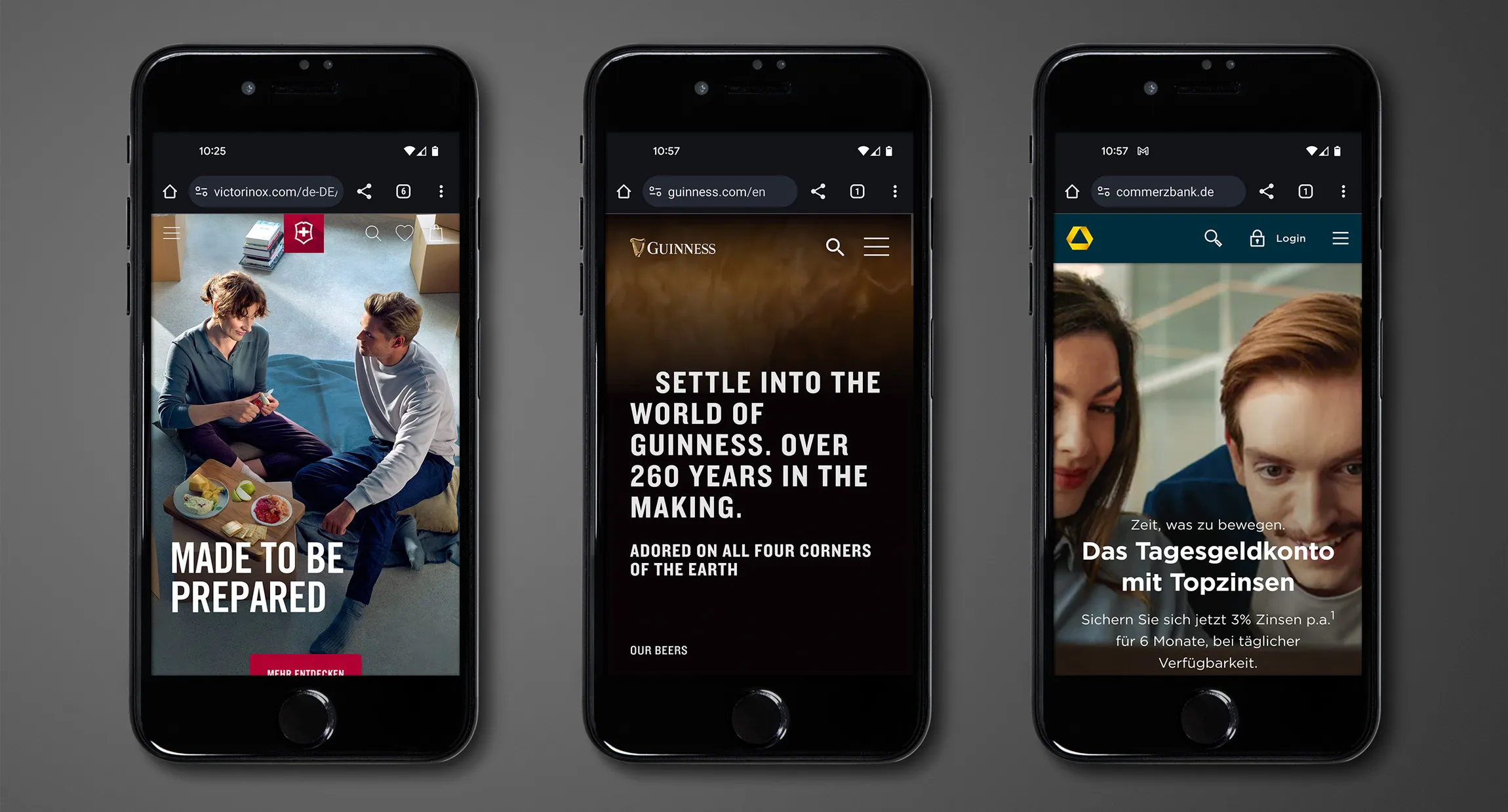
In the mobile version, the Victorinox logo is displayed even smaller and in the center to better structure the interaction options for the user. Guiness has placed the text to the right of the logo instead of below it. This gives the harp more space and the top navigation bar is not too large. Commerzbank, on the other hand, simply hides the text in smartphone resolution.
The role of responsive logos in the user experience is important as they help to maintain visual consistency and brand identity, regardless of how users access the website.
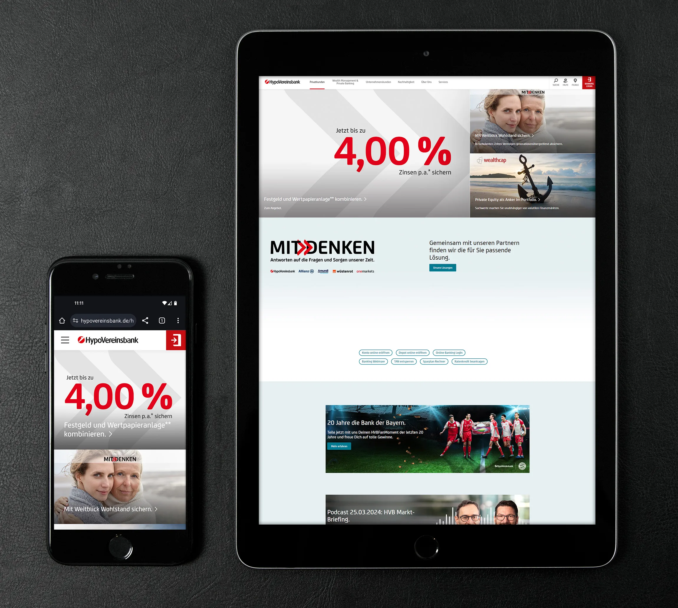
If a logo is not responsive at all to changing resolutions, a logo can also attract too much of the user's attention. In the following example of Hypovereinsbank, the very present logo competes too strongly with the call-to-action placed on the right-hand side - especially in the smartphone view. The navigation points in the middle gray are easily overlooked in the desktop view. In general, this website also has a few other UX errors.
Designers must therefore provide several logo adaptations to ensure responsive logos. The logo must also work well on different backgrounds, and also in different sizes. The smaller the resolution, the less detailed the logo becomes. However, it must not lose its brand essence. This is the fine art of using responsive logos. So if you are commissioning a brand relaunch, think about this requirement when using your upcoming logo.
The file format of the website logo
The use of responsive logos makes sense because the correct size is loaded depending on the resolution. With smaller resolutions, for example on a smartphone, only the smaller graphic is loaded. This saves loading time. However, you will achieve the greatest effect on your loading time if you:
- embed the logo in the correct resolution (also with height and width specifications). Logos are often embedded in a resolution that is too high and are then downscaled for viewing.
- embed the logo in SVG vector format instead of PNG or JPG.
Use the website logo as a favicon
Also use the reduced form of your logo to use it as a favicon. Do not use text or other small elements that are not recognizable in the small resolution of the favicon.
While the Guinness website from the example above uses the logo responsively for the website very well, it is not ideal as a favicon. The small white Guinness text is not recognizable and reduces the overall impression of the favicon. The contrast is low. The impression would be much better without the text and reduced purely to the harp of the logo. The other examples in this article have all solved this better than Guinness.

If you are looking for an agency that focuses on responsive logos, please contact us. We at 4eck Media are user experience professionals.
If professional positioning is important to you, you may also be interested in the following icon packages and corporate design templates:
High user experience with the website logo thanks to responsive behavior
From Matthias Petri
