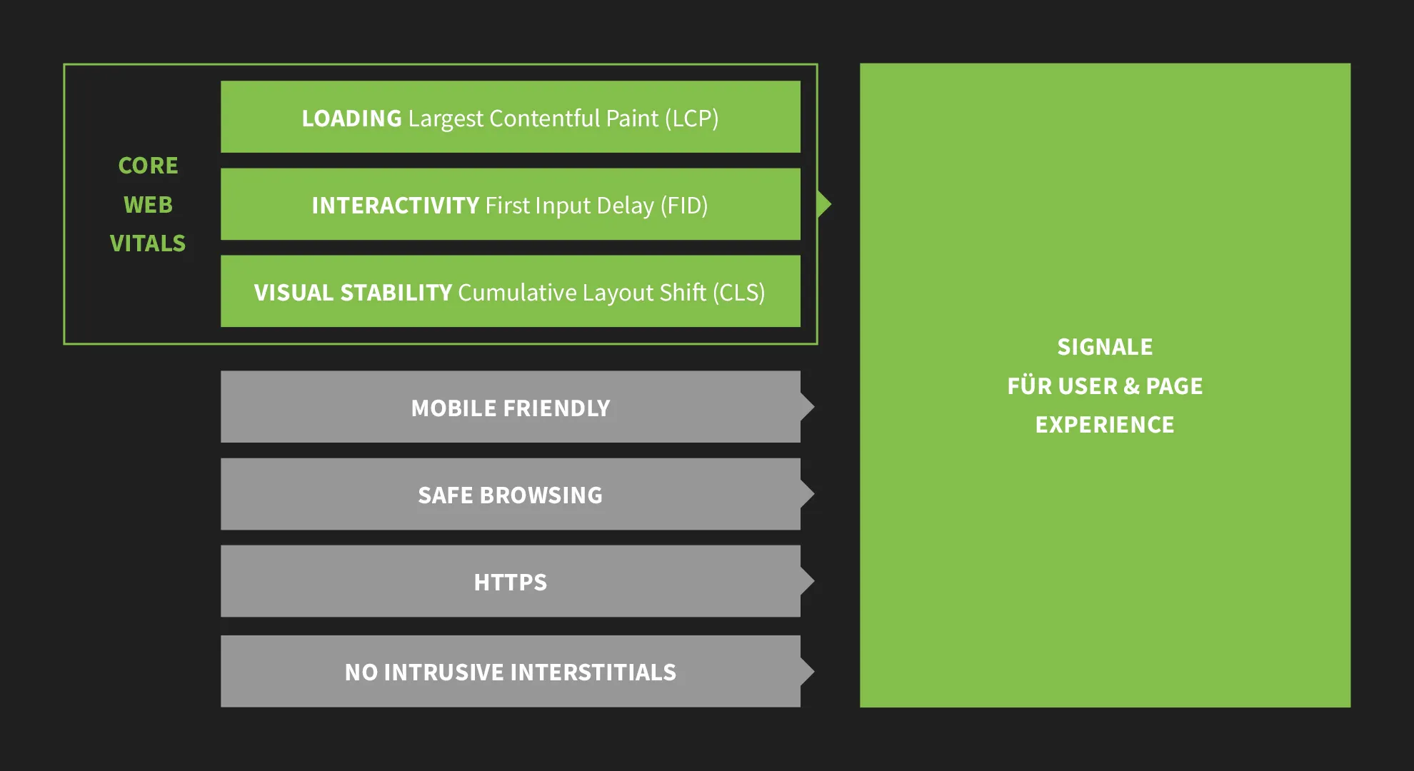
In recent years, Google has increasingly made factors such as PageSpeed, mobile optimization and trustworthiness positive factors for listing in Google search results. In May 2020, Google announced that it would bundle certain measurement metrics as Page Experience Signals and in May 2021, Page Experience Signals were rolled out as a new ranking factor for websites, using various factors to create a holistic picture of the quality of a website's experience.
The seven six primary factors for User & Page Experience include:
- Loading speed
- Interactivity (FID - until February 2024), Interaction to next Paint (INP - since March 2024)
- Visual stability (cumulative layout changes)
- Mobile optimization
- Safe browsing: no malware, no faking of brands, ...
- HTTPS: encryption via SSL certificate
- No intrusive interstitials (full-surface banners)

Loading speed in terms of the Core Web Vitals
Loading refers to the website speed, how quickly the main content is displayed for your user. Google specifies times of up to 2.5 seconds as a good value that website operators should aim for for their users.
Interactivity and responsiveness in terms of core web vitals
Interactivity in the sense of the first input delay means when a page actually reacts when a user wants to interact with it ... for example by scrolling or clicking on a button. It is therefore the reaction speed of the website to user interactions. This period should be kept as short as possible and a good value for Google is up to 100 ms. Since March 2024, the metric has been replaced by Interaction to Next Paint (INP). Interaction to Next Paint (INP) measures the overall responsiveness of a website to user interactions by monitoring the delay of all mouse clicks, keystrokes and keystrokes that occur throughout a user's visit to a page. The final INP value corresponds to the longest observed interaction, excluding outliers. Latency is defined here as the time between a user action and the occurrence of a visible response to it.
The script for my digital marketing tutorial, which was created in the online application Google Docs, comprises over 600 pages. In the back chapters, I noticed small micro-jerks when writing in my browser, as it was obviously struggling to load the resource-hungry hundreds of pages, including the many image files, smoothly. An event that did not necessarily hinder me in my work, but nevertheless represented a reactive disruption in use. So I created a new document in which the chapter was created and then copied it into the large script. This is exactly what the interactivity of websites is all about, that the user experience is positive in many different facets. So it's about reacting to certain interactions with scrolling, clicking, gesture controls and also the smoothness of animations.
Cumulative layout shifts in the sense of core web vitals
Cumulative layout shifts , i.e. CLS errors, occur when your website loads asynchronously and a user reads a section further down, for example, while an image or advertisement with a large file size loads at the top and the final placement causes the layout to jump downwards. It is often the value that causes the Core Web Vitals to fail if your website itself loads quickly.
Test PageSpeed with online tools
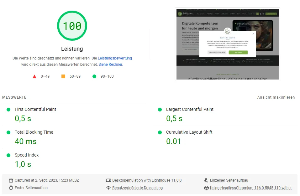
PageSpeed can be tested here:
https://pagespeed.web.dev/
https://gtmetrix.com/

Alternatively, you can also use Lighthouse in the dev functions of your Chrome browser. Simply press F12 and then you will find Lighthouse in the menu on the right, which you can use to test the currently open website.
The website and response speed depends on many factors such as server performance, code quality, what is loaded when, image file sizes, icons as SVG instead of PNG, etc. Therefore, it makes sense to stick to the recommendations of GTMetrix and PageSpeed Insight first in order to achieve global improvements if the values are not yet good.
Google will also give you the summarized value for the new Core Web Vitals for Page Experience as a result. In the Google Search Console, you also have the option to get an assignment to the individual pages of your website. This helps you to identify and fix a problem on your pages during the analysis.
Mobile optimization of a website in terms of the Pages experience
The mobile optimization of a website can also be tested via the dev tools of your Chrome browser with the Toggle Device Toolbar (Ctrl + Shift + M).
For developers in particular, it is sometimes important to be able to understand how a layout reacts on a specific device, for example if a customer reports a problem with an older model of iPhone. Under Chrome = F12, different devices can then be activated directly, which then display the resolution. There are also professional tools that carry out comprehensive tests, such as the Lambda Test service.
Mobile optimization also means that users can comfortably view content on a smartphone without having to zoom in! It also means that content that can be seen on a large desktop computer does not necessarily have to be visible on a smartphone. A smartphone has other (mobile) interaction mechanisms, such as touch instead of click. This is particularly important for the popular hover elements on websites, which do not work in this form on smartphones.
Today, smartphones are also often the starting point for research that may later be continued on another device such as a tablet or desktop computer. This is therefore the start of a longer customer journey across multiple devices, which is why the user experience must also take cross-device use into account.
An example from my personal experience of cross-device use: My partner and I have three children together. We recently went to a friend's indoor pool. My smartphone was lying in a beach chair near the pool area. A thought occurred to me: what would happen if the smartphone fell into the water by accident or through one of the kids? My smartphone already runs half of my life. But the thought became even more explosive because I also manage my portfolio on my smartphone. 100% mobile ... that's how Trade Republic, my online broker, advertises. I suddenly realized that I would have no backup option if I lost my smartphone. I wouldn't be able to access my securities account for several hours or even days. Anyone who has a few knockout securities with high leverage and a tight knockout threshold in their portfolio during the day can imagine that this can trigger a small panic. 100% mobile thus became a latent disadvantage for me, which is why I opened a new account with another neobroker, where I can trade both mobile and desktop. Trade Republic now also has a desktop version - that's a good thing!
Safe browsing in terms of the Pages experience
Safe browsing means that your website does not deliver malware and that you also adhere to the rules, for example by not using brand logos that you are not allowed to use or pretending to have branded products that you do not have in your portfolio. This also means, for example, that a play button for playing a video should actually play a video and not download anything for the user. The malware point in particular is the biggest risk for many websites in safe browsing, which can only be limited by constantly updating the CMS and plugins used. If your website does not necessarily need a contact form, it is worth considering doing without it because the form fields offer hackers or automated hacks a gateway for SQL injects, cross-site scripting, hexadecimal codes, etc.
In August 2021, Google reversed its previous position and declared that Safe Browsing would no longer be taken into account as a ranking factor after all. This step was justified by the fact that many website owners cannot be held responsible for hacking. Nevertheless, there is a recommendation for safe browsing in the PageSpeed Insights and Lighthouse evaluations. It can therefore be assumed that the issue for SEO is not yet definitively closed.

Secure connections via HTTPS for a high Pages experience
HTTPS is standard today. Every site should have an SSL certificate. Especially in Germany, there is also a risk of warnings for website operators who do not have an SSL certificate.
In this context, it is particularly important to ensure that the images that were placed before an SSL certificate was assigned are also adapted from http to https in the code. Otherwise, the browser will indicate that the page is not secure. This is particularly the case with WordPress sites - the most widely used CMS of all.
Do not use interstitials
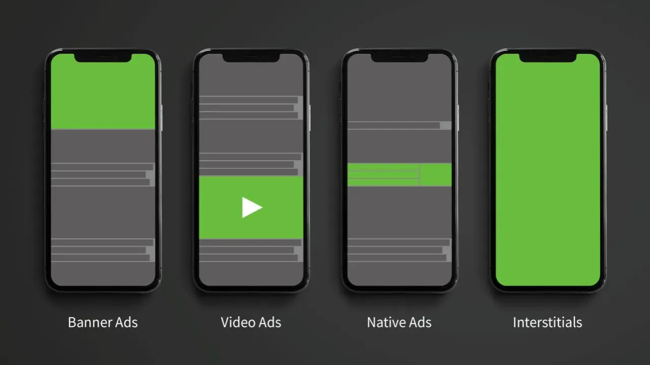
The last point in the chart is to avoid intrusive interstitials , i.e. full-surface banners that rarely make your users' hearts beat faster. They only encourage frustration and thus cause negative emotions and quick abandonment. In this context, you should also think about quickly popping up newsletter sign-up banners. Cookie banners to welcome new customers are also frustrating. If a user returns directly to the SERPs after experiencing such a banner, the user signal for Google is also negative.

Conclusion on the Page Experience factors
The adaptation to the Google factors for a high user & Pages experience can largely only be carried out by your developers or your supporting agency. It is important for you as a marketing employee to know which metrics are used to measure the page experience and which tools you can use for this. If your agency is commissioned with the optimization, ensure directly in the contract that the work requires very good measurement results for the acceptance of the service. And be absolutely aware that since May 2021, Page Experience has been actively influencing the search and ranking of websites on Google. Your competitors will also have experienced ranking effects and will have adapted their websites to the new requirements if they have fallen in the SERPs.
If you want your online presence to rank higher in Google search results, there's no getting around the topic of Page Experience. And ultimately, you're not just doing it for SEO reasons, but also as part of your brand experience so that your target customers are more easily led to the desired behavior.
So what other elements in particular enhance the user experience of your target group on your website? Basically, it's all the touchpoints that your user encounters on their customer journey along the funnel to the desired conversion. More on this in other parts of this help series.
Pages Experience is an SEO ranking factor for Google (Core Web Vitals)
From Matthias Petri
