Microcopy - wherever we have to make decisions online, we come across these small text modules. If they don't speak to us, we ignore them. Markus Möller reveals how you can change this on your website in this blog post.
Microcopy shows us the way through websites and apps, can be a door opener or a stumbling block. We read it on buttons or in contact forms, as a newsletter invitation or success message. Here's an example from the "real" world for comparison:
Imagine you're interested in a new car. The salesperson convinces you, you are on fire and want the car. All that's missing is the contract. But what happens? The salesperson suddenly sounds like a machine, says: "Fill in the form", "read more". And when you try to sign on the wrong page, he informs you in an uninformative way: "Error 404."
Welcome to the world of digital communication. While the product or service is advertised in a warm and cozy way in the description texts, microcopy usually sounds cool and mechanical. Of all things to motivate you to take action? You experience it every day on call-to-action buttons, login interfaces or websites that are inadvertently accessed incorrectly. Yet it is precisely at these points that a clear and emotional approach is essential.
Why microcopy must sound human
The creation of headlines and product descriptions is usually in the hands of professional copywriters. Their job is to make the character of the brand tangible in the language.
Microcopy, on the other hand, is still usually "done on the side". That's why the small instruction texts on buttons and forms sound like foreign objects, as if a machine were talking to you.
Even if you are sitting in front of a machine - communication ALWAYS takes place from person to person. To motivate, it has to sound human. Only when you have the feeling that a person is talking to you will you react emotionally and do something - because you want to, not because you have to.
You can achieve this with good microcopy
It's surprising why microcopy, which is so important, is given so little importance in many cases. You should change that. The additional effort for creation pays off in any case and generates important added value. Good microcopy can do all of this:
- It creates a positive experience.
- It helps in a targeted, clear and unambiguous way.
- It generates emotions - because it can make users laugh, convey security or simply guide them confidently through the respective process.
- It improves usability - because it simplifies user interfaces, reduces sources of error, saves users time and frustration, takes away the feeling of helplessness and breaks down fears and barriers.
- It strengthens the brand identity - because if it picks up on the brand's tonality, users can build a deeper relationship with the product.
The important result: with good microcopy, you reduce the bounce rate on the website and app, and your users stay on the ball for longer - in the best case until they successfully complete a purchase or booking.
How to put good microcopy into practice
So how does microcopy work in practice? I'll show you with a few examples. Often, you don't have to do much. Sometimes all it takes is an additional word or a statement that becomes a question - and the effect is different. When writing microcopy, you should keep a few important things in mind:
- Write so that the words sound good when you say them out loud.
- Say it simply and conversationally.
- Ask questions to create curiosity.
- Convey emotions.
- Use connecting words such as articles or pronouns (e.g. instead of "save settings" use "save your settings", instead of "open the window" use "open the window").
Communication is made up of words, and if you leave them out, you remove the building blocks of the human relationship. So write in roughly the same way you would speak to the other person in real life.
Use your words to create an environment in which your users feel comfortable. And: humor is an important icebreaker. Used in moderation, it can increase sympathy for your brand.
Button texts: make it click immediately
The button is one of the most important elements on your website. After all, it should encourage users to perform a certain action. This can be a simple click to continue reading, a final registration, the option to download or order the entire shopping cart. You should therefore take your time to create a button - and test it again and again later on.
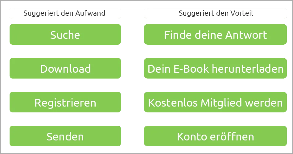
Avoid generic button names such as Search, Send, Download. They do not convey the benefits of the desired action. If your users have to think about it themselves, they are likely to lose interest. Such terms suggest one thing above all: effort. I have to download something, search for something, send something ... It's better to emphasize the advantage of each click right away - and take the decision away from the user.
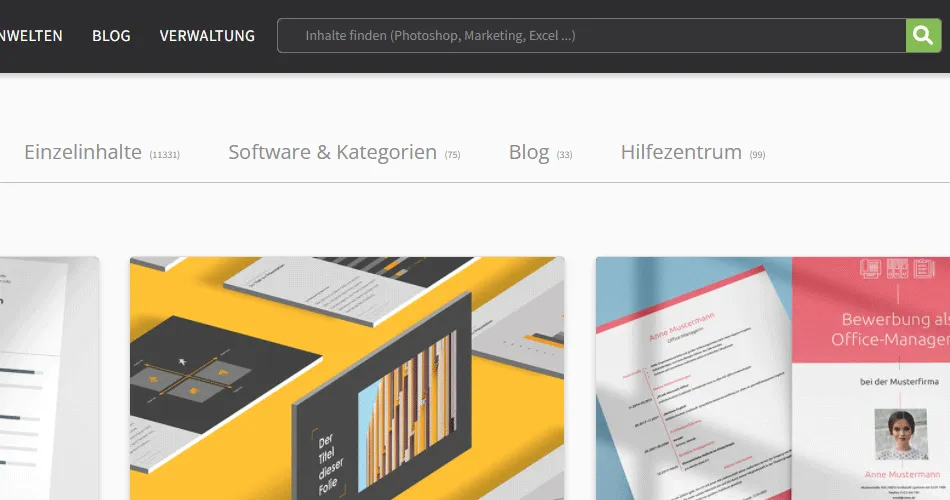
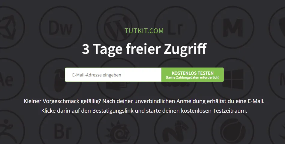
Important : Always remain clear and unambiguous. If you confuse your users, they will leave. A typical example of this is the Cancel action. Here, of course, they want to know what they are actually canceling.
- Rather confusing:
Cancel now? [Back] [Cancel] - More clear:
Cancel order now? [No] [Yes]
Cookie banner: Is there more than just the law?
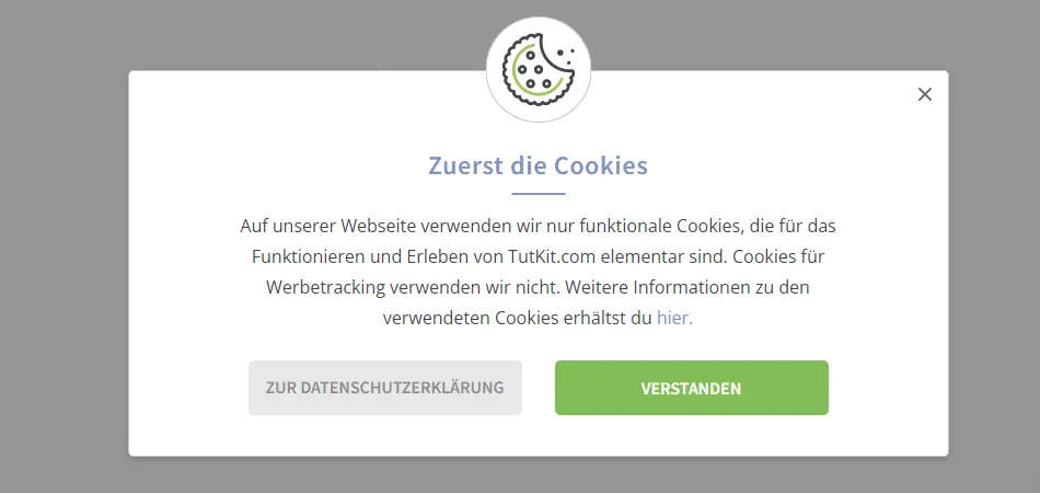
Sure, the law is the law. But instead of sounding like an official directive, you can also add some fluffiness to the cookie banner text . Depending on the tone of your brand, your cookie copy can even have a little wit or charm. Of course, it is and remains important that you communicate the actual message - the law - clearly and don't confuse your users.
- A common cookie banner text:
This website uses cookies that are necessary for the technical operation of the website and are always set. Other cookies, which are intended to increase the convenience of using this website, serve direct advertising or simplify interaction with other websites and social networks, are only set with your consent.
[Accept] [Reject] [Customize] - A more charming solution:
A few cookies for more proximity? We use various cookies. Some ensure that our website works properly, others allow us to measure what you like on our pages, and others make the marketing between you and us much more personal. How would you like it?
[Confirm selection] [Confirm all]
Create an account: Your invitation to the inner circle
Creating a new account is a sensitive action. You enter into a relationship with the users. If you communicate vaguely here, you run the risk of them leaving prematurely. Friendliness and well-tempered language are also good door openers. Here are a few tips for implementation :
- Formulate clearly what you want your users to do - and, depending on the tone of your brand, win them over with a pinch of charm.
- Give them a sense of security - after all, this is sensitive data.
- Be friendly.
Important: With every process that users are asked to complete, they automatically ask themselves the question: "Why should I do this?" Firstly, they hate forms because they take time and require personal data. And secondly, users only commit to something if they really have to.
- A typical login interface consists of the rather terse heading "Customer account", followed by fields that ask for "Last name", "First name", "Address", "Email" and "Password". The password often coolly states something like: "Must contain at least 12 characters. Please use upper and lower case." All this is garnished with a button called "Send".
- Such a login interface is more appealing with a friendly greeting ("Nice to meet you") and a clear statement about what it is all about and the benefits of the action: "Sign up once and track your orders, deliveries and order history". A more appealing formulation for the queries can also be helpful, such as: "Your surname and first name", "Your address" and "Choose a secure password". The submit button can, for example, provide a small portion of additional security with "Log in securely".
Forgotten password: Show how easily you can solve it
"What was that password again?" We've all been there. And everyone wants to solve it quickly. After all, it's annoying enough if you can't remember the 15-digit combination of numbers, letters and special characters straight off the top of your head. This is where you can score points as a quick problem solver. Back this up with a clear message. A bit of humor is also a good idea here. Just always stay respectful and close to the topic.
- The usual standard:
Forgot your password?
We'll send you a confirmation e-mail. Click on the link in it to change your password.
- Maybe your new default:
Forgot your password? Help is on the way.
We will now send you a confirmation e-mail with a link that you can use to easily change your password. Click on it, change your password, done.
The contact area: Encourage communication
There are actually companies that prefer not to receive mail from their customers. Too much work. You must be different, right? And that's why you can open the door to successful interaction in the contact area with a lot of friendliness.
- Make people curious about your brand.
- Use relaxed and friendly wording - avoid official language.
- Provide security when it comes to spam & co.
A standard text above the contact form:
- Contact form
Please fill out the following form. We will get back to you as soon as possible. You can revoke your consent to the processing of your data given above at any time for the future. Please refer to our privacy policy.
How about this introduction?
- How can we help you?
Our contact area is the ideal place to ask questions, make requests, solve problems or simply send us praise. Just write to us. We'll reply as quickly as possible - and without any spam.
You can also make us smile:
- What's on your mind today?
If you have any questions, want to send something back or simply want to tell us a heroic story from your childhood - go ahead. We'll get back to you within the next 2 days. Don't be surprised if it's earlier.
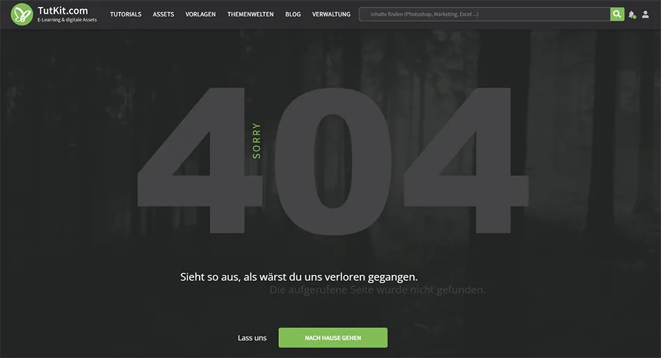
404 - Page not found: Get more out of an error
You know the drill. A typo in the address line or an outdated link and you're in nirvana - or rather, on the 404 error page . If you read nothing but 404 there, you're sure to use the back button in your browser - to say goodbye to this page and therefore to the entire website. But you could have done so much more.
A simple mistake can tell me what you are not, or it can remind me why I should love you.
Renny Gleeson
404, the story of a non-existent page
The quote says it all about why you should do better with your 404 page. You can use it to
- Tell something charming about your brand,
- show in a funny, intelligent way how you and your brand deal with your own mistakes,
- turn your users' anger about this page into a conciliatory smile,
- offer added value - e.g. with nice-to-know tidbits or helpful links to your other pages.
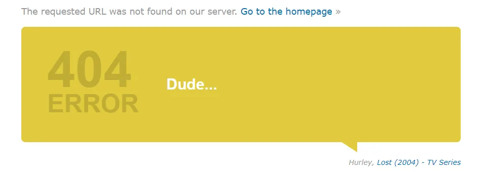
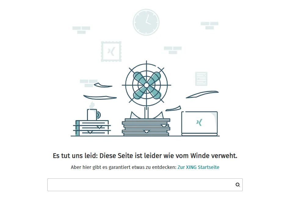
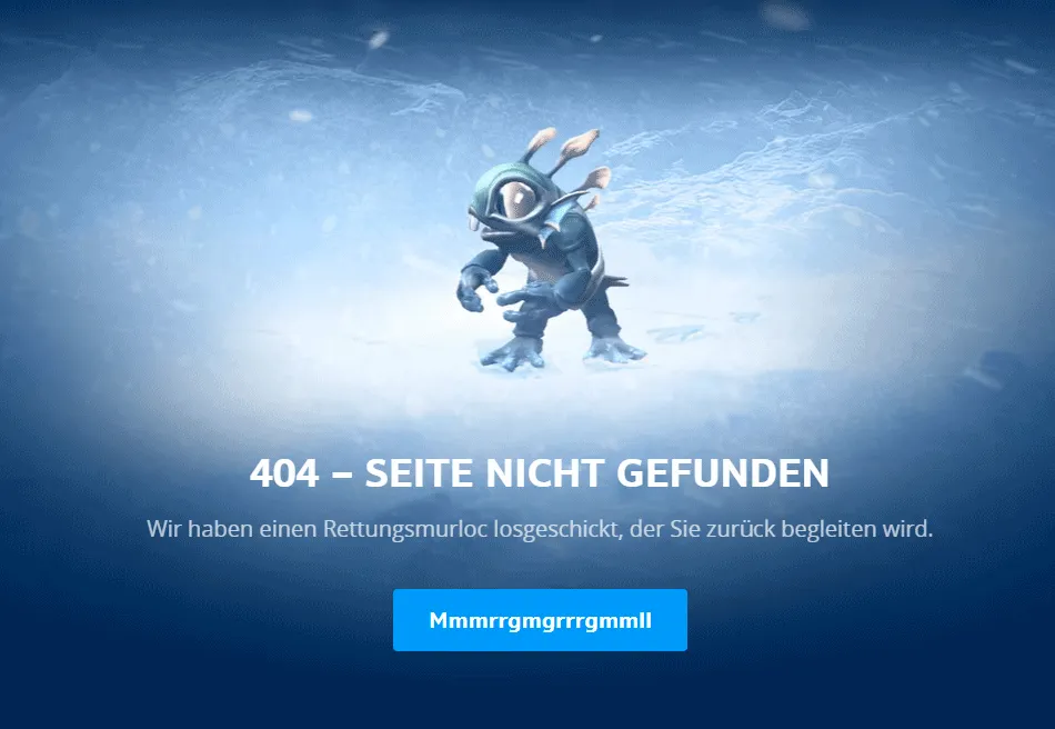
Whether graphically or textually - you have plenty of scope for creativity here. Play with your brand and incorporate it in a Schick way. Here are a few examples of what I think are successful 404 pages:
Newsletter: whet your appetite for emails
Does this kind of thing make the hairs on the back of your neck stand up? No sooner have you clicked away the cookie text than the next window pops up and invites you to receive a newsletter. If the invitation was at least original ... Instead, you read a hackneyed line like: Sign up for our newsletter now!
Why would you or anyone else do that? So if you want to make a newsletter appealing to your users, tell them WHY they should sign up. Remember: Your users have to give you their e-mail address. With the threat of spam, no one will just do that. You'll have to convince them, and these 3 steps can help:
1 . who says you have to advertise your newsletter with the word newsletter? Choose a different title, arouse interest with an intriguing sentence like:
Take a break.
Dive into the 100 most beautiful surf spots in the world.
[Your e-mail address] [Register now]
2 . what do your users get out of signing up with you? Do some convincing:
Do you have an appetite?
Cook something delicious based on a good recipe.
We serve you every week:
- 10 fresh recipes for indulgence from hearty to vegan
- Exotic tips for creations from around the world
- Interviews with the best chefs in Germany
[Your e-mail address] [Register now]
3 . almost everyone immediately thinks of annoying emails when they think of newsletters. In the previous step, you convinced your users otherwise. Now you need to take away their worries about receiving spam:
Unsubscribe at any time. We'll only write to you once a week, guaranteed. Spam? Without us!
Time to get to work
As you can see, it's worth investing time and creativity in these little wonder words called microcopy . They give your users a positive experience at every touchpoint of their customer journey. With the right tone of voice, you create sympathy, with empathy and clarity you create trust and with subtly launched humor you appear more human. In short: you create a genuine sense of well-being that is transferred to your entire offering, sets you apart from your competitors and ultimately increases the overall value of your brand.
Finally, one last tip that you should also take to heart despite all your creativity: Certain terms may be so familiar to your target audience that they specifically look for them. For example, the website section for job vacancies should be called "Jobs", "Career" or "Vacancies" and not "Desire for change". Creativity is good, but never at the expense of user expectations. If both are combined, all the better.
Microcopy - small text with a big impact - and now up! It's time to find the right words ...
