Today I'm going to create my own menu for a restaurant using the available templates in Word. We will learn basic editing techniques to make your menu attractive and user-friendly.
First, we'll browse through the templates offered in Word and choose the one that best suits our needs. Then I'll give you tips and tricks on how to give your menu a unique look.
Let's work together to turn an ordinary template into a unique and attractive menu for your restaurant.
Table of Contents
Who needs menu templates in Word and why?
Word menu templates are widely used by cafes and restaurants because they can be edited by the owners themselves. The prices of the dishes vary and the dishes themselves are also changed. Not every restaurant owner wants to commission an agency with every change. These restaurants are often family-run businesses with a lot of experience and loyal customers.
Fast food is popular because it is convenient, cheap and tastes good. But the true cost of fast food is never on the menu.
Eric Schlosser
The menus are the flagship of the restaurant and should attract customers, but they quickly lose their freshness and topicality. Regular updating of the menu is therefore a necessity. For this reason, ready-made Word templates are becoming increasingly popular:
- Easy to use: Small cafes don't have to spend a lot of time and resources on design. With Word menu templates , they can quickly and easily create a beautiful and functional menu.
- Time and resource saving: Instead of hiring a designer or spending time creating menus from scratch, business owners can use ready-made templates, saving time and money.
- Attractive look: Word templates are not only easy to use, but also provide a professional and aesthetically pleasing menu appearance thanks to a variety of designs and elements.
- Clear and user-friendly: It is important for small cafés that their menus are clear and customer-friendly. Ready-made templates offer a clear presentation of the food and drinks and make it easier for customers to choose.
Using menu templates in Word is the best solution for small cafés and restaurants, as it allows them to create a stylish and functional menu without investing too much time and resources.
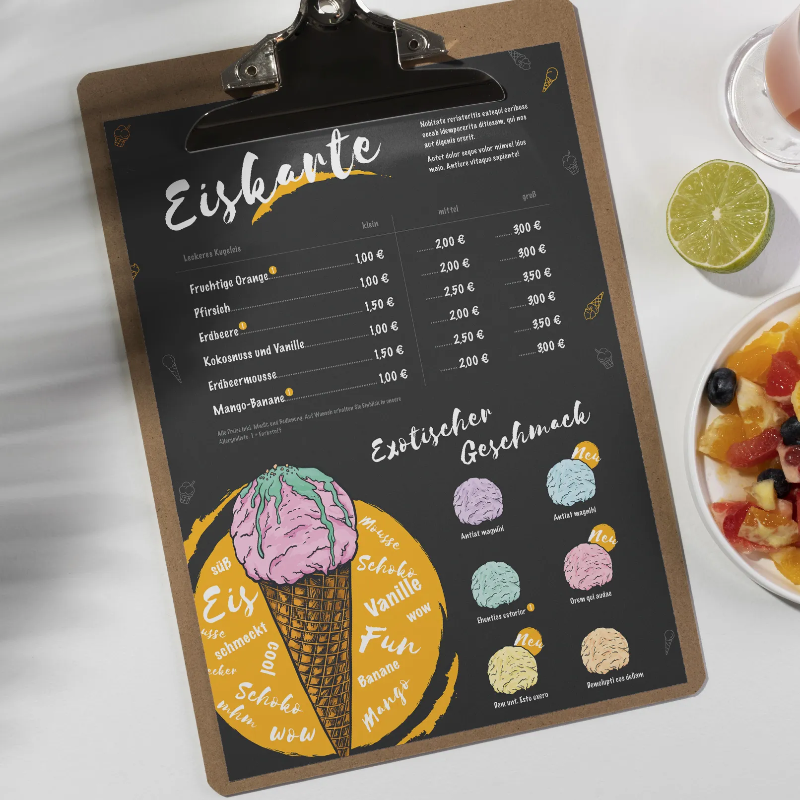
Choosing a theme for the menu template
Let's create a menu for a small café on the first floor of an office building. It offers a simple but varied menu with drinks and snacks. It is aimed at the office workers in the area. The menu will be user-friendly and intuitive, with drinks and prepared snacks such as sandwiches and scones.
The main aim of this menu is to provide a quick and convenient service for office workers who want to grab a quick snack before or after work. The menu will focus on drinks, offering a range of coffees, teas, juices and hot drinks.
Search and download a ready-made Word menu template
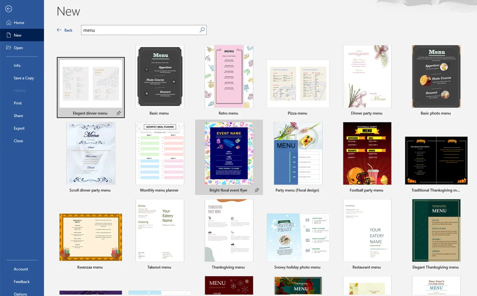
Before you start creating menus, you need to find a suitable template. You can start your search directly in the Word application, which contains a variety of menu templates. The search word here was "menu".
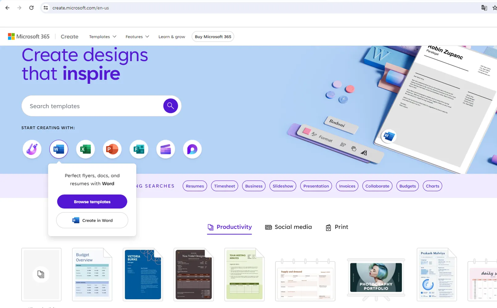
It's also a good idea to visit the Microsoft Office website where there are many pre-designed options.
If you're looking for more options with professional design templates, check out online resources like TutKit.com, where there are also many menu templates for Word that offer agency quality.
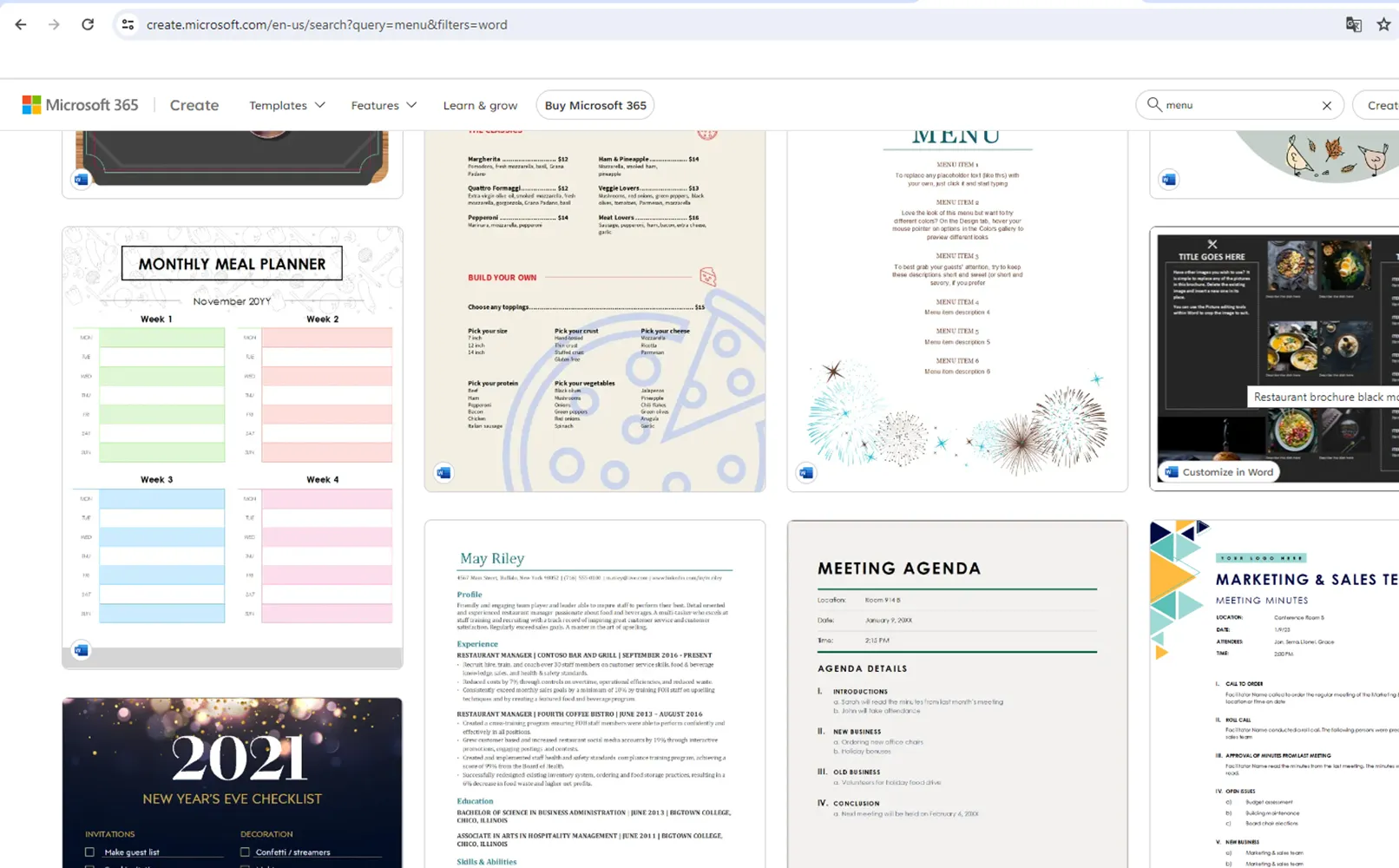
After you've chosen the right menu template for Word:
- Download the menu template in Word to your computer for further work.
- Start Word and open the downloaded template.
- Start editing the text, add images and other menu elements to customize it to the needs of your business.
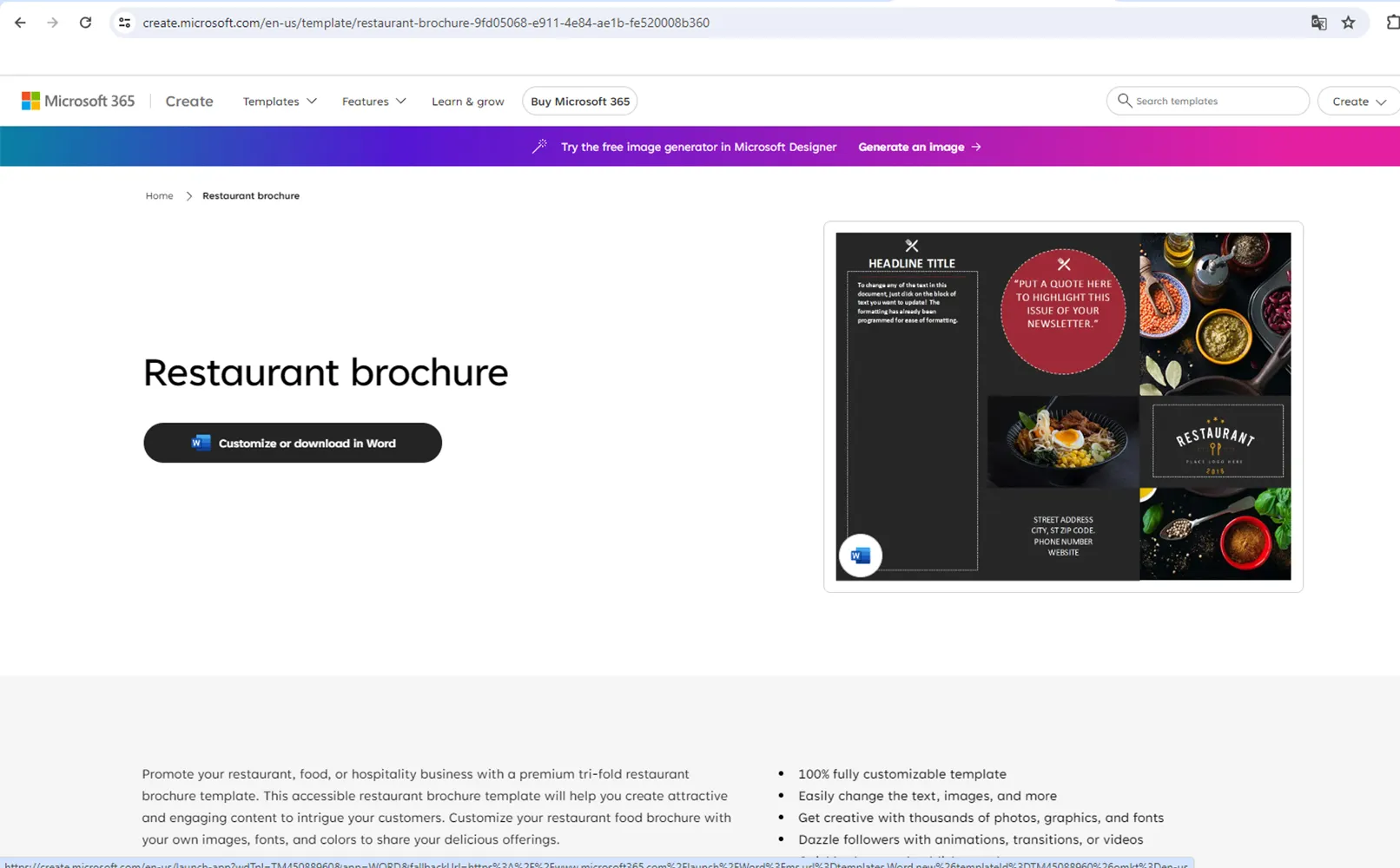
Also note that you can use the online version of Word to edit the template directly in your browser if you can't download the files to your computer.
The process of creating a menu from a Word template: from changing the text to the design and drinks
Before you start editing the template, clean it of unnecessary elements. You can remove all irrelevant images and superfluous text to make the layout more practical for our use. To do this, I use the "cut" tool, simply remove unnecessary components and replace them with new ones.
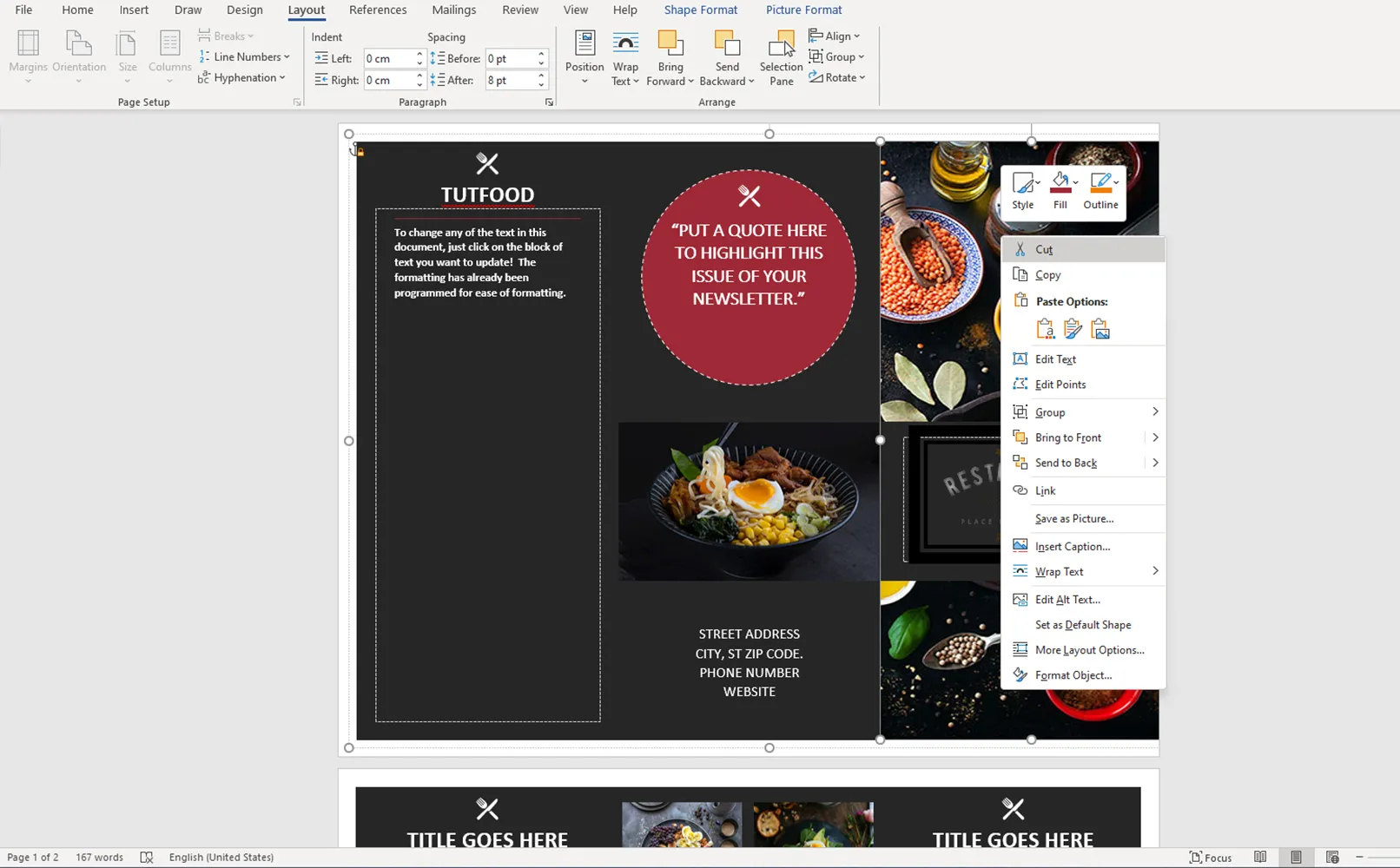
After you have removed unnecessary elements, you are left with the core components that you can use to create a new design. This allows you to focus on the most important elements and use the space in the template efficiently for your needs.
You should start by editing the template in the background and then gradually move on to the front elements. To move elements, simply move the mouse pointer over the desired element and drag it to the desired position.
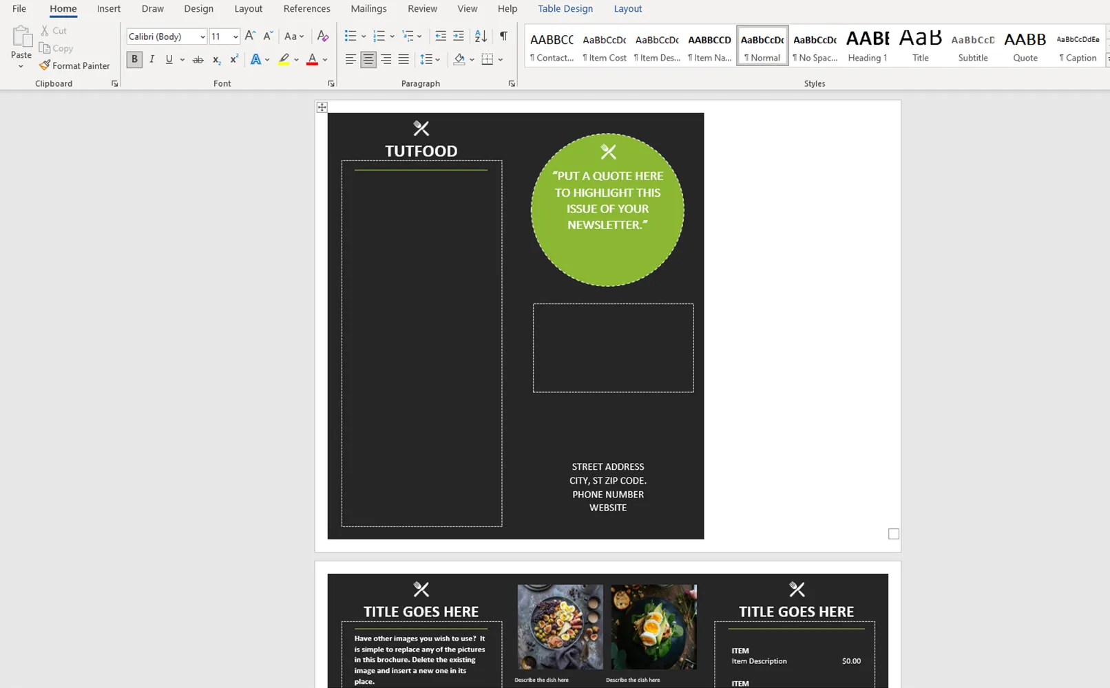
That's it! Now move the circle to the same side so that the composition remains balanced.
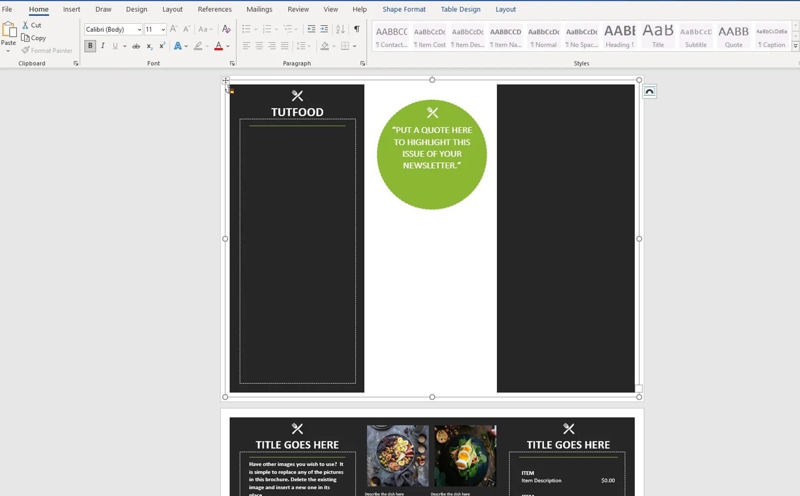
Paste the copied text to the intended position on the left-hand side using the Paste command. Don't forget to check it for correctness and legibility after pasting.
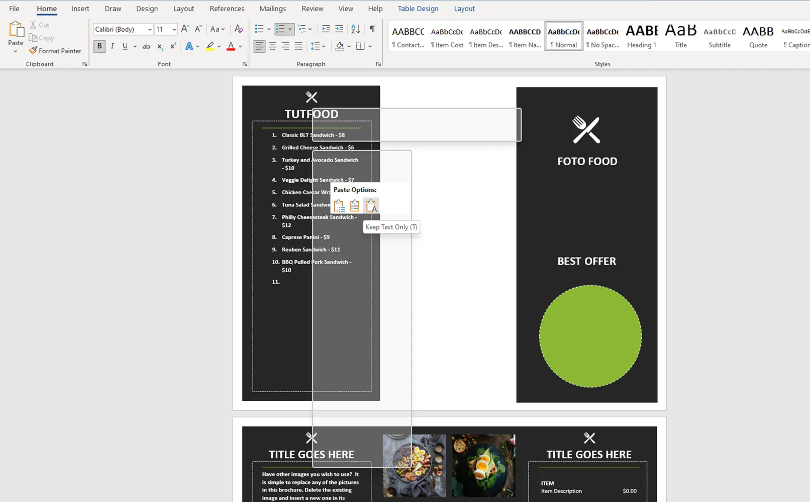
Place the text on the right-hand side to achieve symmetry and balance in the composition. This will give our menu a finished and harmonious look.
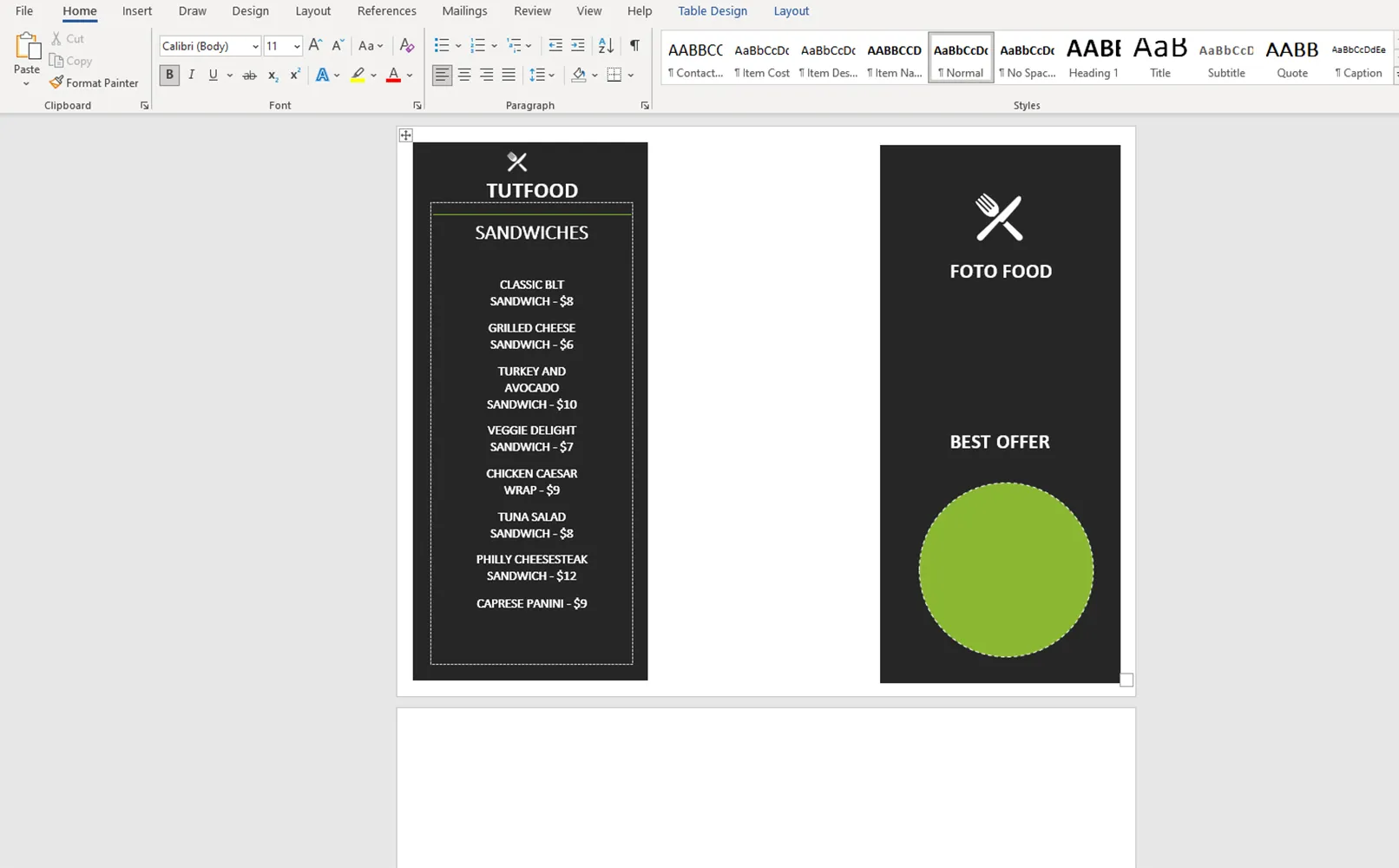
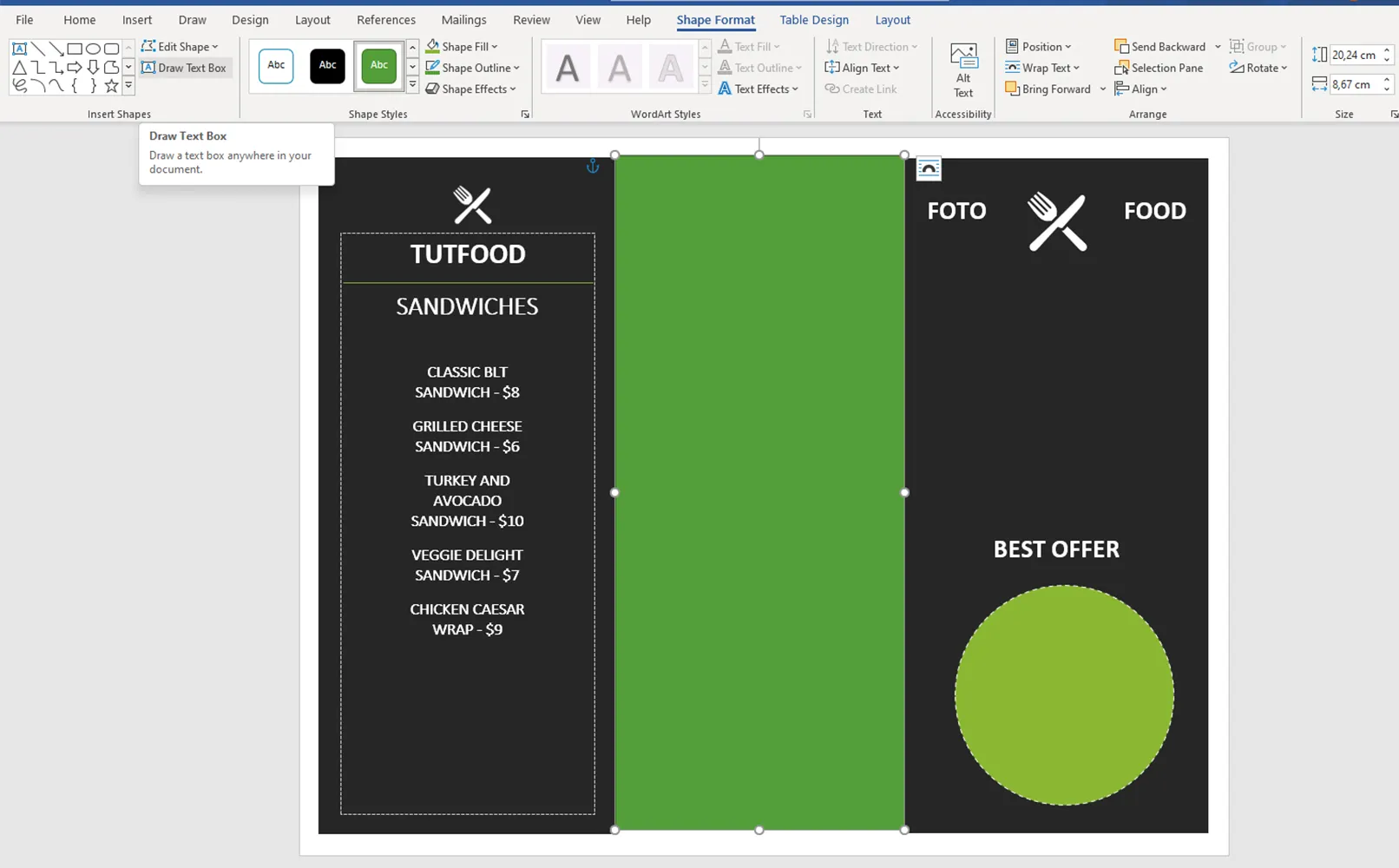
Create a rectangle with the shape tool and place it in the center. We choose colors that match the corporate style to give our menu a high-quality and recognizable look.
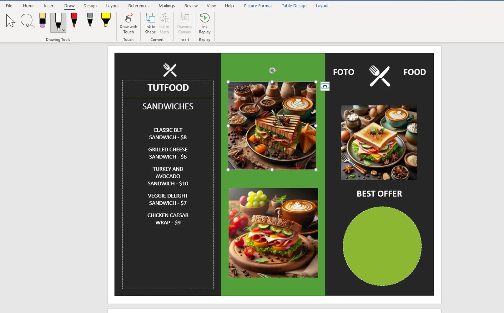
Now we can insert the images. We can insert them in the same way as text or simply drag them into Word. This way we can add bright and appetizing images to our menu.
Let's continue with the creation of the second page. We follow the same steps as on the first page to ensure a consistent style and easy perception. Don't forget to arrange the elements symmetrically and select suitable images and text so that the pages look harmonious.
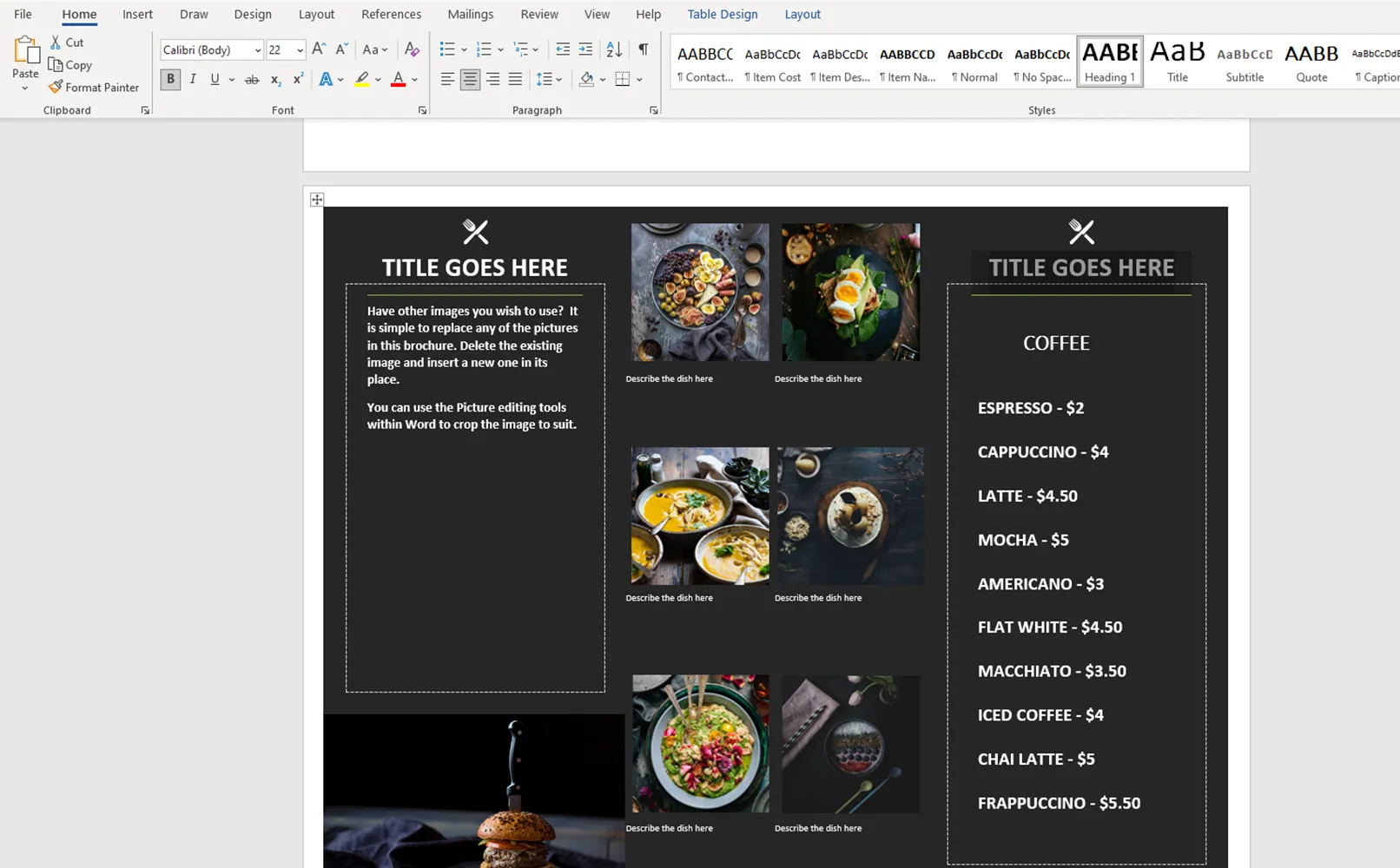
After a few small changes, we have adapted the finished template to our needs. Remember that although Word is a powerful tool, it can be complicated for beginners. It is primarily intended for working with text, not for creating complex graphics.
But with the right approach and imagination, you can create a stylish and functional menu that reflects your vision.
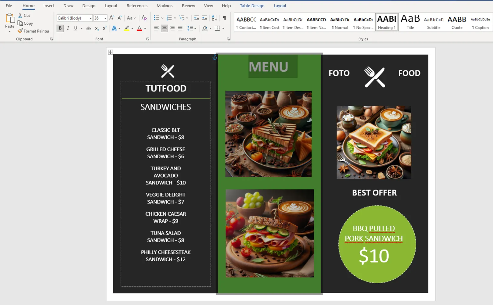
What you need to consider when creating your menu with a Word template
Here are a few tips to avoid the mistakes most beginners make when creating menus in Word. When creating text for menus, keep the following points in mind:
- Clarity and legibility: use a large enough font so that the text is easy to read from a distance. It is recommended to use fonts with a size of at least 12-14 points.
- Avoid artistic fonts: To ensure legibility, you should use simple and clear fonts without excessive ornamentation.
- Contrast between text and background: Make sure that the background color does not blend in with the text color so that the text is easy to read. Choose high-contrast color combinations.
- Text placement: Place the text in such a way that it does not create a flood of information and the menu is easy to navigate. Divide the menu sections into appropriate categories and use clear headings for each section.
If you follow these rules, your menu will be attractive and convenient for customers so that they have a pleasant experience when they take advantage of what your restaurant has to offer.
Why you should buy a ready-made template from TutKit.com
When you buy a pre-made template from TutKit.com, you have access to high-quality designs for a variety of purposes and themes. This site offers a huge selection of templates, so you can find just the right one for your needs and preferences.
If you're creating a menu in a restaurant, you need to be the engineer of that menu. It has to be a crowd pleaser.
Jean-Georges Vongerichten
Of course, there's a more detailed answer here: TutKit.com offers templates in a variety of formats, including not only Word, but also professional design programs such as InDesign and Affinity Publisher. This ensures maximum flexibility when working with templates. TutKit.com provides detailed editing instructions for templates so you can quickly and easily customize them to your needs. When you buy templates from TutKit.com, you get access to a variety of templates that have been specially created by professional designers. This guarantees you a high-quality and professional look for your menu. Here are some menu design templates:

