A brief history of the origins of the business card
The origin of the calling card goes back to ancient China, like many other important cultural achievements such as gunpowder, the compass and the umbrella. The first records date back to historical documents from the second and third centuries BC. Chinese officials carried visiting cards made of special paper, usually red or another special color, on which their name and rank were noted. The color of the paper corresponded to their status. Even back then, these cards were an example of elegance and aesthetics, limiting themselves to the essentials: The holder's surname, first name and rank.
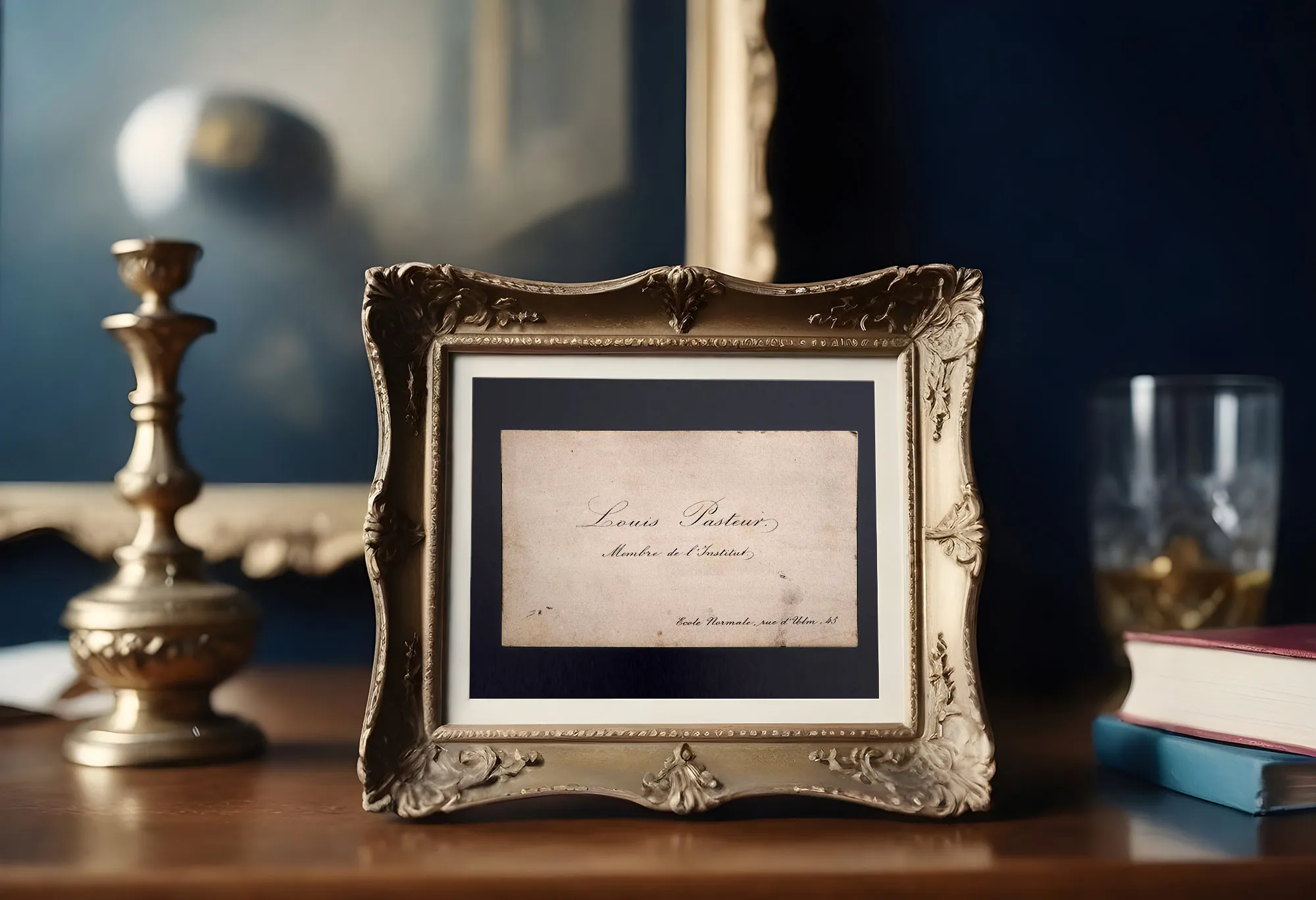
In Europe, the business card began to spread during the Renaissance. Interestingly, many students, especially from Germany, who studied at the University of Padua, brought home small colored miniatures with the family coat of arms. They personally signed under the coat of arms, leaving their name and a message. This practice is considered the forerunner of the modern calling card. As early as the 18th century, there was a paper factory in Leipzig that produced visiting cards in various sizes.
Visiting cards, symbols of the official representation of their owner, were characterized by a sophisticated design decorated with engraved ornaments and elegant coats of arms. By the beginning of the 19th century, they had become an important part of aristocratic and bourgeois representation. Every distinguished house had a special silver tray for visiting cards. The visiting cards placed on this tray served as a kind of living directory of all guests who had visited the building in question and signaled the need for a return visit. These cards became not only a means of exchanging contacts, but also a symbol of status and social standing, emphasizing the owner's importance and influence in society.
At the beginning of the 17th century, visiting cards became popular among business people, as there was no house numbering system and the newspaper system was just beginning. They were not only used to exchange contact details, but also as a means of advertising and a source of information. Business cards often contained directions or information on where to find the company's office or store. While business cards used to be produced using the printing process and had a rather monotonous appearance, lithography had already reached such a high level by 1830 that cards could be printed with text in different colors and thus became true works of art. Such visiting cards became not only a means of communication, but also a vivid expression of the individuality and style of their owners.

10 common mistakes when creating a business card template
The business card is known to be a real perennial favorite among the various advertising media. While television commercials only "live" for a few minutes, flyers can only attract attention for one or two days and newspaper advertisements only remain relevant for a few days, business cards often retain their relevance for many years because they are often kept by the other party. The question, however, is whether it is really useful during this time or just a useless element in someone else's business card folder. It all depends on how professionally the business card is designed.
A business card is an essential part of a company's external image and therefore also a means of positioning. It is a kind of mini CV and contains the most important core information about you and your company that can be useful for potential contacts. For this reason, it is essential that it complies with established standards and rules.
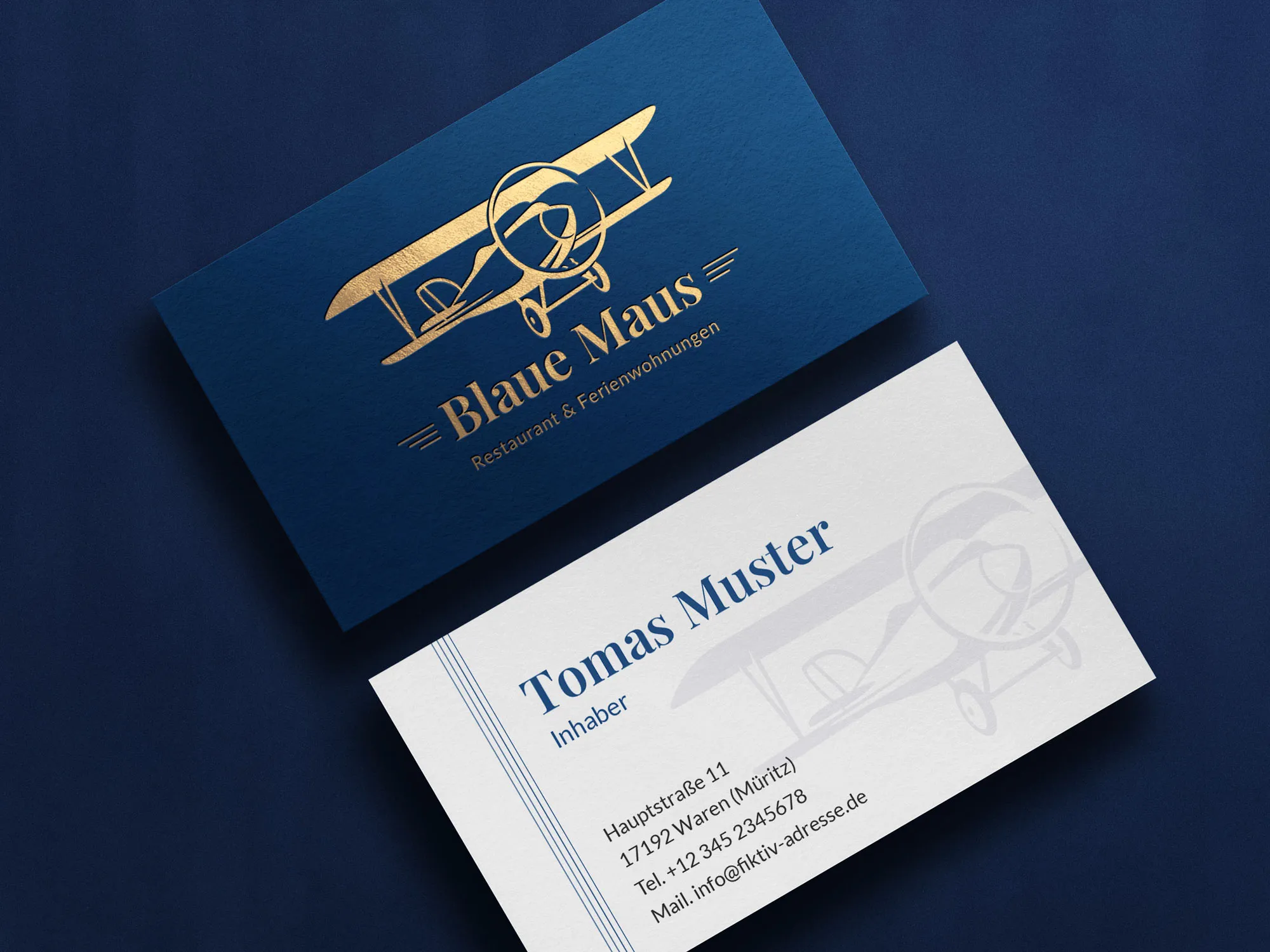
Let's look at the most common mistakes when designing business cards:
- Using low-quality printing: sometimes business owners try to cut costs even when producing business cards. Therefore, they either print them themselves on an office printer or hire the cheapest printing company. However, this has negative consequences: The business cards are printed on low-quality paper with cheap ink. Potential customers may think that a company that skimps on appearance is not paying enough attention to the quality of its products or services.
- Lack of design: This mistake often occurs when a company tries to cut costs by forgoing the services of a designer and leaving the design of the business cards to an unqualified person. The result is often more like an ordinary advertisement on public transportation. It is better to hire a professional designer. This guarantees an appealing and memorable appearance of your business card in the corporate design of the company.
- Mistakes and typos: Designers sometimes make careless mistakes with text, telephone numbers, surnames, etc. Sometimes the desire to make everything beautiful goes hand in hand with a lack of attention to detail. This can be due to psychological characteristics. It is therefore important to get into the habit of carefully checking the text of the business card before the layout is sent to print. A single typo in the phone number can prevent potential customers from contacting you, which can give the impression of unreliability.
- Vague text about your business: When designing a business card, it's important to remember that the person who sees it probably won't remember you. When the person sees your business card, it will be difficult to remember anything other than what is directly on the card. If the text on your business card doesn't tell them what you do, how do they know who the person handing it over was again? Give clear and specific information about your position in your company to make it as informative and identifying as possible for potential contacts.
- Use fonts that are difficult to read: Unusual fonts are often used on business cards. They come in a wide variety - imitations of styles from different countries and eras, imitations of handwriting, squiggly letters and so on. But all these fonts have something in common. The text written in them is difficult to read. The part of the text on the business card that is written in such an "illegible" font is perceived more as an image than as text at a cursory glance. The meaning of what is written is lost. The person will look over the business card and move on to the next one without understanding what you were trying to say. Another version of the same problem is writing that is too small or too thin. The person sees the writing but doesn't read it properly. The result is the same - seen but not recognized.
- Different business card size: If your business card is not the standard size, it is less likely to be kept or used. It may not fit into a standard business card folder or business card album and is likely to get lost or disappear into a desk drawer or even an oversized business card box (wastebasket). This reduces the chance of your card being found at the right time and results in potential contacts being missed.
- Poorly chosen images: Sometimes images are noticed faster and easier than text. So it's easier for people who are quickly browsing through a business card album to latch onto images and logos. For example, a picture of a tooth may remind people of dentistry, while a dancing figure may be associated with a discotheque or dance school. If the image on the business card doesn't match the theme, it's possible that at the "decisive moment" when someone is looking for your company in the business card album, they may not even notice your card or mistake it for something else. So before you put a picture on your business card, make sure it matches your products or services.
- Insufficient color contrast: Using too similar colors for the background and text on a business card is another common mistake. Red on brown, yellow on white or blue on gray are not perceived as text, but as illegible smudges. The result is that the card looks like a meaningless piece of colored paper that the eye doesn't stick to and simply moves on. The classic combination of "black lettering on a white background" is considered the most contrasting and legible. The closer your color palette comes to this standard, the easier it is to read the text on your business card. This means that a person quickly flicking through an album is more likely to notice and read the information on your business card. If you use a dark background and white font, make sure that the font is not too thin, as contrast problems can occur with very thin font styles in white.
- Originality requirements: Some companies, especially creative companies such as advertising agencies, design studios or artist communities, strive to make their business cards unusual. They may use unconventional materials, shapes, colors, drawings or fonts. However, before you decide on such a design, you should ask yourself: How will it be perceived by potential customers? Will it appeal to them or rather put them off?
- The standard in Europe is 85 x 55 mm for business cards. A deviation from this standard visually emphasizes the owner's desire to stand out from the crowd. However, an unusual size can have both positive and negative connotations. On the one hand, it can draw attention to your card and make it more memorable. On the other hand, such a format can be impractical for storage and use, especially if it doesn't meet the standards for business card albums or folders.
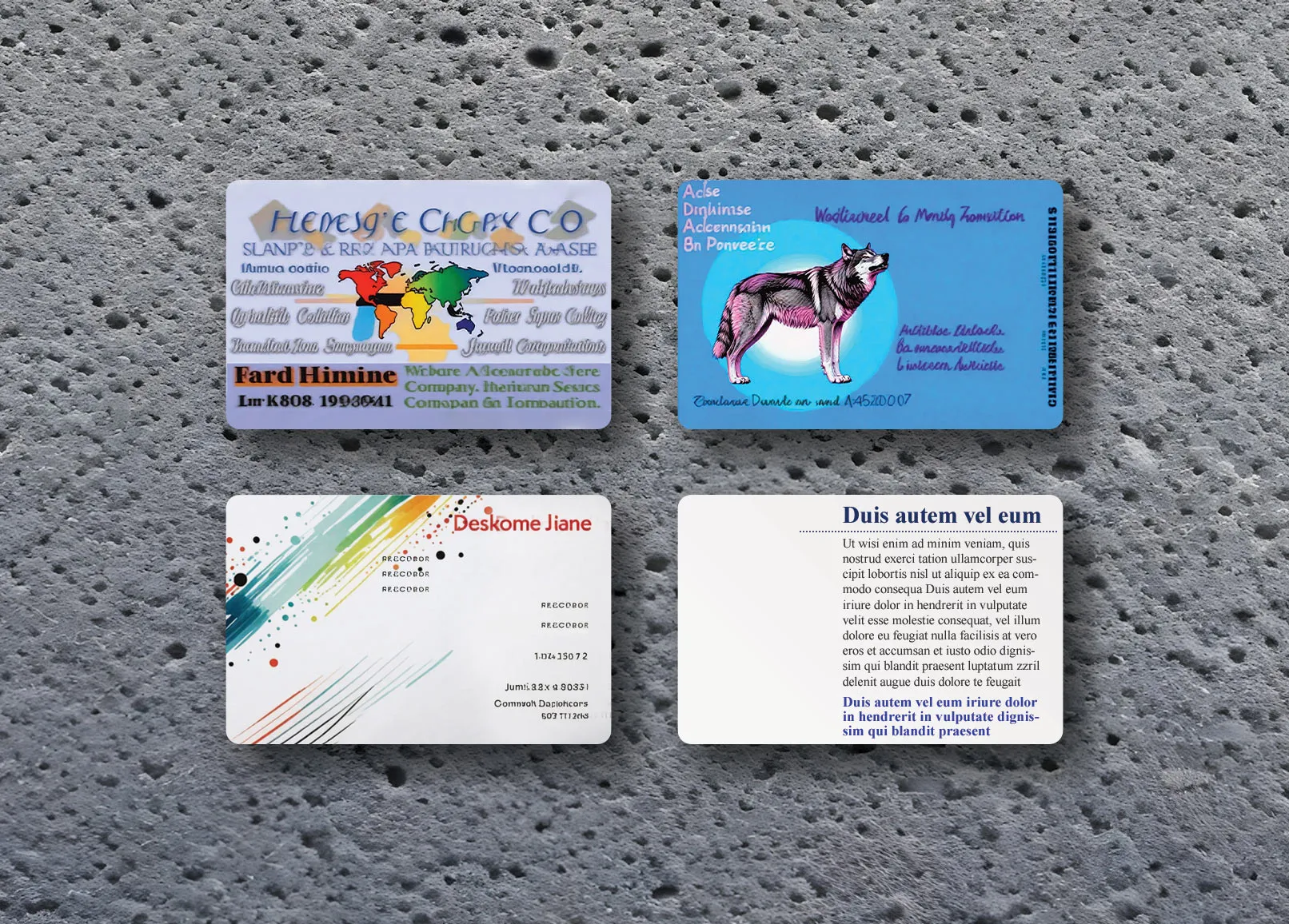
The business card with a frame emphasizes a certain strictness and formality in the relationships that the owner prefers. Someone who uses such cards usually sets clear boundaries in communication and values clarity.
It is common to find business cards where phone numbers or addresses have been crossed out and new information has been added by hand. Many owners are probably unaware of the negative impression this leaves. Such corrections look particularly unfortunate on high-quality and elegantly designed cards. The combination of gold embossing, expensive paper and corrections with a ballpoint pen is a disregard for your own person and the other person.
Corporate design
A business card with a corporate design is an effective branding tool. It conveys the style and professionalism of the company in every detail, from the font and colors to the logo and layout. A uniform design from business cards and flyers to websites and car wraps creates a consistent visual identity for your company and makes you recognizable among your competitors.
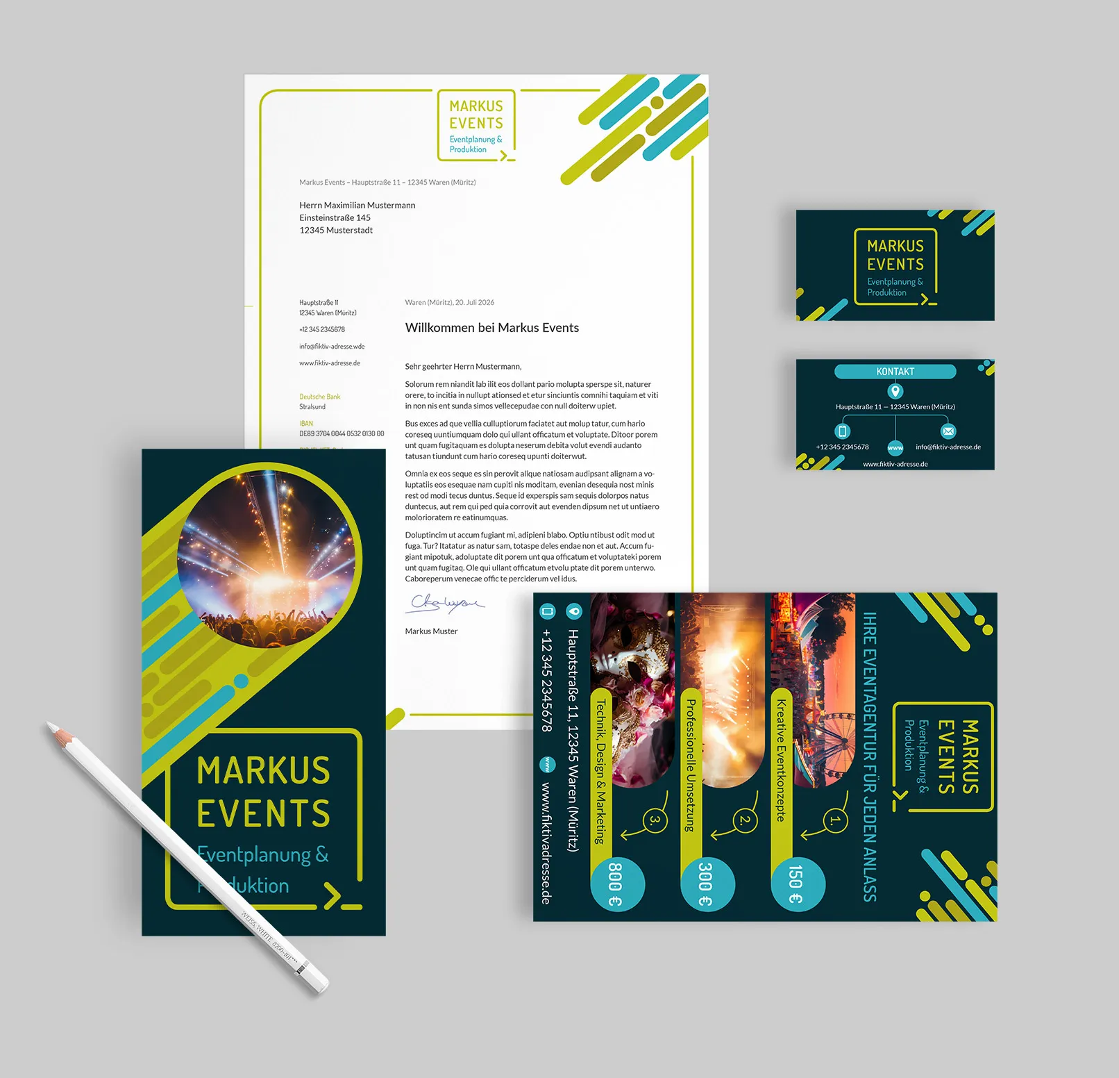
In addition, the design of a business card increases the effectiveness of marketing. A business card that stands out attracts attention and leaves a stronger impression on your contacts. Every time they see your business card again, or even find it on their desk or in their briefcase, they immediately associate it with your company and your services.
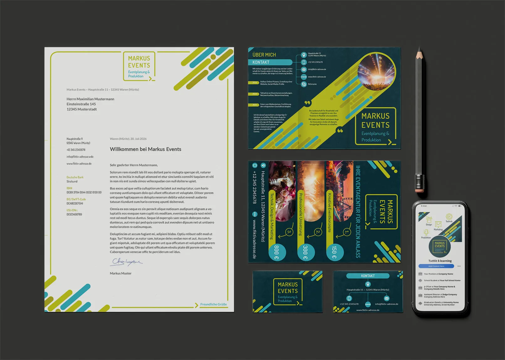
A business card with a corporate design is therefore not just for information purposes, but is also an effective branding and marketing tool that increases awareness of your company and creates long-term customer relationships.
Using professional business card templates is a quick step to success
A good business card template is very practical. It cannot be overestimated. When creating a business card, a traditional approach is recommended: Name of the organization at the top, then first and last name (or first name, last name and middle name) of the owner, position in the company in the middle and contact information at the bottom: Telephone and fax number with area code, e-mail address, address of the company with postal code and Internet address. The first name and surname are printed in a large font size, while the positions appear in a slightly smaller font size. It is recommended not to use more than three different colors and font sizes.
You're in luck, because at the end of this article we've prepared the best business card templates for you. If you go to this section, you'll find a huge selection of business card designs for your company. The attractive designs of our business card templates will help you succeed.

