Table of contents
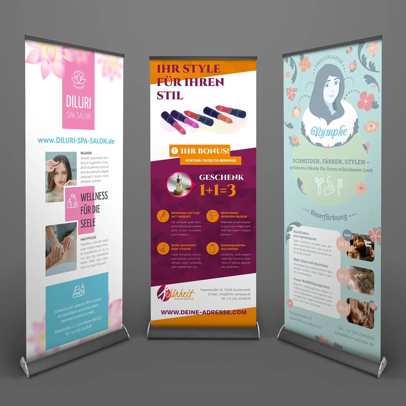
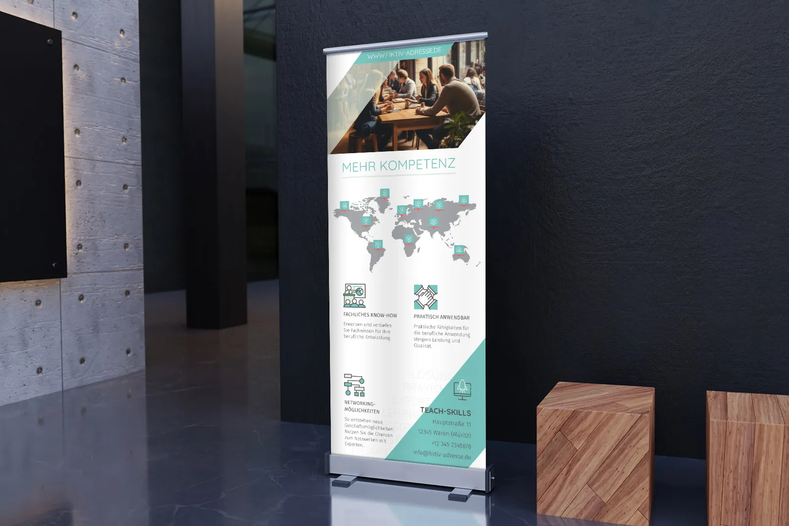
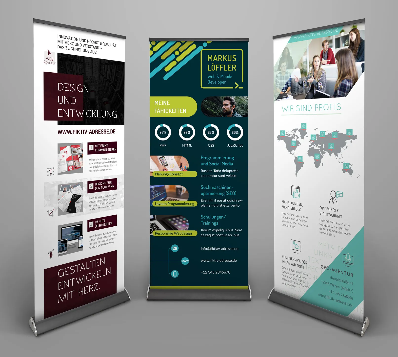
The roll-up banner is the ideal tool for any company pursuing a fast and efficient marketing strategy. Its advantages are obvious: easy transportation, high durability and reusability make it an indispensable solution for presentations at trade fairs or for advertising new products. In addition, roll-ups are also used in waiting rooms, bank branches and hotel lobbies to convey important information and guide visitors. Although developing a roll-up design is similar to creating posters or other printed materials, there are some subtleties you should consider before you start. In this article, we present ten important tips that will help you create an outstanding design for your roll up banner.
Use high-quality software to create roll-ups.
The standard size for roll-ups is 800 x 2000 mm. A resolution of 300 ppi is recommended. It should never go below 150 ppi because of the image quality. If you order roll-up printing from a print shop, it is advisable to familiarize yourself with the layout requirements in advance. Programs such as Adobe Photoshop, Adobe InDesign or Adobe Illustrator are suitable for creating high-quality designs.
Use the CMYK color profile
As with all print products, the design should be exported with the CMYK color profile and not RGB. This is because printers work specifically for printing. Just make sure you select the correct color profile in your graphic design program when exporting your layout. If you try to convert the file after design, you may end up with unwanted color changes that don't look good with certain brand colors.

Think about where the roll-up banner can be used?
The entire roll up banner should be visible from top to bottom so that all the space on the banner can be used to present the messaging and branding. However, if you display your banner on a table or at the back of your stand, parts of the banner may be obscured and may not be visible. Therefore, it is important to develop an appropriate design. If you know that your roll-up is covered at the bottom, place the important information in the upper visible area.
Use the company colors for your roll-up
The design of your banner should fit organically into the look and feel of your brand. Make sure you use a color palette that reflects or complements the uniqueness of your company. So stick to your company's corporate design. If your company has fixed fonts, use them accordingly.
Use fonts that are easy to read
Your banner should be easy to read from any point in the room or exhibition space, so don't forget to choose a legible font that is large enough to be seen from a distance - this is especially important for your main message and company name.

Only high-quality images and illustrations should be used to create a roll-up.
Only high-quality images and logos should be used to create a roll-up. As already mentioned, your banner should be designed with a high resolution. This also applies to any images or logos you use in your banner design. Before importing images into your design, check their size and resolution in programs such as Photoshop. The image size should match the physical format required for the banner (avoid manual stretching as this can lead to loss of quality) and ideally be 300 ppi. It is not advisable to hope that no one will pass by your roll-up stand. Images with a lower resolution may appear blurred or pixelated when viewed up close.
Place your logo and company name at the top.
We all know that people read from top to bottom and left to right, so it's a good idea to place your logo or company name right at the top of your banner. Generally, it's best to place the logo or name on the left or in the center. Placing logos on the right side is usually not a good idea. You know it from websites: there the logo is also placed either on the left or in the middle.

Place your main message at eye level.
It is important to place the main message at eye level, as this is where it is most likely to attract the attention of passers-by. Divide your banner into three parts and place the main message in the lower third of the upper third or in the upper third of the middle third.
It makes sense to place the contact information at the bottom.
We recommend placing the contact information somewhere on the roll-up, usually at the bottom of the roll-up. At the very least, you should include your company's website. Phone number, email address and social media icons are also good contact information so people know how to reach you once they've left the event or your location.

Carefully check your roll-up template
Your roll-up template must not contain any errors. As with all printed documents, it is very important to check all the text carefully before you Schick the document to print. Ask someone from your company to check the spelling and information, as you could easily miss spelling mistakes. Or use automated corrections via AI tools.
With these 10 simple tips, it won't be difficult for you to create a really practical and appealing design. If you don't have this option, our agency is always ready to help you with the design of banners and other marketing material. We have many ready-made roll-up templates at attractive prices. You only need to buy one set of templates and you can download high-quality roll-ups. Editing a ready-made template takes very little time. And if you don't know how to do it, we have video tutorials and training materials. Take advantage of the opportunities to save money with our high-quality roll-up templates by not having to hire an expensive agency.

Training video on how to create your own roll-up using the template from 4eck Media
It's never too late to learn new design and marketing skills. Below you'll find a video with detailed, step-by-step instructions on how to create your own roll-up. Download a ready-made, high-quality template and use it to create your own roll-up!

