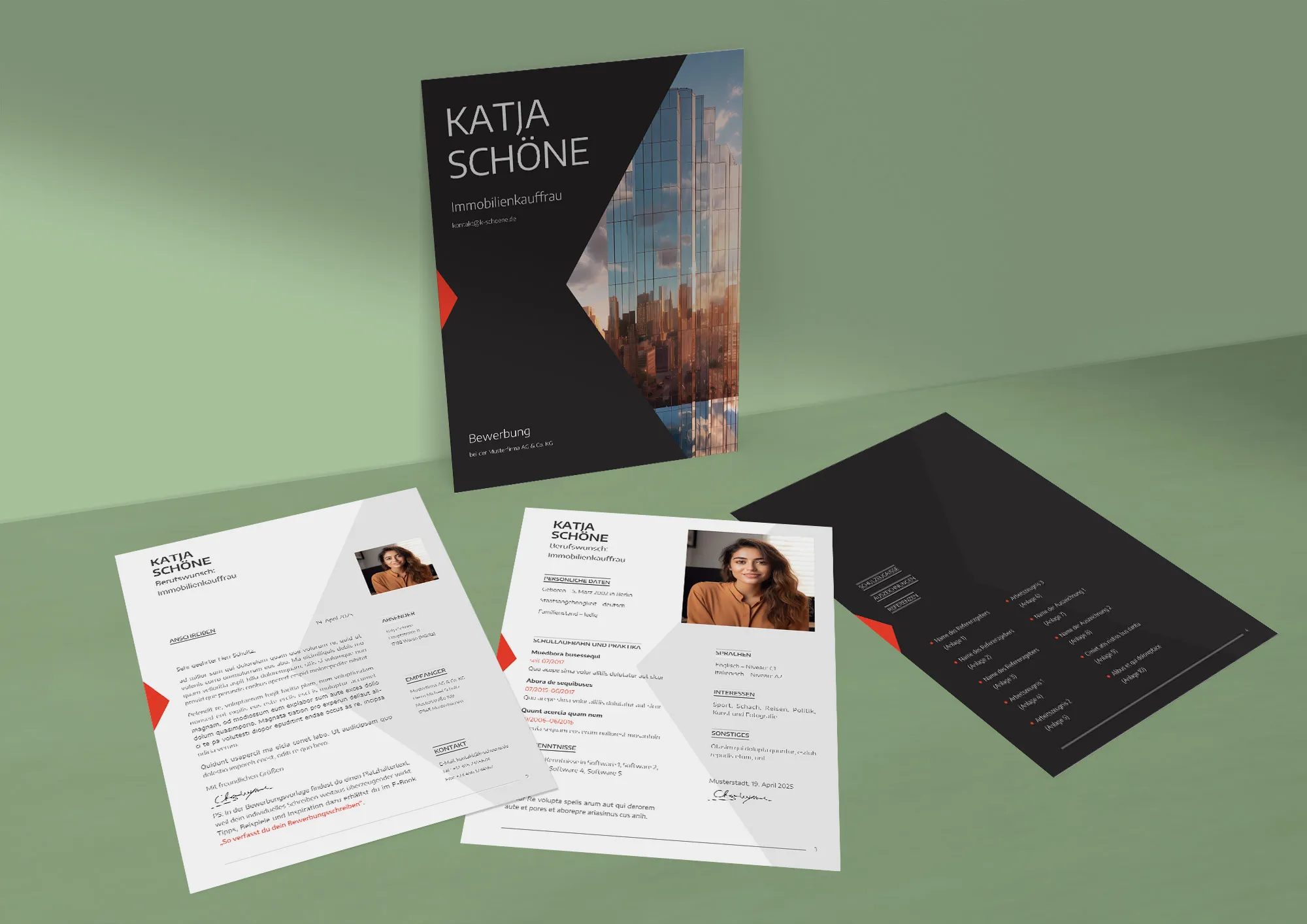
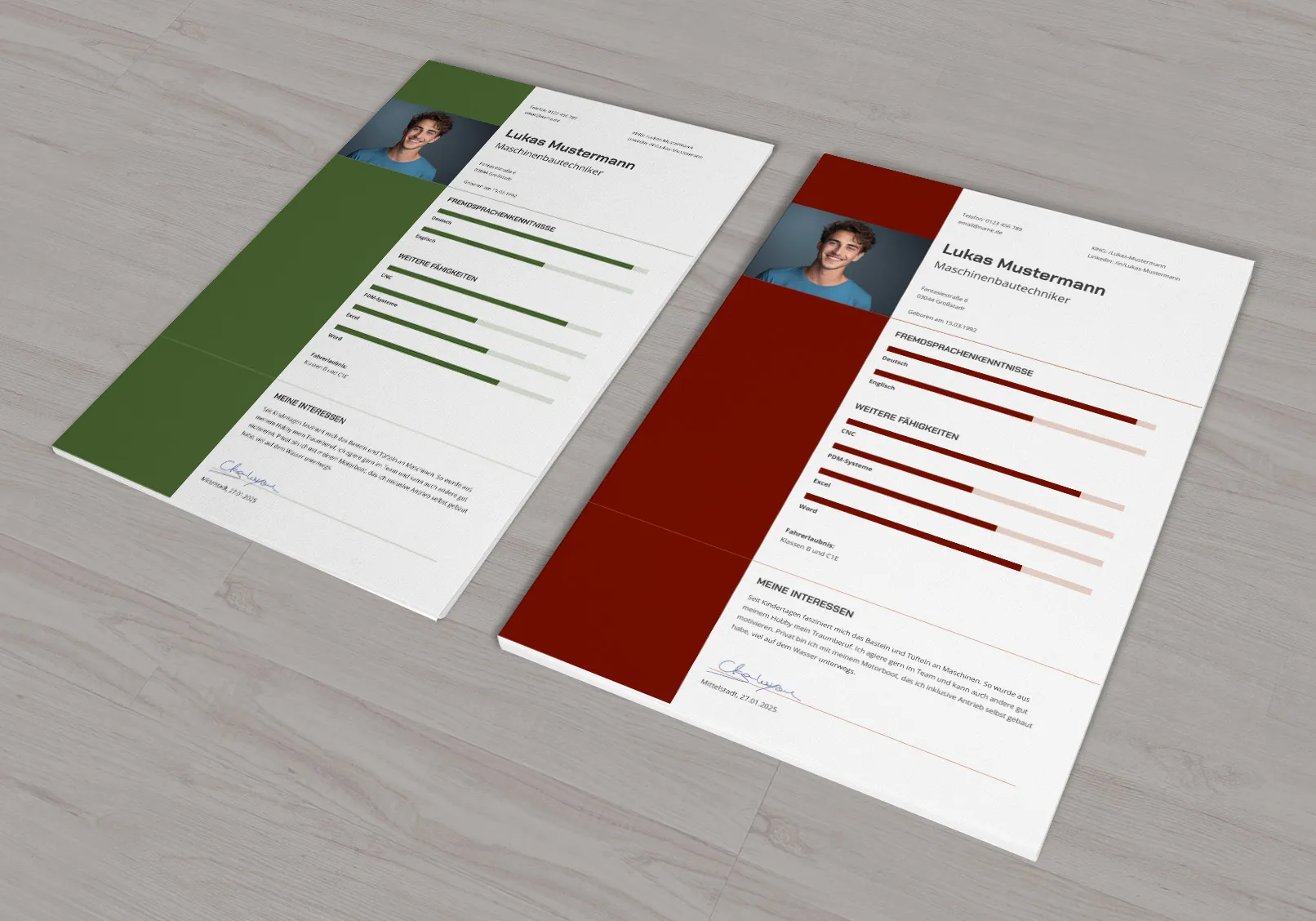
A CV is the key to making a first impression on potential employers. The layout of your CV, including design, structure and formatting, is your chance to position yourself as the best option for the vacancy and successfully stand out from other applicants. In this article, I'll show you the essential elements for creating a modern CV: from the structure and design concepts to the rules for presenting your information effectively. The article includes links to ready-made CV templates to help you create a professional CV quickly and easily.

Table of contents
Structure: the basis of the CV
You should start with the structure when creating your CV, as a logical presentation of the information is crucial for a quick grasp of the information and a positive first impression.
- Classic version: This includes profile, education, professional experience and additional information. The chronological order of events helps to show a step-by-step career progression.
- Reverse chronology: Here you start with the most recent professional experience, descending to the oldest, followed by training or studies. This emphasizes recent accomplishments and is especially appropriate if your most recent work experience is more significant than your more recent degrees.
- Skills-based resume: This emphasizes skills and uses work experience to illustrate their application. This is useful if you want to change industries or move into a different field.
- Functional CV: The focus is on skills and accomplishments, not the sequence of jobs. This is particularly suitable for those who have gaps in their work history or are looking to make a radical industry change.
- Targeted CV: This is focused on a specific job or industry. It only contains information that is relevant to the position you are applying for. This helps to show that you are perfectly suited to the specific job.
- Combined CV: This combines elements of the chronological and functional approach. Skills and achievements are highlighted, but information about previous jobs is also listed chronologically. This is ideal for those who want to emphasize both work experience and specific skills.
- Academic resume: Used to search for jobs in academia, such as teaching or research positions. It includes a detailed list of publications, research projects, teaching experience and academic achievements.
Each section should have a clear heading. The information should be presented in the form of short paragraphs or bullet points. Pay attention to consistent formatting of data and to spelling and layout to enable quick orientation in the document.
A well thought-out structure is the basis of a successful CV. It systematizes the information and makes it easier for employers to grasp, so you are perceived as a structured and logical person.
When choosing the structure for your CV, you should consider the following:
Match the structure to your career: If you are changing industries or have little experience, a functional resume will help you highlight your skills. A chronological structure is suitable for presenting steady career growth.
Consider the requirements of the job: Study the job description and highlight the most important requirements. Structure your resume to emphasize your relevant skills and experience, especially if you are applying for a specific position.
Resume design concepts and layout
The variety of resume design concepts allows each applicant to stand out and emphasize their professional qualities. Choosing the right design depends on the industry and the type of position you are seeking. An effective CV combines clarity, functionality and visual appeal, supporting your professional image. The article not only introduces the main types of design, but also provides links to CV templates for easy application.

Variants of design concepts for the CV
Minimalist design
The basis is a clear structure and simplicity. Easy-to-read sans serif fonts such as Roboto, Lato or Montserrat are used. Suitable for areas that require logic and systematic thinking, such as law, finance and IT.
Graphic design
Includes the use of infographics, icons and illustrations. This reflects creativity and unconventional thinking. Ideal for design, marketing and art. Make sure to find a balance between visual elements and content.
Color design
Uses bright colors, contrasts and unusual hues to create an energetic image. Particularly suitable for youthful resumes and creative posts, possibly less suitable for conservative areas.
Typographic design
Focuses on the use of expressive fonts and variations in font type and size to create a hierarchy of text. Serif fonts can also be used here if you have typographic skills as an applicant. Pay attention to the legibility of the text.
Modern design
Combines elements of graphic and typographic design and adds modern visual solutions and digital innovations. This helps applicants stand out by presenting information in a dynamic and contemporary format.
In addition to the basic design concepts mentioned above, there are other styles for designing your resume that can be useful depending on individual needs and industry-specific requirements:
Corporate design
Corresponds to the corporate design of the company to which the CV is addressed. Corporate colors and fonts are used to create a resume that is visually associated with the future workplace.
Ecological design
Uses green tones, natural motifs and a minimal number of graphic elements. Suitable for applicants who want to work in areas such as the environment or sustainable development.
Vintage design
Incorporates elements of antiquity or retro style, such as old-fashioned fonts, patterns and colors that convey a sense of classicism and tradition. Particularly attractive for careers in culture, antiques or hospitality.
Technological design
Based on the use of modernized elements such as QR codes for links to portfolios or professional profiles, as well as digital innovations that can interact with mobile devices.
When designing your CV, you should consider the following:
Resume objective: Consider the industry and position. Creative professions require a design that shows uniqueness. For traditional industries, a restrained design that focuses more on the information is more suitable.
Corporate culture: Find out about the style and culture of the potential employer. Innovative companies may appreciate unconventional designs, while conservative companies may prefer a classic style. It also depends on the size of the company and how likely it is that a recruiter or managing director will see the application. Managing directors who also founded the company are usually more open to unusual concepts.
Correct formatting of the CV template
To create a harmonious CV design, you should follow the rules of formatting. This makes it easier for the employer to capture the information and emphasizes your professionalism. A well-formatted CV increases your chances of successfully passing the selection process. A clear and attractive visual style makes a positive first impression.
Formatting tips:
- Balance between text and white space
Avoid overloading with details. White space improves readability and provides visual comfort. - Font selection
Put readability first. Sans serif fonts such as Noto, Open Sans or Source Sans - to name a few more in this article - make reading easier. Very characterful, individual fonts can make reading more difficult. - Use of fonts
Limit yourself to a maximum of 2 harmonizing font families to create a visual hierarchy. You can bring variation into the typography through font sizes and font styles or colors. - Emphasis in the text
Use bold text, italics, underlining, frames and lines sparingly. This helps to emphasize important points without overloading the design. - Consistency of data entry
Dates, numbers, cities and positions should be formatted consistently to improve readability. - Spelling and punctuation
Avoid mistakes as these can give the impression of carelessness and disorganization. So check your document before sending it! There are plenty of tools for this. - Logically divide the information
Use headings and subheadings to separate different sections of the CV. This makes the document easier to navigate.
Adhering to these formatting principles will help you create a clean and attractive visual style for your resume that emphasizes your professionalism.
Choosing the design of the CV template
Choosing the design of your resume requires careful consideration of the specific requirements of the job and the industry. This not only ensures an appealing visual appearance, but also a professional match with the employer's expectations.
Design selection guidelines by industry:
- Finance, law, public service
An understated, minimalist design that emphasizes reliability and professionalism is recommended. - Creative industries (design, marketing, advertising, art)
Bright, graphic solutions with illustrations and icons are suitable to show a creative approach. - IT and technology companies
An ideal combination of minimalism with unique typography or color accents that emphasize innovation. - Manufacturing, engineering, construction
A traditional structure with a focus on chronology and professional achievements is preferred. - Young people and start-up positions
Bold designs with contrasting, bright colors and unconventional graphics.
Interesting fact:
It has been found that candidates who choose a resume design that matches the culture and visual style of the company they are applying to are more likely to reach the next rounds of selection. This underlines the importance of a harmonious interplay of form and content so that the CV not only meets the professional requirements but also the corporate culture of the potential employer.
Application and CV templates free of charge in Adobe InDesign, Microsoft Word and Serif Affinity Publisher formats
Thank you for reading the article to the end! I'll keep my fingers crossed that you get the job you deserve. I have prepared something special for you: Directly below this text, you'll find a link to a free download of not just a CV template, but a complete set of application templates. In the downloadable archive, the templates are saved in Adobe InDesign, Microsoft Word and Serif Affinity Publisher formats so that you can easily adapt them to your needs. Good luck!

Modern CV template: design, formatting, structure
From Vitalii Shynakov
