Each of us has been faced with the task of writing an application with a CV and application photo to get the job we want. We choose our words carefully, write down our achievements and look for the best way to showcase our experience and skills. But we often overlook an important point that many people underestimate - the choice of a photo for the application. Can an ordinary photo really sway a hiring manager's decision? It turns out: yes, and to a great extent! A bad photo can ruin all your efforts and reduce your chances of getting the job you want. Let's take a look at the top mistakes applicants make when choosing and creating application photos and how you can avoid them. Get ready to learn about the most common mistakes that could cost you your dream job.

Table of contents
Top 5: Typical mistakes when creating your application photo
Although any discrimination in hiring based on appearance has been prohibited by law in Germany since 2006, the photo we upload when applying for a job still plays an important role in the employer's decision-making process. It is often the photo that contributes to the applicant's favor or disadvantage if the characteristics presented in the application are equivalent to those of other applicants. The right perspective, the clothing, the background, the eye contact - all these things can be additional arguments that ensure that you are invited to the interview. But all of this can also have a negative impact if you make the following common mistakes when preparing an application photo.
Technical shortcomings
If you want to take a good photo that makes an impression, go to a professional. This golden rule applies to technical aspects that have a major impact on the quality of a photo. The most common technical mistakes include
Unfortunate angle
One of the most important aspects of taking a photo for your CV is choosing the right angle. A bad angle can significantly detract from the impression, even if you look great. For example, shooting from below will emphasize the chin and create a double-chin effect that looks unaesthetic. A shot that is too close can make the viewer feel uncomfortable, and a shot that is too far away will make you look less expressive.
The optimal angle is to look directly into the camera, slightly raised to eye level, which gives a natural and attractive look. It's also important to avoid unusual angles, such as shots from the side or above, as they can distort facial proportions. You're not on Tinder, you're applying for a job!
Don't miss the chance to get your dream job. Our job application templates will help you make a lasting impression on your future employer with a great layout. Get the perfect template today! To the templates 📄
Poor lighting
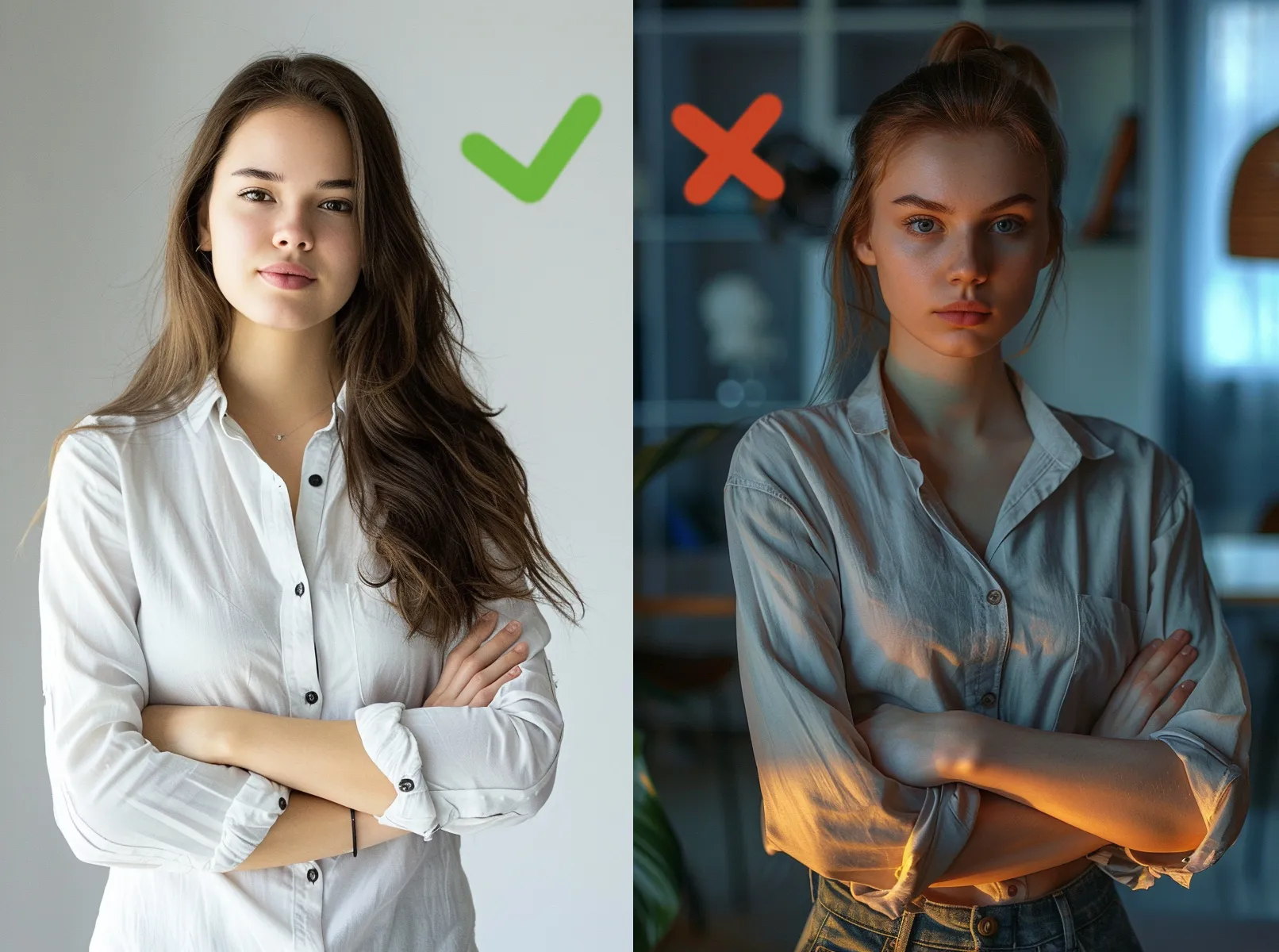
Lighting plays an important role in creating a good photo. It's not without reason that photographers greet each other with: Good light. If the lighting is not properly aligned, it can lead to a number of problems: Overexposure, shadows on the face and unnatural skin tones. For example, lighting that is too bright causes overexposure, where white areas of skin look too bright and lose detail, or shiny reflection effects appear on the skin. Too little light, on the other hand, leads to dark and blurred images in which the details on the face are difficult to make out. If the light source is positioned incorrectly, shadows can appear on the face, especially under the eyes or nose, making the face look tired or unhealthy.
It is best to choose soft, even lighting, such as natural light from a window or professional studio lamps.
Blurred image
Another common technical mistake that can ruin the impression of your resume is a lack of sharpness. Blurred images can have various causes: Camera movement during shooting, insufficient lighting and incorrect focus settings on the camera. If the camera moves when you press the shutter button, the image will be blurred and it will be difficult to make out details. In low light conditions, the camera uses a slower shutter speed, which also increases the risk of motion blur. Misfocusing, where the camera focuses on the background or another object instead of the face, can cause the face to look blurred.
To avoid this, you can use a tripod to stabilize the camera in poor lighting, provided the shutter speed is slightly slower.

If you are sending your application online, it is better to include a digital photo. If you scan a photo from a printed application, the quality and therefore the attractiveness of the application will be significantly impaired. Scan lines form. The quality suffers. If you send your application by post or courier, you should make sure that the document is printed in high quality. This is especially true for photos on the cover page. Also always pay attention to the size of the photo, with formats of 4 x 6 cm being considered good practice. The photo should not be too large and therefore presentable!
Poorly chosen clothing for taking photos
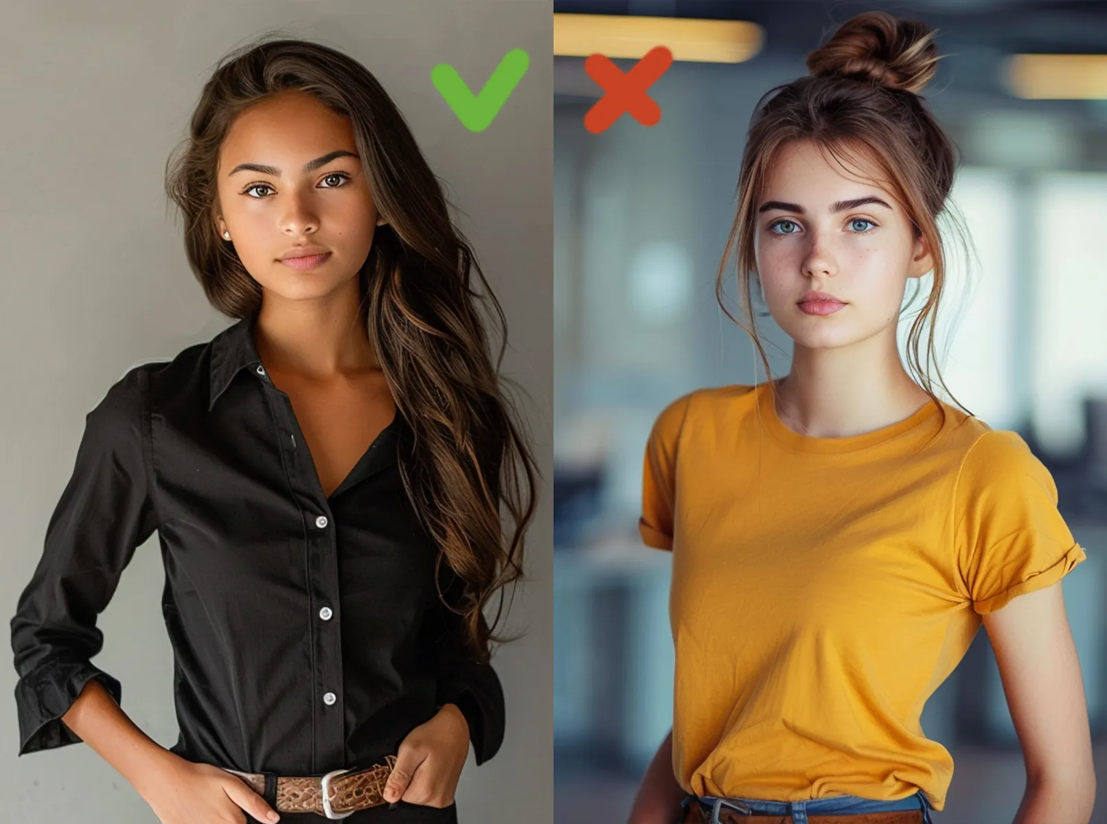
Research conducted by the University of Texas at Austin in 2020 has shown that the wrong clothing and accessories for application photos can have a negative impact on the overall image. One of the most common mistakes women make is wearing too much make-up and jewelry as well as inappropriate clothing.

After studying the opinions of around 3,000 recruiters, the researchers concluded that it is better to do a little research before taking a photo, namely:
- Visit the company's website and research its corporate identity.
- Assess the style of the photos of the company's employees and the clothes they are wearing in the photo. As a rule, you will always see the company's business look in the team view or the about us page.
- A neutral option for women is a photo in a blouse with a suit. For men, a shirt with or without a suit.
- It is important that the color of the clothing is not too bright, it is better to give preference to muted colors.
Background
Make sure that the background does not outshine the applicant in the photo. It should always be simple. The most common background mistakes are as follows:
Restless background: too many details in the background can distract attention from you, the main subject. A background filled with different objects, furniture or people looks messy and can give the impression that you haven't put enough effort into taking a good photo. The ideal background for your resume photo should be simple and neutral so that it doesn't draw attention away from your face. It can also be an office or architectural backdrop. In this case, it is advisable to soften the background a little.
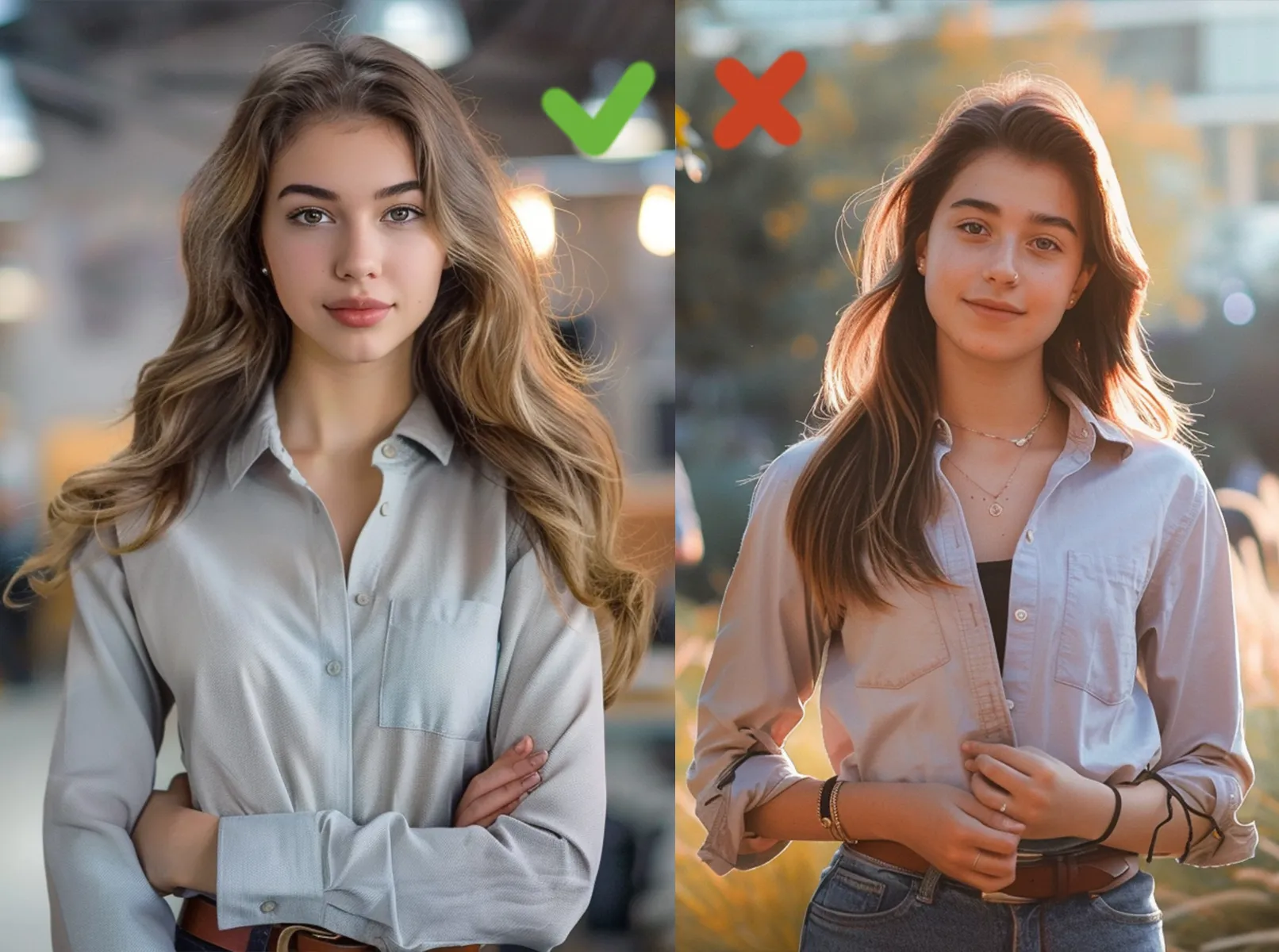
Inappropriate context: A background that does not match the professional context can have a negative impact on the impression your CV makes. For example, a photo taken on the beach, in a bar or at a sporting event does not look professional. It's better to choose a background that emphasizes your professional image, such as a neutral wall or office decor.
Incorrect backlighting: Incorrectly chosen backlighting can cause unpleasant shadows or overexposure. A bright background can lead to overexposure, where you appear darker against the background. Conversely, a dark background without sufficient lighting can make your application look less expressive. It is important to find a balance between foreground and background lighting so that both look harmonious.
Create a professional CV and increase your chances of success! Use our application templates for documents that won't leave any employer indifferent. Start by choosing a template 📄.
Mismatching colors: Background colors that clash with your clothing or skin tone can create an undesirable effect. A red background, for example, can make your face look too intense or unnatural. It is better to use neutral or pastel-colored backgrounds that match your appearance.
Unprofessional backgrounds: Photos taken at home, in the kitchen or bedroom don't look professional. Even if you're working remotely, it's important that you give the impression that you take your job seriously. Use a background that looks professional, such as an office wall or a specially prepared area with minimal and stylish details.
Background with logos or text: Backgrounds with company logos, text or other graphic elements can look sloppy and distracting. They can even give the impression that you are promoting another company instead of presenting yourself as a professional. Use as clean a background as possible without unnecessary lettering or graphics to draw all the attention to you.

Keep these flaws in mind as they will help you avoid common background mistakes and create a photo that emphasizes your professionalism and helps you stand out from other applicants.
Wrong perspective
Point of view is an important element of photography that can have a big impact on the first impression of you as an applicant. Choosing the right perspective for your application photo can highlight your best features, while the wrong angle can ruin even the most professional application photo. Here are some of the most common mistakes you should avoid:
- Photographing from below: This can create a double chin effect and visually enlarge the lower part of the face, making it look unnatural and unaesthetic.
- Photographing from above: It can make the face look disproportionately small and emphasize the forehead and the top of the head, which is not always attractive.
- Shooting too close: Causes the viewer to feel uncomfortable and gives the impression that you are violating personal space. It also emphasizes even small skin imperfections.
- Too far away: This makes you look less expressive and your face is harder to recognize. This can give employers the impression that the applicant is distant and unapproachable.
- Side shot: Distorts the proportions of the face and can give the impression that you are not completely open or are trying to hide something.
- Unnatural head angle: Tilting your head too far to the side or forward looks unnatural and can give the impression of suspicion or overeagerness.

Remember that the right angle will make the best first impression on a potential employer. If you're taking a photo for a specific job opportunity, it's better to look at the angle of employees on the website or social media.
Head position on the resume photo
The position of the head in an application photo influences the overall impression of the applicant in the picture. An incorrect head position can leave a negative impression. Here are the most common head posture mistakes and how they affect the perception of your photo:
- Excessive forward tilt: If your head is tilted too far forward, it can give the impression of being too serious or even aggressive. This posture makes your neck less visible, which leads to a visual enlargement of your chin. It can also give the impression that you are stressed.
- Leaning back excessively: Not only does this look unnatural, but it can also give the impression of arrogance or indifference. This posture can emphasize the lower half of the face and create an awkward appearance. It can also make the eyes appear smaller and the gaze less expressive.
- Leaning to the side: Looks playful or even careless, which is inappropriate for a job application photo. It gives the impression that you are not taking your professional image seriously. This pose can distort facial features and make the photo look less symmetrical.
- Turn your head in profile: Taking a picture with your face turned 90 degrees may look interesting for an artistic portrait, but not for a professional photo. This obscures part of your face, which can give the impression that you don't want to open up to the employer. Also, a profile photo often doesn't convey a person's true appearance.
- Unnatural turns: Excessive twists and turns, such as when the face is turned to the side and the eyes are looking into the camera, look too unnatural and can make the viewer uncomfortable. They give the impression that you are trying to look in different directions at the same time, which looks strange to say the least.
- Asymmetrical posture: If one part of your head is higher than the other, it looks inharmonious. This can give the impression that you are not confident or have poor posture. Symmetry is important to create a pleasant and professional appearance.

The right head position is the key to a professional and attractive photo. Your head should be straight and you should be looking directly at the camera, slightly raised at eye level. This will give the impression of confidence, openness and seriousness. Avoid unnatural tilts and turns to make the best possible impression.
A conclusion about application photos
The photo in your application plays an important role in making a first impression. The wrong angle, poor lighting, a blurred image, an unsteady or inappropriate background and the wrong head position can all have a negative impact on your application. If you avoid these common mistakes, you can present yourself in the best possible light.
Make sure that the angle highlights your best features and that the lighting is even and natural. Use a simple and neutral background that does not distract attention. Maintain the correct head position to create a symmetrical and professional image. And don't forget: make a friendly face. Your counterpart should be able to identify with you. This works best with a friendly, inviting smile.
The right photo can enhance the impression of your application and show you as a confident and professional person. With these tips, you can avoid the pitfalls and create the perfect photo to land your dream job.
Application photo: The most common mistakes on the way to an impressive application
From Vitalii Shynakov
